In the guide, you will learn about the Fitness page , and the features available.
Each section is covered in a separate post, so that any features relating to the specific section on this page can be updated accordingly.
The Fitness page. ![]()
The Fitness page is without a doubt one of the most important pages because it gives you an immediate overview of the result from everything you’ve done in the past and, everything you’ve planned for the future.
The Fitness and Form charts are the heart of the page and if you come from another software suite, you may know them as the PMC (Performance Management Chart). The terms Fitness/Fatigue/Form are used iso of the trademarked CTL/ATL/TSB ™. The idea and implementation is the same.
Fitness is a number that gives you an idea of how much work you’ve done in the last 6 weeks. The Fatigue number estimates the fatigue introduced by that work and given the fact that recovery occurs faster then building fitness, it is a weighted average of the last 7 days. Form is the “balance” between Fitness and Fatigue and tries to evaluate your readiness to perform. This mathematical model showed good results for already a very long time and is tailored well for most athletes. You should not change any default settings unless you know what you’re doing!
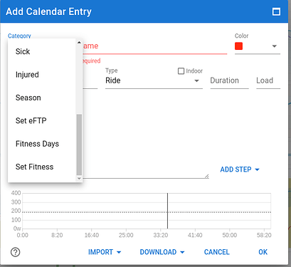
If you have imported activities and/or planned future workouts (with load estimation), the chart will already be populated. If you come from another software suite, you can copy a starting point for the three metrics. And if you know that your body reacts differently in terms of load impact and recovery, you can change the time-constants used for Fitness and Fatigue. Click on Add calendar entry and then select “Fitness days” and/or “Set Fitness” under Category. You can do that on any point in time, past/present/future by selecting a date.
This functionality gives you the opportunity to check if other values for the metrics of Fitness and Fatigue days, represent a better reflection of the chart to match your subjective feelings entered in the Wellness data. I would suggest to leave it as is for as long as you‘re not sure what you’re doing. Or even better, leave that to a coach who has way more experience.
If you’re starting out your journey, leave everything set to default and begin working out and planning. It will take about 6 weeks of regular training for the charts to become meaningful. That’s because the default Fitness time-constant is 42 days.
To check the different metrics on a particular day, hover the mouse pointer over the chart(s) and the metrics will be displayed on top or to the side as configured. If you have more charts then can be displayed without scrolling, click left mouse button to lock on that day and then you can scroll easily without loosing track of the selected day. Clicking again will unlock the pointer.
Choose the period you want to display the charts for at the top-left. There are standard selections for the last 3-6-12 months and for the seasons you have defined. The “Next month” selection will extend the chosen period with one month. This is very useful to check the impact of future planned training and even more to help you customize your taper into a major event.
The Add Calendar Entry button also allows you to add workouts (planned activities), a manual (already done) activity, Race dates, Notes, Injuries, Sickness, define seasons and modify eFTP for any point in time.
The “Ask a coach for help” button does exactly what it says.
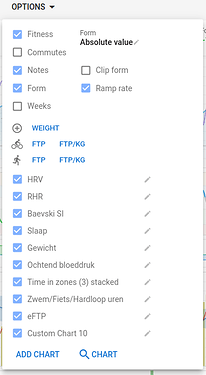
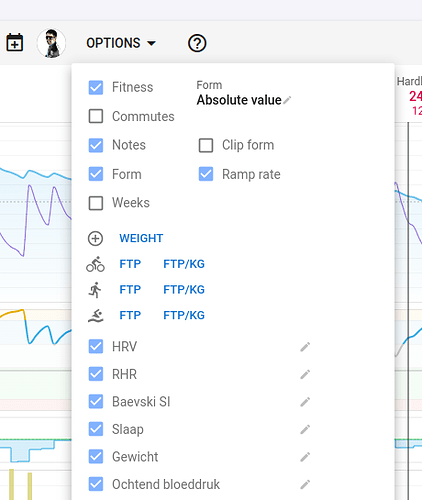
In the Options dialog on the Fitness page, you can configure what you want displayed. Fitness, Form and Ramp rate selection boxes, show or hide the charts for Fitness/Fatigue, Form and Ramp rate. Same goes for Notes and Commutes. Weeks will add a gray vertical line to the chart so you can easily distinguish the start of a week. Clip Form will reduce the vertical size of the Form chart by clipping high values, just to get a better definition of the smaller changes in Form. An epic Ride/Run with a huge load would otherwise make the chart less readable for your normal day to day activities.
Then you can add/remove other charts on the page by choosing some predefined charts, making your own specific ones (Add Chart - see separate post FITNESS PAGE - a guide to getting started - #4 by MedTechCD) or import interesting charts made available by other users (Search Charts). There is a lot of flexibility to turn this page into something that makes sense to you and your training habits.
There is also a setting to display Form as an absolute value (Fitness – Fatigue) or as a a percentage of Fitness. There is a debate on what is “best”. Now, for someone just starting out, I would suggest to set it on Absolute Values because otherwise, any workout load will immediately drive your Form in the red zone. For an experienced athlete with Fitness level approaching or surpassing 100, percentage is probably the better choice. And for anyone in between, try both and check what best matches your subjective feelings. If Form is in the Red zone and you feel like you could move a mountain, something isn’t right. Same goes for Form in the Grey zone and feeling totally exhausted. More detailed info in separate post FITNESS PAGE - a guide to getting started - #3 by MedTechCD
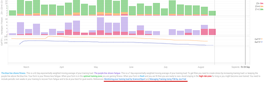
On the bottom of the page is some text to explain the PMC chart which includes clickable links that go into much more detail. If you want to know more about the subject, make sure to check those links. You will find similar links on just about all pages in Intervals.icu.
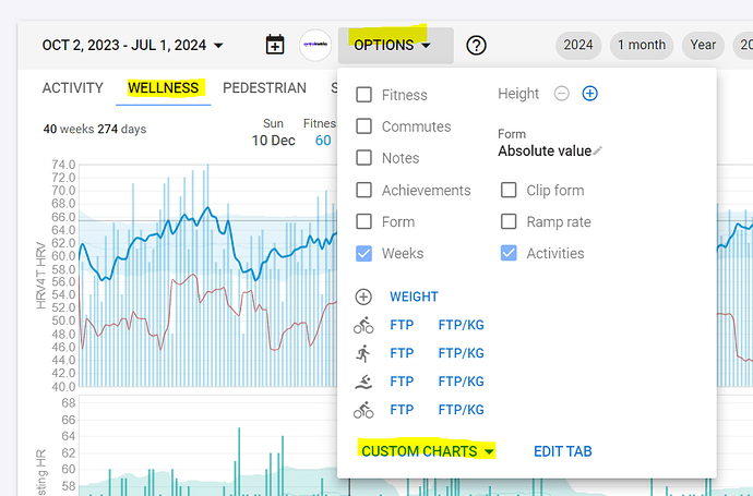
Settings for the Fitness page like, the displayed charts on each tab and the order they are in, are saved to one out of two settings sets. There is a set of settings for mobile devices and one for laptops/desktops. The reason is that the layout (portrait/landscape) and the available space is very different. This means that the Fitness page that you assembled on a desktop is not immediately shown on a mobile device. But, don’t worry, all charts that you created on one are not far away on the other device type. The best way to handle this is to first create the wanted Tabs on the other device. Then select the Tab to customize and from the Options menu - Custom charts, you can add any chart that was already constructed to any tab you want and in the order you prefer. You can mirror everything or you can have a smaller set of charts on mobile versus a larger set on a desktop. There’s no need to recreate each and any chart.
FAQ Fitness Page: My Form number is not matching how I feel
This is a remark that shows up regularly on the forum and there are multiple reasons why people have difficulties understanding this.
A first thing that has a pretty big impact on the numbers, is the setting of how Form is displayed. It can be displayed as an absolute difference between the Fitness and Fatigue numbers or as a percentage difference related to the actual Fitness number.
If your Fitness number is 100, both settings will result in the same Form number. Fitness 100 and Fatigue 130 will result in
• Form (absolute value) = Fitness-Fatigue = 100-130= -30
• Form (percentage of Fitness) = (Fitness-Fatigue)*100/Fitness= (100-130)*100/100= -30%
Both are right at the Green/Red zone limit.
If you do similar math for someone with a Fitness number of 15 and proportionally Fatigue 19,5
• Form (absolute value) = 15-19,5= -4,5
• Form (percentage) = (15-19,5)*100/15= -30%
Results in Blue (Fresh) zone or right on the edge of Green/Red zone. That is a BIG difference.
For those not used to Fitness numbers, 100 is a huge fitness level, usually only attainable for seasoned athletes or highly motivated amateurs with lots of time available for training.
So what should you use?
There is some debate regarding this but the example above shows quite clearly that for someone with a Fitness number on the extremes (about zero or above 100) the choice is rather simple.
With low Fitness, use absolute values because otherwise, the slightest workload will drive you in the Red zone while you will feel like you have a lot left in the tank. If you keep with percentage, it will seriously slow down your initial fitness building because the numbers will only allow you to do very short low intensity work.
If on the other hand, you have been working out as an elite athlete for years, and your fitness is above 100, it’s probably a good idea to set it on percentage. You will be able to do even harder and longer workouts before getting to the Red zone. That is after all logical, because with the years of dedicated training, your body is able to handle more load.
For anyone in between, try both options and evaluate objectively which one is best reflecting your subjective feelings. Or just stick to absolute values and find out what Form number is making you thrive. I for example do this but almost never let my Form go down below -22 (iso the default -30). To evaluate what is going on, it is very important to record wellness data on regular bases. If you don’t record that data, it will be impossible to evaluate a negative trend that is going on for a couple of weeks. If you have Wellness data, Resting HR and maybe even HRV data that shows a negative trend while you Form trends positively, you need to correct that situation.
And that brings us to something else that is usually overlooked. Take 2 random beginning athletes, same age, weight and height, both with a daytime job. Both decided to do something about their health and discovered an endurance sport that brings them joy and happiness. One of them is a construction worker and the other one is a marketing director. Which one would have the best starting fitness, most stress?? These different circumstances explain why the mathematical model isn’t working in the same way for everyone. After all, the model can only capture (best case) about 5-10% of your daily time that is allocated to working out. All the rest, daytime job, sleep, family time… isn’t captured. But it has a huge impact on your ability to recover and on the load that you can tolerate.
Don’t criticize the model, but try to understand it and adapt it to your specific situation, to your unique human body and lifestyle. If you’re not interested in that or don’t have the time to do some meaningful analysis, consult a coach. That is, if you are performance oriented. Coaches know these stuff and will do it for you. If you workout for simple health advantages and have a lot off interest in how things work, enjoy and learn. You may even become an avid student…
Fitness page: Creating additional charts
This is a post to explain how to add custom charts to the fitness page. I will not make separate posts for modifying build-in charts or shared charts. They can be handled in the same way.
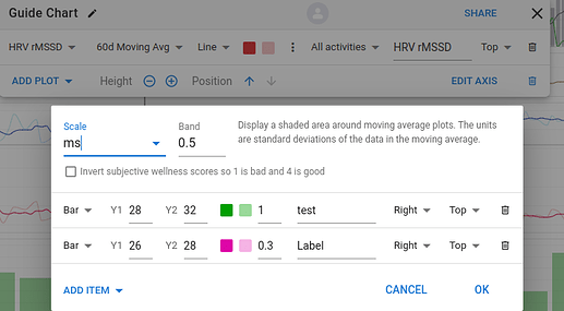
Go to the options dialog and click on “Add Chart”. Give the chart a name by clicking on the pencil icon. Now click on “Add plot” and pick a metric that you want to chart. You will see that there is a lot to choose from. Then click on the drop-down next to “As is” to select in what way you want to chart the metric. Next, choose to display it as a line or as dots and pick a color you like. The first color box is for the line, the second one is for a band around the line if you want that be displayed. To display a band around the line, click on the three dots, set the scaling and a multiple of SD (standard deviation) that you want to use for the band width.
You can also add background colors to visualize zones by clicking on “Add Item”, setting the Y-values and defining a background color. The label for the zone can also be set and will be displayed on the chart. If you just want a line to indicate a certain level, set both Y values to the same number and a line in the selected color will be shown.
Now you can adjust the vertical height and the position of the chart and adapt the axis range to be automatic or a fixed preset value.
You can setup an immense number of different charts with all the available options. If you have something that could be of interest to other users, spare them the time to do the configuration and share your chart by clicking on “Share” found on the far right of the title bar of the chart. You can share “Private”, “Followers” or “Public”. Give it a name and preferably add a screenshot so that others can immediately see what it is about.
Hello. Is it possible to calculate the required weekly load to maintain a certain fitness level. For example my current fitness is ± 70. If I regularly spin 4 times a week, what should the load be to maintain 70. Thanks.
70 is calculated using the exponentially weighted moving average for the previous 42 days worth of training load.
If you did 70 every day for 42 days it would be 70. As one 70 drops off on day 43, you’d need to do another 70 to keep the average. If you did 140 every second day, it would also be 70.
My training, and that of most of the athletes I coach are 5-6 days of training per week. 2 hard, 2 easy during the week, and then 1-2 longer endurance rides on the weekend. So the training load calculation starts with what we know we will be doing and then planning around that.
As you asked about maintaining 70, are you only doing 4 sessions per week? Nothing else?
How long are your sessions? All the same, or a mix of types of activities.
To maintain 70, you need to do 490 per week (70 * 7).
If it’s only 4 sessions, then it’s 122.5 per session.
For me, an easy endurance ride (L2/Z2 @ +/- 71% would be close to 100 TSS). To get 122.5, it would be 2.5 hours at about 70%.
1 hour at threshold (FTP) = 100, so to get 122.5, you have to ride for longer than 1 hour. That’s already quite taxing, so I’d break 490 down into:
- 4h endurance ride (220).
- 2x threshold session, 4-5x 8m at threshold (75)
- 2h endurance ride (115)
Thanks Gerald, this was very helpful. I realize I will struggle to keep it at 70 on my normal schedule. I have put in much more hours than usual over the past 5 weeks in prep for a big race on 3 Sept. Thanks again.
FAQ Fitness Page: Plotting Wellness subjective scores
If you want to plot your subjective scores for wellness, like sleep quality/soreness/mood/etc, you might be surprised that ‘good’ values are low and ‘bad’ values are high. That’s due to the way it was implemented and is one of the rare mistakes made by david. It’s difficult, dev wise, to correct the implementation but david provided a workaround to invert the scores before plotting them.
While setting up the chart, you can choose to invert the scores as described in this post:
Click on the three dots to bring up the dialog box and check the ‘Invert…’ checkbox.
Hello
Is there any way to plot the “predicted fitness” that is calculated from the future workouts plan?
The intention is to compare both , predicted and real ( that is already available)
Not at the moment and that would be hard to implement. The ATL and CTL values are calculated and stored for each day so it isn’t simple to have another set.
You can compare planned load vs actual load on the calendar (turn on compliance in options) which will give you similar information.
Hi,
I am trying to plot a chart for decoupling, but the bar graph type doesn’t plot negative values. Line or dot displays everything correctly.
Yes unfortunately negative bars are not yet supported.
Is there a way to reset the values to “factory” after I messed the graphs in order to display the standard PMC chart? Or can I rebuild them?
Delete all your personalized charts.
The fitness chart itself is not editable as far as I know. You can only show/hide it.
Yes! Thanks! Stupid me! I thought I messed up but it’s a fix one.
The fitness chart is based off of the PMC chart in TrainingPeaks, but the Form number in this fitness chart tracks the difference between fitness and fatigue on the day of, while in TP it tracks the form based on the day previous. What is the reasoning behind this difference if you’re replicating the PMC chart of TP? Thanks in advance!
How can I have the fitness chart include the load from running and ski activities? Thanks
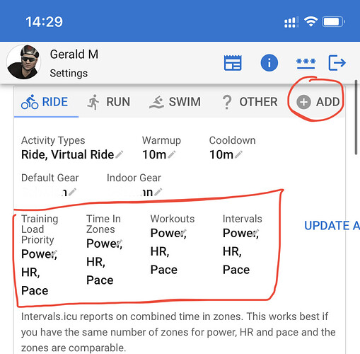
- Go to Settings page.
- Check that you have Running and Skiing as selected disciplines. You add anything from the list.
- The priority should then be set in order of preference.
I hadn’t actually used the TP PMC when I did this and it just seemed the right way to was to do it all on the day. Have had a few requests to change it and will likely add an option sometime.
Hi, I am using the possibility to import my training calender from Trainerroad, which automatically also imports the anticipated load (in TSS) from the planned workouts. I can see the future impact of these loads under my fitness tab (and also, e.g., on my graphs under the “Compare” tab). Is there a general way to not have that happen? I.e., I would prefer to see my fitness (and other data) WITHOUT the projection of future loads, but still be able to see the workouts planned in my calendar. Did I miss that I can set this somewhere, or is such an ignoring of future planned loads not implemented currently? Thanks.
