Graphing Wellness Data

I agree that I probably have these the wrong way round. However if I change them now I am sure to cause some problems for someones charts or someone using the API or wellness CSV download. What to do?

1 Like

I wondered about that. Two thoughts:

  1. Call it an update of an oversight and, c’est la vie. Sometimes ya just can’t be backwards compatible when progressing.
  2. Provide some type of option to allow flipping or assigning individual wellness values when plotting. I’m sure this is more work that option 1 but has the benefit of being backwards compatible.

To be clear, leave the actual entry within the Wellness data window the same. Just remove the visible values and re-assign them ‘in-house’.

Or is there some way to only change the mood and motivation values when they are plotted so that they appear “correctly” in the graph?

@David, any thoughts?

Migration of any “established” or “open” data which others are subscribing to, can cause untold “excitement” in one’s life. (ref: strava 3rd party data forwarding)

eg: I’m currently enjoying this headache refactoring a lot of code to migrate from MRC → JSON and handling user preferences…

Personally, I like it when there’s openness in why something has changed. Whoop and Oura change the way they calculate metrics without any information. Client’s data isn’t even available which means that nobody has any idea what gimmicks the companies are up to. (To be clear, I don’t have either of those devices.)

OTOH, when change and correction are admitted and made with explanation for corrections, fixes and updates and when one’s data is available, that shows me integrity. I have a number of beta apps on my iOS device; some of the companies (i.e. Downcast, ProtonMail) are clear about what’s been added, updated and fixed. Others tell nothing, and their apps are usually buggy as hell.

Sometimes things change in a way that I’m not stoked about but if I’m provided information about the reasoning I usually get over it, sometimes even loving the change. Heck, I eventually came to love the scroll method (newest on top) in Intervals Calendar. :v:

3 Likes

Not everyone stands by the reasoning behind the change.

And not everyone wants to know the details behind the change (eg: some users and their “relationship” w/ FB)

ignorance is bliss to some.
or it can also be
one man’s meat is another man’s poison.

Yeah, ignorance is abuse. :pensive:

Integrity is always beautiful, even if not easy for some to accept. Many people completely misunderstand what integrity and honesty actually look like. …But I digress. (I’ll leave further discussion on that topic to my IG & blog.) :pray:

1 Like

I am thinking about this. Probably all I could really do would be something on the charting side. Changing how the data is stored would break a lot of stuff (Intervals.icu and anyone using the wellness data).

Perhaps a quick, easy solution would be to provide an ‘Inverse’ As Is option. This would only graph daily values appropriately not any of the calculated options. But it could be an option until a more encompassing graphing solution for all values is created.

(Of course, I have no idea about the coding and maths feasibility of this. :relaxed:)

you could just change the parameter’s name.

Rename Wellness (a term i dislike) to something like “Misery index” or “Cosmic angst”

-Steve

3 Likes

:rofl: I love it!
What about motivation? Insipidity of life? :sunglasses:

@david , when you get around to fixing the Mood & Motivation inverse graphing issue, would you mind rounding the Feel to a whole number for anything other than As Is?

image

Wouldn’t it be better to round to 1 decimal?

Probably, yes. :+1:
Certainly better than filling the screen with fine numbers. :crazy_face:

Feel now gets up to 1 decimal. You need to delete the plot from your chart and re-add it to get the update.

Thanks mate!

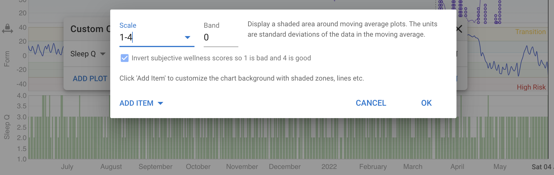
I added a plot option to invert the values of subjective wellness scores (including feel from activities):

4 Likes

Sweet! Thank you. :+1: