You can now add custom activity charts to the activity heart rate, power, pace and data pages. These charts are created using Javascript code executed on the Intervals.icu servers and rendered using Plotly.
Look for the new charts button at the bottom of the activity power/hr/pace/data pages:
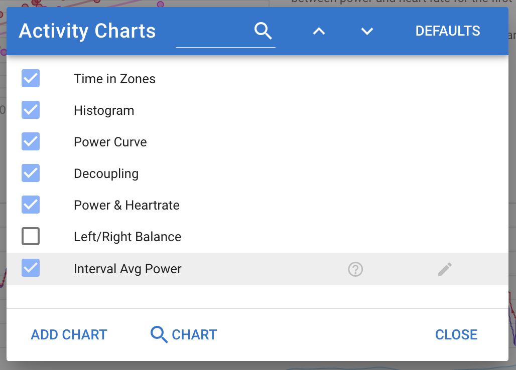
You can toggle all the standard charts on/off and move them around and add your own charts. You can optionally share your own charts with everyone and search for charts others have created.
The script has access to an “icu” object providing access to the following objects:
activity
athlete
streams (watts etc.)
sportSettings (for the activity sport)
wellness (wellness record for the day)
powerCurve (power duration curve)
powerCurveFatigued0 (power curve after some KJ of work done)
powerCurveFatigued1 (power curve after more KJ of work done)
hrCurve (heart rate duration curve)
paceCurve (distance vs time curve)
gapCurve (distance vs time using gradient adjusted pace)
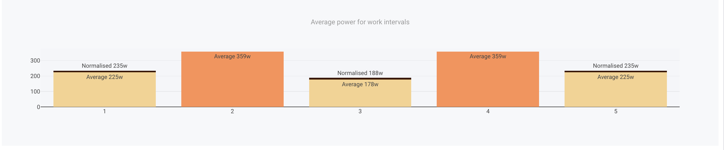
Here is the code:
{
  let activity = icu.activity

  let x = []
  let y = []
  let intervals = activity.icu_intervals || []
  for (let i = 0, c = 0; i < intervals.length; i++) {
    let iv = intervals[i]
    if (iv.type !== 'WORK') continue
    ++c
    x.push(iv.label || c)
    y.push(iv.average_watts)
  }

  let data = [
    {
      x: x,
      y: y,
      type: 'bar',
      marker: {
        color: '#63c',
        opacity: 0.7
      }
    }
  ]

  let layout = {
    title: {
      text: "Average power for work intervals"
    },
    margin: {
      l: 30,
      r: 20,
      t: 20,
      b: 30
    }
  }

  chart = { data, layout }
}
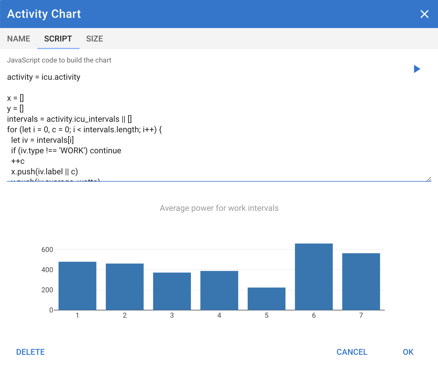
Edit: ok, my bad. This happens when having intervals with same name. I should do an average of the data on the same interval. Edit 2: or I can have it per interval just adding the index: x.push(iv.label ? c + '-' + iv.label : c)
Thank you @david for this
Can we use any feature provided by Plotly to create these chart? I mean, different kind of charts (scatter, line, …), several traces in the same chart, etc
Yes anything you can create with Plotly should work. I am not familiar with Plotly myself. I picked it because it is declarative and seemed full featured + there are versions for Python and so on so others might know it.
I probably need to add some formatting functions to the environment for pace and speed.
Hello,
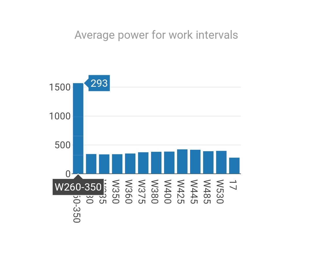
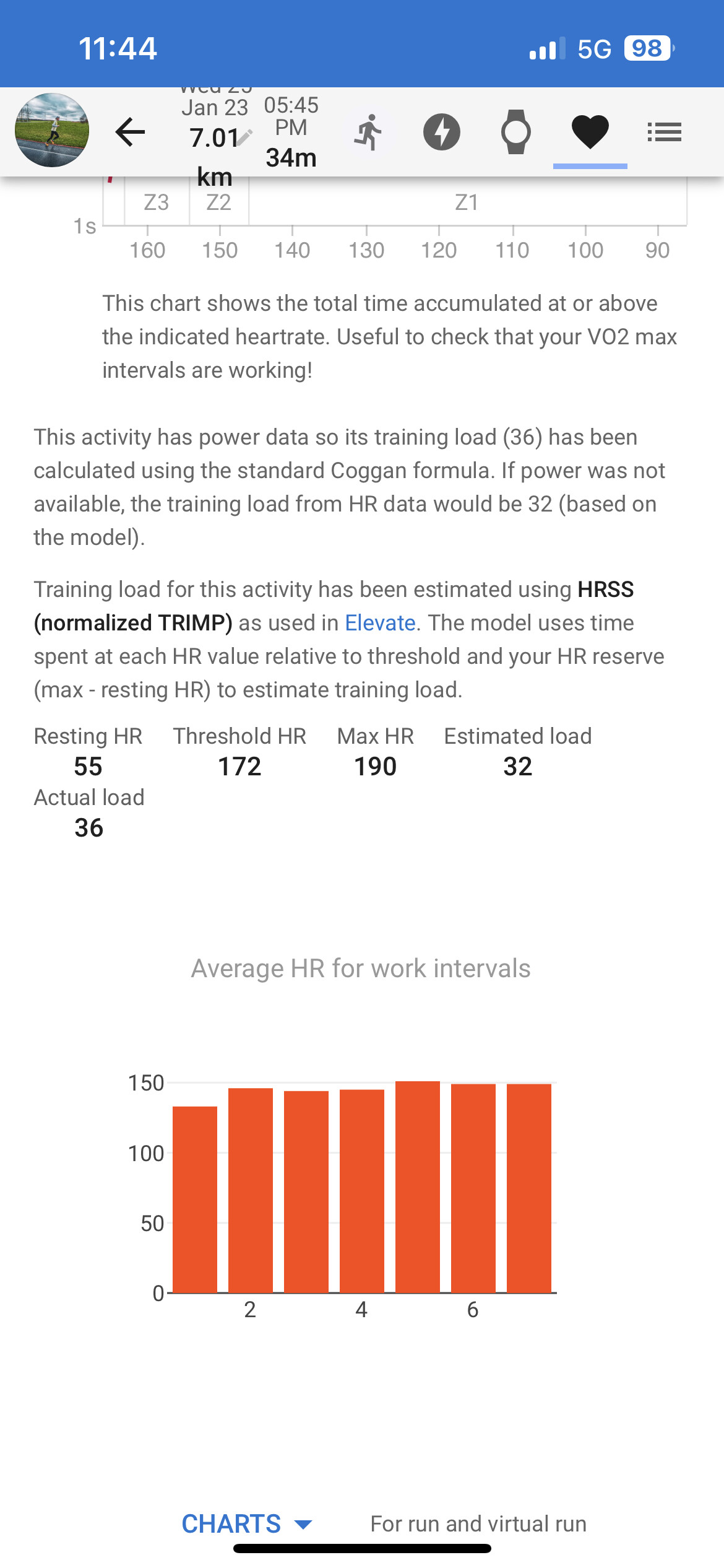
Great, I have a question, could iv.moving_time be used to remove the pause time from the average of a lap in a graph?
if ( iv.moving_time != ’ ? ')
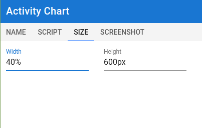
I added support for uploading screenshots for custom activity fields. If you are creating a new one you do need to save it first, then re-open to see the screenshot tab.
I haven’t quite figured it out completely and on mobile it seems to act a bit strange but there are sizing options on the third tab when you click on the pencil icon for the custom chart.
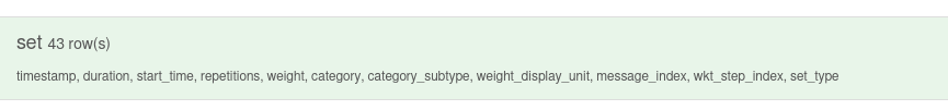
Maybe some of you can help me, I think there is no way to access the other sections of the ‘.fit’ file, right ?
I wanted to try implement a recap graph for weight training session. Showing the rest/work graph for different sets. The weight training files are a bit different from the usual bike ride ‘.fit’ files, the reps logs are stored in a section called “set” (see the screen shot from fitfileviewer.com). I didn’t found any way to access such sections from javascript code.
You can access with the code “set.weight”, but you only get the value of the last row.
However, you can only map FIT file fields to custom activity fields, so you will only see them as summary. If you only want it per session and your last “set” row has the final weight you want, then you are good to go with “set.weight” as the FIT file field.