Custom activity streams can now store an array of numbers (32 bit floats) per second. You have to create the stream using Javascript, you can’t just select a record field.
{
  for (let m of icu.fit.record) {
    let v = m['1st SmO2 Sensor 7769 on Location Not Set']?.value
    if (v) data.setAt(m.timestamp.value, v)
  }
}
This is what ends up in the stream:
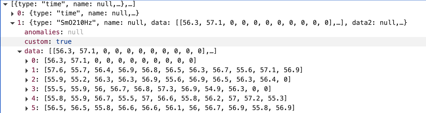
The Intervals.icu activity trace charts will display the first value from each array. You can build your own charts in JavaScript to get at the high resolution data.
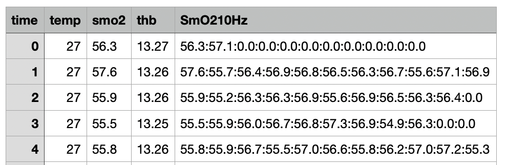
The CSV download uses a single column with colons to separate the values (like HRV):
I could make this work for the simple record field version but that would change existing behaviour. At the moment if you use that on an array field the first value from the array is used. Maybe I should just go ahead and make the change?