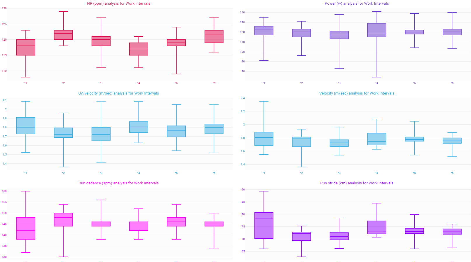
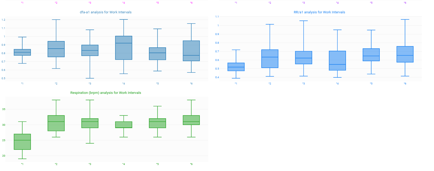
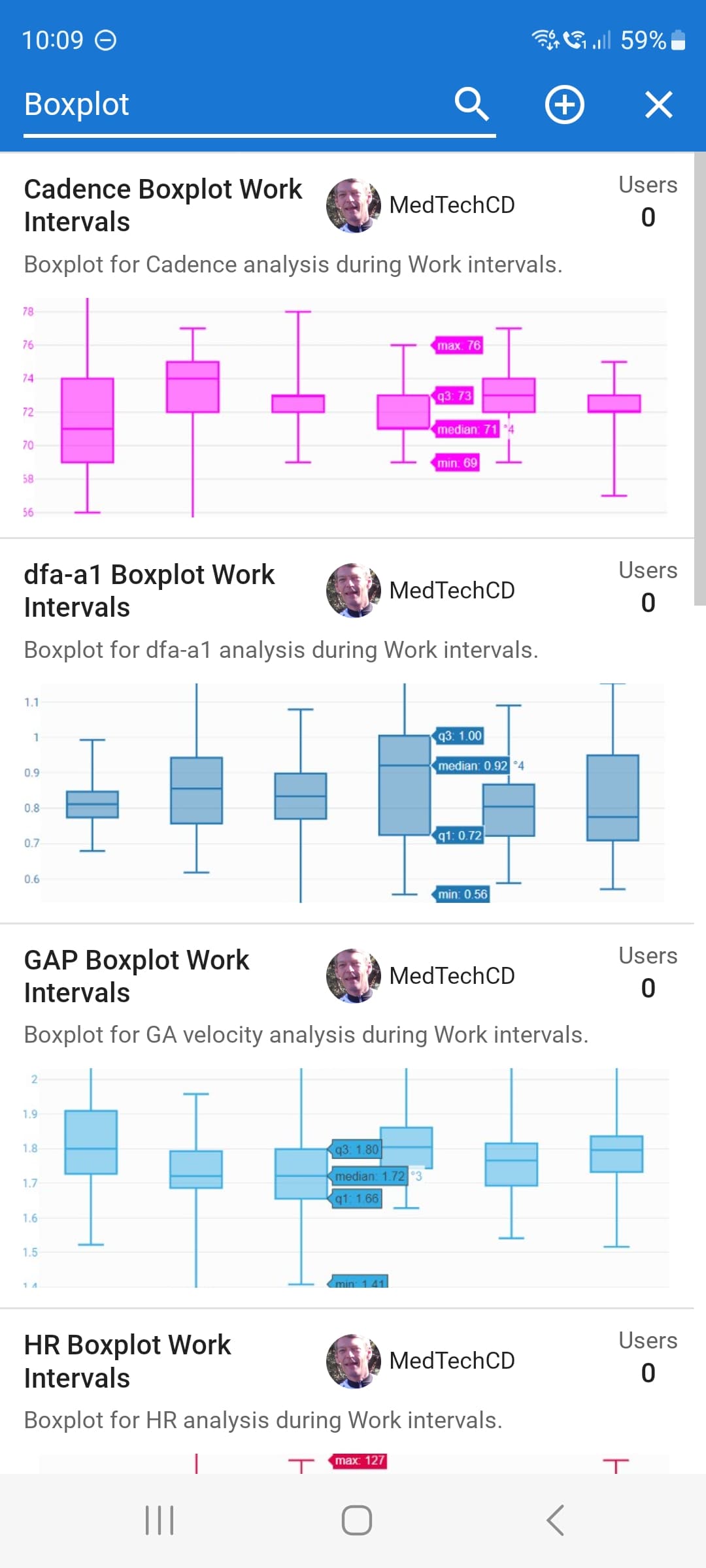
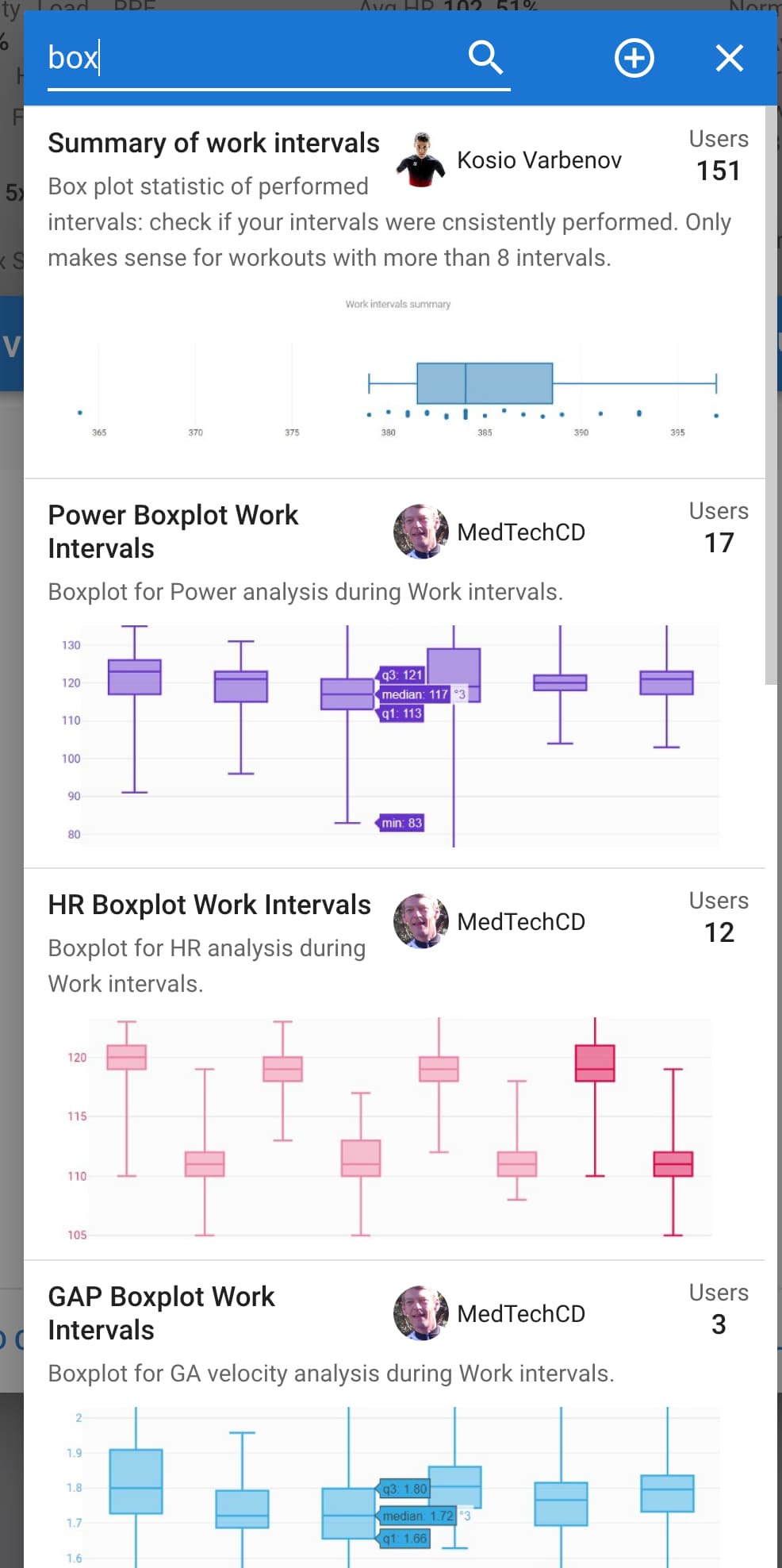
I wanted a uniform way of visualizing the data for Work Intervals and created a series of boxplots. I have ‘stolen’ some ideas from other charts made by contributing members and brought it all together. There are a total of 10 charts. For both running/cycling:
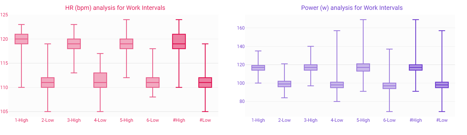
Heartrate in bpm
Power in w
dfa-a1
RR/a1
Respiration in brpm
For cycling:
Cadence in rpm
For running:
Run cadence in spm
Stride length in cm
Pace - Velocity in m/sec
GA velocity in m/sec
There’s a line in the script for ‘mean’ value (average), but it’s commented because I consider that to ‘crowded’. Turn it on if you want.
They are all publicly shared.
Example for running:
Edit: added one line of code to avoid errors if the stream is absent. Plots for unavailable streams will no longer display.
PS: if no intervals exist, all plots will be ‘empty’.
Edit: changed code to use interval_index iso interval_time because time causes errors when there is stopped time in an interval. Thanks to @Andreas_Haigermoser for troubleshooting! If you see strange behaviour, update your copy of the boxplots by deleting it and adding the modified ones.
@david David, I noticed that these new charts do not show up on the list of shared charts unless you specifically search for them. (search for ‘box’ brings them up right away)
I also don’t see them listed as shared on my profile page.
And a second thing: can I check the interval type also as ‘selected’? I used WORK in the scripts above but I just got the idea to maybe add 2 more boxplots to the right which summarize the ‘selected’ and not ‘selected’ intervals. That would make a nice view for a structured workout with 2 different types of intervals.
These charts are great, thanks! I have made the search return 100 results (was 30) which gets everything currently. The results are sorted by usage count which doesn’t favour new stuff. I need to figure out how to make that better.
Which intervals are selected is currently client side only state and the charts are rendered once on the server. And it would be a bit slow to re-render that chart whenever that changes.
All my boxplots now have a ‘Grouping’ functionality. Grouping is done by the interval label. It’s all dynamic. If a label occurs twice or more, you will get an extra boxplot to the right that summarizes all intervals with same label. Blank labels are also handled. Summaries have a denser colour and a # in the label
If you want the new functionality, you wil need to remove the existing chart and re-add it.
If you don’t like it, the first line in the script has a toggle. Set the ‘grouping’ variable to false if you don’t want grouping.
My impression is, that this happens if intervals are edited. I changed to “use laps” in this case. David mentioned that the charts are rendered once on the server. Coukd this cause this effect? Is it possible for the user to initiate a new rendering ?
Please explain what te problem is because I can’t see what’s wrong.
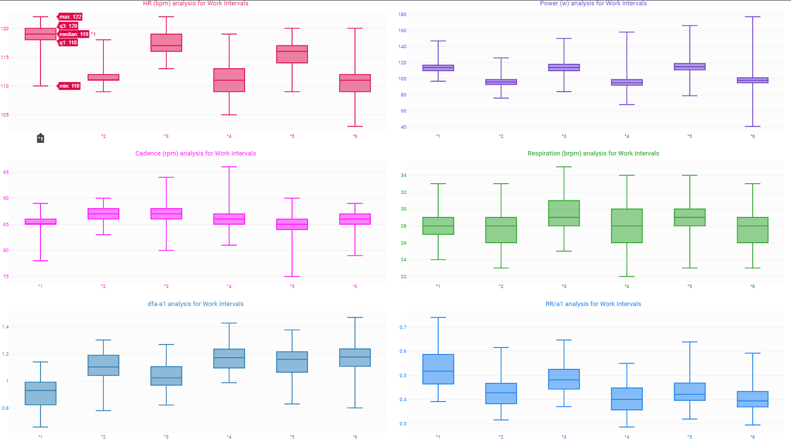
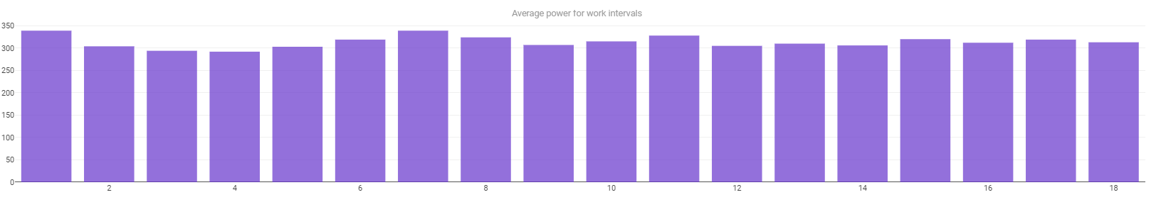
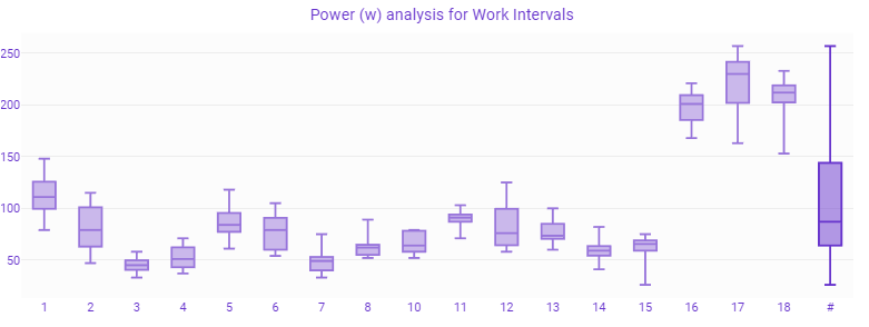
There are 18 intervals, and the table gives you the ‘Average’ power.
The plot gives you the ‘Mean’, 25 percentile, 75 percentile, max and min power for each interval and the same for the grouped intervals.
Are you confused about the difference between and Avg and Mean perhaps?
Average is the mathematical average of all points.
Mean is the value of the midpoint, meaning that there are as many datapoints below as there are above that point. The box is where 50% of all datapoints lie and the extremes are the max and min.
Take e.g. interval 14: The average is 306 W in the first plot, the median is 59 W and the max is 82 W.
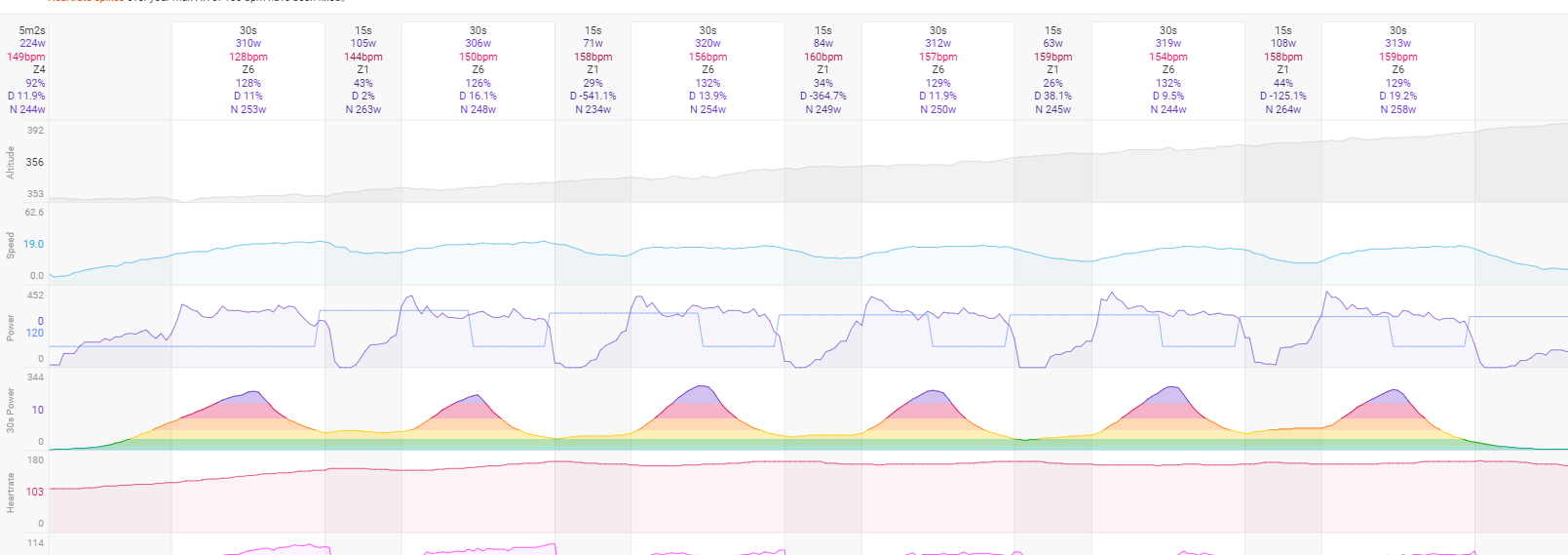
The values in the boxplot do not correspond to the time history of the power. In the next plot you see the last 6 intervals, no. 14 is here the second one. The max value is 412 W, min is 232 W as shown in the figure.
Apparently the boxplot uses wrong data. Remarkable is that this happens only in some cases. There are others where the plot looks perfect.
David mentioned on Dec '23 that the selection of intervals is client side only state and the charts are rendered only once on the server. Can this be the reason for the wrong figure?
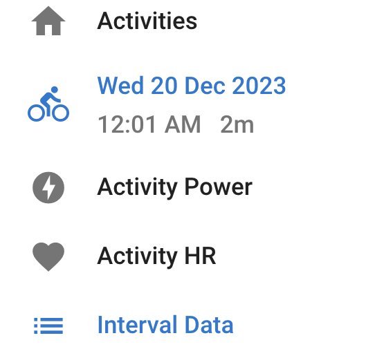
Can you show the intervals data page table please?
It looks like the boxplot script is confused by what is a ‘Work’ interval or not. I went over te script already but it’s not clear to me why the Work intervals would not be detected correctly. Maybe it has something to do with the workout that is coupled to the activity. I see in your screenshots that the workout is not aligned with the activity. Did you already try to align them? Options menu at te bottom, Workout slider.
I have never seen any problem on my data, simply refreshing the page immediately takes the newly set intervals into account.