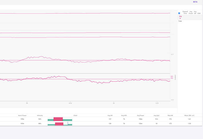
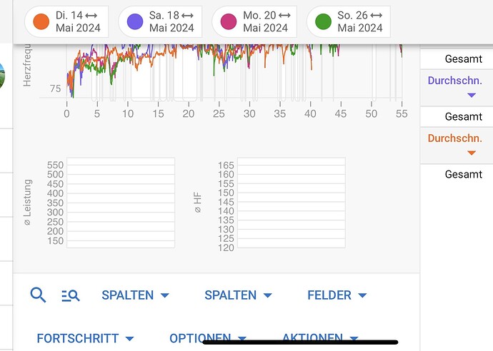
You need to use the interval table on the right for this. It shows summary information for the selected visible intervals.
Ok found that it shows the Interval summary when the whole workout is displayed. If I highlight a section of the workout, that is when the summary information is blank
Yes that table shows summary info for the intervals visible in the zoomed portion.
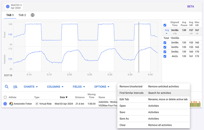
You can now search for activities with intervals matching intensity, duration etc… Zoom so the intervals you are interested in are visible on the chart and do Actions → Find Similar Intervals:
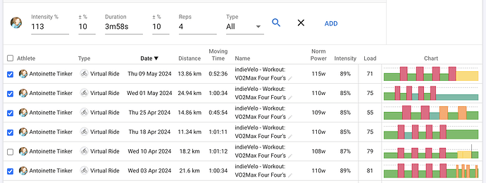
That will open the interval search bar with the average intensity and duration for the visible intervals filled in and show matching activities. Tick off the ones you want to look at and click “Add”:
The intensity value is the average power, heart rate or pace of the interval compared to FTP, LTHR or threshold pace respectively.
You can also open the interval search bar using the button:
The search is performed by looking at the skyline chart data. So unfortunately I can’t add distance or other parameters to the search. The detailed interval data is in “offline” storage and takes a long time to fetch in bulk.
Hi David,
As always, I’m amazed at how quickly you’re making progress - unbelievable!!
But do I understand your last entry correctly that you won’t be able to search for interval names in the future?
See also: Intervalls by Name - #3 by Cooper
Tx. Yes unfortunately not. The easiest workaround is to tag the activity #vo2max or whatever makes sense.
This is AMAZING!
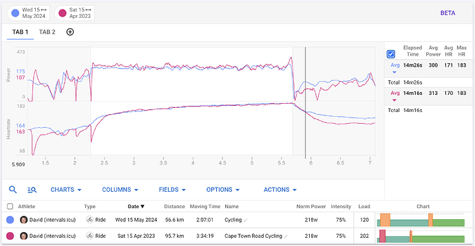
I love that you’ve added the ability to put distance on the x-axis (and the curve shift feature) as it makes it dead easy to align outdoor rides (it works nicely!).
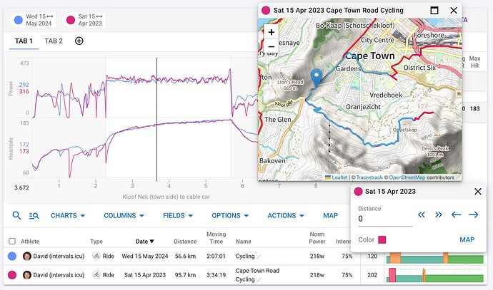
Can i make a request that the ‘map’ window be made available so that it is much easier to find specific hills that I do my efforts on when i ride the same loop every Monday or Tuesday? ![]()
(also, completely agree…supporting this effort is one of the best investments i’ve made wrt my cycling data!)
This is fascinating…the same loop ridden 3 weeks in a row and in some cases 9-12m difference in altitude! That translated into 10m more climbing…for some reason…just at a lower altitude! ![]()
![]()
Understood
Awesome these new features!
The “search for similar intervals” button on the activity summary now goes to the new compare activities page with the activity selected. The interval search is filled in from the selected interval.
When I click on the new tab icon no new tab is shown but the altitude and pace/km charts disappear. Then I have to click on any other tab AND back to the original tab before the new tab is shown and the charts that disappear reappear.
Also, those tabs that didn’t initially appear… I can’t edit them. I click Actions/Edit but nothing happens until I click back to one of my original tabs at which point the tab Edit window pops up.
I have fixed this. Tx for the report.
I have added the map. Use the legend tags at the top to choose which activity is displayed. It zooms to the currently visible portion.
SO COOL!
Thanks! ![]()
Another thing I’ve noticed recently is the huge number of new posters to the forum. Many of these are coaches and seem to want to transfer their clients to Intervals (presumably from TP). Some (not all) of these same business owners are not subscribers to Intervals.icu
A good place to start for making something subscription based would be a mandatory fee for coaches using intervals as their coaching platform. Whatever about an individual using intervals for free, it’s cheeky to say the least to use intervals as the bedrock of a business and not pay a cent for the privilege.
Cheeky, agreed. There’s a well known coach who hacked his way through the TP API and uses the platform for all his athletes without paying a cent. What’s more, he’s even bragged about it, and his clients are left with basic, limited TP. IMHO, no class at all.
You can now select activities to compare from the athletes feed (tx @Jeff_Schiller1 for the idea):
I am busy working on interval progress charts, showing average power and other stats for the selected intervals for each activity over time. Similar to the chart on the current /search page but much smaller.
You can now add little progress charts showing the progression of an interval field (e.g. average power) from one activity to the next:
Click the “Progress” button on the toolbar to choose which fields to display on these charts. Defaults to average power and average HR.
The line shows the average for all of the selected visible intervals on for each activity. The dots the value for each individual interval. Mouse over the chart to see the average value and date or the value for a dot.
The activities are shown in reverse order to the activity table at the bottom of the page. The legend at the top is now also displayed in that order. Usually the activities in the table are newest first but these charts want oldest on the left.
I am going to release this to everyone this week, likely as a premium feature. It can now replace the old buggy interval search page.
ext mit deiner Kamera übersetzen
hello David
I don’t have an ad, do you have an explanation
LG Helmut
There are a couple of bugs with those charts that I have fixed but not deployed yet. I will likely deploy sometime tm. Tx for the report.
