I have finally started this (big) piece of work. A replacement for the existing activity /search page with way more functionality.
As you can see I haven’t got too far yet.
I have finally started this (big) piece of work. A replacement for the existing activity /search page with way more functionality.
As you can see I haven’t got too far yet.
but the beginning has been made ![]()
![]()
![]()
Thank you for undertaking it, can’t wait to see it! This is going to be awesome! ![]()
Yassss!!! I so appreciate how you continue to update and improve things, rather than just leaving it as is.
Thanks for all your hard work.
A simple request totally overdone … Very Nice.
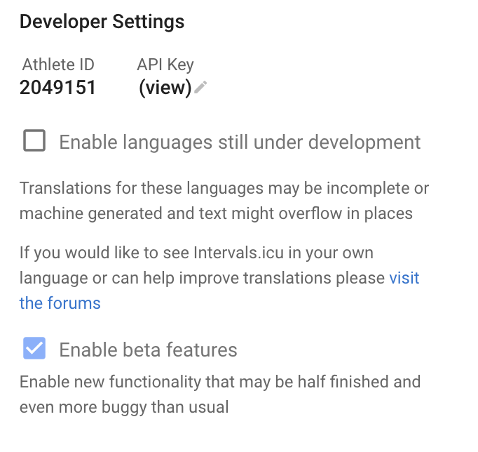
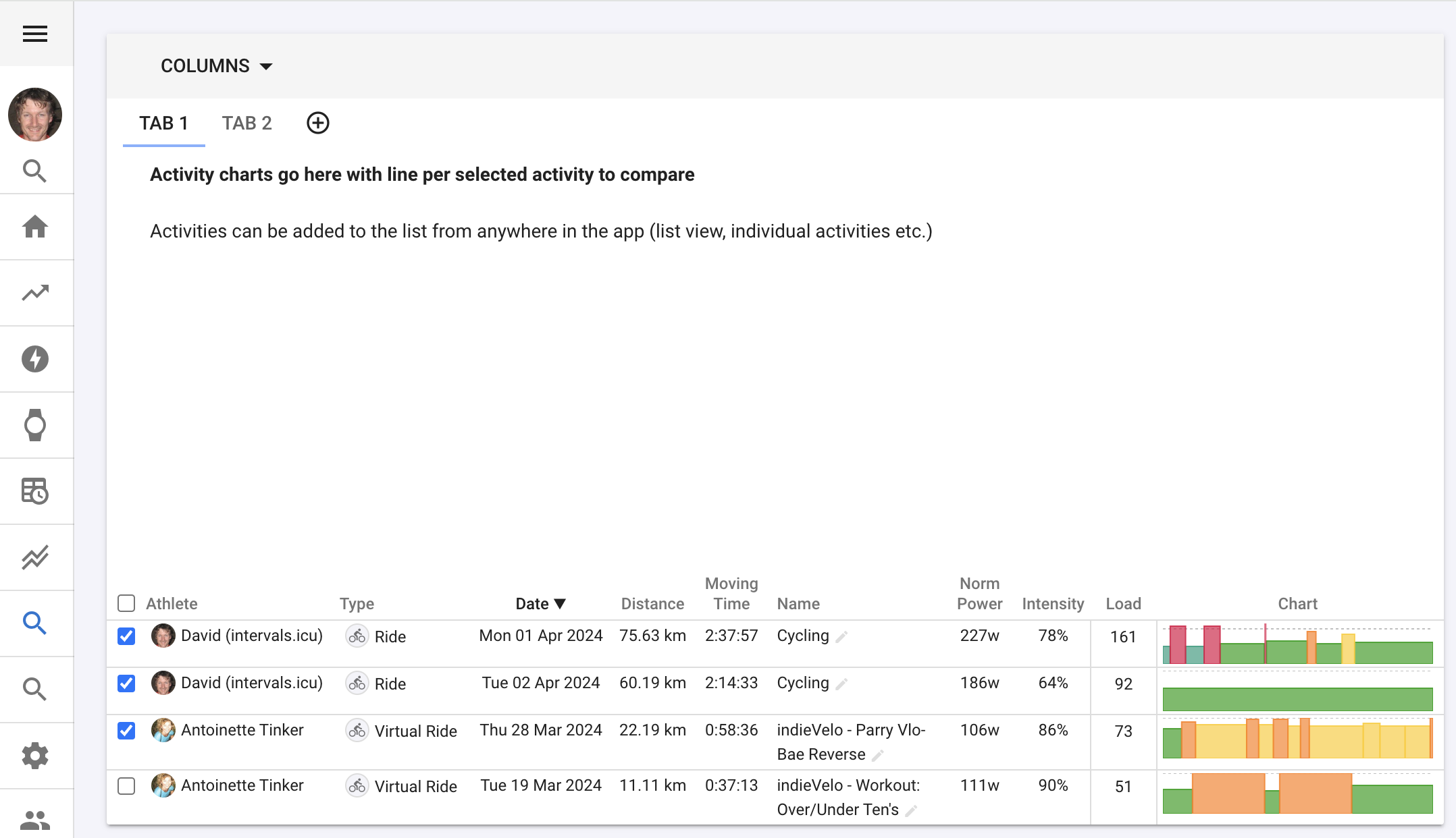
Early adopters can play with this now. It is nowhere near complete. There is a new flag on the /settings page to enable incomplete and beta functionality:
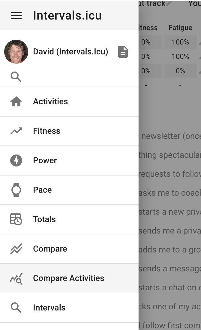
If you tick that the new page will appear on the menu:
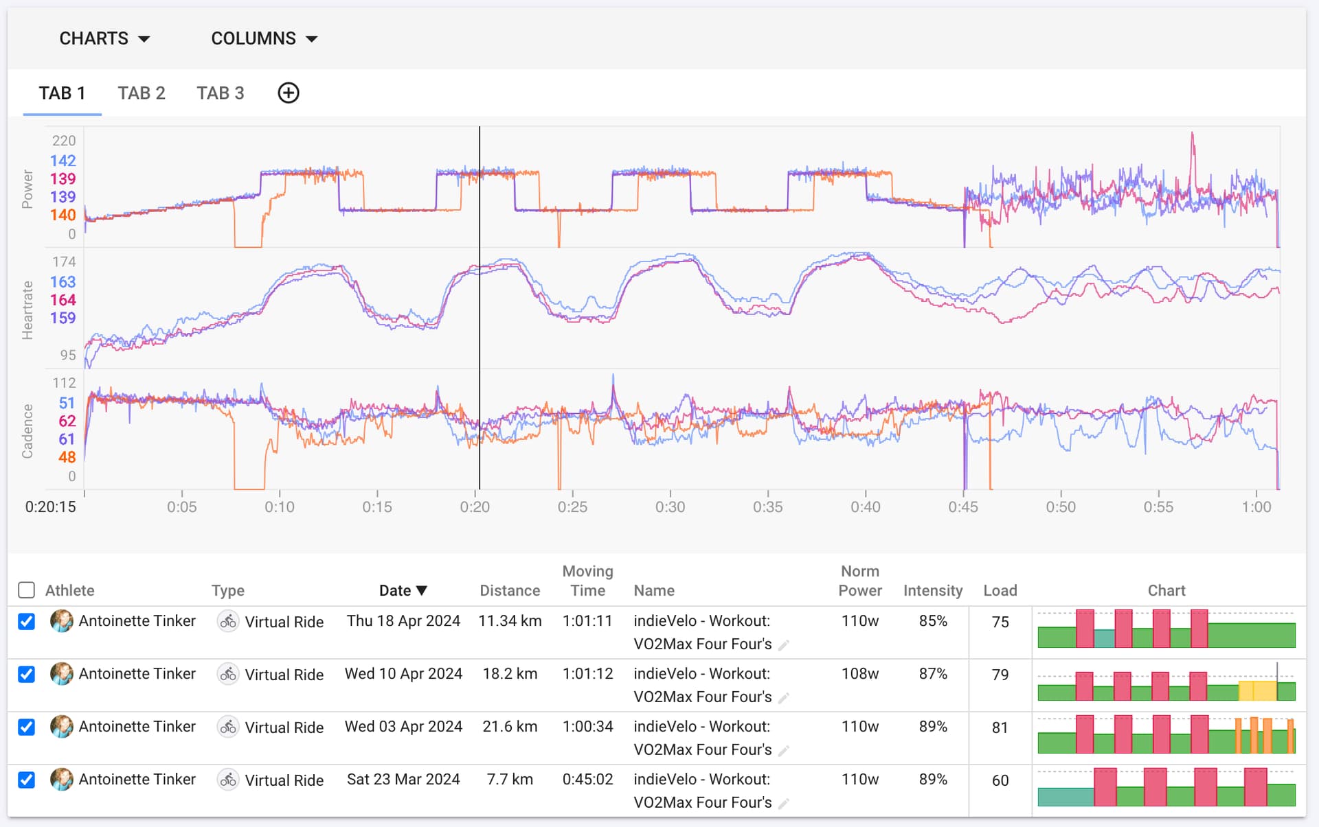
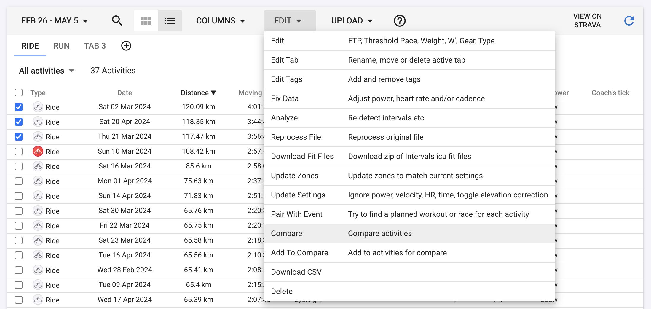
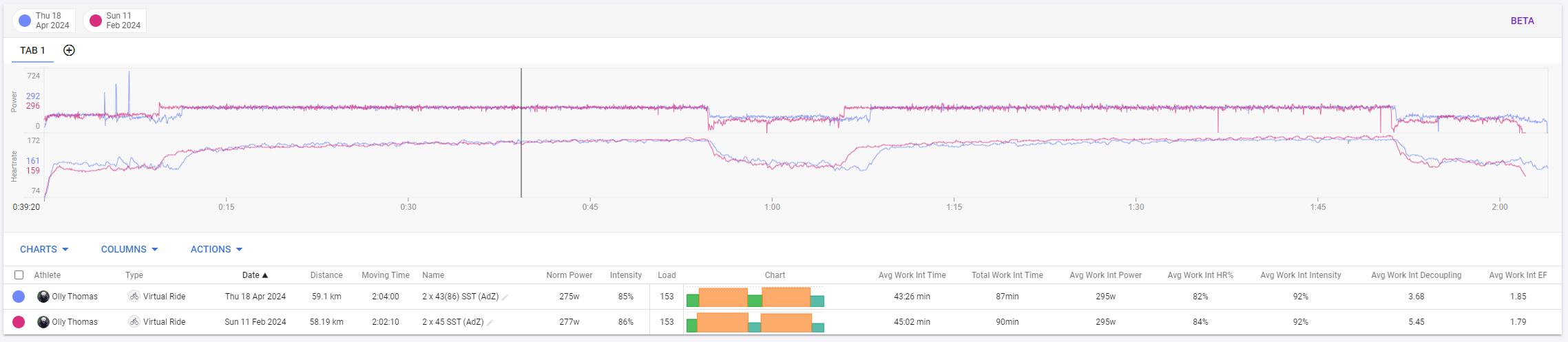
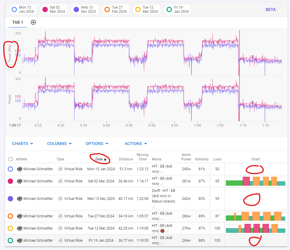
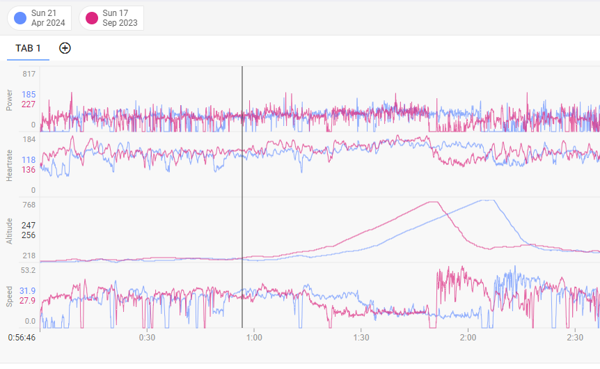
There are also options on the activity list view to compare activities:
And a similar one on “Actions” under the ride timeline chart.
This is looking fantastic!
Even with ‘just’ with this beta functionality, being able to pull through custom activity fields is amazing!
If as part of the Charts (or separate area below table) you could create Custom Charts which could access the Custom Activity Fields (like the charts on the Fitness page do) then it would be brilliant - future functionality perhaps
unbelievable ![]()
![]()
![]()
Thanks
Only thing left on my list for visits to Strava.
Worth the wait.
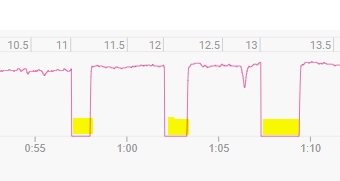
@david For comparing two identical workouts, it would be relevant to be able to adjust the pauses with a setting slider.
I don’t quite understand what you mean by “adjust the pauses”?
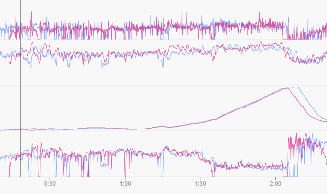
The chart now supports zooming and you can move activities left and right to make them line up.
Wow this is going to be Epic!
@david I don’t display the pauses.
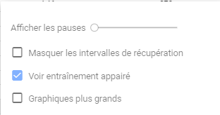
However, they show up on the graph that allows for comparing activities.
I like it, and I’m helping to test it.
There are a few things I noticed in my first comparison, but I think they are still being worked on. ![]()
A: I could also select custom charts, but the settings were not applied (Here at the top, a custom chart with an average of 30s, and at the bottom, the original power chart).
B: In some activities, the preview chart is on the left (the older one?).
C: The table is not sortable.
Fantastic @david …I have one request though ;
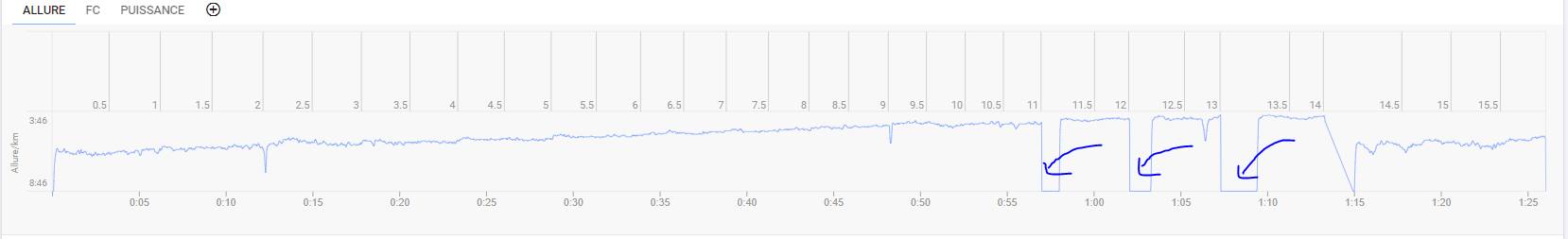
I attached the comparison of 2 of my activities : it would be nice to be able to " align " the 2 activities so that I can analyze for example only the uphill section ( which in my case are staggered because for example I reached the uphill late)
Also the power figure turns out to be staggered because I started the climb at different times
I hope I have explained myself
I concur on the concept of aligning the activities - maybe a slider that allows the user to shift one activity forwards until the data points match up?
You can align activities. Click the text on the activity markers at the top of the page. Obviously I need to make this more obvious. Will likely add little pencil to each.
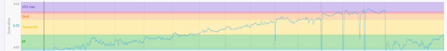
For outdoors rides, x axis as distance would be more convenient for comparison.
Would it be possible to change from time to distance according to user selection?
If not, implementing current custom charts (with scripts) in the compare activity page would be also a solution in these cases