The Fitness page. ![]()
The Fitness page is without a doubt one of the most important pages because it gives you an immediate overview of the result from everything you’ve done in the past and, everything you’ve planned for the future.
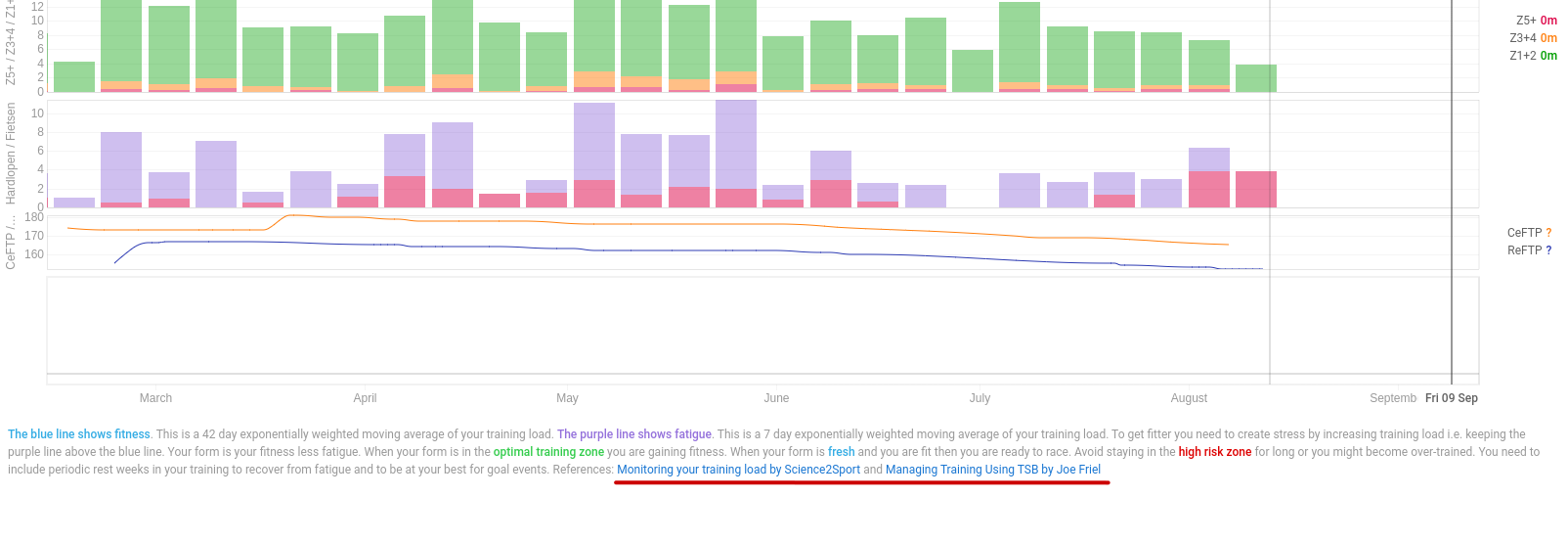
The Fitness and Form charts are the heart of the page and if you come from another software suite, you may know them as the PMC (Performance Management Chart). The terms Fitness/Fatigue/Form are used iso of the trademarked CTL/ATL/TSB ™. The idea and implementation is the same.
Fitness is a number that gives you an idea of how much work you’ve done in the last 6 weeks. The Fatigue number estimates the fatigue introduced by that work and given the fact that recovery occurs faster then building fitness, it is a weighted average of the last 7 days. Form is the “balance” between Fitness and Fatigue and tries to evaluate your readiness to perform. This mathematical model showed good results for already a very long time and is tailored well for most athletes. You should not change any default settings unless you know what you’re doing!
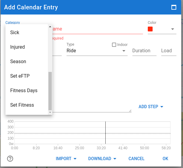
If you have imported activities and/or planned future workouts (with load estimation), the chart will already be populated. If you come from another software suite, you can copy a starting point for the three metrics. And if you know that your body reacts differently in terms of load impact and recovery, you can change the time-constants used for Fitness and Fatigue. Click on Add calendar entry and then select “Fitness days” and/or “Set Fitness” under Category. You can do that on any point in time, past/present/future by selecting a date.
This functionality gives you the opportunity to check if other values for the metrics of Fitness and Fatigue days, represent a better reflection of the chart to match your subjective feelings entered in the Wellness data. I would suggest to leave it as is for as long as you‘re not sure what you’re doing. Or even better, leave that to a coach who has way more experience.
If you’re starting out your journey, leave everything set to default and begin working out and planning. It will take about 6 weeks of regular training for the charts to become meaningful. That’s because the default Fitness time-constant is 42 days.
To check the different metrics on a particular day, hover the mouse pointer over the chart(s) and the metrics will be displayed on top or to the side as configured. If you have more charts then can be displayed without scrolling, click left mouse button to lock on that day and then you can scroll easily without loosing track of the selected day. Clicking again will unlock the pointer.
Choose the period you want to display the charts for at the top-left. There are standard selections for the last 3-6-12 months and for the seasons you have defined. The “Next month” selection will extend the chosen period with one month. This is very useful to check the impact of future planned training and even more to help you customize your taper into a major event.
The Add Calendar Entry button also allows you to add workouts (planned activities), a manual (already done) activity, Race dates, Notes, Injuries, Sickness, define seasons and modify eFTP for any point in time.
The “Ask a coach for help” button does exactly what it says.
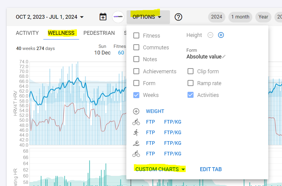
In the Options dialog on the Fitness page, you can configure what you want displayed. Fitness, Form and Ramp rate selection boxes, show or hide the charts for Fitness/Fatigue, Form and Ramp rate. Same goes for Notes and Commutes. Weeks will add a gray vertical line to the chart so you can easily distinguish the start of a week. Clip Form will reduce the vertical size of the Form chart by clipping high values, just to get a better definition of the smaller changes in Form. An epic Ride/Run with a huge load would otherwise make the chart less readable for your normal day to day activities.
Then you can add/remove other charts on the page by choosing some predefined charts, making your own specific ones (Add Chart - see separate post FITNESS PAGE - a guide to getting started - #4 by MedTechCD) or import interesting charts made available by other users (Search Charts). There is a lot of flexibility to turn this page into something that makes sense to you and your training habits.
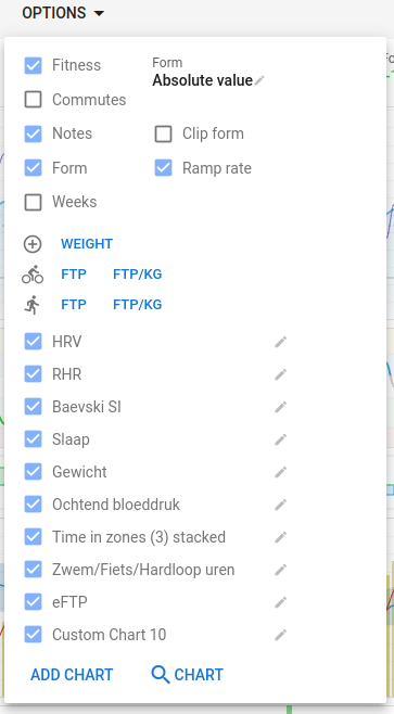
There is also a setting to display Form as an absolute value (Fitness – Fatigue) or as a a percentage of Fitness. There is a debate on what is “best”. Now, for someone just starting out, I would suggest to set it on Absolute Values because otherwise, any workout load will immediately drive your Form in the red zone. For an experienced athlete with Fitness level approaching or surpassing 100, percentage is probably the better choice. And for anyone in between, try both and check what best matches your subjective feelings. If Form is in the Red zone and you feel like you could move a mountain, something isn’t right. Same goes for Form in the Grey zone and feeling totally exhausted. More detailed info in separate post FITNESS PAGE - a guide to getting started - #3 by MedTechCD
On the bottom of the page is some text to explain the PMC chart which includes clickable links that go into much more detail. If you want to know more about the subject, make sure to check those links. You will find similar links on just about all pages in Intervals.icu.
Settings for the Fitness page like, the displayed charts on each tab and the order they are in, are saved to one out of two settings sets. There is a set of settings for mobile devices and one for laptops/desktops. The reason is that the layout (portrait/landscape) and the available space is very different. This means that the Fitness page that you assembled on a desktop is not immediately shown on a mobile device. But, don’t worry, all charts that you created on one are not far away on the other device type. The best way to handle this is to first create the wanted Tabs on the other device. Then select the Tab to customize and from the Options menu - Custom charts, you can add any chart that was already constructed to any tab you want and in the order you prefer. You can mirror everything or you can have a smaller set of charts on mobile versus a larger set on a desktop. There’s no need to recreate each and any chart.