I’m quite a new user but one thing I love about intervals is the custom charts. Just interacting with people in this forum, and seeing posts with some really interesting looking charts, I know that I’m not beginning to use the full potential.
If I’m honest I also don’t even know what to try.
But one thing I do know from the field I work in, is examples are one of most powerful tools for learning - often more so than an explanatory manual.
So what’s your favourite chart?
- How do you set it up?
- Why do you like it
- What’s the most important thing it shows you and any tips on reading it.
As far as I’m aware there’s no way to see a ‘library’ of sample charts or a way to share setups? If that’s not the case please let me know.
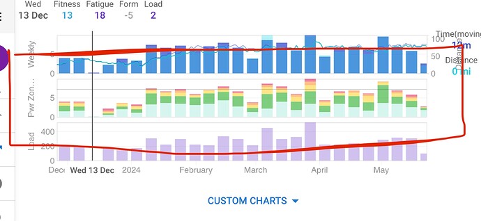
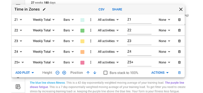
I’ll start with my humble one which I’m sure I copied from a post here - which is weekly summary of times in power zones. I like the ‘at a glance’ of what I did.
(Probably my iPhone wasn’t the best for this)

