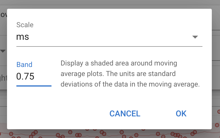
You can now add a band around any plot using a moving average on a custom chart on the /fitness page. The width of the band is measured in standard deviations of the data in the moving average. This is useful for plotting things like HRV when you need to know if the value is outside of the normal range.
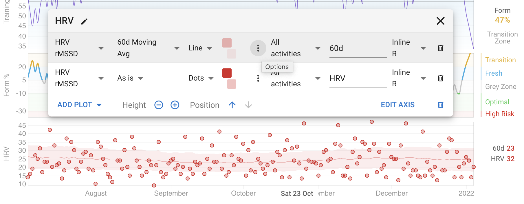
Click the “dot dot dot” icon to open a dialog with more options for the plot:
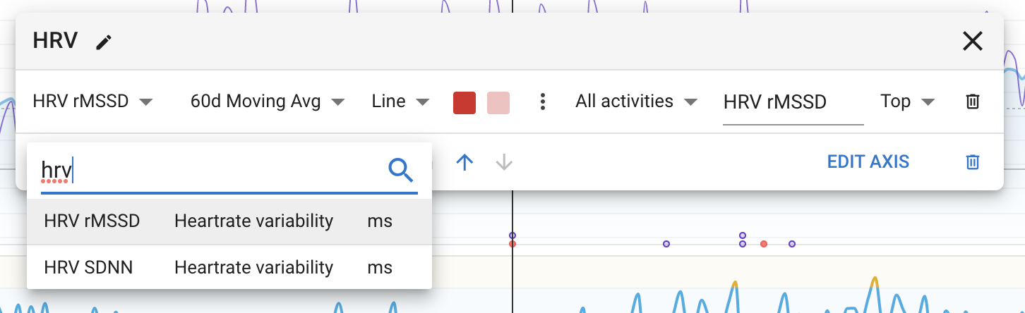
Also the “Add Plot” drop down now has a search box: