Hi David, would it be possible to configure the Y axis to be simply Heart Rate please?
The reason for the request is that I’ve changed my HR settings at some point in the past and so when trying to compare my Year on Year fitness I’m getting a skewed view. I don’t think my max HR has actually changed … just that I’ve altered the setting at some point.
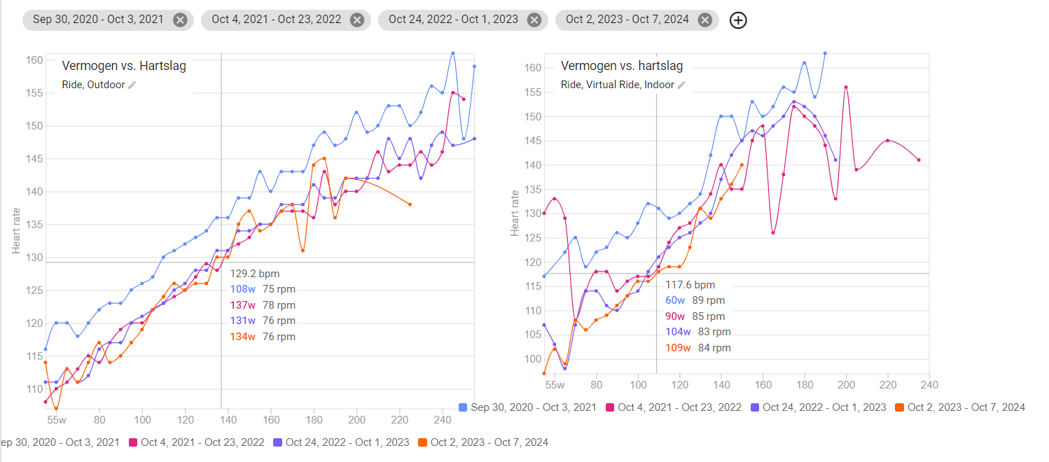
Actual example - a point on the chart showing that I’m -14w this year to last. 248w in 2022 vs 234w in 2023 for 169bpm vs 166 bpm. So actually 3bpm slower in 2023 (presumably because I’ve lowered my max HR at some point). If I find 169bpm in 2023 on the chart the associated power is actually 247w … so just 1w lower.
It would therefore be really useful if there was a 3rd chart option of pure HR for those of us who’ve changed our HR settings in the period we’re trying to compare.
Is there any way to change the colors for the years? It’s now kind of confusing as the same year shows in different colors in different charts. Thanks!
I think you can solve that by re-defining the time periods.
Leave all the charts in place, delete the years, and then add them again. Should be the same color then.
I fixed that issue a little while ago. I think if you remove that “Intensity vs HR” chart and re-add it you should get the same colours on all the charts.
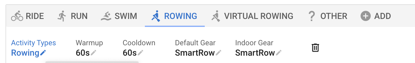
David, my HR vs Power chart filtered for “Virtual Rowing” is blank. Previous to a travel break in late September/early October 2023, I categorized my indoor erg rowing workouts as “Rowing” and that data successfully displayed on the graph.
Resuming my erg rowing in late October, data from my now categorized “Virtual Rowing” workouts do not show on the graph. Any thoughts?
You have “Virtual Rowing” as a separate sport in /settings. Rather delete the “Virtual Rowing” sport and add “Virtual Rowing” to the activity types for “Rowing”:
I am 100% certain this is me being box as a rock of dumb, but can anyone explain how this works? I can’t see how w/hr is relevant without also having time in the equation. Is it for 1 min intervals?
These are ‘cleaned up’ chunks of 30sec where you plot the relation between heartrate and power.
If the plot moves further down right for different dat ranges, it means that you are fitter because you produce more power for a given % of LTHR (or maxHR).
It’s a nice feature where you can clearly see that there is a linear relationship for power to HR when within the aerobic range.
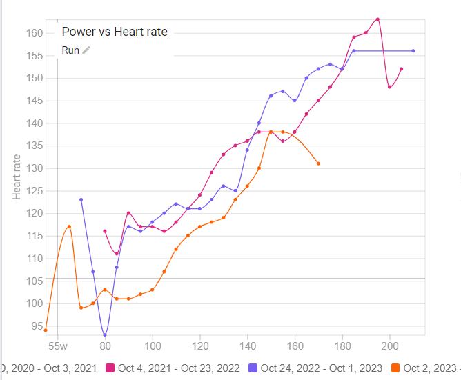
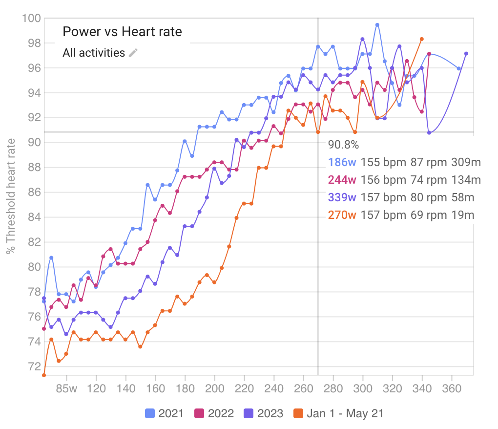
Here’s mine for Running activities over the past three seasons, showing that my running is definitely getting better this season.
Thnx David for your response. My challenge with doing as you suggest is My erg rower (Ergatta WaterRower) has two different Power meters (S4 & SmartRow) that read Power differently for the same workout. Each allows me to share/compete in workouts with different user groups. My hope was to track my stats separately for each in intervals.icu, which is why I created ‘Virtual Rowing’ as a separate type. Any thoughts on an alternative solution?
BTW, I’ve run into an issue using ‘Virtual Rowing’ as a distinct activity when using TrainerRoad….my planned ‘Virtual Rowing’ workouts do not download into my TR WOD. Alex is working on a solution to that issue…
Tx for answering this. The chunks are actually 1 minute long and there is quite a bit of processing to get rid of “bad” ones (e.g. cadence much lower or higher than normal, any stops etc.) so only clean “you were riding/running for the whole 1 minute at normal cadence” stuff is kept. And HR lag is adjusted for.
Unfortunately my curves are also all over the place. My heart rate monitor disconnected very often in the past ( due to bad wifi connection with Zwift and Companion App). I don’t think that it would be possible to find out all of these activities and remove them manually.
Wouldn’t it make sense to just ignore the files where heart rate data has too many zeros and don’t use these rides for the graph? Thanks for the great work.
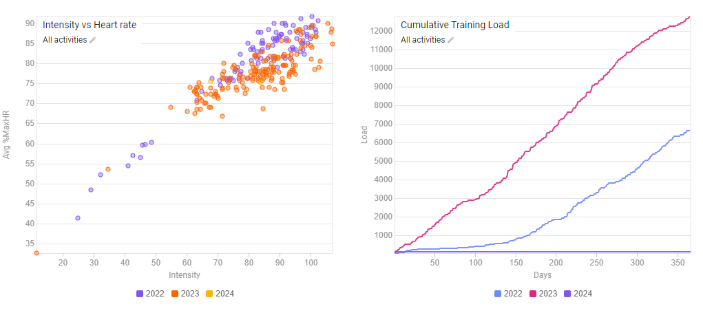
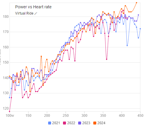
I’d love the forum’s help in interpreting my data. I assume this means that I’ve improved my aerobic fitness over the past several years, especially this year, when I did a nice extended base season of Z2 work. But once you get above my threshold, which is currently 265, the lines come together, which I assume means my high end fitness is similar, but not better, to year’s past.
What do I take from this? That as I sprinkle in high intensity, now that we’re getting into summer, I’ll be able to move the whole line to the right, which would signify measurable progress?