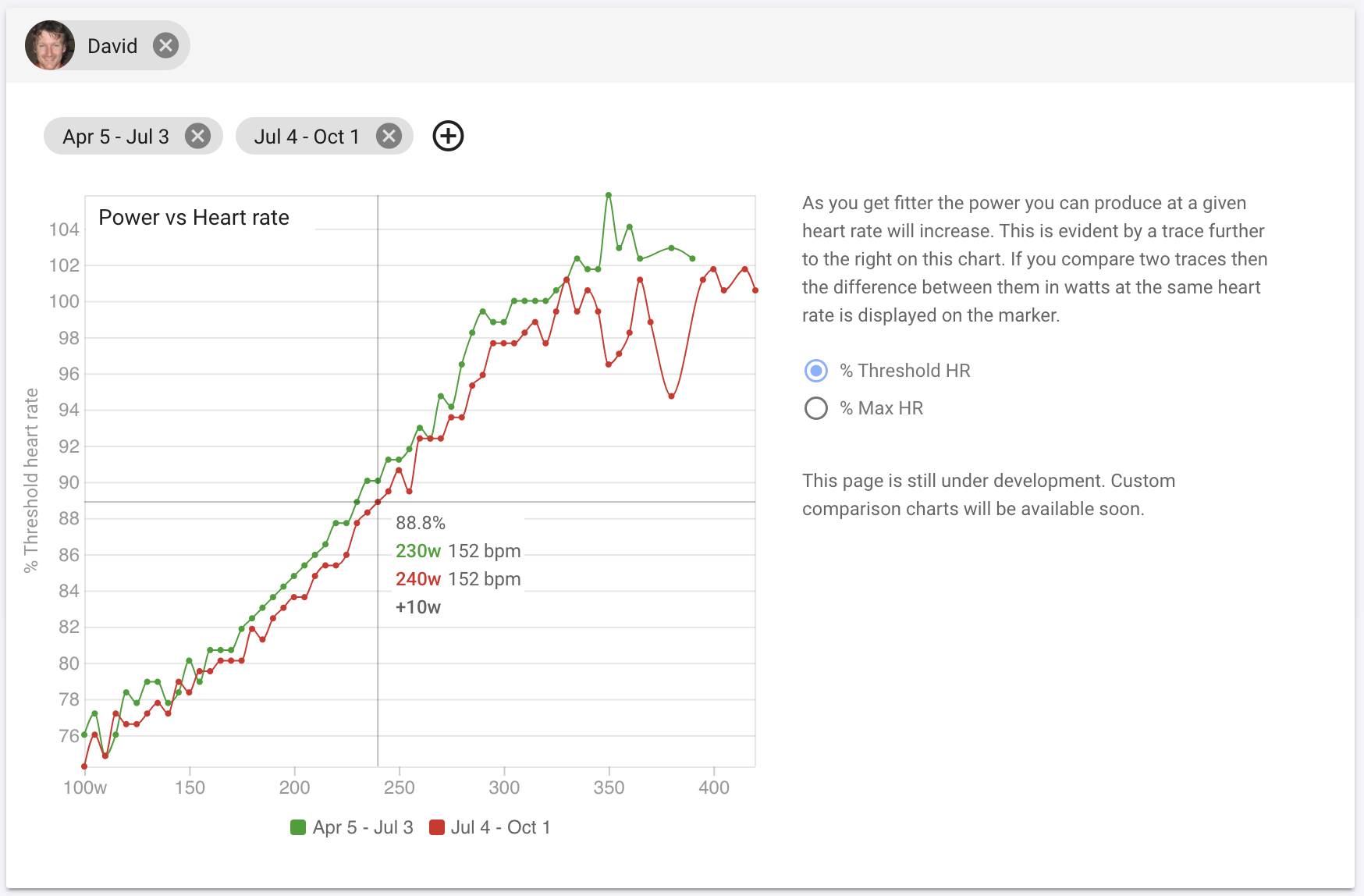
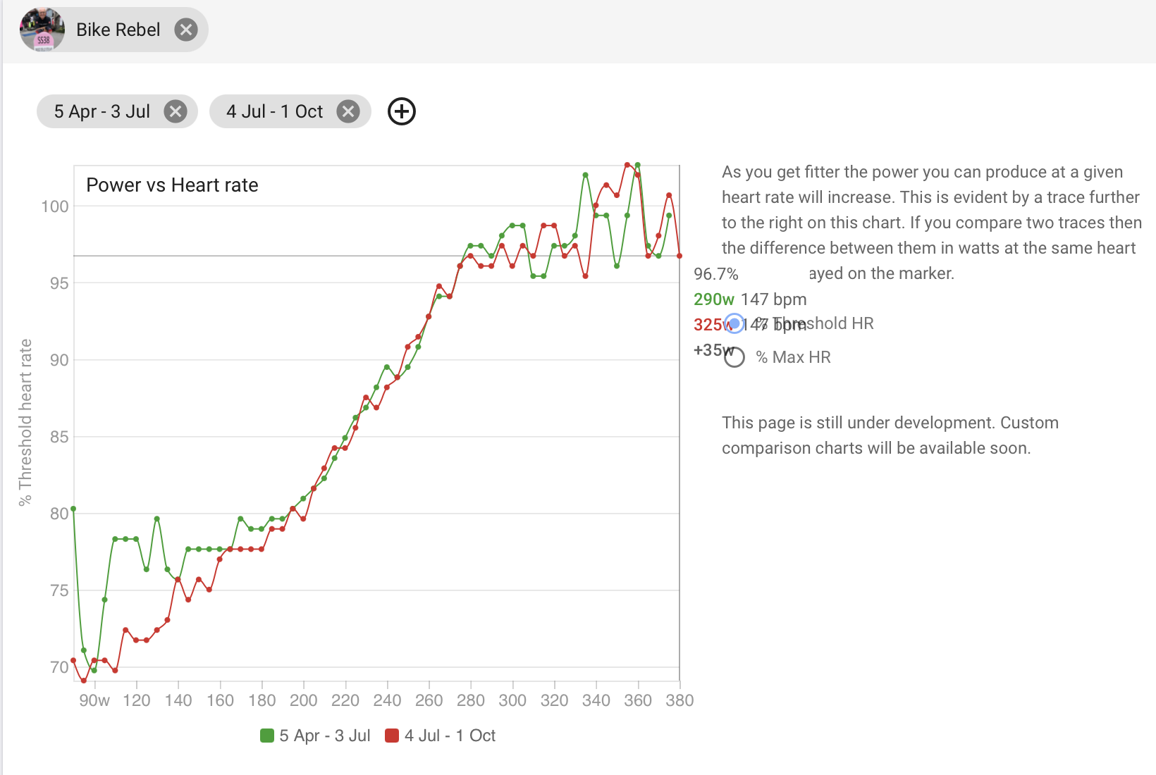
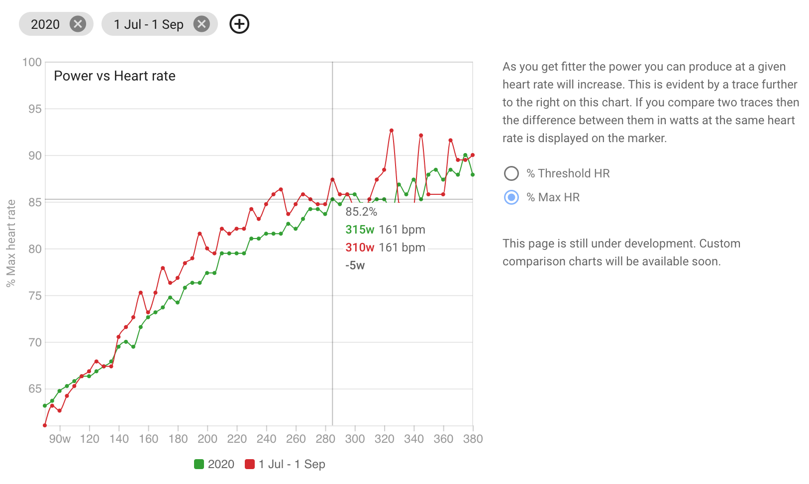
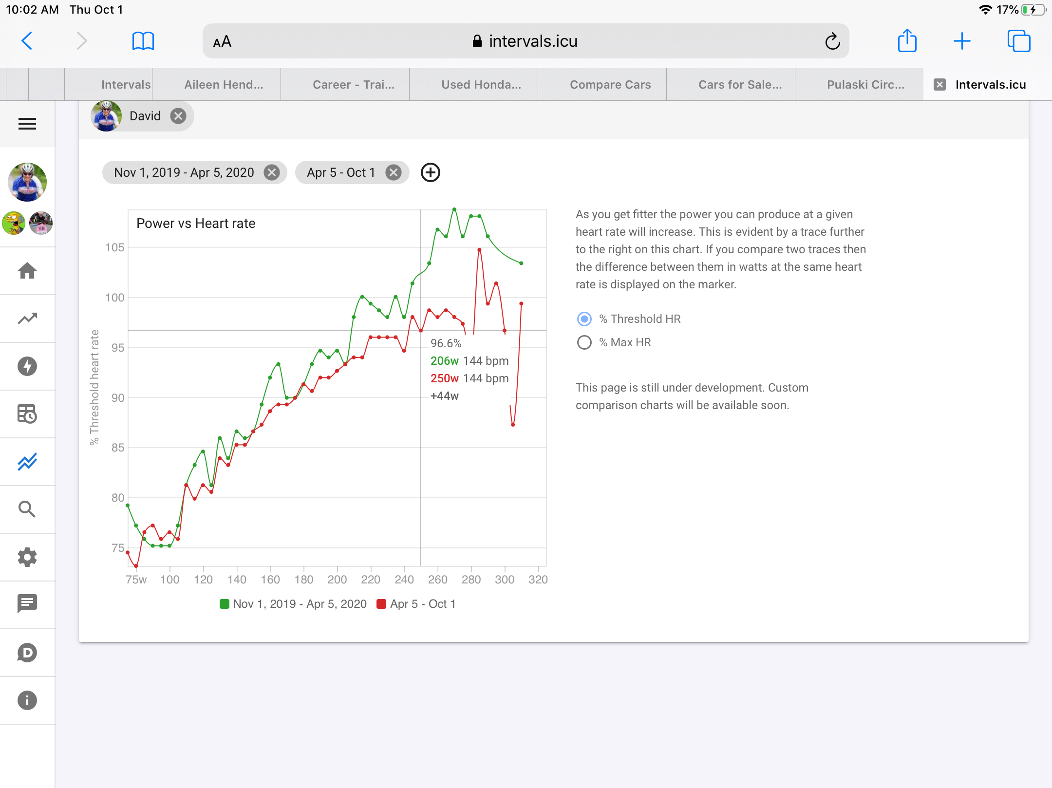
There is a new top level menu item for comparing time periods and athletes. It currently only shows power vs heart rate but I intend to add more in future including custom charts (like on the fitness page).
The power vs HR chart shows changes in fitness very clearly. As you get fitter your curve will move to the right (more power for the same HR).
The points are derived from the HR lag adjusted data shown on the decoupling charts on the activity HR page. The power vs HR data for each ride is aggregated into 5w buckets.
Very nice setup …
For a future feature in Compare;
Power & HR to specific workouts in the Activities Library.
One Activity done multiple times, could show some interesting numbers.
( … or is this moving into 3D territory … )
You can choose any time periods you like. Default is last 3 months vs 3 months before that. Just click the date chips to edit and the “plus” button to add more. There are quick buttons in the date picker for “2019”, “2020” etc.
Wow, you continue to impress David!
This is not available as is in any tool I know
Would be interesting to know the “confidence” of the algorithm for different ranges. I guess “the wavyness” at the top end comes from the lack of data “from above” in terms of heart rate (so no way to null out)?
Anyway the relevant section (for me: Fatmax, THR) line up well with my own calculations :-))
PS: Would be useful to filter out ERG-workouts as those HRs can differ from HR on the road
The way it is currently written it finds the HR at the point closest to the power line and then looks for the highest power for each line for that HR. So thats why it has 310w and 315w on the popover. But this is confusing and I am going to try come up with something else.
The marker movement is smooth now. It finds the curve with the lowest interpolated HR for the watts at the marker. Then it interpolates power for all the other curves at that HR. It still gives some strange numbers if you have an anomaly like you do (high power with very low HR) but mostly that happens on the less interesting “close to or above threshold” part of the curves.
Absolutely love it!!! Also it is quite nice how clearly you can see your threshold with it. Will be eagerly waiting to see how this develops.
Also an idea for filtering noise at high power and Hr (way above LTHR): set it up so that the graph requires a positive slope all the time to remove non-existent drops.
Again an excellent tool !
I’ll compare those numbers with outdoors vs indoors. I know that I usually have almost 10 more bpm when I do my workouts on the HT.
Really helpful and cool. As someone already mentioned, it needs a selection for activity type. At least to filter out or deselect indoor trainer rides (which I always do without fan and even with a fan would lead to higher heart frequencies than the same effort outside).
But probably you already have that on your list or it would be a feature of the coming customizing options of this page.
why is the horizontal axis watts and the vertical HR? It maybe is just me, but my intuition would do it the other way round.
maybe it would be useful to have the page remember the date ranges you set. For example, if I set 2019 vs 2020, it gets lost every time I leave and revisit the page.
I think that’s a good point. For the higher intensities I find the chart is a bit optimistic (or shows slightly lower HR). Maybe a way to avoid this is only allowing 1minute or x-minute samples of steady HR/PWR to be charted?
For me it seems that ranges that I pedal at for a long time are best represented in the graph.
Todays Plan has something similar with power on the X-axis so thats why I built mine that way. It should remember the dates between pages until you reload the app. But I might change it to store those on the server like other settings.
@nfkb The lag adjusted power vs HR data for each moving minute of each ride (as shown on the ride decoupling charts) is bucketed into 5w buckets (e.g. 220w, 142bpm, 20 minutes). The curve for a time period is the average of these buckets for all rides weighted by the number of minutes in the bucket. So anomalies mostly get smoothed out.
For watts a bit under threshold you should have a linear relationship between power and HR which is shown quite clearly on the curves. Once you go over threshold your HR climbs the longer you continue until you blow up.