I love the idea of you adding some cadence analysis - I’ve often wondered what the most efficient cadence is for any given power output. As well as efficiency I’d also be interested in performance - so what cadence was I hitting at my best 1m, 5m, 20m power ranges etc. or any other way of analysing this data.
First and foremost: Great Stuff @david!
I was trying to create a chart where I can see my season power best and compare it not to the last season as a whole but to the exact same time one year ago. I typically create my seasons to start in November. When I’m looking at my current and last season, I can compare the both very well as everything is said and done for this year. However, when I will compare my power curves in December, the progess is not really visible. Is there any way I can see my season power bests compared to last years power bests at that time (eg. december to december, january to january and so on?)
Hope this makes sense
I just noticed that on my Power v HR ‘Compare’ graph, when I filter outdoor rides only the 2020 line disappears - as if there was no outdoor data.
This is a bit odd, as the 2020 Indoor/Outdoor graph is different to the Indoor only one, so there is clearly Outdoor data in there. I also did a lot of outdoor riding in 2020 so I know the data exists!
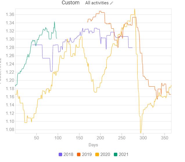
It is possible to look at increasing fitness over years by Efficiency factor (EF). Thats normalized power/HR. But dont look at to short period. It gives you wrong numbers. For example, you cant compare base miles period on flat terrain (for example January) vs July with a lot of races or a holiday in the mountains. When your NP and avg power or higher, the EF will automatic also higher.
I have in golden cheetah a chart for the last 3 years. It gives me nice insight about my aerobic fitness. You can see that the lowest and highest points increased…so it is possible to compare every single month with the other years, in order to prevent comparing appels and orange.
You can plot this on the /fitness page using a custom chart. It doesn’t have the trend line however.
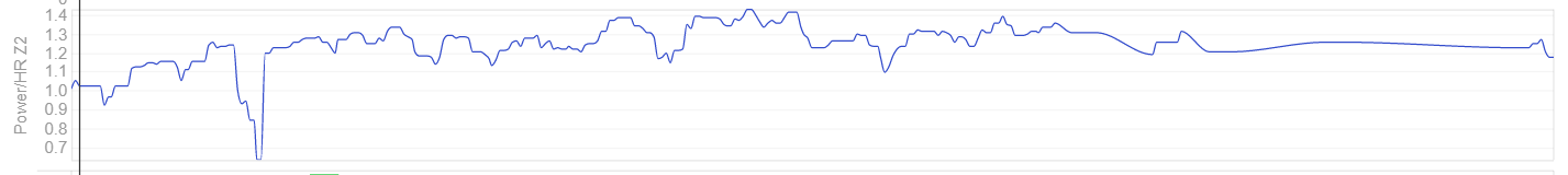
You could also look at Power/HR which gets ride of the NP skew from hard rides. There is also “Power/HR Z2” which is only from zone 2 data and has lots of cleanup done (HR lag adjusted, minutes with coasting thrown out etc.).