I think you could better watch the webinar from trainingpeaks:
They explain it better than me…

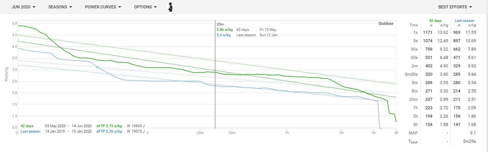
Your picture with optimized intervals, you mark the FRC zone, which is more Anaerobe. The FRC/FTP zone is your max aerobic zone.
I think you could better watch the webinar from trainingpeaks:
They explain it better than me…
Your picture with optimized intervals, you mark the FRC zone, which is more Anaerobe. The FRC/FTP zone is your max aerobic zone.
Yes there are ilevels for, but i prefer more the target zone from the power duration curve.
Thank you! So it is modeled based on record POs as per Grappe, very interesting. Looking forward to having an OK enough dataset to see where I stand.
Tx. I just fixed this bug. About 10% of the time MAP would not be found when it should have been.
Is there sense and the ability to display MAP and TMAP in a ranking table?
That would be hard to do because the duration differs. Someone with a shorter T-map is likely to have a better w/kg number. Probably best proxy is to just look at 5m power.
hi, i don’t have any MAP or T MAP ?
I have a powermeter ans tacx neo but nothing in this cell
Maximal aerobic power (MAP) is the power at VO2max (maximum oxygen use) for a given test protocol. T-MAP is the duration for which this power can be sustained. The values depend on the lab or field test protocol. Intervals.icu uses the power duration curve and the method described in Pinot & Grappe 2014. If no value is displayed for a given power curve then the data was not good enough for this methodology. Choose MAP in power chart options to see the regression line and confidence interval described in the paper.
Hey, I recognize that image! 
One of the interesting challenges a colleague of mine is working on is a consistent method to assess MAP empirically with a single session lab test.
MAP being defined as the highest average workload over the shortest duration that will elicit VO2max before task failure.
We’re currently using standard 100 W + 30 W/min continuous ramp test, with MAP defined as peak 60sec power. Then after 20-30min rest we perform an additional TMAP test. TTE should be ~90-180sec, depending on VO2 onset kinetics (how quickly VO2 responds to the onset of workload).
We wanted to pilot test it on more athletes of different bodyweight, fitness, female cyclists, etc. We were considering comparing this empirical method with modelled predictions from Pinot & Grappe, WKO5, etc.
But then COVID…
The relevance of MAP for our purposes is for HIIT interval prescription in the severe intensity domain, ie. between FTP/CP and VO2max.
I just wrote an article looking at how metabolic intensity and mechanical workload are related to VO2max training. ie. how can we modulate interval prescription within that severe intensity domain to optimize our own individual adaptations?
Forgive me for blatant self-promotion on my first post here, but someone suggested this community would probably be interested. I hope you are!
Is anyone around here also on Xert? To me it seems that Xert has implemented this, using - or calling it - MPA and TTE?
I’m only peripherally familiar with Xert, but MPA (Max Power Available) represents something more like W’, or work capacity. edit: nope, that’s HIE (High Intensity Energy). Thanks @david and @Cyclopaat.
So MPA [and HIE] will be depleted by working at MAP, until MPA = MAP, meaning roughly ‘no more watts are available’ and indicates TTE @ MAP.
But in theory and in practice, you could continue to work by decreasing your power below MPA. Since you still have some work capacity available… just not enough to continue performing at MAP. You might be able to see how hard-start intervals would fit into this model. It’s very compelling.
Actually, you pull MPA down by working above TP (threshold power). When MPA drops below TP, you have what they call a breakthrough (BT), where you increase any of three parameters, Peak Power (1 sec max, but that usually only occurs if you exceed your previous PP at any time during your effort), High Intensity Energy (available energy to perform above TP) and/or your Threshold Power.
I would be interested to know how Xert decides between increasing your HIE (W’?) and Threshold (FTP/CP) or some combination when you achieve a breakthrough. Intervals.icu will put you on a higher power curve (FTP) and slightly higher W’ but the W’ number comes with the curve and isn’t individual.
I think it’s simple? You break the old barrier, by continuing - just needs to be 5-10 seconds - to push > TP after you pulled MPA down.
Your HIE will increase as you continue to push above MPA/TP, but it is volatile and difficult to calculate, but MPA is individual, determined by PP.
Anyway, they have good experts - and lots of documentation - to explain the science a lot better than I would be able to 
Picking this thread up - one of the things I like to look at in relation to MAP is Fractional Utilisation (relationship between FTP and VO2Max - FTP/MAP as a %) to see whether I would benefit from some focused VO2Max work or FTP work.
It would be great if we could have this % calculated based on our MAP value and set FTP (and/ or eFTP) shown on the /Power page and also as a field to be able to plot in a custom chart on the /Fitness page. Could this be added?
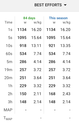
Why does it not give a MAP value in 30 days but in 84 days? The best record was achieved today
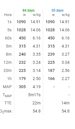
I need to do some work on the TMAP calc to make it work for more “messy” data.
Do I understand that correctly, to get MAP and TMAP data I have to do a very specific test protocol, otherwise the fields always remain empty?
Sort of. You need a well filled in power curve like in the paper.