This is fixed now. Tx.
Fixed, tx.
The Plotly.js version is now “1.58.4” (was “1.52.1”). Presumably they have fixed some bugs but I am a bit annoyed. I will see if we can roll that back.
This is fixed now. Tx.
Fixed, tx.
The Plotly.js version is now “1.58.4” (was “1.52.1”). Presumably they have fixed some bugs but I am a bit annoyed. I will see if we can roll that back.
I have downgraded Plotly.js to 1.52.1. Shouldn’t be any issues with charts now.
Hey @david,
looks like you’ve got one of the best beta testing teams in the world here! ![]()
For sure! V3 is now live for everyone so hopefully there aren’t any serious problems. Thanks everyone who helped with testing!
Same for me on Edge - although only intermittently…
I haven’t managed to reproduce this using Edge on my Mac. Need to test on Windows.
For me, on initial calendar load the scroll bar isn’t there. It only appears (and persists) when I open an activity. Taking any other action from the calendar is fine. Hope this helps.
It’s ok. Thanks
On v3, fitness page, inline R descriptions are too far to the right, and end up being cut off
Pixel 8a, Firefox
FWIW, on fitness page if I enter 1 October 2016 (first power meter) thru 31 May 2025 it takes over a minute and its a blocking operation - can’t switch to Activities/Settings/Compare/etc until it completes. Same behavior on production and v3.
Good evening,
I don’t know if it’s been mentioned before, but I noticed today that after this update, the view on the computer is the same as on the cell phone, that is, the left sidebar is now retracted, and some of the display data doesn’t fit well.
Here’s the retracted sidebar. This is how it looks on the cell phone, on the computer the tab used to be completely open, I thought it would be a better view of the information.
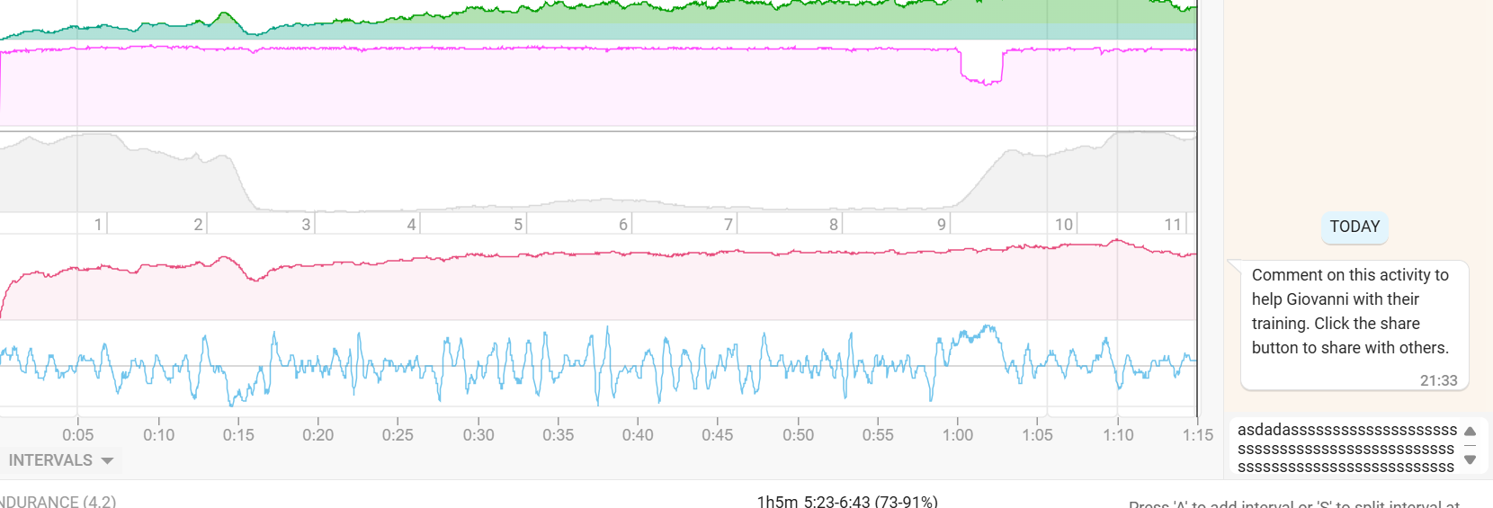
Another point is the feedback part, the typing space is now too small to view the text, sometimes you can only view one line, thus losing the notion of the context that you have already written. This would be another point that I saw after the update.
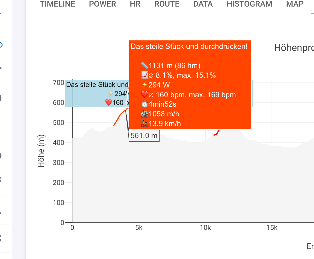
@R2Tom Taking advantage of this, how do you view this graph with this information? I would appreciate it if you could help.
You should be able to click the three lines at the top to expand it and it should remember that setting. We are looking into the scrollbar issue.
Fixed, tx.
I have similar behaviour but can navigate away (likely just faster computer). It is nice to re-render the charts as data comes in to provide feedback but that breaks down a bit with such a huge date range. Not sure what we can do about that.
Does that run on the Intervals server or my laptop? Mines a year old, MacBook Pro M4 Max. It’s much much much faster on WKO5 that runs on my laptop (although it does some caching IIRC).
Can’t move the interval on mobile anymore.
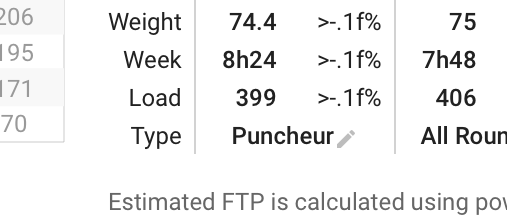
The percentage of Weight/Week/Load are not shown correctly on the power page:
Here are some details about it:
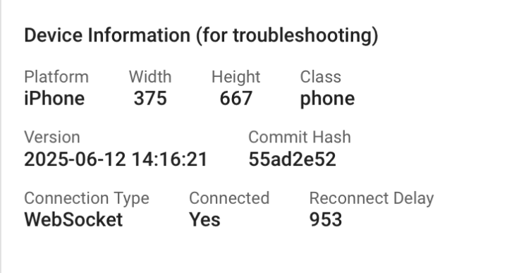
It works for me… iPhone
@david Yes, I am doing this, but previously when it was expanded, for me, it became easier to use. On a 24" screen with 100% zoom the tab is expanded. On a notebook with 1920 x 1080 with 150% zoom (recommended) the tab hides (it stays in mobile format).