The huge Intervals.icu library update is finally complete. It would not have been possible without @Eva joining the team (thanks!). We had to edit just about every file in the project and make many changes.
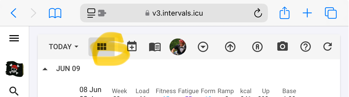
The good news is that the app is faster and we fixed many issues on phones. The other good news is that we will be able to get back to building new things as soon as this is live for everyone.
We have done a lot of testing but obviously there will be things we have missed. Please report any issues you find on this thread. We need to focus on things that are working on the old version and not in the new.
Some stats:
608 files changed
460 commits
31,437 lines added
56,116 lines deleted
For the software developers here: We migrated from Vue.js 2.6 to 3.5 (not too bad), from Vuetify 1.5 to 3.8 (they broke everything!) and converted lot of Javascript to Typescript.
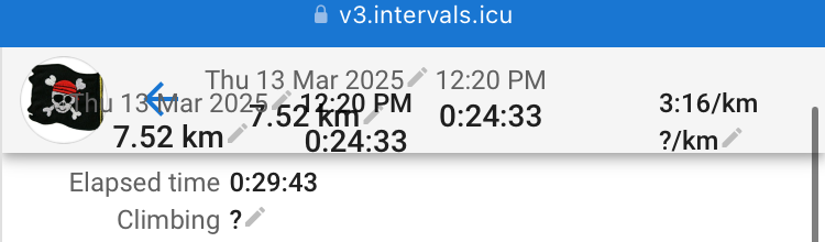
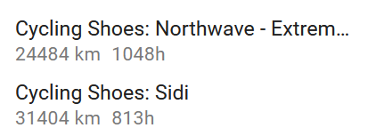
Thank you very much for the work! V3 feels much snappier. I have found one issue that is only present in the new version. In the Routes section af an activity, when there are many recorded rides on a route (this is my daily commute), there is some overlapping when you scroll down the list.
I had a great time updating pretty much the entire project! It provided a really good and fast way to learn the codebase and Vue, neither of which I was familiar with before, given my background with other JavaScript libraries.
Now, I’m looking forward to your input and enhancing the user experience, beginning with the more obvious, smaller improvements and later addressing larger UX/UI changes.
I gathered some more stats to the ones who are interested:
I’ll have a look this weekend. I’m not a fan of the mobile view for analysis purposes due to the small screen. I like the option to update my personal info (feel, RPE, wellness data, etc.).
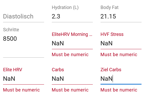
I have fixed this. Custom field input was partially broken. There was also a bug adding new wellness fields to the dialog.
Could you please post a screenshot. I am not sure what you mean.
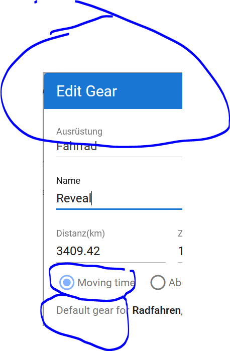
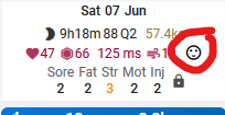
That is actually due to the icon changing. Vuetify changed the names of all the icons. I remapped the top 30 or so manually but there wasn’t always a good match. You need to edit the field and choose a new icon. The good news is that there are now many more icons to choose from.
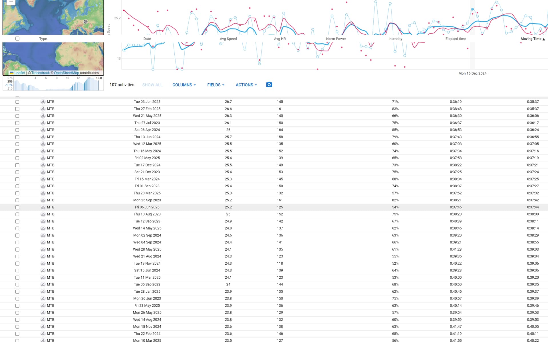
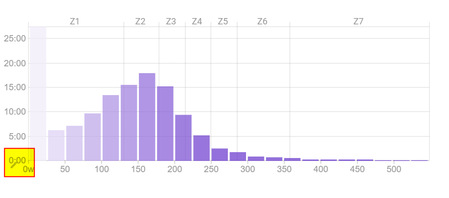
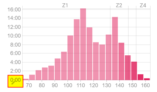
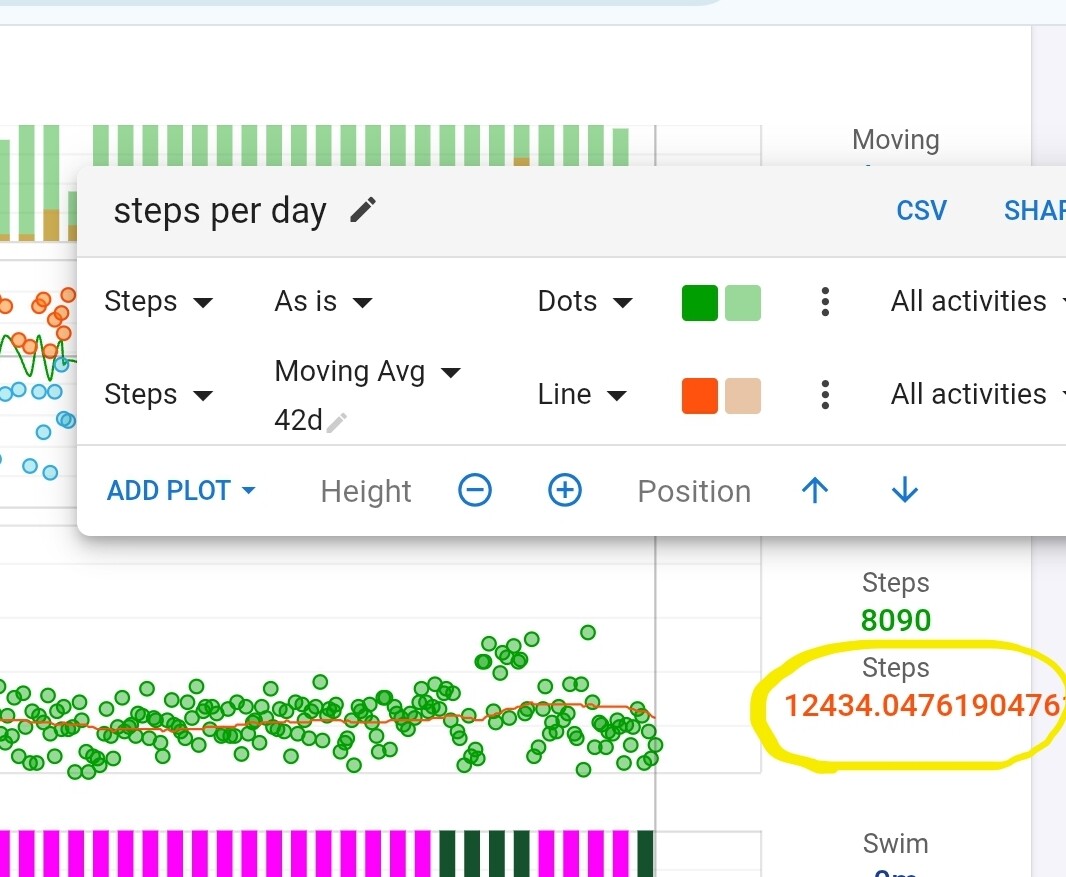
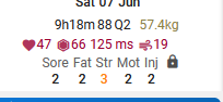
I moved the pencil button for the histograms to the top right and added a border. Always looked horrible on the bottom left.
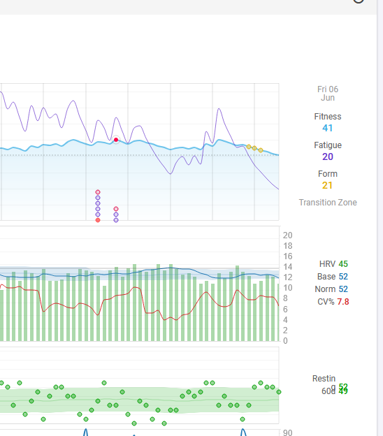
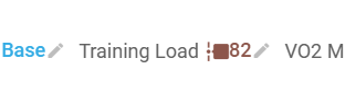
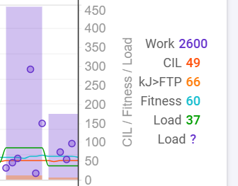
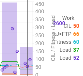
I cleaned up the fitness chart labels a bit but that section definitely needs some css grid work.