Custom charts on the activity timeline chart

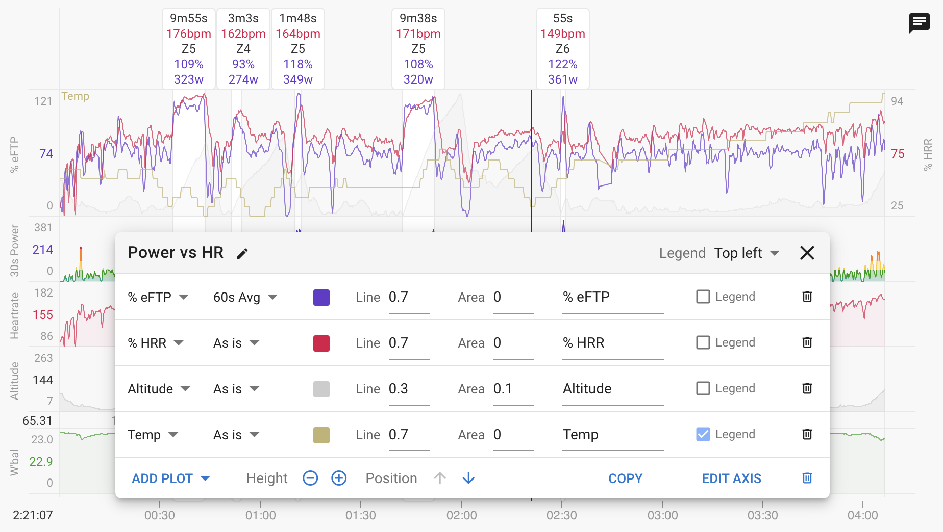
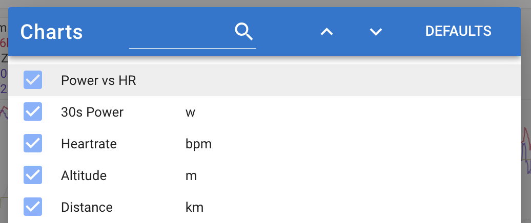
You can now add custom charts to the activity timeline chart. Click Charts → Add Custom Chart. Here I have mostly recreated the decoupling chart from the activity power page:

I am going to be adding plots for the paired planned workout (if any) so you can compare planned vs actual and so on.

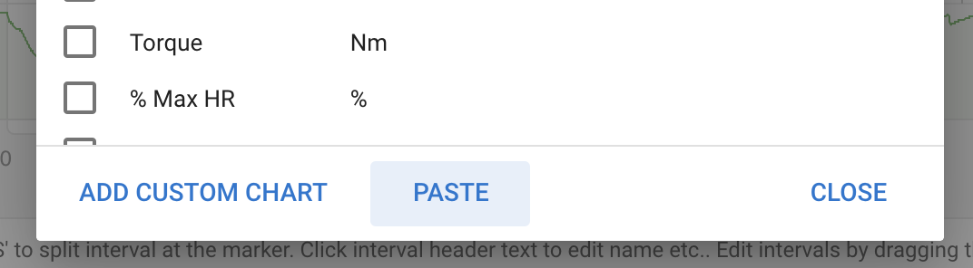
The “Copy” button at the bottom of the settings dialog copies the chart to the clipboard in text (JSON) format. You can mail that text around or post it on these forums etc… The is a corresponding “Paste” button on the bottom of the charts dialog where you can paste charts you get from others:

Once a custom chart has been created you can selected it like any other in the “Charts” dialog:

I still need to do some work for traces that don’t appear on the axis (e.g. temp in my example) so you can see the value at the marker.

21 Likes

David, would the software that you use to produce those traces also allow for user generated formulas that use the metrics that are already available as traces?
I am thinking along the lines of VO2, Carbs etc as a function of e.g. power.

It’s all JavaScript so I certainly could add user defined expressions and so on. I was wondering if anyone would ask actually. I will look into that.

2 Likes

Here is the decoupling chart from the screenshot if you want to test pasting a chart:

{
  "id": "ccd0bbbee6",
  "name": "Power vs HR",
  "height": 120,
  "yAxisLabel": "",
  "y2AxisLabel": "",
  "plots": [
    {
      "id": 1,
      "text": "% eFTP",
      "color": "#6633cc",
      "legend": false,
      "stream": "watts_p_eftp",
      "transform": "avg_60s",
      "areaOpacity": 0,
      "lineOpacity": 0.7
    },
    {
      "id": 3,
      "text": "% HRR",
      "color": "#dd0447",
      "legend": false,
      "stream": "heartrate_p_hrr",
      "transform": "none",
      "areaOpacity": 0,
      "lineOpacity": 0.7
    },
    {
      "id": 4,
      "text": "Altitude",
      "color": "#ccc",
      "legend": false,
      "stream": "altitude",
      "transform": "none",
      "areaOpacity": 0.1,
      "lineOpacity": 0.3
    },
    {
      "id": 5,
      "text": "Temp",
      "color": "#c0b570",
      "legend": true,
      "stream": "temp",
      "transform": "none",
      "areaOpacity": 0,
      "lineOpacity": 0.7
    }
  ],
  "legendPos": "topLeft"
}
2 Likes

I was hoping you would say that :heart_eyes:

The new plots from the paired workout used to implement planned vs actual are now available for custom charts:

1 Like

Oh, I found the option to make the plotting from the planned workout match with the curve of the actual ride by shifting a value (no unit, is it by seconds ?). Nice addition. :ok_hand:

Tx. Yes it is seconds.

Left power, right power would be nice if it was possible to add? (if data is available that is) Not only balance.

1 Like

Yes I do have that on the todo list. I was planning to just take the overall power and split it into left and right according to the balance percentage. Does that make sense?

Is it possible to get Normalised Power as a curve for the activity?

1 Like

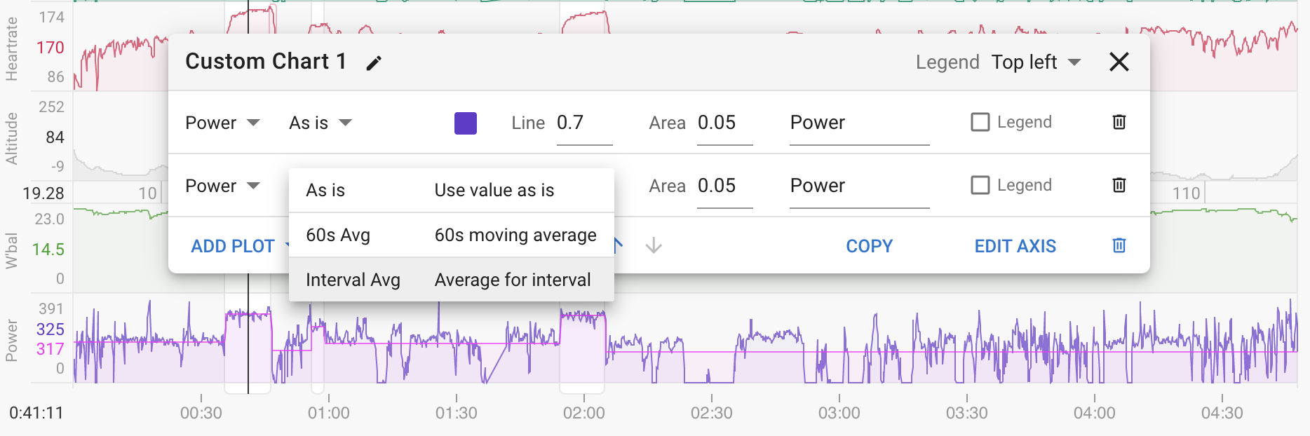
This is really cool. Would it be possible to have average interval pace/gap/hr/cadence/power etc available for custom charts? It would also be nice to be able to change the colour of fields so that I can have colours match my custom charts.

Hi I was thinking of graphs like dc rainmakers:
https://analyze.dcrainmaker.com/#/public/5b747d65-6db7-438f-7b8d-c16dd4ead878

Obviously ha has to much info in this left/right graph in this specific case, but having one left/right source with absolute values.

I do have that on the todo list. You mean NP vs duration curve right?

I am not quite sure what you mean. The interval fields still work as normal?

I should be able to do that.

1 Like

So this is W Pace chart:


An Intervals Pace chart would look the same, with a straight line for each intervals average pace/gap/hr/cadence/power etc. I hope I’ve been able to explain it better.

Ok I get it now. I have added that to the todo list.

I added a new option “Interval Avg” which calculates the average for each interval for whatever the selected plot is:

1 Like

Wow that looks really cool, and great solution. I’ve got to get some workouts in Intervals and to check this out asap!

Hi David, it looks like charts interval avg pace is incorrectly calculated. For this activity, the pace is completely different than the intervals field pace. It should be the same?

Also, it is interesting how some interval field paces are similar to Polar/Strava and some are less so.

Charts Interval Avg Pace - Intervals Field Pace - Strava - Polar
07:22 07:03 07:00 07:01
06:49 06:37 06:25 06:29
07:42 07:26 07:22 07:20
05:00 04:47 04:46 04:46
10:15 12:22 11:42 09:49
06:48 06:32 06:30 06:31

https://intervals.icu/activities/6047936340

The Strava activity should be viewable and if needed I’ll send a link for Polar.

This is awesome! Can you maybe add a filter for each line, so that some can be toggled only on “work” intervals? Say, if I am plotting interval VAM, I wouldn’t want the additional clutter of meaningless VAM when riding to a hill for an hour.