You need to add a calendar entry spanning multiple days with category “Note”. Click the icon with a plus on it next to the date on the /fitness page or click on the calendar.
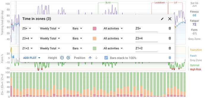
maybe it’s just me but what about the “time in zones” chart in percentage and not hours? I saw that now the percentage is visible but I would like to see every bar the same height (100%) but with different colors in it, depending on the percentage of zones I did that week so I can see what kind of week it was just looking at the “quantity” of green/orange/red of the bars
thanks
That would be a great option to go along side the current chart.
Mike
could the date markers that are at the bottom of the charts page also be shown at the top? Given the amount of custom graphs I have now, my I have to scroll to see my timeline…
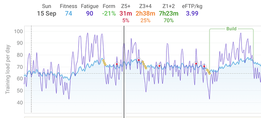
likewise, can the data also be added to the top information box that appears when you mouse over the fitness chart. It’s currently only shown in the bottom box that lists the rides.
+1 Been thinking (missing) the same thing
There is a new option “Bars stack to 100%” that you can toggle on/off for any chart with stacked bars:
David, for Z1+2, Z3 +4, and Z5 + is it possible to break this down into individual zones, or at least separate Z3+4 ? 1+2, 3, 4 and 5+ is more valuable analysis in HIT work.
Clive
Will do. Easy enough. Was waiting to see if someone asked. I am going to have to put sub-menus on that drop down soon.
All the zones are there now. They stack with the combined zones so you can make a chart with Z1+2, Z3, Z4, Z5+ if you like. If you do Z1+2 and include Z2 then it will double count Z2 so be careful of that.
thanks works a charm and I can change colours too, awesome job.
Hey @david,
Could you add TSB as one of the configurable metrics in the custom charts? I know it already has its own chart but sometimes its nice to see things on the same axis.
Thanks.
I just added “Form” to the list. Note that this works a little differently to the others. It uses the form value precomputed for the day and doesn’t recalculate it from scratch using the activities. So you can’t filter for only some activity types and so on. To do it “properly” I need to implement subtracting one plot from another.
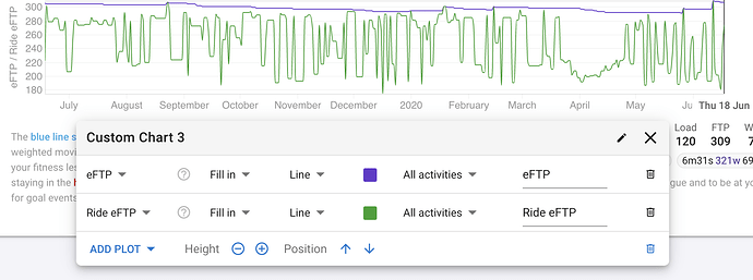
Could you add the estimated FTP for each ride in the custom charts?
Done. Also added eFTP for each ride alone (not the rolling value that goes up or decays). You can make quite a nice plot showing when you have bumped up or come close to bumping up your eFTP. Also added weight.
Not sure if it’s been mentioned but the colour of the plot on my custom chart doesn’t match the colour that the corresponding figure is shown in on the day overlay from the mouseover event.
Tx for the report. It’s fixed now.
These custom charts are really neat. I can’t seem to get standard ramp rate chart to be positioned anywhere other than at the bottom - I guess I could create my own but just seems odd.
One thing I would really like to see (and used to use on Wattsboard) was a week on week chart for best 30s / 2min / 20min / (or whatever intervals I use) power to help see progression in zones I am targetting (and potential drop off in others).
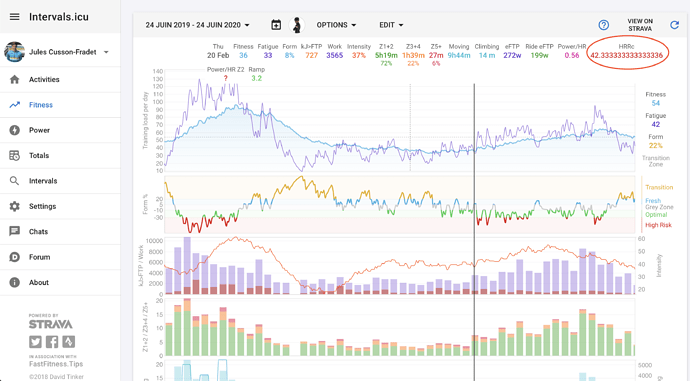
Tx. I fixed that a little while ago. You need to remove HRRc from that chart and add it back then the decimals will go away.


