I have added a ramp rate plot which is fitness today - fitness 7 days ago. Also added a 7 day moving average (default for ramp rate) and 42 day moving average.
3 Likes
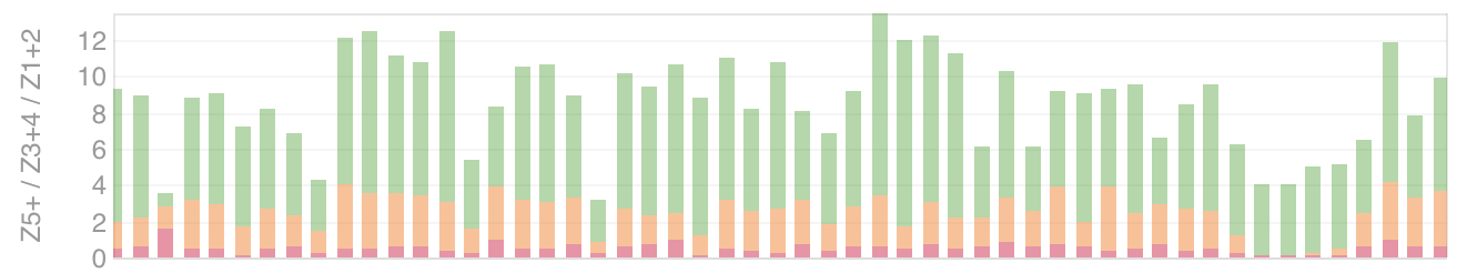
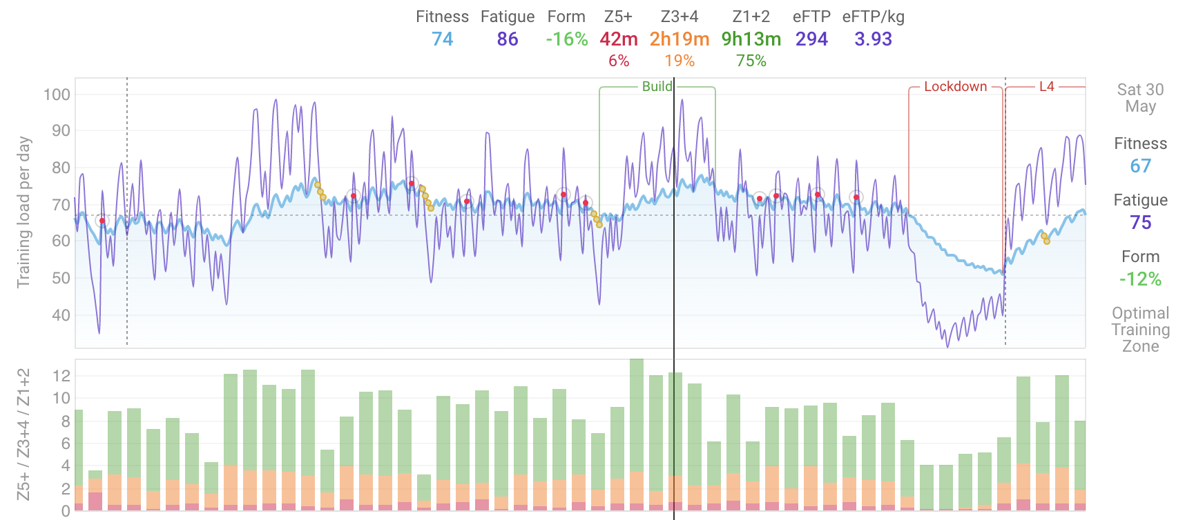
Compatible bars now stack. Currently this only happens for the “Sieler” zone plots (Z1+2 etc.). If you already have a chart with these on you need to remove and re-add them to see the stacking.
6 Likes
This is really great!!
Could there be the possibility to add a horizontal line to these custom plots. As an example: I have goal of reaching 250 km per week, and it would be great to see a horizontal line in the custom distance graph, to see which weeks I’ve reached this goal.
Thats a good idea. I will try fit it in. Busy adding filtering for activity types and so on.
2 Likes
You can now filter the activities used for a plot and change the axis label. This one is showing time spent running. Going to do plot colours and so on tonight.
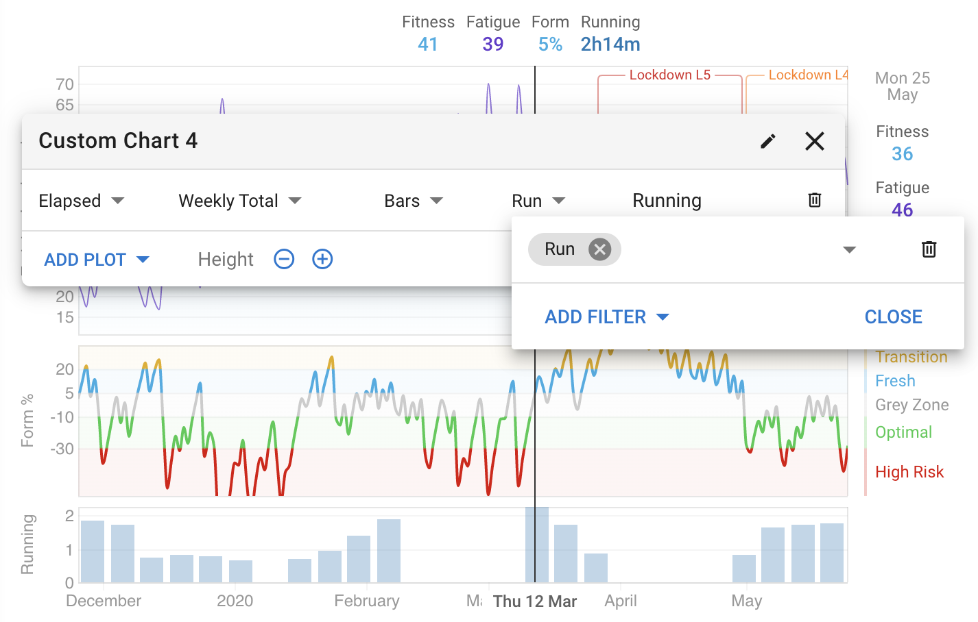
6 Likes
Awesome stuff. Any thoughts on having the ability to re-order the charts?
MIke
1 Like
Hello, this is a great addition!
When you make a custom chart of the Z1-2 / Z3-4 / Z5 it shows the time in each of these. Is it possible to change this to a % of time when you hover?
Thanks for all the great work!
1 Like
Yes I will add re-ordering.
Thanks. I will look into the % thing for stacked charts. Would be nice to have a solution that doesn’t require hover for iPads and so on.
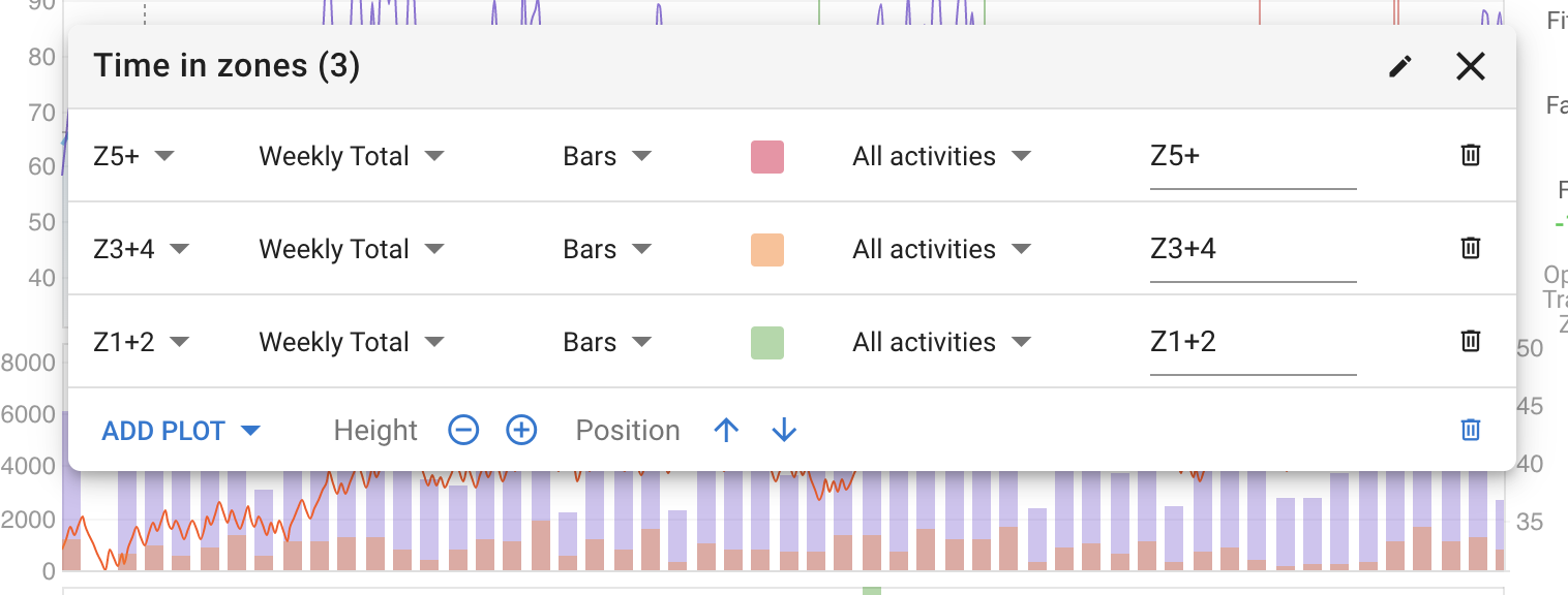
Hi David, is it possible to set somewhere the “time in zones” chart with % instead of total time?
thanks!
1 Like
Awesome.
The colour picker now includes swatches for all the standard colours as well as any extras on your charts.
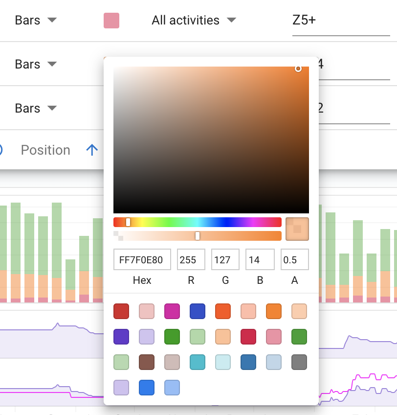
6 Likes
Nice work, this website is better and better.
Can we sort the zones the other way, so we can have Z1+2 at the bottom, Z3-4, and then Z5+ like in 30s power graph, i think it is more logical
Thank you.
You can already do that if you set up a custom chart rather than use the built in one, adding the zones in the reverse order.
Here’s mine for daily and weekly totals:

Mike
4 Likes
oh, thank you, exactly what i wanted
Mike_Lauder: thanks – good tip!
Sweet.
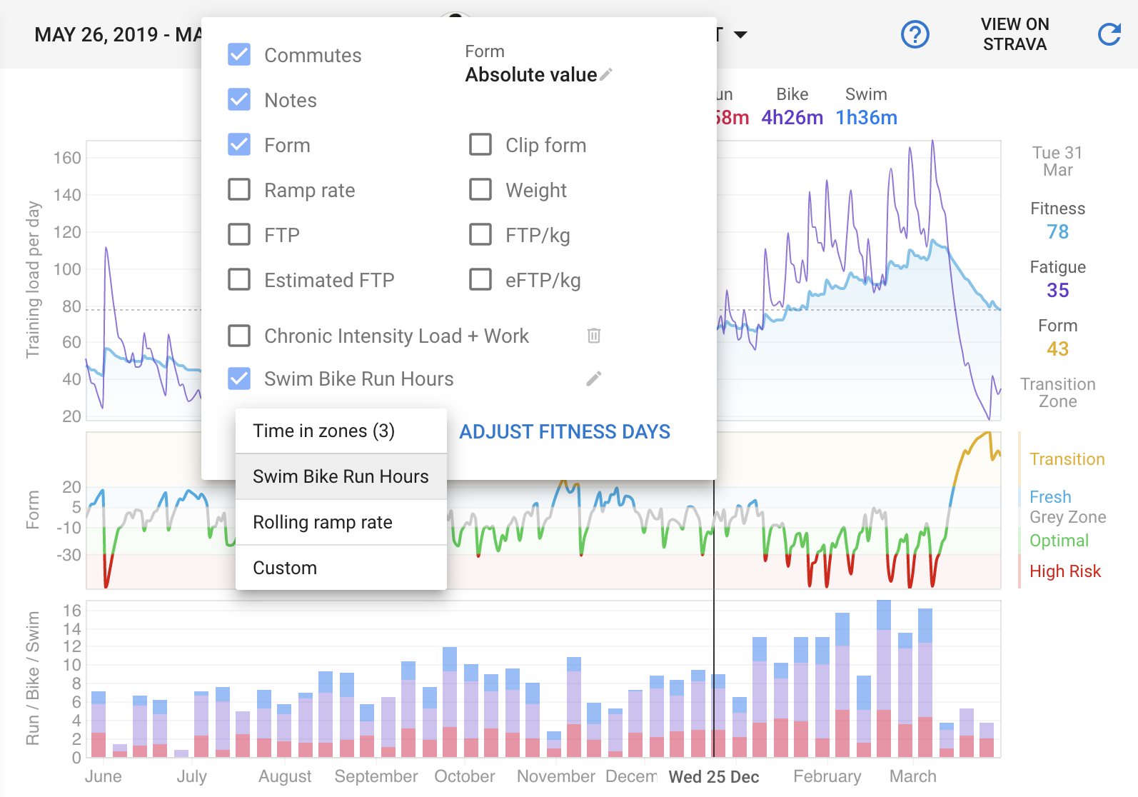
How did you get the Quarantine/Build/Rest labels to show?