thanks works a charm and I can change colours too, awesome job.
1 Like
Hey @david,
Could you add TSB as one of the configurable metrics in the custom charts? I know it already has its own chart but sometimes its nice to see things on the same axis.
Thanks.
I just added “Form” to the list. Note that this works a little differently to the others. It uses the form value precomputed for the day and doesn’t recalculate it from scratch using the activities. So you can’t filter for only some activity types and so on. To do it “properly” I need to implement subtracting one plot from another.
1 Like
Could you add the estimated FTP for each ride in the custom charts?
Done. Also added eFTP for each ride alone (not the rolling value that goes up or decays). You can make quite a nice plot showing when you have bumped up or come close to bumping up your eFTP. Also added weight.

3 Likes
Not sure if it’s been mentioned but the colour of the plot on my custom chart doesn’t match the colour that the corresponding figure is shown in on the day overlay from the mouseover event.
Tx for the report. It’s fixed now.
1 Like
These custom charts are really neat. I can’t seem to get standard ramp rate chart to be positioned anywhere other than at the bottom - I guess I could create my own but just seems odd.
One thing I would really like to see (and used to use on Wattsboard) was a week on week chart for best 30s / 2min / 20min / (or whatever intervals I use) power to help see progression in zones I am targetting (and potential drop off in others).
1 Like

Tx. I fixed that a little while ago. You need to remove HRRc from that chart and add it back then the decimals will go away.
1 Like
I have added a new custom plot “Cadence Z2” which shows average cadence for the Z2 heart rate data points for the ride i.e. the same points used for “Power/HR Z2”.
1 Like
Can you add the maximum power for a specific time, e.g. for one minute, 20 minutes etc?
1 Like
I have added that to the todo list but its a bit more work that the other custom plots. The power duration curve for each activity is stored separately so that info is not currently available to the fitness page.
Perhaps such weekly progression charts of power over particular intervals would fit better on the “intervals” page, rather than try to squeeze them into custom charts on the “fitness” page? That “intervals” page is certainly where i would instinctively go for such info…
Hi @all,
first - big thanks to @david for this great work!!!
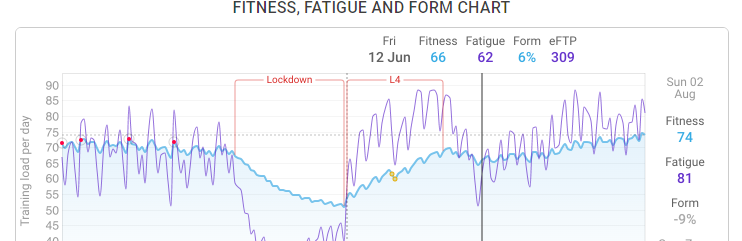
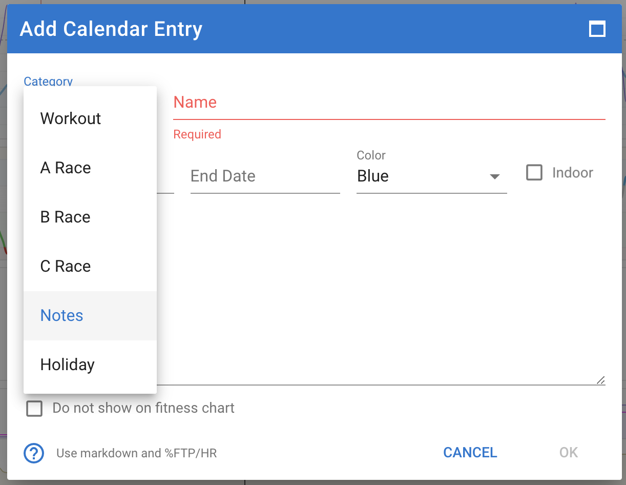
Please can tell me somebody how I can Edit this comments (Lockdown, L4) in the chart below? Thanks
1 Like
Click in the word L4, it will highlight with a darker red and open a popup where you can write some notes.
You can add a calendar entry with category “Notes” either on the fitness page or on the calendar page.
3 Likes
I cannot express how much I love this feature!
It makes looking at performance charts so much more meaningful, without having to remember exactly what happened. Love it!
3 Likes
Works very well - thank you! This is really great feature.
1 Like
Hi everybody! I’ve got a suggestion for better readability of the charts.
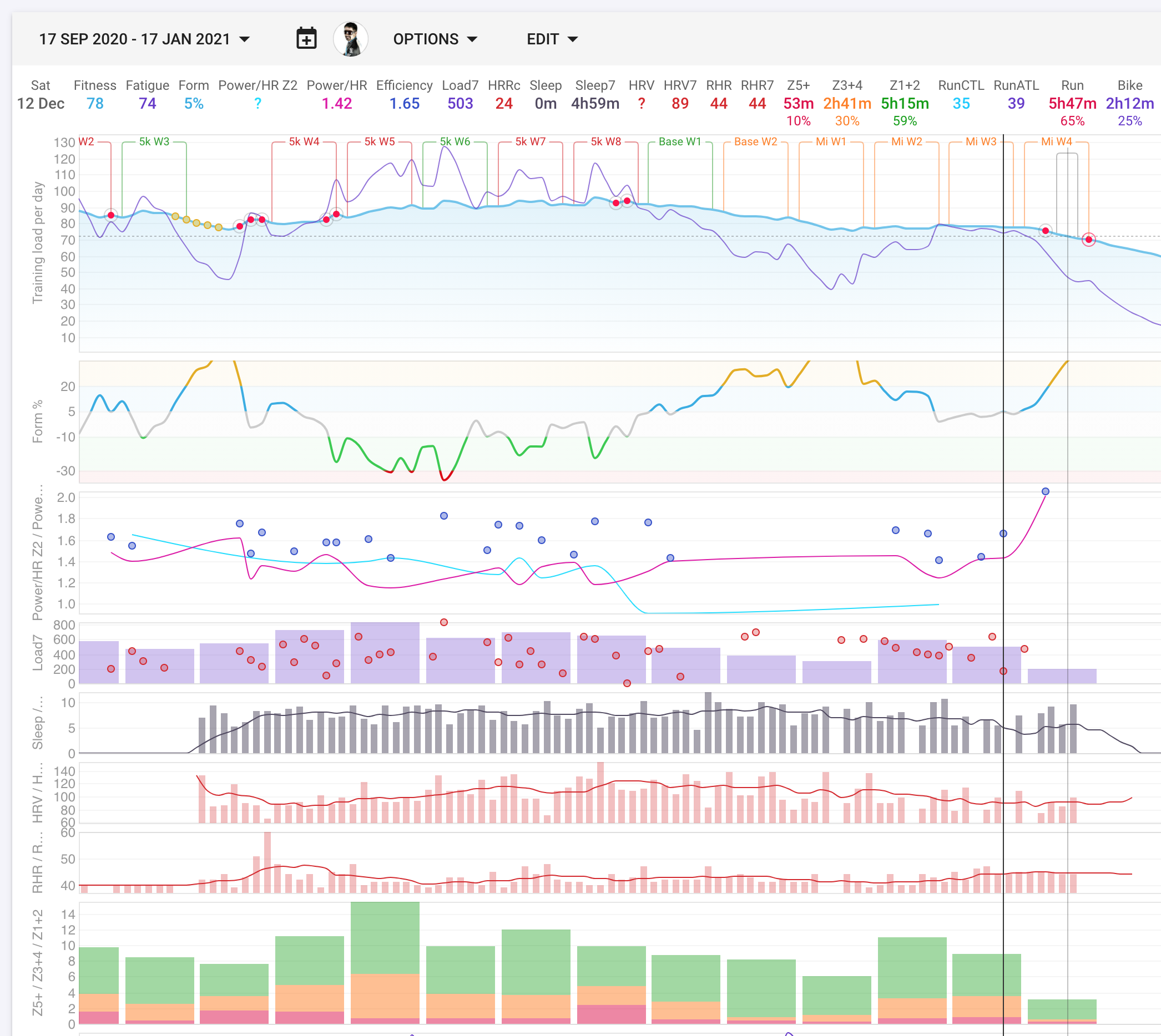
I have many custom charts and I group logically similar quantities together. For example, the plot below the form contains (Power/HR Z2), (Power/HR) and (Efficiency). Turns out it is difficult to remember which one is which.
My suggestion is: we have axis labels for each of the quantities. Let’s color them the same color as the lines/dots/bars
3 Likes