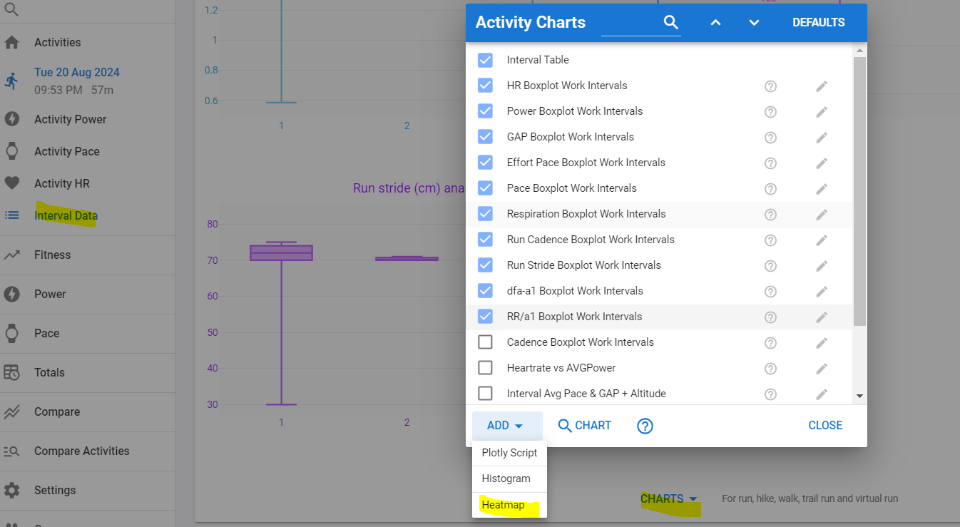
You can add these to the various activity detail pages. If you put them on the activity timeline page then they display data for the portion of the activity currently visible.
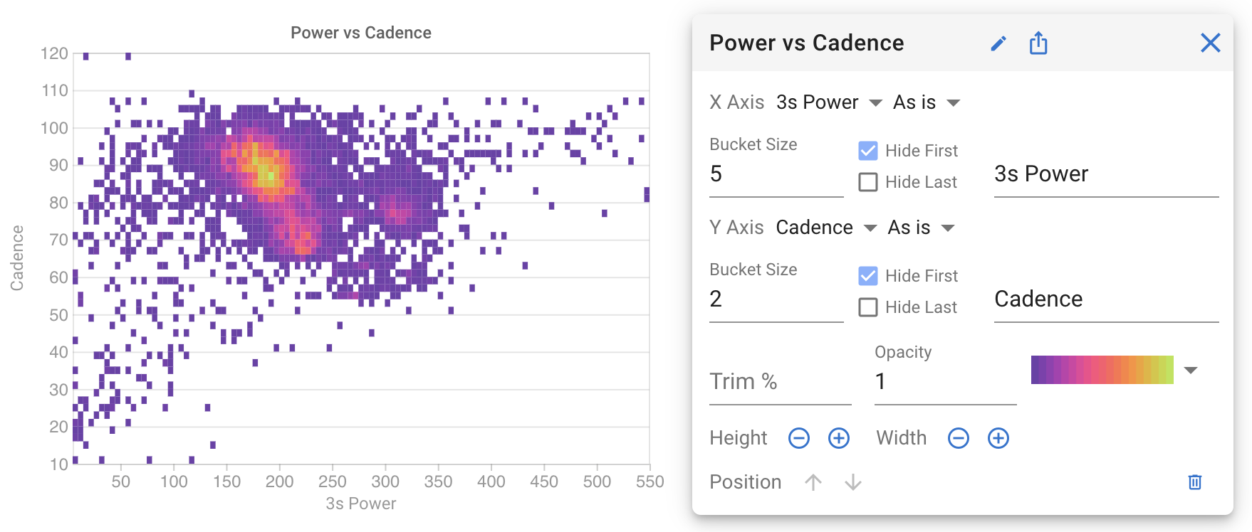
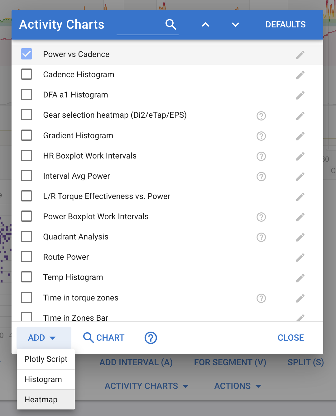
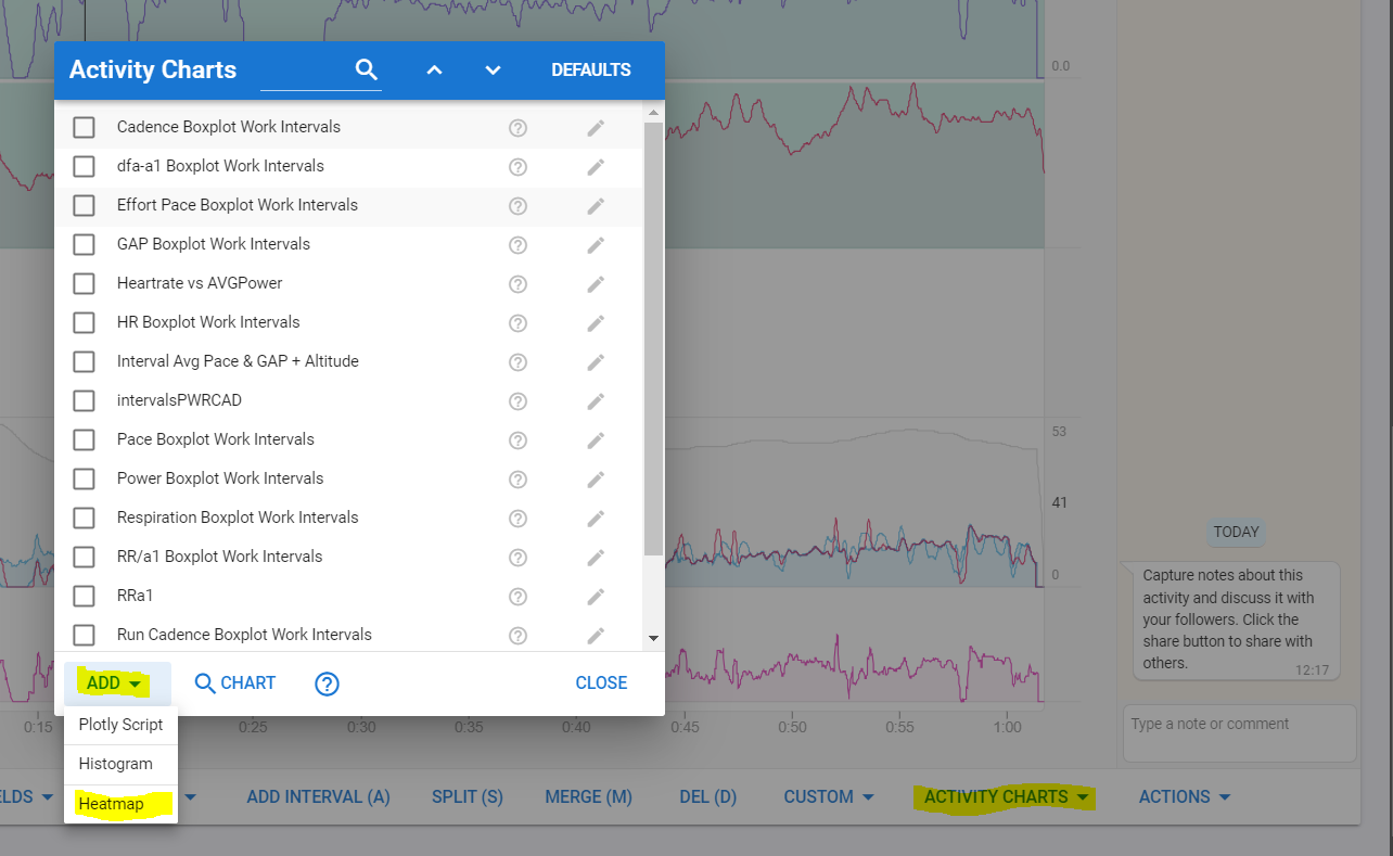
Click the “Activity Charts” button, “Add” and choose “Heatmap”. Pick what you want on the X and Y axis and set the bucket sizes. If you do not want axis labels then just delete the text.
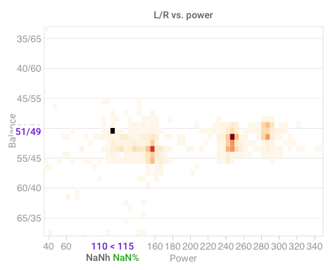
However, the ‘Nan%’ leads to the Trim field being not very helpful right now as nothing is shown as soon as i enter a trim value. (Used the same setting as you, David)
Yes tx I found that on the other thread. I have implemented a contours option (bit more work in d3.js!), just need to get the mouseover working. Back on my day job now so will finish tonight or Thursday am. From the 1st of September Intervals.icu will be my day job and I will be able to get a great deal more done.
Looks interesting. On what page can I find the “Activity Charts” button? What are “various activity detail pages”? If I go to “Activities” in the left menu and click on an activity I don’t see the button.
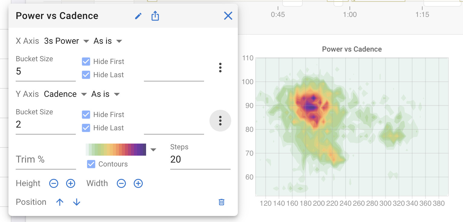
These are fantastic! Since the axes of the heatmap automatically scale to fit the data, I would love the ability to clamp to absolute ranges, not just percentage of the data. Or specify the exact ranges for both axis. This would be useful for example on data where the useful stuff is likely to always fall in certain ranges, or in order to keep the axis scale consistent across several charts.
Great, congrats and good luck!
And congrats to all of us, shall be wonderful considering how you managed to develop and deliver this super-cool tool already so far:-)
Uh, oh, yes:-| This was on my old laptop at the trainer and the problem disappeared over night … apparently it reloaded now;-) Sorry for the line noise!
You can now specify the min and/or max value to be plotted for histograms and heat maps. This is applied before “Trim %” and the hide first and hide last options. Click the dot dot dot button:
This is a great feature. Is there any chance of having a 3rd axis be represented in the color map? You have added a 3rd axis in the form of density, but being able to select one would be killer. I’m thinking an efficiency metric on top of cadence and stride length, for instance. Or, even HR on top of power/cadence as you have it in this last message (as opposed to just concentration/density).
I did think about that for a bit but decided to see if anyone came up with good use-cases for it first. At the moment the density of each bucket is decided by the total seconds for the x-y bucket. How does that work for say heart rate? Average the HR for the bucket?