I didn’t know about those, thanks:
out: {
  if (true) break out; // not the right type of activity or whatever
  // your chart code
  let chart = { data: [] }
  chart
}
I didn’t know about those, thanks:
out: {
if (true) break out; // not the right type of activity or whatever
// your chart code
let chart = { data: [] }
chart
}
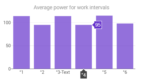
This also creates unexpected behaviour as Plotly disregards Text values in the x-array when numbers are present. If some work intervals do not have a label, only those will be plotted and the intervals with a text label will not be shown.
I haven’t found a way yet to tell Plotly that it needs to interpret the whole x-array as text values, so I came up with this intermediate solution:
x.push("°" + (iv.label ? c + "-" + iv.label : c))
The ° sign as first character, makes sure that all values in the x-array are considered as text values.
You can remove that and just include this in the layout options:
layout = {
  ...
  xaxis:{"type": "category"}
}
Thanks for that tip!
Works like a charm.
Anyone able to assist, please, with the syntax required to create a chart with the x-axis in hours (activity duration) and then the y-axis using any of the metrics, eg. kJ?
I can work out what the various sections of the code means, but I’m not sure of the correct syntax used, so I created a Google Sheets document to allow a line-by-line explanation of the coding. I’m sure this will help other people besides myself.
TIA
so the quoted code is running through each of the intervals in the activity and picking out the label and average watts for the work intervals and saving them in their own array. (it then moves on to the plotting bits)
the options for what metrics you can pick are here
it sounds like you don’t want to look at the metrics aggregated into their intervals though and instead want the time series, in which case have a look at the activity stream models
best bet is probably to explore some charts already shared that look a bit like what you want and adapt them
Thanks for the reply. My request is two fold:
The custom stream has kJ/hour, but looks to be total kJ/duration, which is an average. It doesn’t say if the first hour was more or less than the second, third, and so on. I can view the summary by highlighting each hour, but would be easier to view across all activities and athletes.
Sorry I can’t explain this better right now but this might serve as a skeleton.
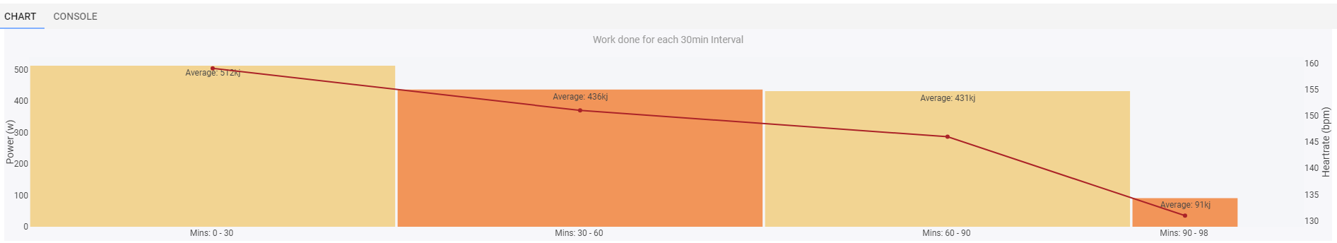
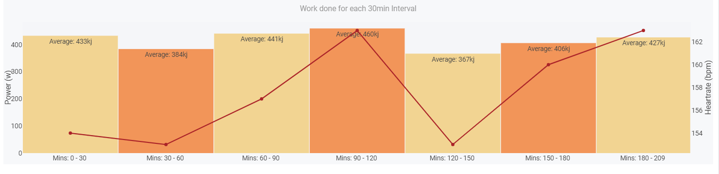
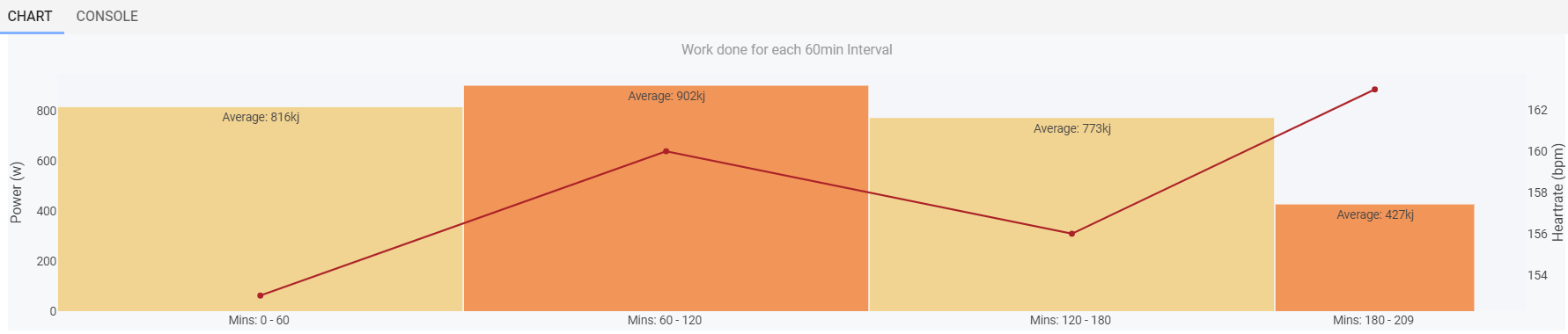
intervalLengthMin = 30  // change this number for different interval sizes


// define variables

//activity = icu.activity
streams = icu.streams


// filter time and watts for points with positive velocity

intervalLength = intervalLengthMin * 60
time = streams.get("time").data
watts = streams.get("watts").data
heartrate = streams.get("heartrate").data
velocity_smooth = streams.get("velocity_smooth").data


// body of work

Int_number = []
Int_power = []
Int_work = []
Int_hr = []
Int_length = []
Int_text = []
Int_colour= []

for (let i = 0, IntV = 0; i < time.length; IntV++) {

	z1 = i

	for (j=0, temp_power = 0, temp_hr = 0; j < intervalLength; j++, i++) {
	 if (i === watts.length) { break; }
	  temp_power += watts[i]
		temp_hr += heartrate[i]
	}

	if (IntV % 2 == 0) {
	  Int_colour.push('rgb(242, 212, 146,1)')
	} else {
	  Int_colour.push('rgb(242, 149, 89,1)')
	}


	z2 = i
	temp_text = `Mins: ${z1/60} - ${Math.floor(z2/60)} `
	Int_number.push(((z1+z2)/2)/60)
	Int_power.push(Math.round(temp_power/j))
	Int_work.push(Math.round(temp_power/1000))
	Int_hr.push(Math.round(temp_hr/j))
	Int_length.push((j-12)/60)
	Int_text.push(temp_text)
}

data = [
  {
    x: Int_number,
    y: Int_work,
		text: Int_work.map(a => `Average: ${a}kj`),
		width: Int_length,
		marker:{color: Int_colour},
		hoverinfo: 'text',
    textposition: 'auto',
    type: 'bar'
  },
	{
		x: Int_number,
		y: Int_hr,
		text: Int_hr.map(a => `Average: ${a}bpm`),
		width: Int_length,
		marker:{color: 'rgb(171,35,40, 0)'},
		hoverinfo: 'text',
		yaxis: 'y2',
		type: 'line'
	},
	{
  type: 'bar',
  y: [200],
	orientation: 'h',
}
]


layout = {
  title: {
    text: `Work done for each ${intervalLengthMin}min Interval`
	},
	showlegend: false,
  xaxis: {
		ticktext: Int_text,
		tickvals: Int_number
  },
	yaxis: {title: 'Power (w)'},
	yaxis2: {
		title: 'Heartrate (bpm)',
		showgrid: false,
		overlaying: 'y',
		side: 'right'
	},
	paper_bgcolor: 'rgba(245,246,249,0.8)',
	plot_bgcolor: 'rgba(245,246,249,1)',
  margin: {
		l: 35,
    r: 40,
    t: 40,
    b: 20
  }
}

chart = {data, layout}
chart
I think this is kind of what you were asking
Many thanks @Ben - this was like getting a short push to close the gap in the bunch. It gets me closer to having a working example. I’ll play around and see what else I can “report on”.Also easy enough to change to 60-mins (second image).
no worries, it was an edited version of a chart that I shared to the public library months and months ago (hence why I forgot to rename the x axis).
If you look at another one I shared (All Intervals (Power Avg + Norm) or HR selection) you can add dropdowns within the charts to flick between whatever you want to report on, once you get to grips with first getting the data you want there’s a shed load of flexibility with displaying it.
Is there already any way to access data for an entire period like last 90 days or season? Or for now the only available data available is from a given activity?
I need to add support for custom longitudinal charts for that. However you can get at the athletes current MMP power curves and so on from a custom activity chart. See ActivityJsData.
Example pulling the athletes MMP power curve for the last 42 days (from activity date) and extracting best 5m power:
let mmp42d = icu.bestPower['42d']
let best5mWatts = mmp42d.getWatts(5 * 60)
Hi David! Yeah, I have saw this type of long term data on some examples and while I was plaining with icu object but nothing for elevation, which for my use case is crucial and that’s why the question. It’s also a question how far is the implementation of the feature request for the elevation goal and how easy/hard is to add this new elevation data to icu object for modeling other use case.
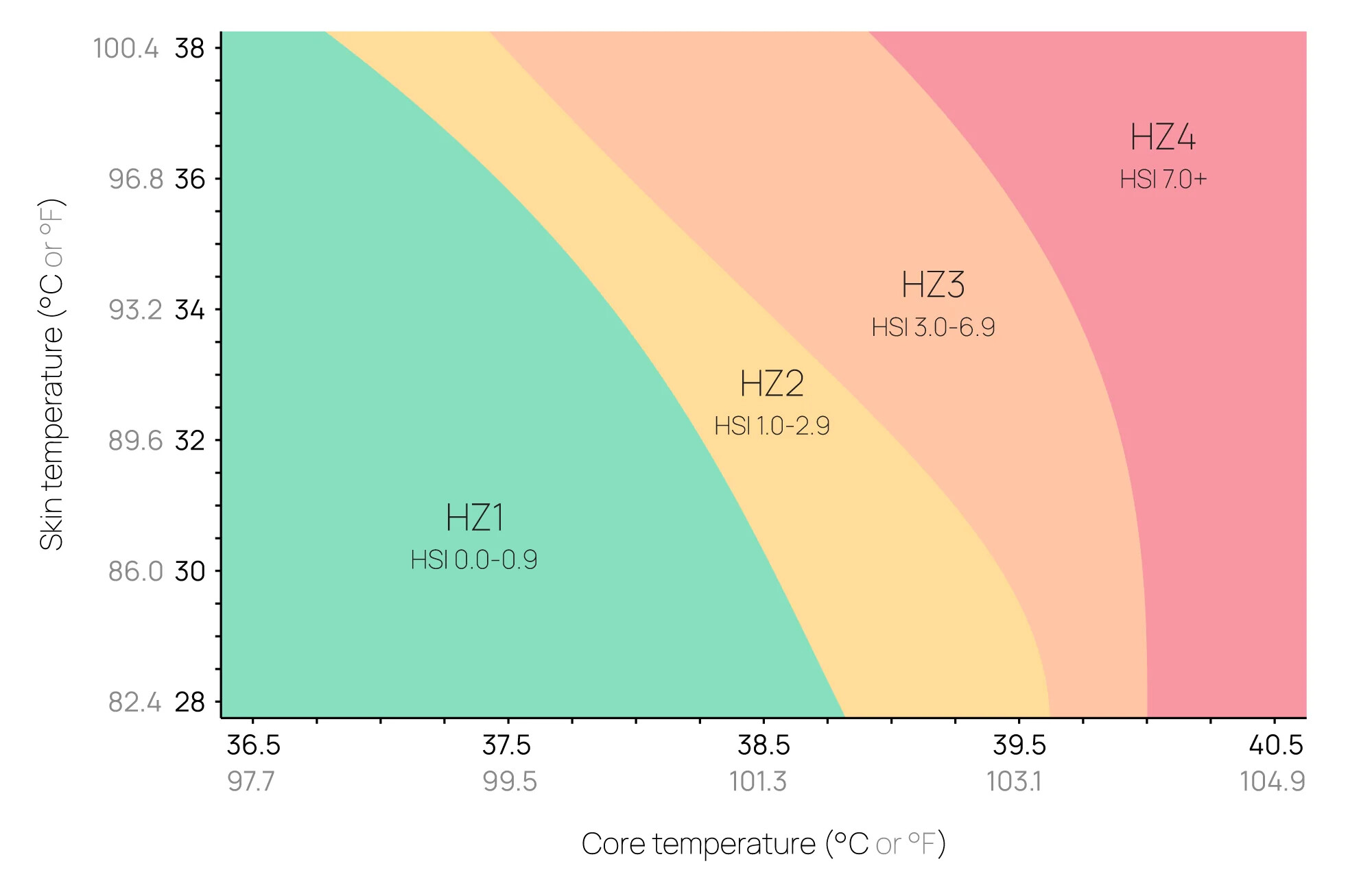
Hi! I managed to reproduce this plot from Core to better identify heat zones based on skin temperature and core temperature :
Original : https://corebodytemp.com/pages/cores-heat-strain-index
How can I access the best maximum pulses in the last 42 days? I don’t know if this is possible
Yes you can:
Example pulling the athletes MMP power curve for the last 42 days (from activity date) and extracting best 5m power:
let mmp42d = icu.bestPower['42d']
let best5mWatts = mmp42d.getWatts(5 * 60)
Sorry I just realised you were probably looking for heart rate data. You can do:
let hr42d = icu.bestHR['42d']
let best5mBpm = hr42d.getBpm(5 * 60)
Everything available is listed here.
Any chance to access fit file messages as in custom activity fields?
Is it possible to code custom charts for the fitness tab too?
You can already do this: Computed fields from fit file messages
Not yet but I am planning to add that soon.