@Xavier_Hipolito_Marg, I’ve actually modified the zone plots a bit since my post above. I find them more informative now.
They are Custom Plots. I label the Left Axes ‘HR Zones’ & ‘Power (cycling)’. I’ve colour coded the 5 zones so that I can visually see 3 zones.
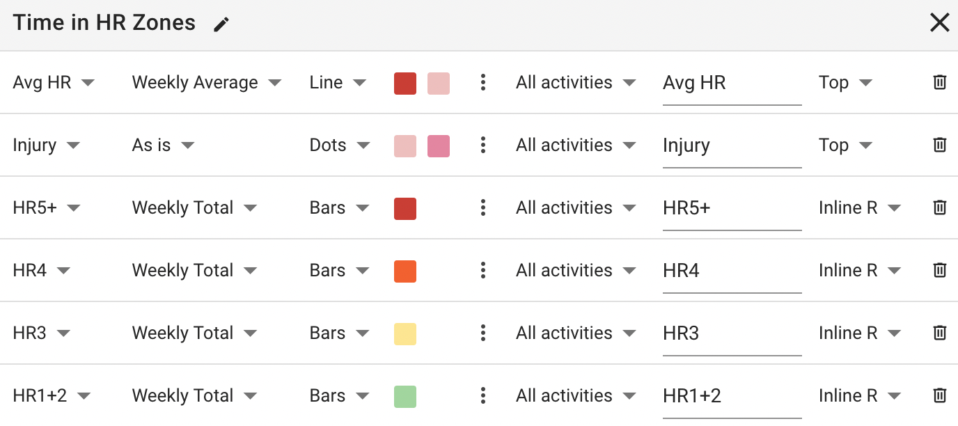
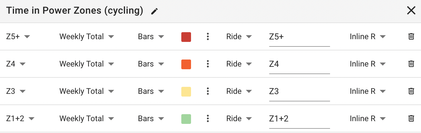
Those plots are on the /fitness page. The x-axis is date. Choose Options → Add Chart.
2 Likes
Thanks David, got it and did it 
@Xavier_Hipolito_Marg, it looks like you have the bars stacking to 100%. I personally don’t do that so that I can see both the amount/volume and the distribution of that volume. I also have them stacked by week.
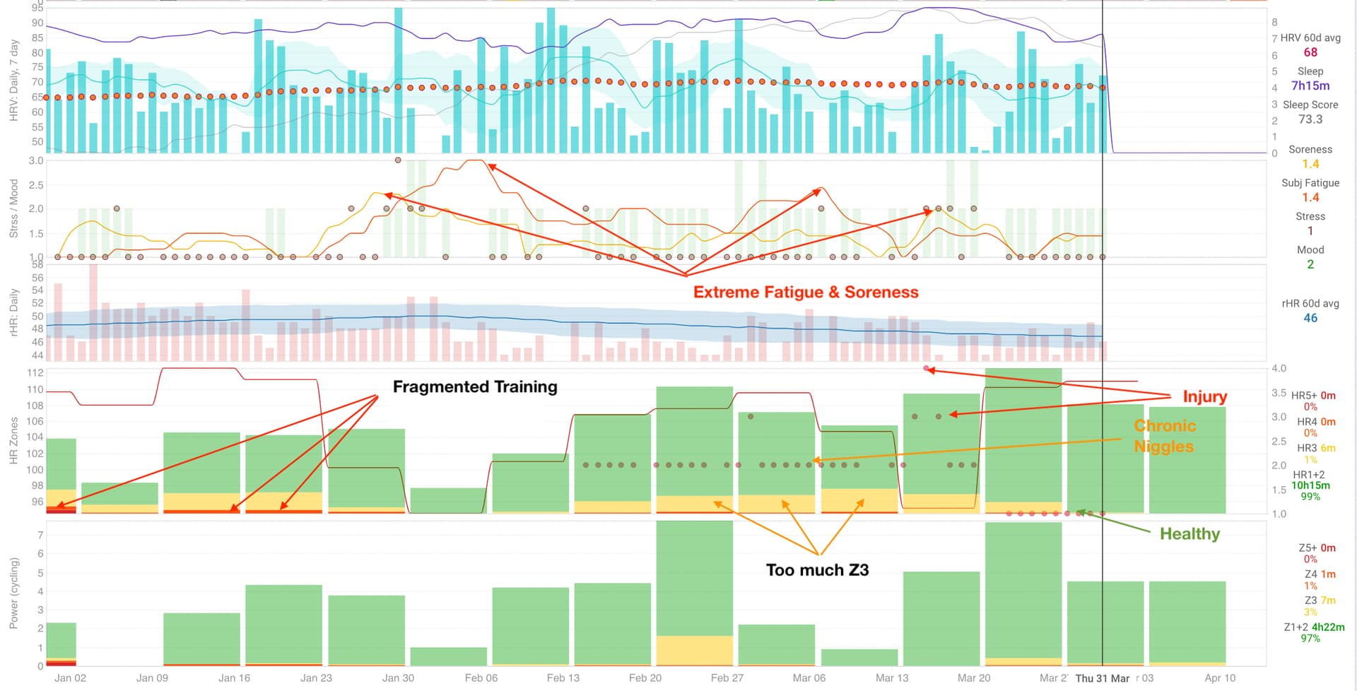
Thanks to the addition of some wellness metrics I can objectively see why I’ve recently followed my intuition and changed my training. (I plan on saying more about that in a month or so once I see how things have (hopefully) stabilised.)
Note: There’s a ton of information to harvest in the image below (that I don’t point out via overlaid text and arrows), and what’s lying just outside of the screenshot. I won’t go into it all right now.
3 Likes
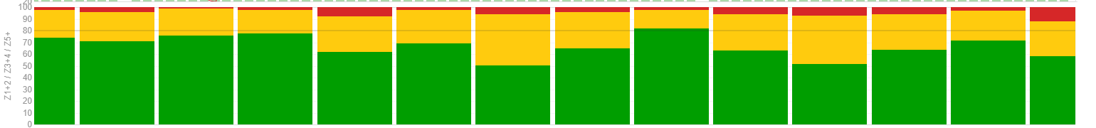
I understand your point, but I usually, for volume, look at the hours, maybe I can change if it’s better. But in the stack at 100% I can clearly see if I’m doing good at the ~80% Z1+2.
I really liked your welness metrics, do you measure that with a watch? I never did it so, that’s why I’m asking. With that monitoring you can see when you need a recovery or even a rest day, that’s pretty nice!
No worries. I was just clarifying. If you like the 100% stack then that’s what it’s there for. 
My Polar watch tracks resting HR, nocturnal HRV and sleep time. All the other metrics I input each morning. Intervals.icu makes that documentation super fast and very clear (as opposed to other platforms where I can’t for the life of me understand the logic).
1 Like
A God’s watch, I see 
1 Like
A question about this graph, can we somehow put a dark line where we want like it happens when we hover the graph? I want to have a line in the 80 value to undertstand better the 80/20 intensity
Thanks
PS: i know…not 80% enough ahah
Is your intensity graphed by session or TIZ? Remember, 80/20 is defined by session. For TIZ distribution needs to be >90% below VT1.
My graph is TIZ, okay thanks for the knowledge about it.
1 Like
And remember, some VT1 could represent low zone 3 too!
That depends on two things:
- Where a person’s VT1/LT1 actually lies. IOW, the state of their metabolic health/dysfunction. It’s been shown that most people are at or near LT1 virtually at rest.
- How someone has defined their zones. Traditionally in a 5 zone model, zone 3 is above VT1.
1 Like
I think VT1 is more like zone 2 high and low zone 3. At least from what Inigo says in podcast, I assume that VT1, for althetes that really train everyday, could be low zone 3. But you’re right, some health diseases could lower your VT1 to almost resting or walking pace.
IIRC, Dr san Millán has stated that it’s only the very well trained and metabolically healthy athletes who have any zone 3 below LT1.
1 Like
Clever indeed!
But does one need to set HR pre-set zones to a particular setting? Like the 80/20 or else?
(under Settings → HR settings → HR zones → Pre set)
I have my HR zones set appropriately. No fiddling is necessary for charting wizzardry.
1 Like
Hi Howie, don’t get it…you set them to the 80/20?
Polarised training—either 80/20 by session OR >90% <LT1 & up to 10% >LT1 by time in zone—is a matter of schedule prescription. I use the five zone system to set my intensity zones: first by HR and then seeing what power and/or pace I deliver for each of those zones. I like to graph using three zones because that’s most reflective of physiological energy systems.
1 Like
I wonder what is behind the hardcoded zones definitions HR1-5+ and Z1-5+ if I set only Z1/2/3 and HR1/2/3 for my ride and bike activities?