One more thing. Would it be possible to add a feature in where you can group together everything Zone4+ rather than Z3+4 together and just Zone 5+ together? If there is another work around for this would be great.
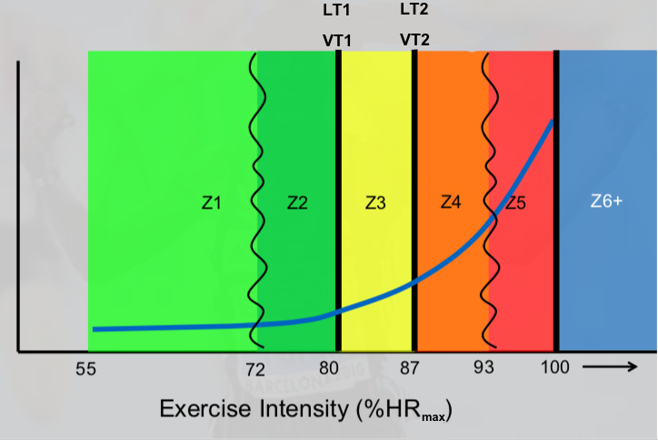
I’m basically trying to cut everything out in Z3 between LT 1 and the turning point to LT2.
I have “custom zones” on the todo list but its quite hard to implement for a number of reasons. So for now you need to be creative with the boundaries of the zones.
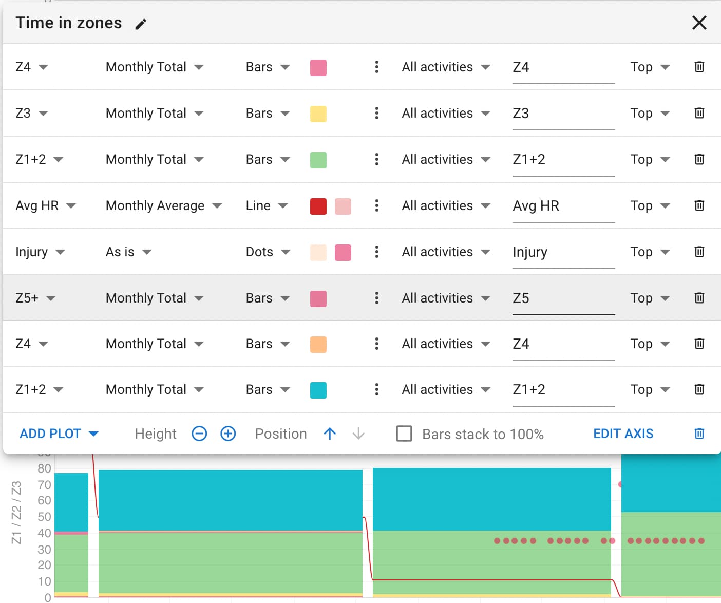
What’s more, there’s something very odd going on with the graphs. I can’t find a way to REorder the plots to at least have a proper visual according to the 3 zone model. Currently, the plot at the bottom of the list is shown at the top of the graph.
The user has to add plots in one’s desired order in order to get a typical zone accumulation plot (see below), but that doesn’t help with @sirpoc84 's (and my) aim to have 3 zone model accumulation data in a plot (visual and quantitative) yet still record and have quantitative 5-7 zone data in other analysis.
@MedTechCD , I’m not sure to whom you’re reply was directed. But,
Are you saying that the plots labelled only as Zones, i.e. Z1, Z2, Z3+4… are ONLY power information? (Clearly, the ones listing HR1, HR2, HR3+4 are ONLY HR data.)
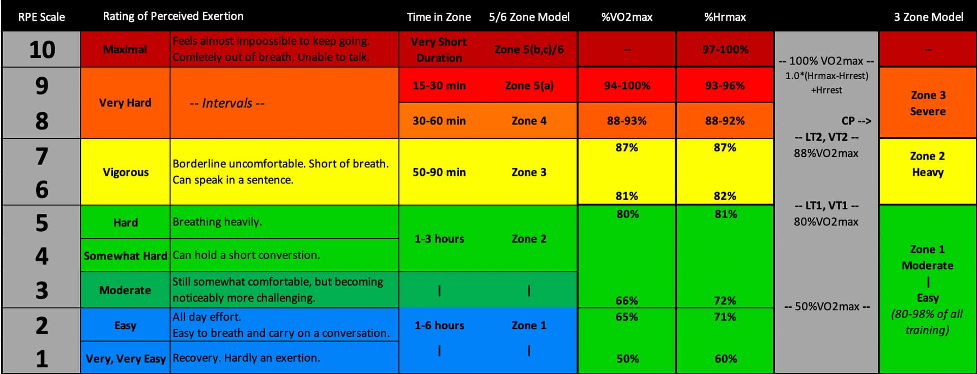
Correct, Power zones based on FTP are…
Z1 Recovery 49%-56%
Z2 Endurance 56%-76%
Z3 Tempo 76%-91%
Z4 Intervals 91%-102%
Z5 Strength 102%-120%
Z6 Burst >120%
HR zones are as follows. (The chart attempts to find the similarities between Alan Couzens, Stephen Seiler, Shawn Bearden, Rob Sleamaker/Ray Browning, Karvonen, Coggan/Friel, Chris Hauth and others.)
That’s a workaround. IMHO, it would be more appropriate if there was an HR4+5 grouping as well as HR5+ so that a) HR zones are still aligned with physiology; b) custom graphs would directly show the physiology from the perspective of polarised training.
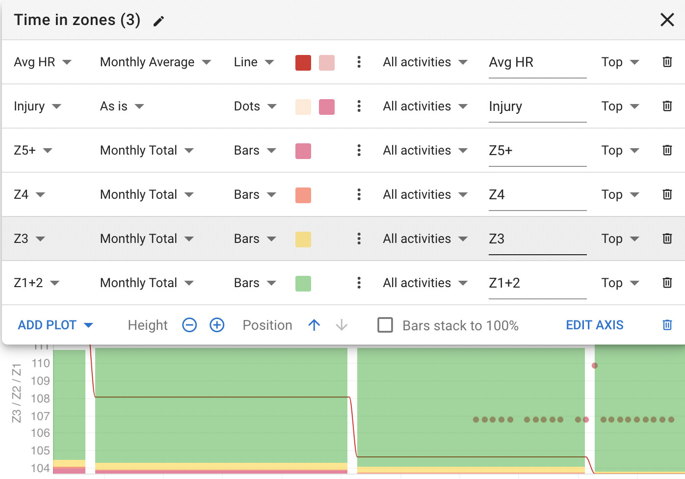
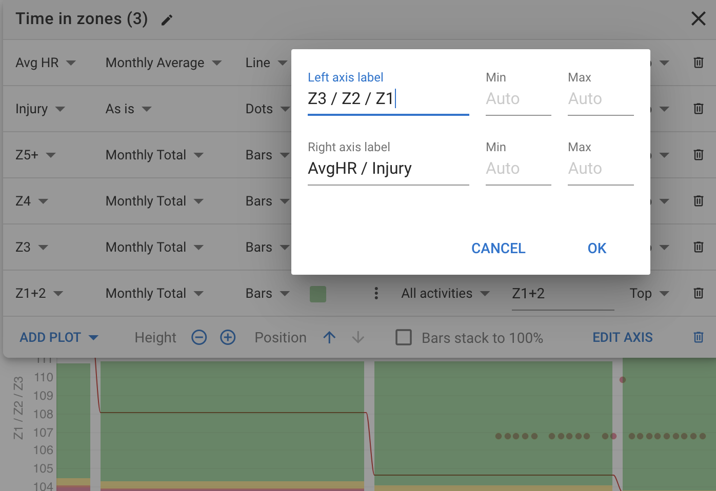
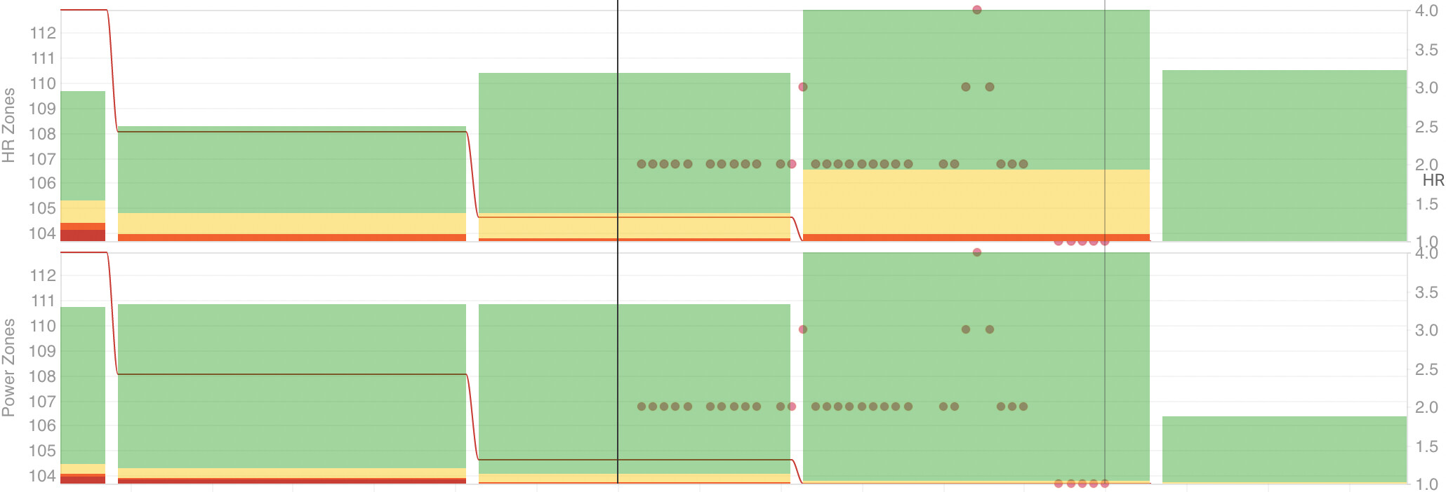
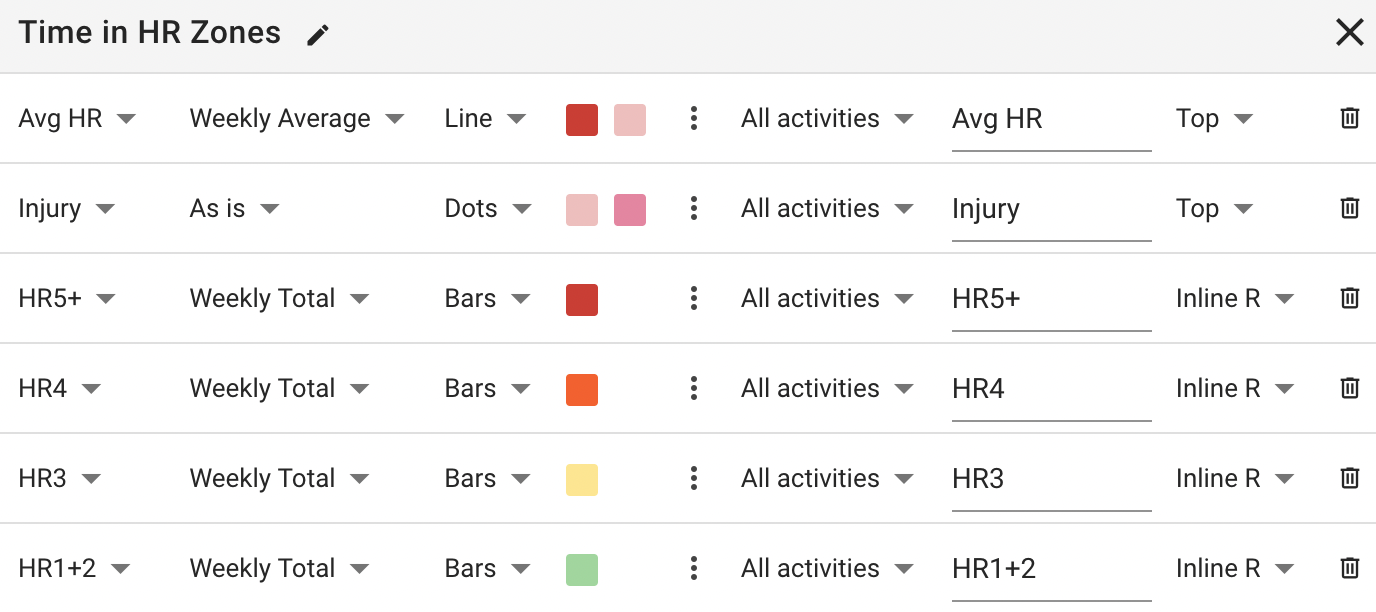
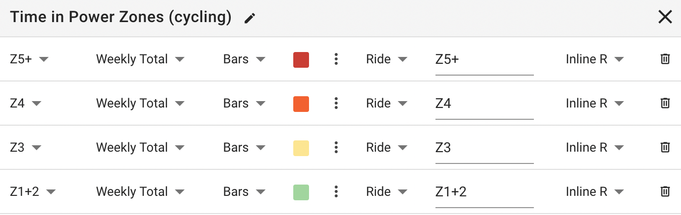
@Xavier_Hipolito_Marg, I’ve actually modified the zone plots a bit since my post above. I find them more informative now.
They are Custom Plots. I label the Left Axes ‘HR Zones’ & ‘Power (cycling)’. I’ve colour coded the 5 zones so that I can visually see 3 zones.
@Xavier_Hipolito_Marg, it looks like you have the bars stacking to 100%. I personally don’t do that so that I can see both the amount/volume and the distribution of that volume. I also have them stacked by week.
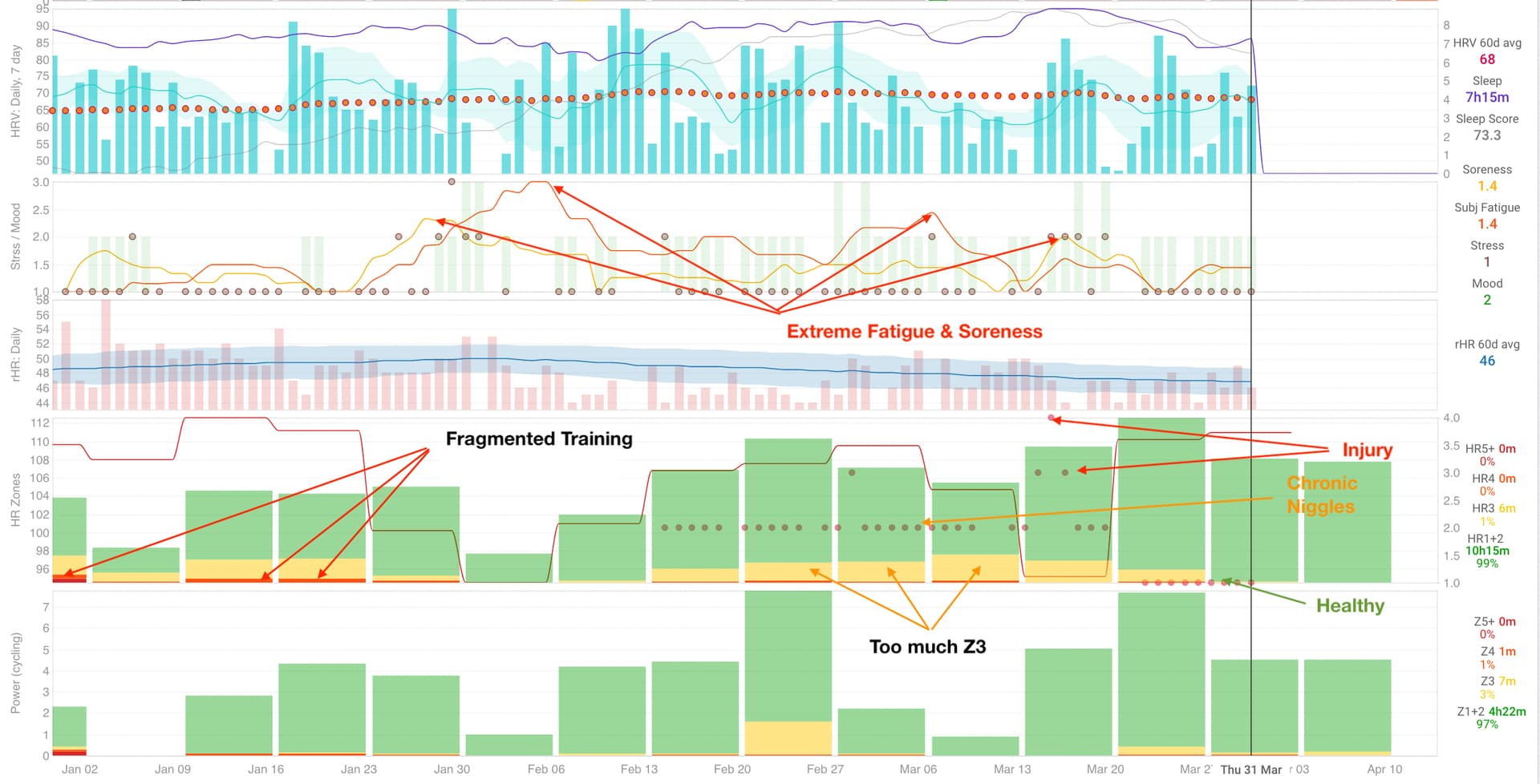
Thanks to the addition of some wellness metrics I can objectively see why I’ve recently followed my intuition and changed my training. (I plan on saying more about that in a month or so once I see how things have (hopefully) stabilised.)
Note: There’s a ton of information to harvest in the image below (that I don’t point out via overlaid text and arrows), and what’s lying just outside of the screenshot. I won’t go into it all right now.
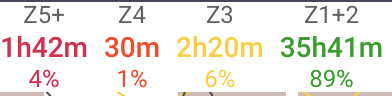
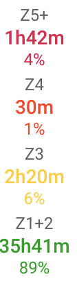
I understand your point, but I usually, for volume, look at the hours, maybe I can change if it’s better. But in the stack at 100% I can clearly see if I’m doing good at the ~80% Z1+2.
I really liked your welness metrics, do you measure that with a watch? I never did it so, that’s why I’m asking. With that monitoring you can see when you need a recovery or even a rest day, that’s pretty nice!