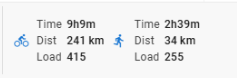
That makes sense. It just feels a bit inconsistent since the load still has a label.
 vs
vs 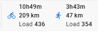
1 Like
Yeah it’s a pain but load is unitless ![]() We have to make so many tradeoffs.
We have to make so many tradeoffs.
Thanks!
Eva has sorted this out. I broke it.
The mobile view now has two columns which should help with this.
1 Like
Thanks that looks better on the mobile. Nice use of the smaller space
As I was checking it out I noticed a couple of planned activities that hadn’t correctly been allocated to an actual activity. So I dragged (on my mobile) the planned activity on to the actual and it paired them up nicely. But then disabled the ability to scroll up and down. Even trying to scroll by dragging the day/date areas of the screen.
I killed the app and relaunched it, scrolled down to find another unpaired plan/actual, and repeated it. Again the ability to scroll stopped.
I was able to use the menu to switch to the graphs screen, but couldn’t scroll up/down there. I could move the cursor around on the graph (the one that gives vertical/horizontal black lines) so some input was working
1 Like
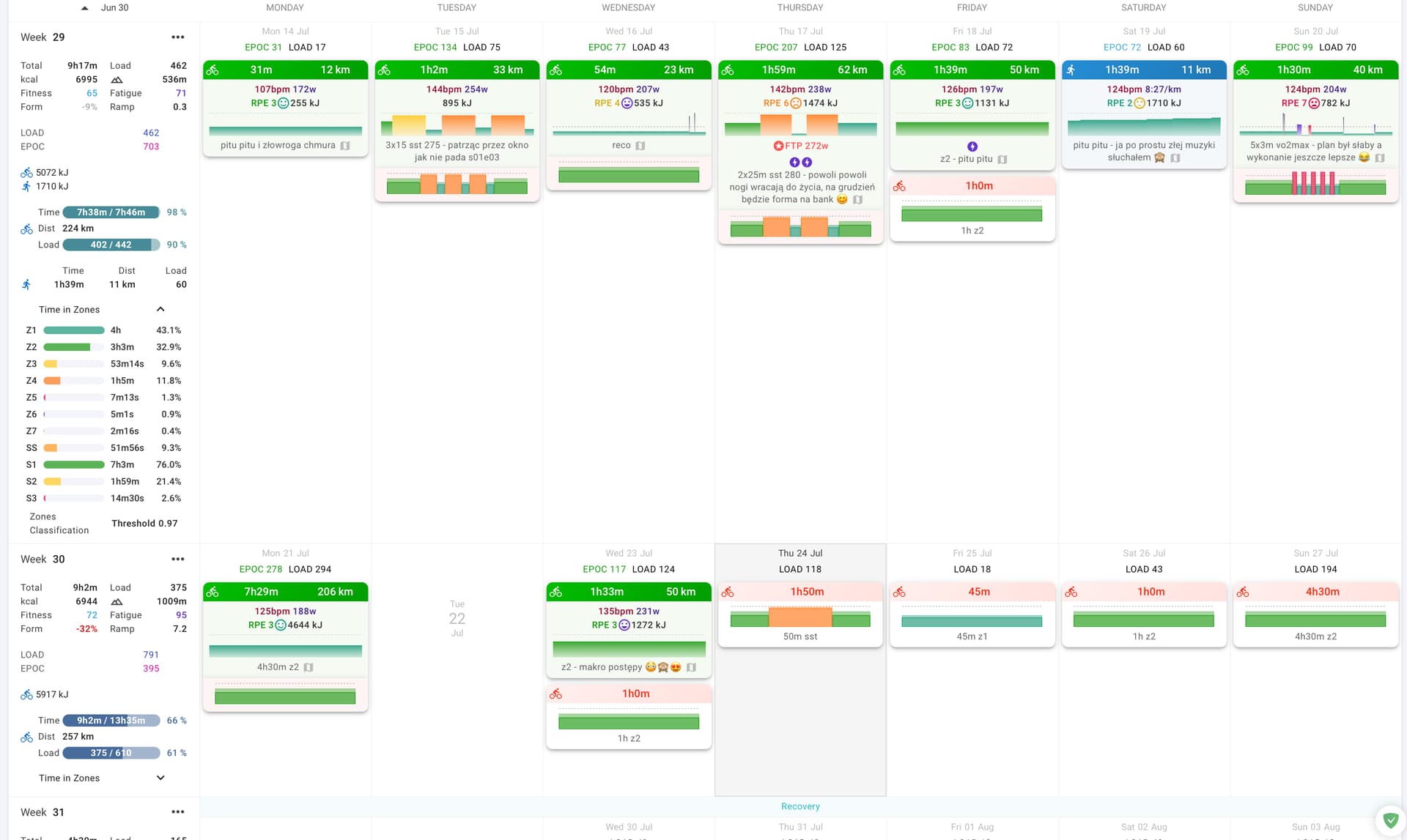
small thing but I think the setting in for time in zones should let you make them showed or hidden
-maybe a button under “show times in zones” something like keep them open/close
and
-would it be possible to make the times in zones appaer next to the and not at the bottom? it pushes the whole next week out of the screen rn and it is hard to compare multiple weeks, ofc you can close the tiz but like I often check week from past years for example. for desktop view at least
(best would be if it would push the days to the right and not hide one beneath ofc)
sry for my quick edit in preview (new system)
1 Like
Hi @eva @david, well done for this amazing job !
Personally I’m not a fan of the white shade on the coloured chart, it is harder to see/read.
That’s all I have to add ![]()
2 Likes
This should be fixed now. Tx for the info.
We have added the classification and polarisation index to the drop down. We will have to see what we can do about putting the zones table in its own column on really big screens.
Thanks that is fixed now. I’m liking the new look on mobile screen. The content fits really well to the screen size. I have noticed that it is possible to scroll sideways accidentally in the calendar view though, which is a bit annoying. It’s as if there is a page event that is wider than the screen width/content.
See below the normal view I get, and then how it looks if I accidentally scroll sideways.
1 Like
Is this iOS with what browser?
Sneaky FTP increase flex there! Nice ![]()
3 Likes
iOS with Chrome. It’s an older iPhone 11 (still supported and going strong!)
1 Like
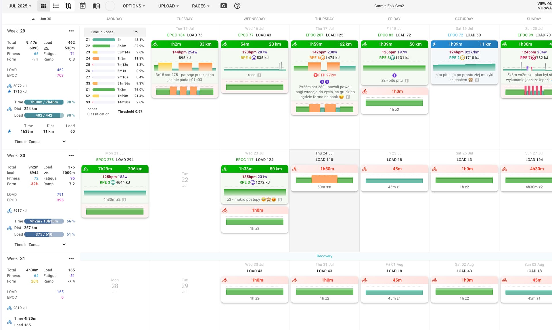
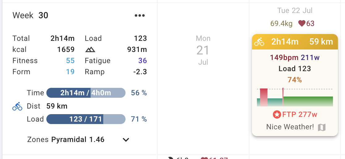
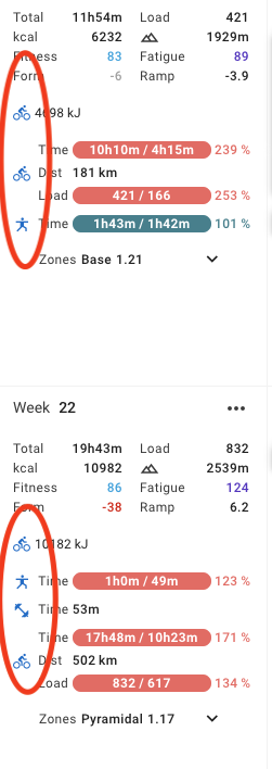
This looks really really good. Would like to thank and throw you extra kudos for the great effort. Progress over week was the one addition I was looking forward to. My only feedback is the missing “Planned” from the Total section. [Total: 10h58m/10h31m, Load 610/…]
It is great to have the progress and vs. to total on the breakdown for sports - but helps a lot to have it for totals too. Otherwise you cant see total volume planned for a given (upcoming) week (or I have to mentally add for 4 disciplines ![]() )
)
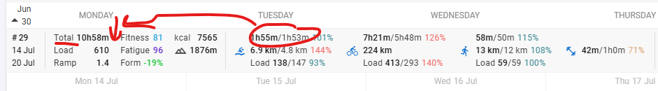
1 Like
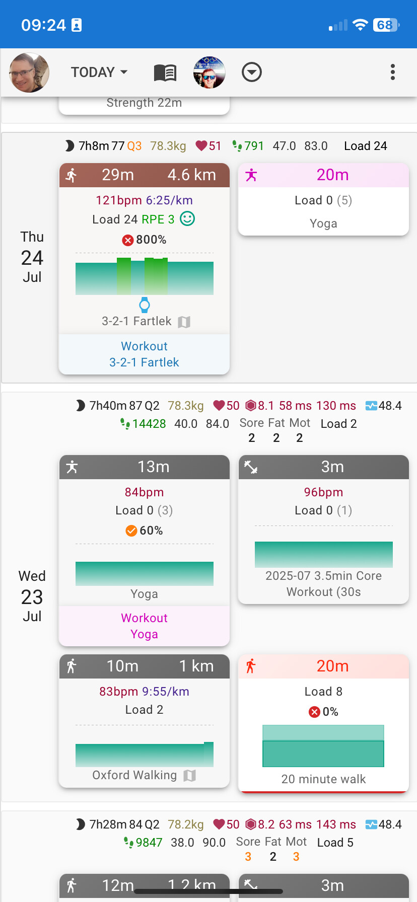
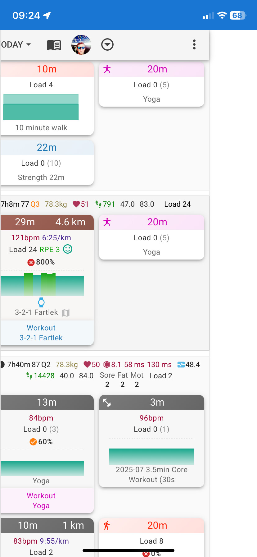
Another small detail, but maybe having the workout names displayed systematically at the bottom of each activity card is somewhat redundant (most of the time, I guess it should be the same as the activity name itself)?
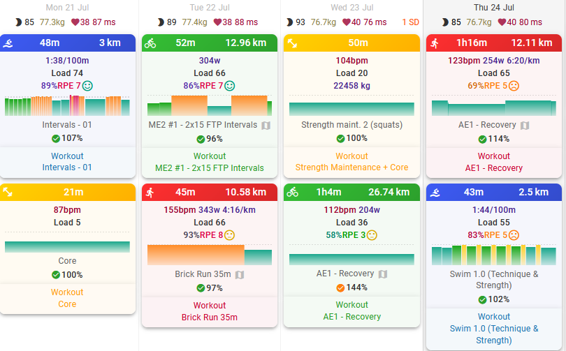
I think the old design made more sense (showing the workout’s load and duration)…
3 Likes
This is fixed now. Tx.
1 Like
This is live now! Tx everyone for all the testing!
There is now an “Expand zones” checkbox in Options to do that.
2 Likes
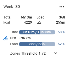
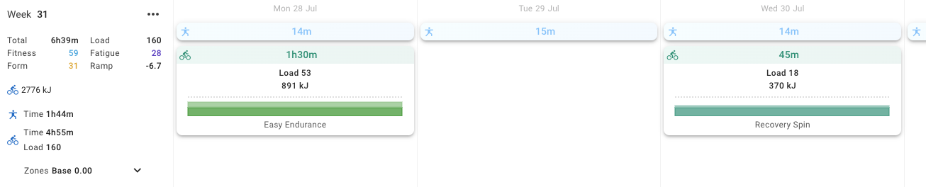
Is there a way to bring back the load progression forecast?
Right now, I can see that I’ve completed 368 Load out of the planned 585. However, since I overperformed in some workouts (i.e., I generated more load than planned), if I follow the rest of the plan as it is, I should end up with around 650 Load by the end of the week.
Previously, I remember this kind of projected total being shown, and it was quite useful to track how deviations affect the overall weekly load.
Same for the Time/hours.
Would it be possible to bring that feature back?
4 Likes
Yeah, having the “completed/planned” volumes is definitely useful, but implementing an option to also view the volumes as they were originally would be very helpful
Would it be possible to have an option not to have shadowed cards? I much preferred the previous UI, which was easier to the eye, making elements more distinguishable between them.
To the current day, seems like everything is darker, while previously the workout’s were lighter than the background of the day.
As a designer and dev myself, I know change is always hard to adopt, but IMHO the elevation layer added through shadows does not play as good as the previous color-based elevation did.
1 Like
Also, I see the same calendar UI in the beta and non-beta websites. Is this expected?
1 Like
This is nice! I was using the compact version but now I’m switching to this new view!
couple of things on my calendar:
- I have 2 “cycling” icons, why those are not groupped?
- order of the sports is “random” (or has some logic that changes between weeks). My preference would be to have always the same order, for example cycling on top, running, weight, yoga, etc… and not one week cycling then yoga and the other week yoga then cycling
also, for future weeks, I have some planned workout but the weekly tab doesn’t show the “progress bar”
Yes this is now live for everyone ![]()
3 Likes