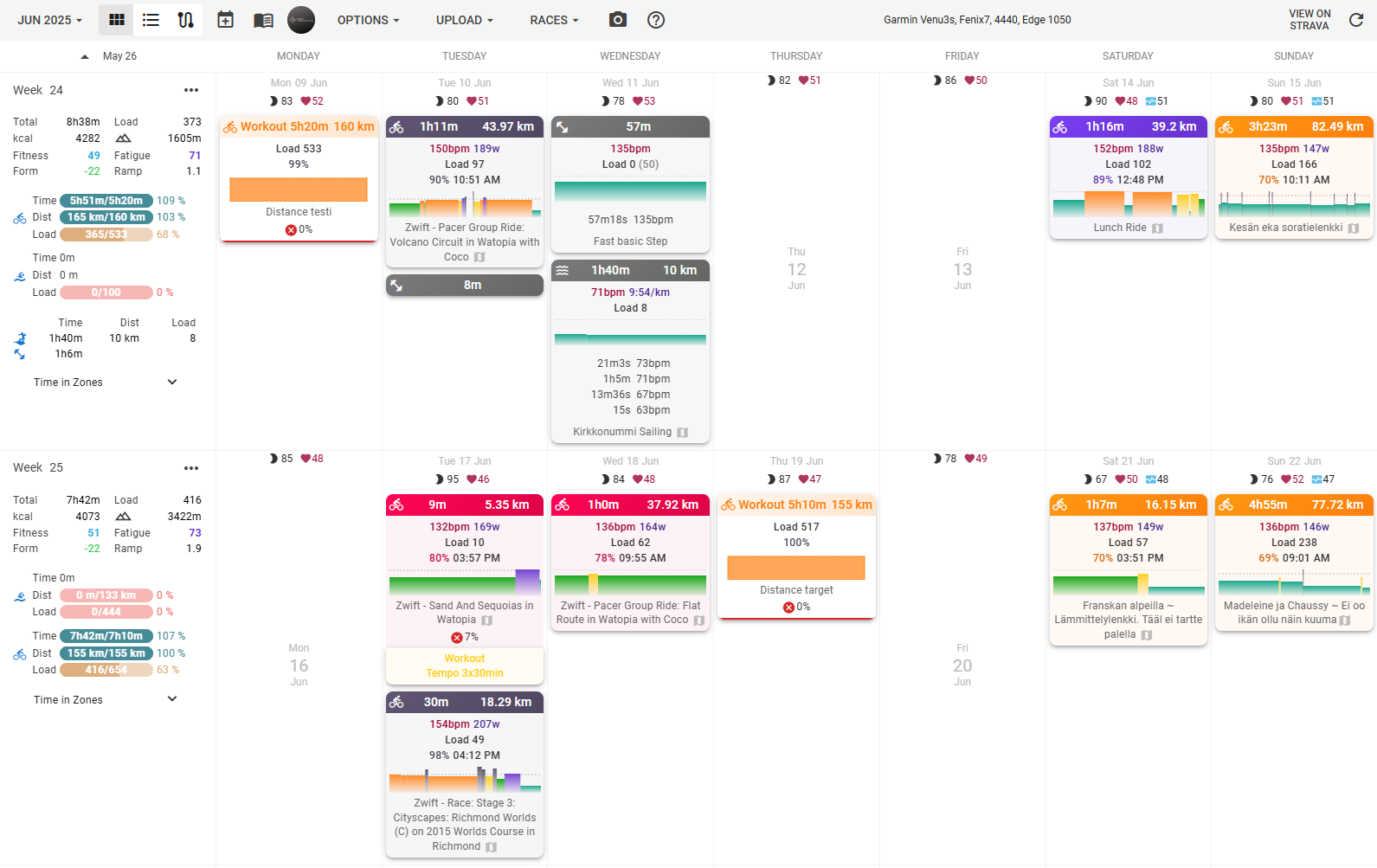
Exciting news! We’ve been busy doing our first visual refresh and it’s almost ready to roll out. We’ve given a fresh new look to both the calendar and weekly info dialogs.
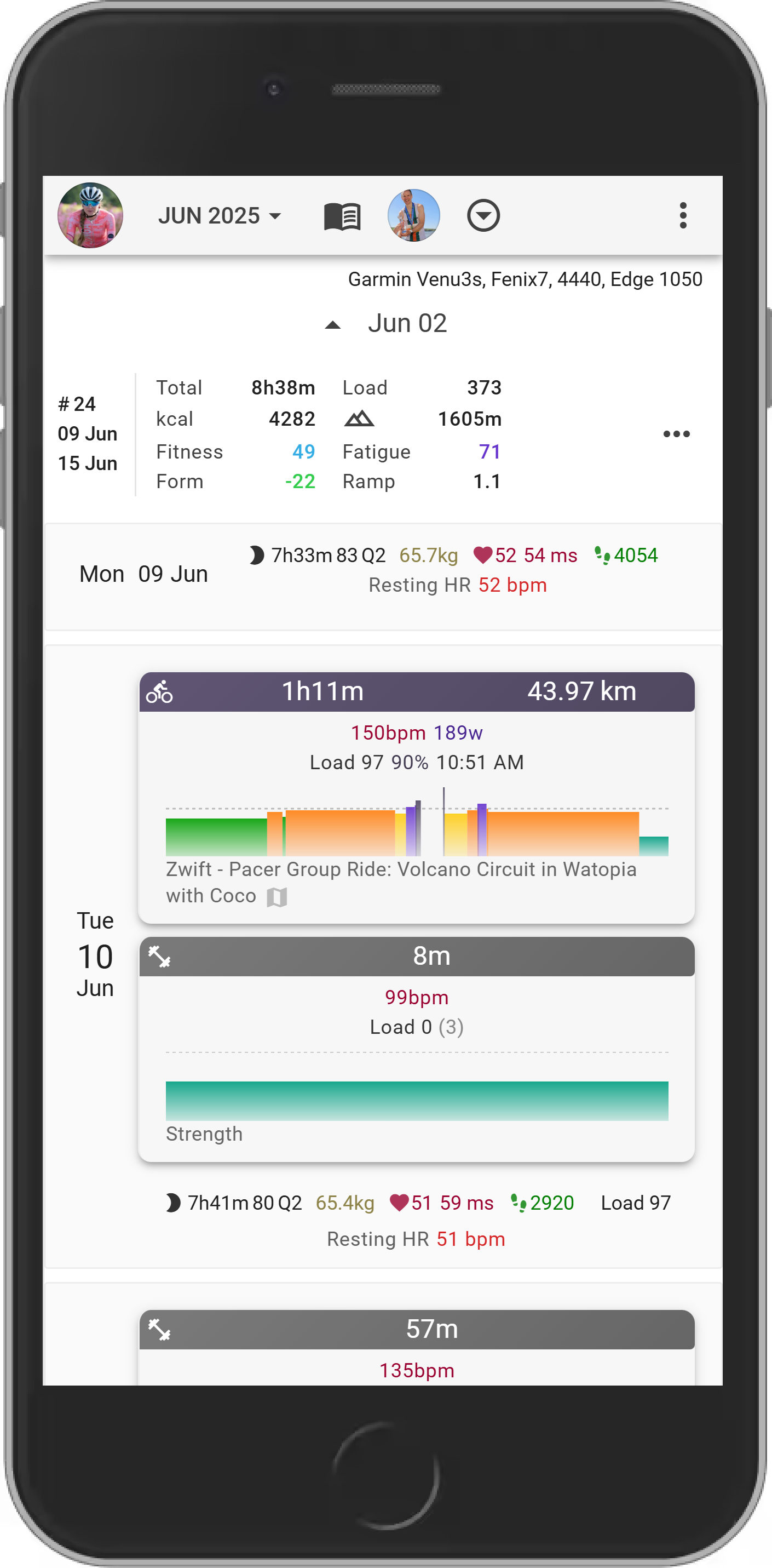
We also took this opportunity to tackle some issues with the mobile view in these sections. So, not only do they look better, but they should also be much more user-friendly on your phones and tablets.
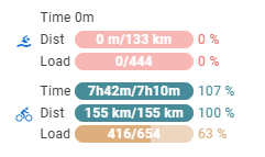
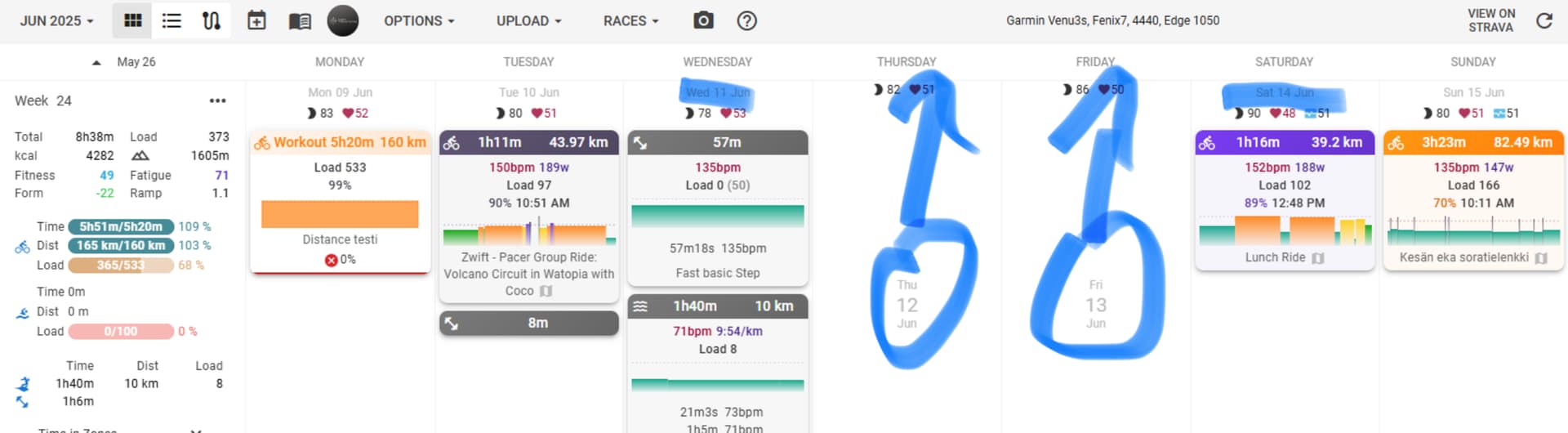
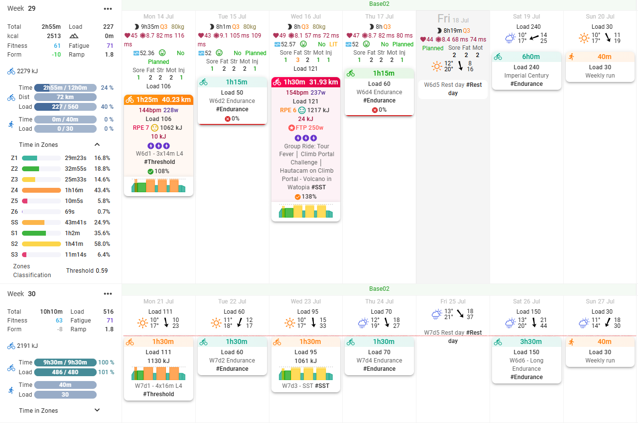
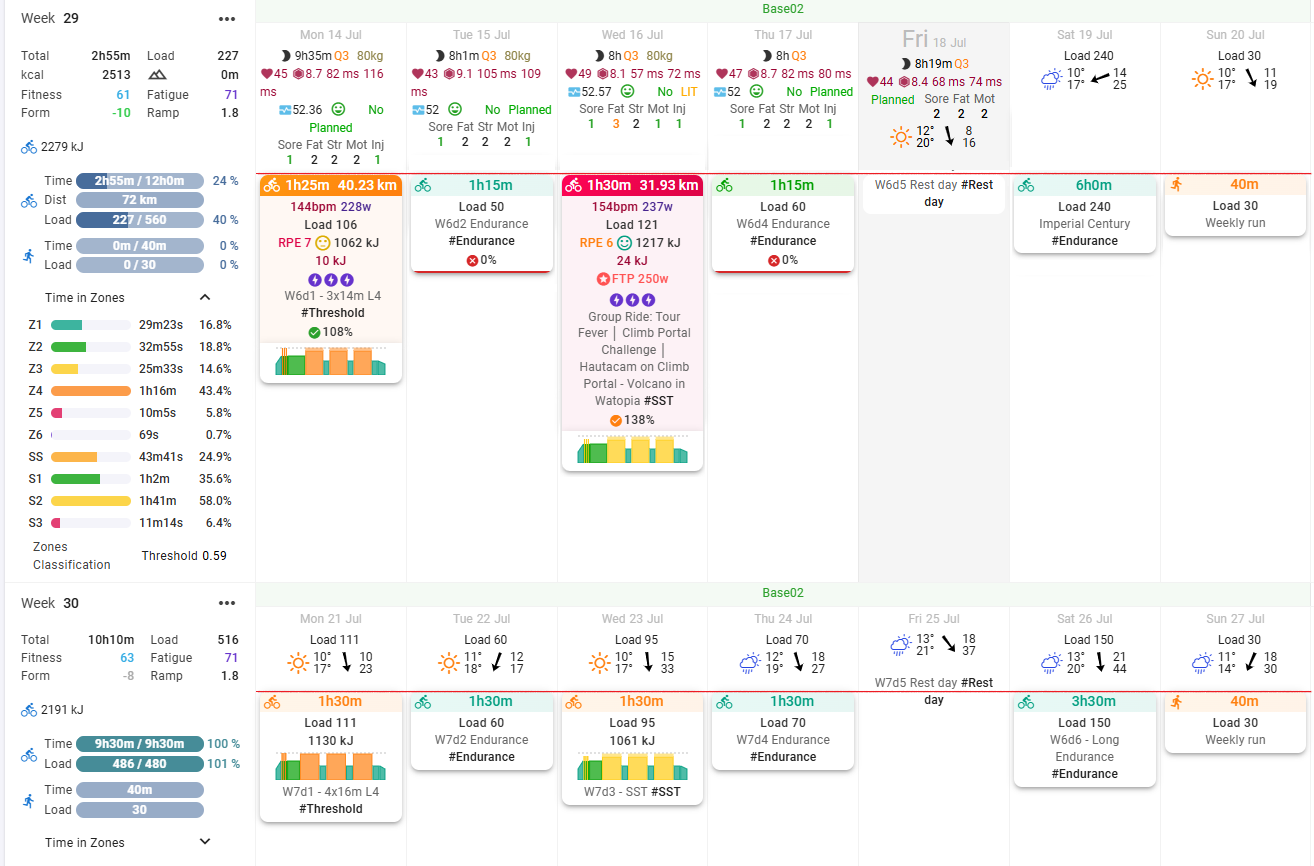
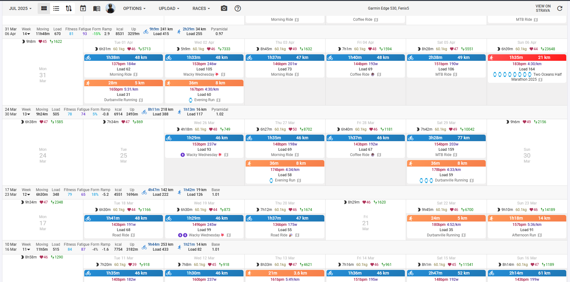
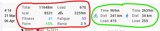
Not only did we do visual changes, but we’ve completely revamped how targets and “compliance to plan” are presented too. Now, instead of one number, your weekly targets will be displayed as progress bars for each sport type. This gives you a much clearer and more granular view of your targets and how you’re tracking against them across different activities. We believe this new format will make it much easier to visualize your progress and stay on top of your training.
We’re just putting the finishing touches on everything now and would like to get your feedback. So go check it out on https://beta.intervals.icu/ and tell us what you think.
Shout-out and a big thank you to everyone who provided feedback and suggestions on the new calendar view. I’ve reviewed and implemented some of the ideas. Keep them coming!
(This should probably be moved to a separate post, on reflection..)
On a very quick initial play, this looks awesome! Thanks for the work.
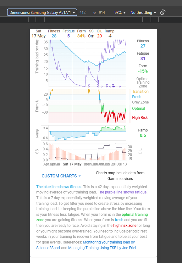
Would it be possible to revamp the space allocation/visibility of the explanation and values on right on the fitness page for mobile? Maybe set the bottom text to collapsed by default, use icons/colours for the right data (with the icons->text info just below the graphs)?
But additionally it is the only day with grey background. Could maybe be enough to “find” today.
Personally I must say, I like the current look of today better (Bold date, and a black frame around it with white background).
First, I want to say I really appreciate all the work that’s gone into this update. I know these design changes take considerable effort, and I’m grateful for the ongoing improvements to the platform. That said, here is some feedback after comparing both versions:
Zone duration values in week headers now match the font weight of zone labels (“Z1”, “Z2”, etc.) instead of being bold. This differs from other header fields where values and labels have distinct weights. The same applies to Zones Classification.
The gradient effects in graphs feel distracting compared to the previous solid colors.
Today’s date is harder to identify quickly without its previous solid border highlight.
Past calendar entries lack visual distinction since they now blend with the white day background instead of having a separate background color.
The color palette feels inconsistent with too many similar shades. Progress bar colors (green, blue, pink) don’t match other interface elements, creating visual discord.
Progress bars use identical colors whether showing 95%, 100%, or 120% completion, making it impossible to distinguish between these states at a glance.
The week header consumes significantly more vertical space—nearly double the previous version.
The overall design has too many competing visual elements that fragment attention when viewing the calendar.
The new look is very elegant — congratulations on the great work!
I got the impression that the weekly summary column is a bit unnecessarily wide. What do you think? Maybe it could be a few pixels narrower, but without cramming things too much.
It looks like it needs to be roughly this wide to support >10h time amounts. They might be able to scale it based on that, but that might get do weird things if it changes based on the week or when more past weeks load in.
In general, I like these changes. The actual/planned is something I was just thinking of before I saw this post.
The large font for today is nice to me; one of my monitors is lower contrast and I didn’t even notice the background was different, but I did notice the font size. The gradients for completed skylines to differentiate from planned is nice.
Not sure how I feel about the changes for mobile size screens yet.
My OCT (tendencies, not a disorder ) would like to see the workouts/activities section line up horizontally on the upper margin (if possible, please). I know there’s a lot of information in the section with wellness, weather, etc. Next week lines up relatively well when there’s a full week of weather showing. Not sure if limiting the wellness block to a max height with some of the wellness data showing that then opens to the larger view with all the information. Perhaps 5 metrics wide instead of 3. Same with the weather.
I use the compact calendar with the Week totals on top. I prefer the more compact bar from the current site. There is to much whitespace on the beta for me.
just started testing and for now I like most of the changes and my only fripe is the white shading on the workout graphs (I think it is eye tiring longterm) and left panel with stats is much less readable but ofc look more ellegant and nicer. I think it is partly due to the font change and overall nice look but much harder to read fast (it can be due to jsut new look and my eyes will get used to it who knows )
-small thing, the grey line dividing days (constructing the calendar) is whiter and much less visible which makes st the same time the left menu harder to read (the weeks are not divided enough I think)
oh one more thing on the left panel, I would really try to keep fitness form fatigue and ramp together in one column even if thath. means pushing all of the mto the right and load and eleveation to the right
ps. I’m just writing my thoughts, overall all changes are amazing!