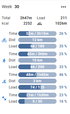
To be honest, I might be in a minority but I don’t think the progress bars add anything that I couldn’t get from just numbers.
If you click in empty space in the calendar, you get the add calendar entry dialog as before, but clicking the Close X does nothing. Clicking elsewhere works to dismiss it.
I hate the giant font for the current day. It looks scruffy, it doesn’t actually do a great job of highlighting the current day and it throws off alignment below even more than it already is. I far prefer the current method of highlighting the current day.
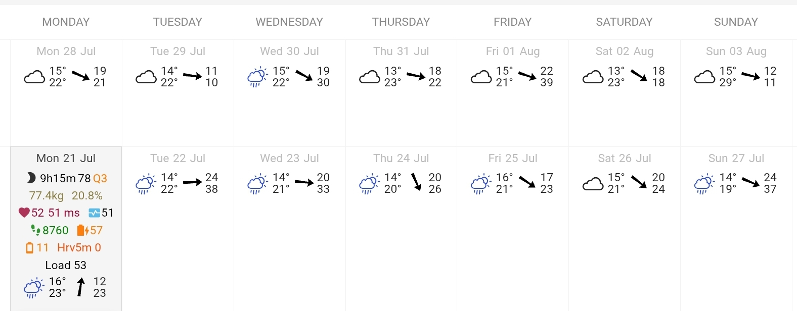
Don’t know if this is the place to put this request but…could the weather data and icons be added to days which have gone by, there is weather data for this week and next week and for this day but not for the previous days. I know I can find the data on the map of the activity, but it would be nice if you could see in a glance what the weather was the day of the activity.
It would make the look and feel of the interface more consistant too.
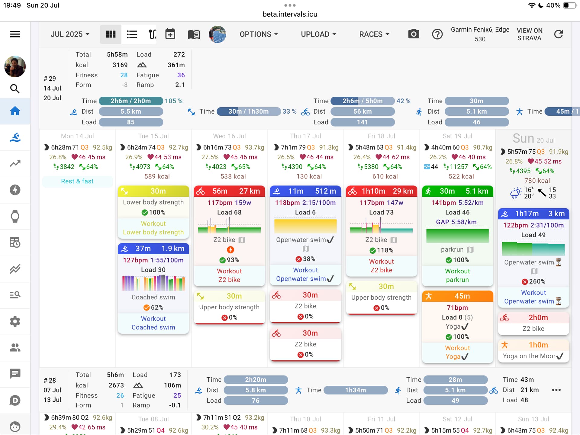
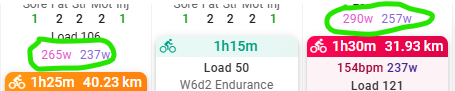
And there is some inconsitancy in the activity headers, too much spacing between icon, time and distance. Running is the most affected, you don’t see the distance anymore
I missing seeing the Training Style [Base, Pyramidal, Threshold, Polarized, etc] at a glance
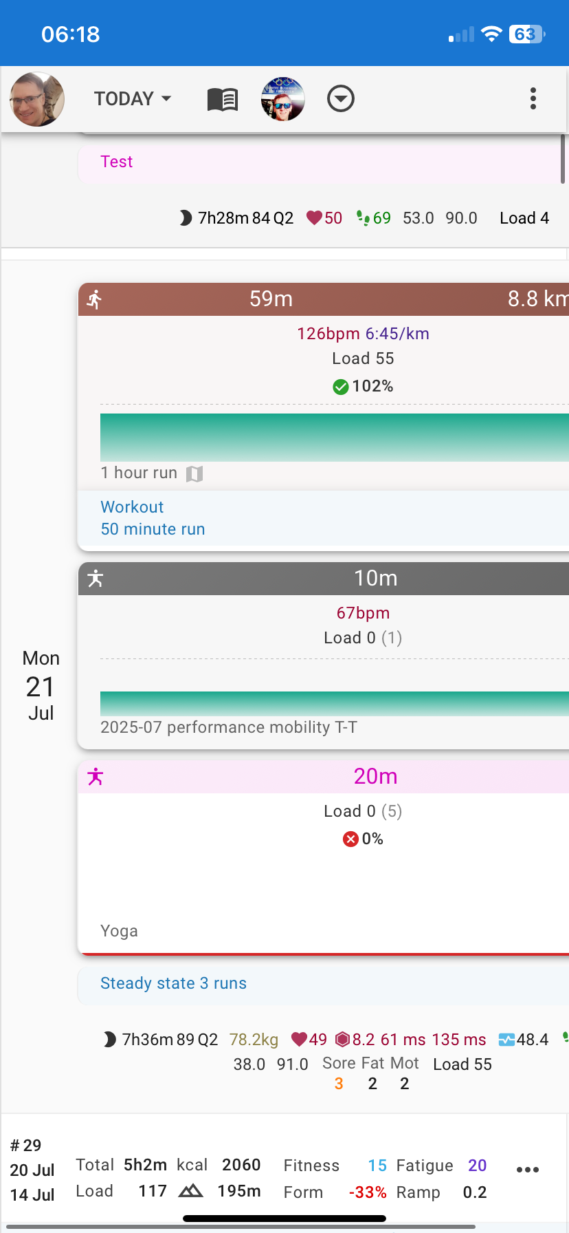
I have some weird bars on some weeks. “Others” has a progress bar which appears to be my “rest day” or “day off” or similar comment from my coach that I have 0% compliance with.
Additionally, when is v3 going live? I still see differences between them, and I’d like to not try to compare 3 sites further.
We might be able to do that at some point. That data is not currently stored so we would need to do that first. I agree it would be a nice feature.
Yes it is wider. We needed to space to fit in progress bars. Not many people understood the previous way of showing progress all in one number. This also exposes the targets feature that many people are likely unaware of. The sidebar is narrower now so not much impact on people who had that open.
That was fixed earlier today. Tx.
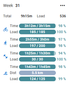
The idea is to reduce the complexity of the UI a bit by putting that behind the expander. But maybe we will replace the “Time in zones” text with that.
We will look at that “Other” bar.
V3 has been live for some time now. All the URLs apart from beta are serving the same version.
If you’re going to persist with the progress bars, can there be a way to disable the entire weekly totals section (so e.g. options to show on left, show on top, don’t show)?
It’s just so busy and distracting now and takes up so much space when using a tablet.
@david I notice on some workouts, it shows best power when hovering on it, and it matches the 5m and 20m power from the workout. It’s not a season best, and also not a personal best. Why does it show on some workouts, but not others, or in my case it doesn’t show on outside rides. This was from last week (Monday and Wednesday) if you need to check on my workouts.
On my mobile (Chrome on IOS on IPhone 11) the data at the top of the activities goes off the screen. I could zoom out but then the text gets quite small. I also find the wider spacing between pieces of information quite hard to read. For example run icon, 59 minutes, 8.8km are spaced across the entire width of the screen, which is harder to read than the old version which had them next to each other. Could they all be placed on the left side of the brown bar? In the first example below (old) all the key activity metrics are very close together
Also the activities tend to use more screen space now, so I get fewer activities showing on the same screen.
Thanks again for all the testing and suggestions. We made changes to how the “today” is highlighted and changed the layout in week summary “on top” view.
Working together with all of you, we were able to get this polished and ready. It’s starting to feel like it’s ready to be released soon.
This doesn’t mean development stops here - we’ll continue improving the calendar in the future as well. This is just one major push to get things where we want them.
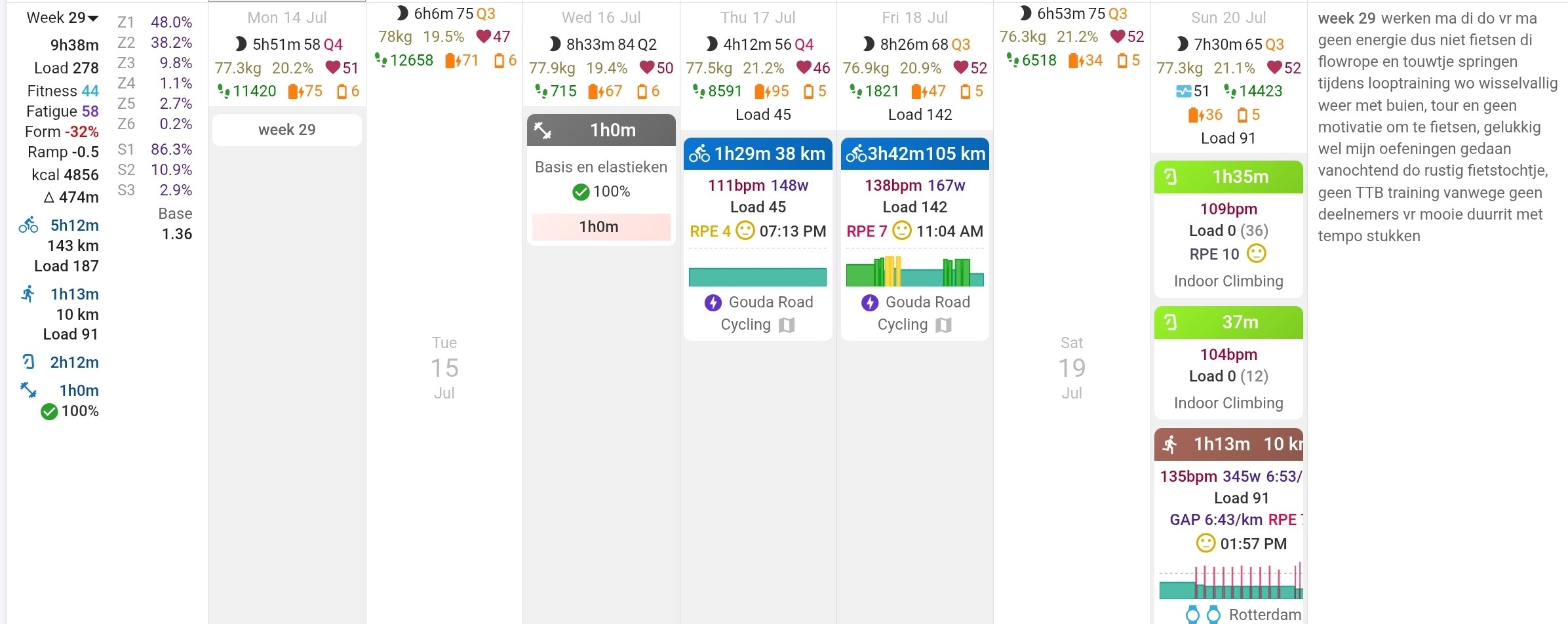
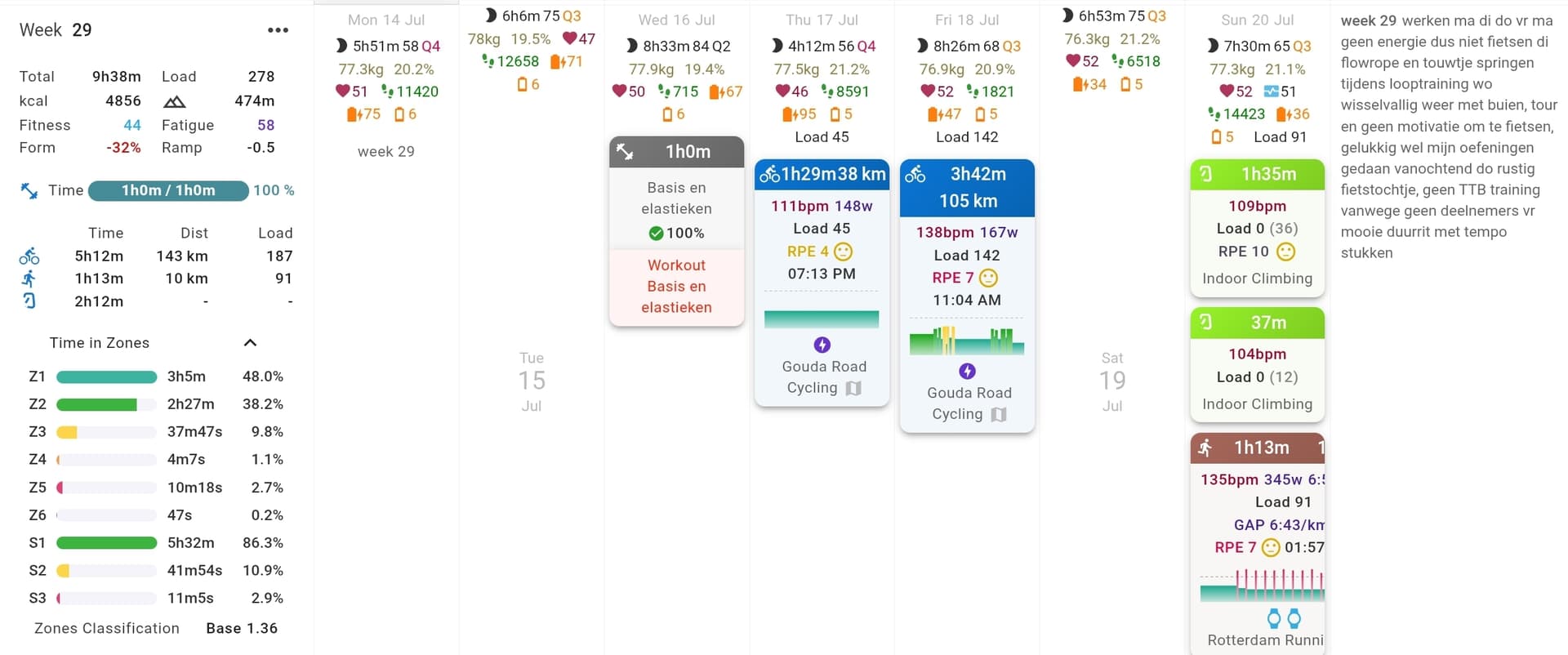
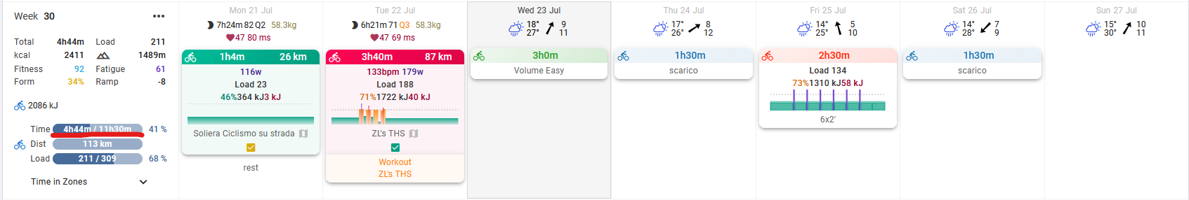
In the old layout, if I completed a workout in more time than planned, the “planned” time for the week would adjust accordingly, showing the correct value based on the volume already done and still to do. Now, with the new “time done / time planned” implementation, this no longer happens — and it’s quite frustrating. For example, you could see that the total planned time, considering the volume already completed, would be 13h14. With the new layout, this is no longer possible — you only see 4h44 done and 11h30 planned. The extra 40 minutes from Tuesday and 1h04 from Monday are not taken into account, which makes things quite inconvenient for me.
This is how TrainingPeaks works, and it was one of the features that made me prefer Intervals.icu for planning as well. Would it be possible to have an option to keep the old style?
Unfortunately very few people understood that behaviour and we think it was a mistake to do it that way. It doesn’t really make sense to change the planned figured based on your actuals so far. Maybe you did more early in the week because you know you won’t have time later? The new separate “actual vs planned” is something we hope people will be able to understand. You can choose to adjust the plan if you have decided to do more.
The “exploding width” bug should be fixed now.
We are looking at the other issues e.g. the “Yoga” tile being too high etc.. Tx for all the feedback.
I’ve noticed a small bug with the progress bar : for future weeks, the distance bar shows up for swimming activities although no target as been set. So these bars don’t behave the same way as for running and cycling (distance bar hidden when no target is set).
Same thing for the current week. Additionally, I think the way the distance bars appear with the actual distance ridden / run / swum makes it complicated to understand. Maybe the color makes it confusing? Maybe they should be in dark blue? Maybe they shouldn’t even be shown when no target is set?
About the colors, don’t you think that the past weeks’ progress bar should differentiate from the future weeks? As different things are being compared (completed vs target / planned vs target)? Maybe the same color pattern but with a different shading?
Finally, I’d really like to be able to choose in the options which progress bars are displayed and which aren’t (I never use distance targets and removing the distance bars would make it a lot easier to evaluate at a glance progress of current week and completion of past weeks.