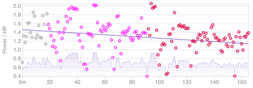
So all the blue dots are the power / HR ratios for each ride and the dotted line is the trend?
I am trying to figure out how to do something like this. Preferably by selecting and plotting “good” values for each ride so I don’t have to fill the screen with dots and plot a trend. I am starting with the 1 minute data points used to produce this plot:
These are already quite cleaned up and adjusted for HR lag. In addition I can keep only the ones with 60s of moving time. And then group them by zone. Initially I am looking at Z2 (169-230w). Here is a set of these points from one of my rides (a random hills and stuff effort). The index is the minute of the ride (zero start) and time is just that in secs:
index,time,watts,hr,ratio
5,360,201.0,125.0,1.61
7,480,175.0,137.0,1.28
10,660,176.0,140.0,1.26
11,720,181.0,136.0,1.33
12,780,219.0,141.0,1.55
13,840,173.0,136.0,1.27
14,900,171.0,135.0,1.27
https://pastebin.com/CbPTinkS
I want to try come up with an algorithm to select which points to use to create a “Power / HR ratio” value for Z2 for this ride.
- Exclude warmup (20m on this ride)
- Exclude any cool down
Other ideas:
- Only keep points from the 1st hour to avoid any decoupling effects?
- Only keep points that are part of consecutive sequence at least x minutes long (5 mins+?)
- Only use points around the middle of the zone (±5w, ratio at bottom is much lower than top)? What if ride doesn’t have any points near the middle? Don’t assign a value?
- Just average the whole lot? Or everything from the 1st hour?


