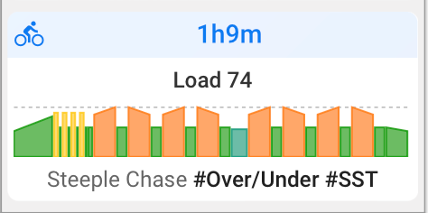
Just noticing the new colored interval charts on my home screen.
Those are incredibly helpful for at a glance workout evaluations.
Extremely good work!
Just noticing the new colored interval charts on my home screen.
Those are incredibly helpful for at a glance workout evaluations.
Extremely good work!
I don’t have this “workout” setting next to chart.
And the “chart” setting toggles the Fitness graph dialog on top of the activity calendar, but has not effect to the activity charts. I can only get rid of them by going to “minimal view”, otherwise they are always there.
Then, while this is really cool for structures training rides, it is really annoying for the everyday mobility sessions, gym power sessions, etc. (in fact even cycling to work, but that’s probably a harder to make distinction, I confess;-).
Thus, I would really like to be able to turn it on as a per sports setting, have it enabled for cycling and running in my case but not for anything else…
Oh, well – yes, of course! ![]()
I missed the redirect form the settings to “ colors”:-o Althiugh it’s clearly written above:-o
Thank you, once more, @david! Wonderful stuff ![]()
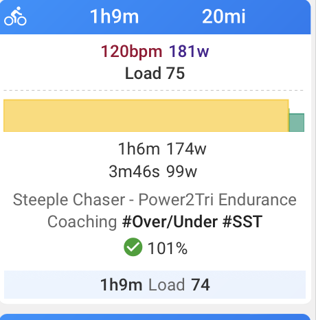
I’m really confused - all of a sudden I’m seeing differences in the prescribed workout, what is shown on the calendar after the workout and what’s in the file (see below). But basically, what’s shown on the calendar after seems to not reflect the workout that I did the work against. Within the file is fine. My previous workouts (like last week) weren’t doing this, the calendar would show the workout as completed. I’m not sure if I changed something unknowingly… any ideas?
The workout (before):

Displayed (after):

What’s shows in the file (after):
skyline charts works best based on Laps. It does look like you’ve not enabled LAPS but is using auto detecting. (hence I see the 1h6m @174w)
There’s also another reason which I can’t remember on how intervals will “merge” laps together IIRC.
I think someone did ask before.
How did you record the workout? Garmin, 3rd party app, eg. Zwift?
I think @app4g is correct when referencing the laps/steps are not embedded in the workout.
I’m not a fan of the skyline chart on the activities page (calendar layout), as I like to see the actual planned workout and then go into the workout to see the details. However, I do like the skyline in list view.
I’m assuming you know howto switch this on/off, based on the instructions from David above.
The skyline chart for a completed activity shows the intervals for the activity. These can be auto-detected based on power, manually edited or taken from the laps in the fit file. For Garmin devices controlling an indoor trainer the laps in the fit file match the workout steps so then using laps makes sense for the intervals.
To clarify: I performed the workout off both Zwift and my Garmin (with the workout loaded up). The file that’s associated with the originally programmed workout is the Garmin file (I deleted the Zwift file). What I believe to be the case is that previously if I completed a workout on my Garmin, it would show the skyline chart directly corresponding to the workout… from the second image above, it’s not doing that. In looking IN the activity it’s clear the workout is there w power and I’m compliant with the target (was in ERG)… so I’m confused why the skyline is no longer representative of the workout… not suggesting this is a bug, but I’m guessing maybe I changed a setting?
I’m getting some “negative feedback” regarding how completed workouts are loaded on the calendar. If I create a workout for one of my athletes and it’s completed, instead of matching to the planned workout it’s basically logging separately and creating a new workout… is that by design, a setting, a bug?
this should be the one i think.
And when the planned and completed don’t match due to x reasons, just drag and drop.
Can you please explain why some of my rides show a more detailed graph with power data figures and others show virtually nothing? Thank you.
YOur 2nd workout looks like a single interval, either that or the intervals are very close together in terms of HR/Power that it’s merged together.
More details in this thread above
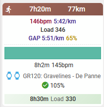
I have noticed that the summery graph on the calendar not always accurately reflects the detailed data of the activity.
Example:
summary: all blue-green (Z1)

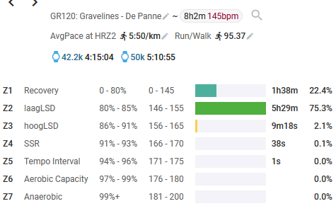
the HR detail of this activity shows mostly Z2, so I would have expected the summary graph to be the more green color (Z2)

The intervals setting for runs is HR:

Or do I miss something in my interpretation of this data?
Chart is based on intervals either detected or LAPs as denoted within the FIT file.
If the laps are very close to each other in terms of intensity / power / pace then it will all be lumped together.
That was not my question/remark.
There are no laps or intervals in this workout, it’s just one interval.
My question is why the color of the skyline chart doesn’t match the color of the dominant HR zone.
eyeballing - it says hr 145bpm and the color for 145bpm is the Z1 color.
Laps are based on average data. Hence in that sense, it’s the correct color.
You may be spending more time in Z2, but looks like overall, the entire interval was spent at Z1 HR of 145bpm
OK, I see.
Thanks!