Next time just ask ![]() I wasn’t planning to make this part of the API but I can’t change it now that there are millions of these charts so it is safe to use!
I wasn’t planning to make this part of the API but I can’t change it now that there are millions of these charts so it is safe to use!
Tx!! Will keep that in mind, tho due to time zone differences, when I want to ask, you’ll be sleeping and vice versa.
I was just browsing the API data returned and per-chance saw it. (else I was gonna manually get it via some other means)
I used “split” to carve the ride out into intervals and I now see more or less the chart I expected to see.
Thanks for clearing that up! I was struggling with it for days ![]()


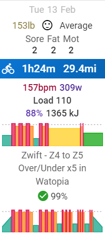
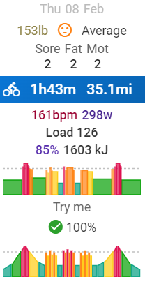
I love this feature but it doesn’t seem to be producing the expected results. In these two cases the rider had compliance scores of 99% and 100% but the skyline charts for the activities don’t look anything like the planned workouts. The workouts were created in the Workout Builder and exported to Zwift. Workouts are based on % of FTP.
Just a note for the skyline chart. The chart will utilise the averages of the intervals, hence for a ramp, it would show up as a flat bar instead.
compliance scores are based on actual Load and Duration vs planed load/duration.
There was a temporary HR glitch during the workout, but the power output matched the planned workout perfectly. The skyline chart looks as if it did not.
The skyline shows the avg for each defined/detected interval.
Define all intervals in the activity and the skyline will show exactly that. Ramps will look like a steady block with the interval avg.
The part about the ramps makes perfect sense. I reanalyzed the ride and it detected most of the intervals so the chart looks more like it should.
Fantastic
I would like the skyline in the activity detail page too. It helps particularly with outdoor rides (or any activity not associated with a workout file) to be quickly understood what kind of workout it most closely resembles.
Don’t you already see that in the intervals? The skyline chart is actually just the defined intervals.
You can simulate it using a custom chart with these settings:
You can even sort of simulate the ramps by using the interval trend option.
Is it possible to have a custom power chart where the power zone colors are solid over the entire lap/interval (like on the skyline chart) rather than come in horizontal color stripes (like on the standard 30s power chart)? ![]()
How do you do that?
when does intervals.icu try to detect intervals?
toady I finished a short virtual ride (with TranerDay if that matters), and I hoped to see some intervals on it, but none were detected.
In one of the post, can’t remember which from @MedTechCD, intervals are detected automatically via Power (not HR)
If you’re riding via TD, if TD segments the intervals data into LAPs, then there’s all there is to it. Just Use “Keep laps” and no need for auto interval detection.
Those intervals were a bit “easy” (mostly Z1 and Z2) compared to your FTP so they were ignored. If you do some tougher intervals like those (squarish) they should be detected.
I thought that might be the case.
I had a slight accident about a month ago, and I guess I didn’t do even one “proper” interval since, which would explain a lot ![]()
thanks again!
turns out TD does have the intervals as laps, and after checking “use laps for intervals” and reloading the activity everything looks like I hoped it would.
thank you for ur help!
quick followup question:
if I have “use laps for intervals” checked, and I upload an activity without laps (or rather all of it in one lap, I guess, technically), will intervals.icu auto detect intervals in it assuming I rode with a power meter?


