Activity skyline chart on the calendar

The calendar now shows a skyline plot of the intervals from each activity on the calendar. This gives a quick overview of what you did in the session.

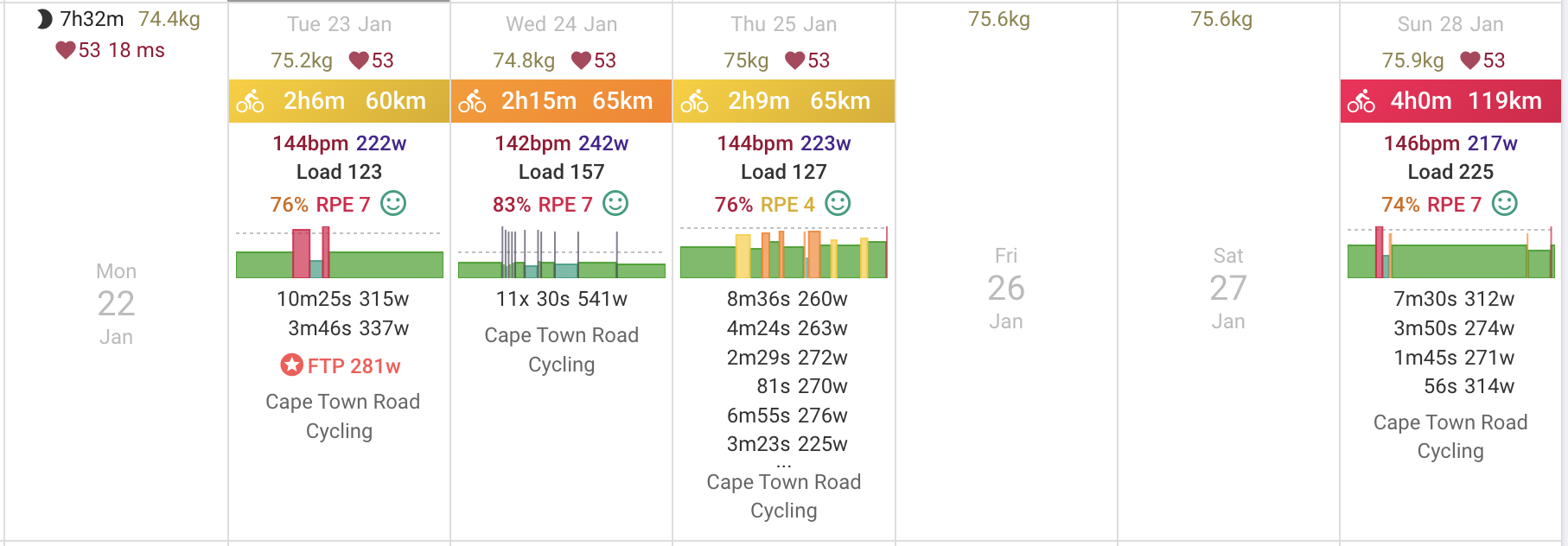
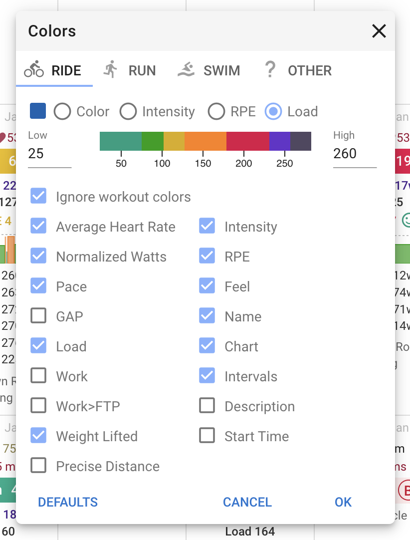
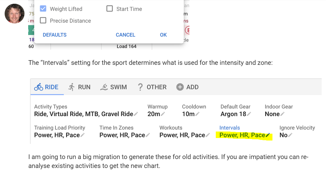
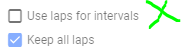
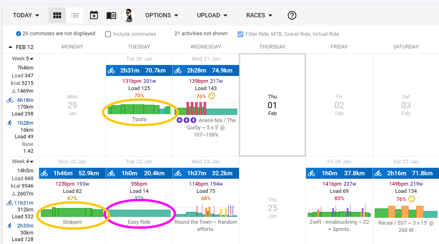
You can also compare it to the planned workout (if there is one). You can turn it on/off per sport (“Chart” checkbox) by doing Options → Colors on the calendar page:

The “Intervals” setting for the sport determines what is used for the intensity and zone:

I am going to run a big migration to generate these for old activities. If you are impatient you can re-analyse existing activities to get the new chart.

51 Likes

It only shows in Normal view, and not Compact, nor Minimal. On a mobile device, it should be in landscape view.

3 Likes

Does the roadmap for this include the ability to save the structure of the skyline chart as a workout for future reuse? I’ll be honest I can’t come up with a usecase for this outside of being able to “hack” saving zwift/TR/etc workouts into intervals, but it still seems like a natural extension of this.

1 Like

You can do that already. Just drag the activity and drop it onto a folder in your training library.

6 Likes

I am not sure the skyline for my session is entirely correct.

I did what I would consider a Z2-run (or even high Z1):

But it gets a skyline chart saying threshold?

Arg. It is because Intervals are set to Power, HR, Pace for running. And for some reason the Power zone score higher than the others:

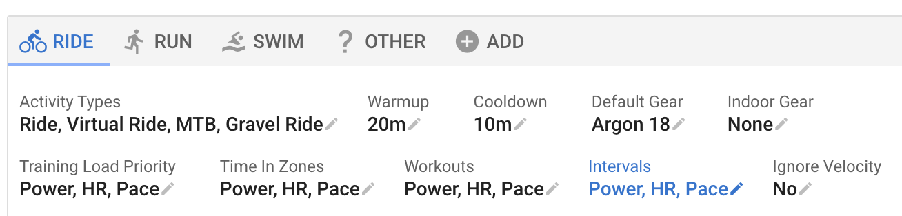
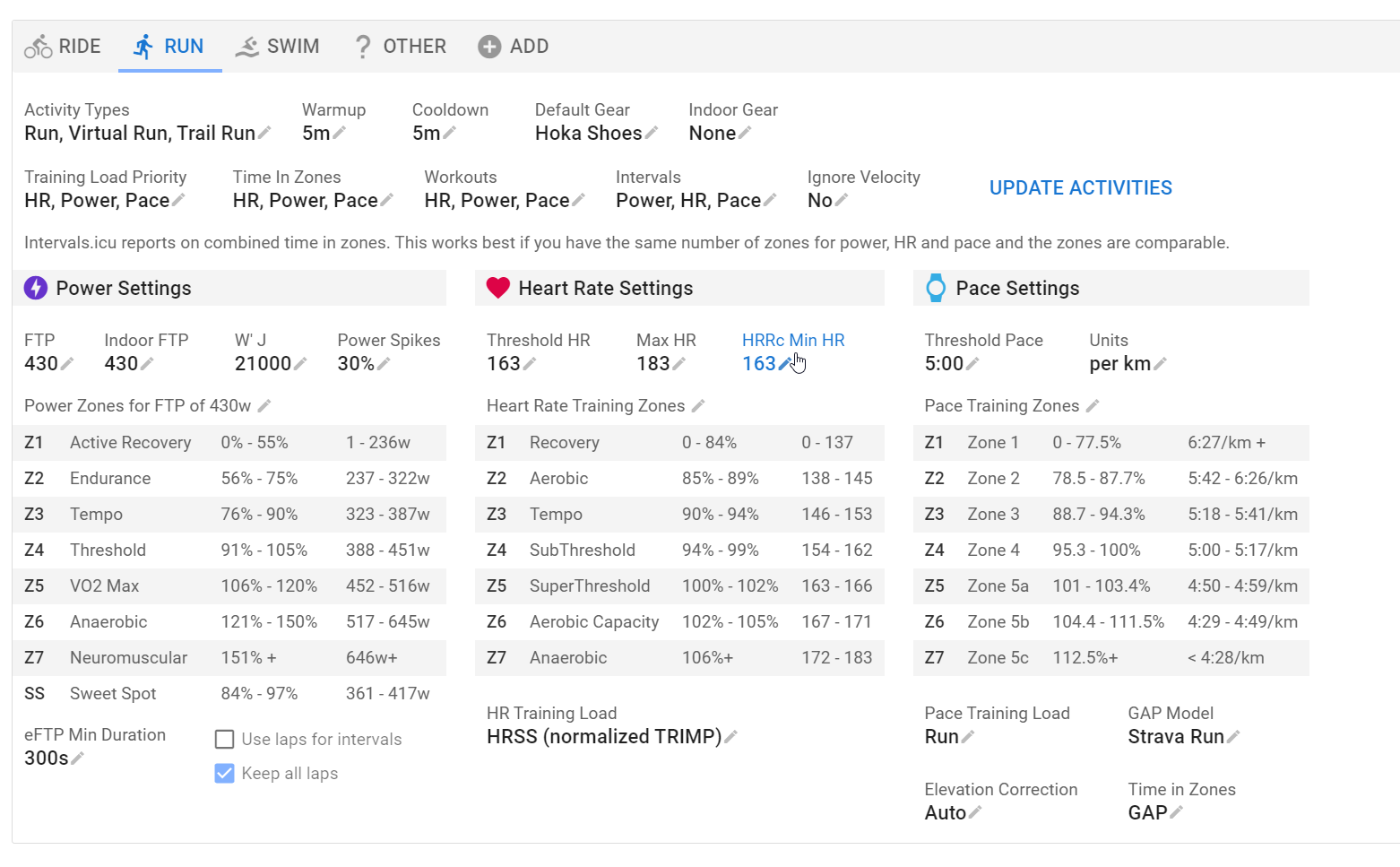
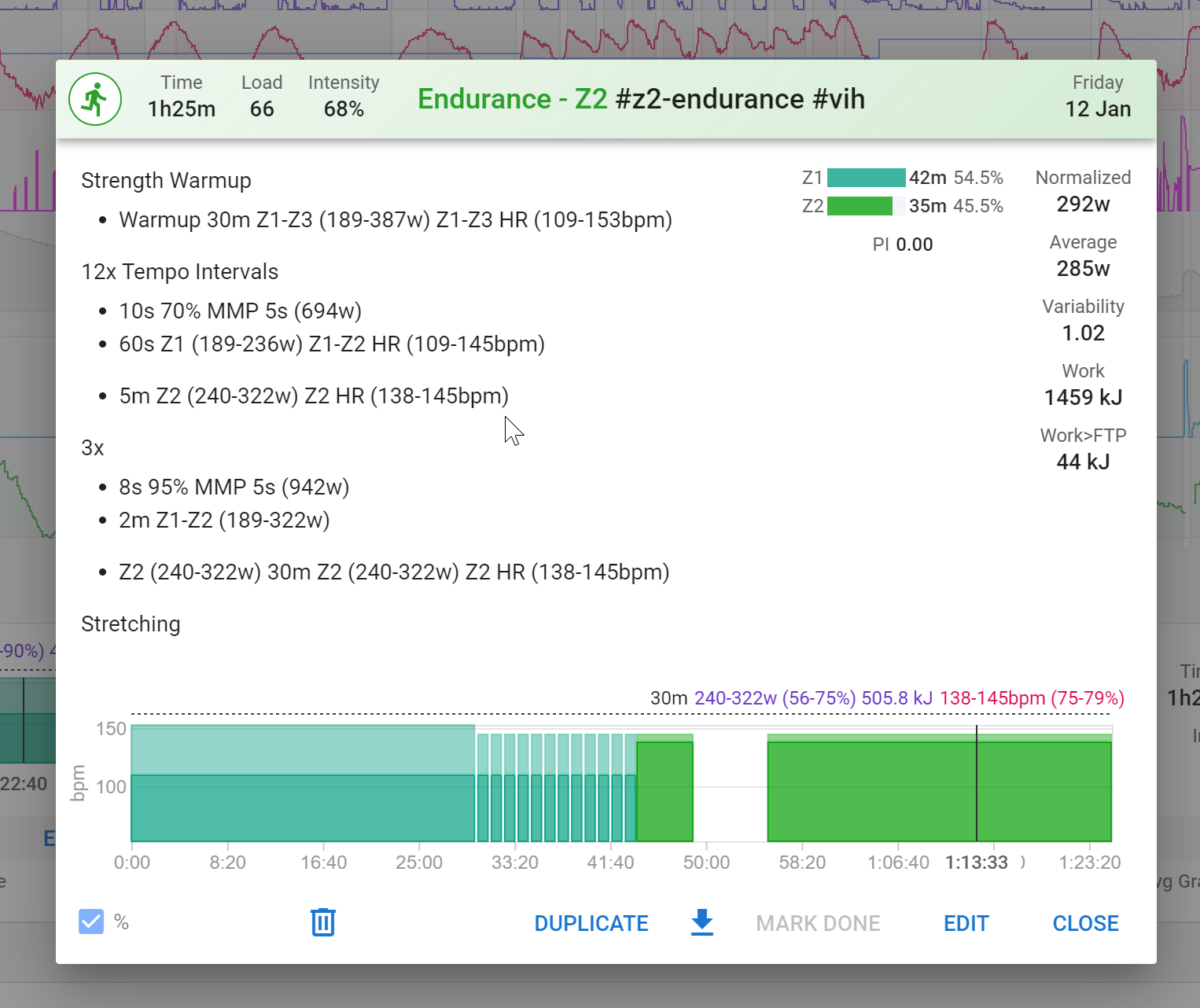
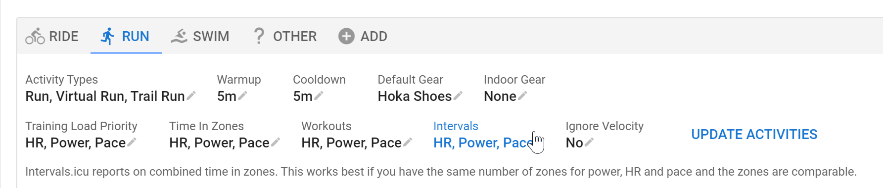
This defines what is used to base the skyline on.
If this is, as an example, HR priority, and you do a session based on Power, while your zones for HR and Power don’t match, the skyline will show something different.
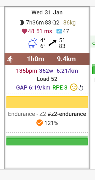
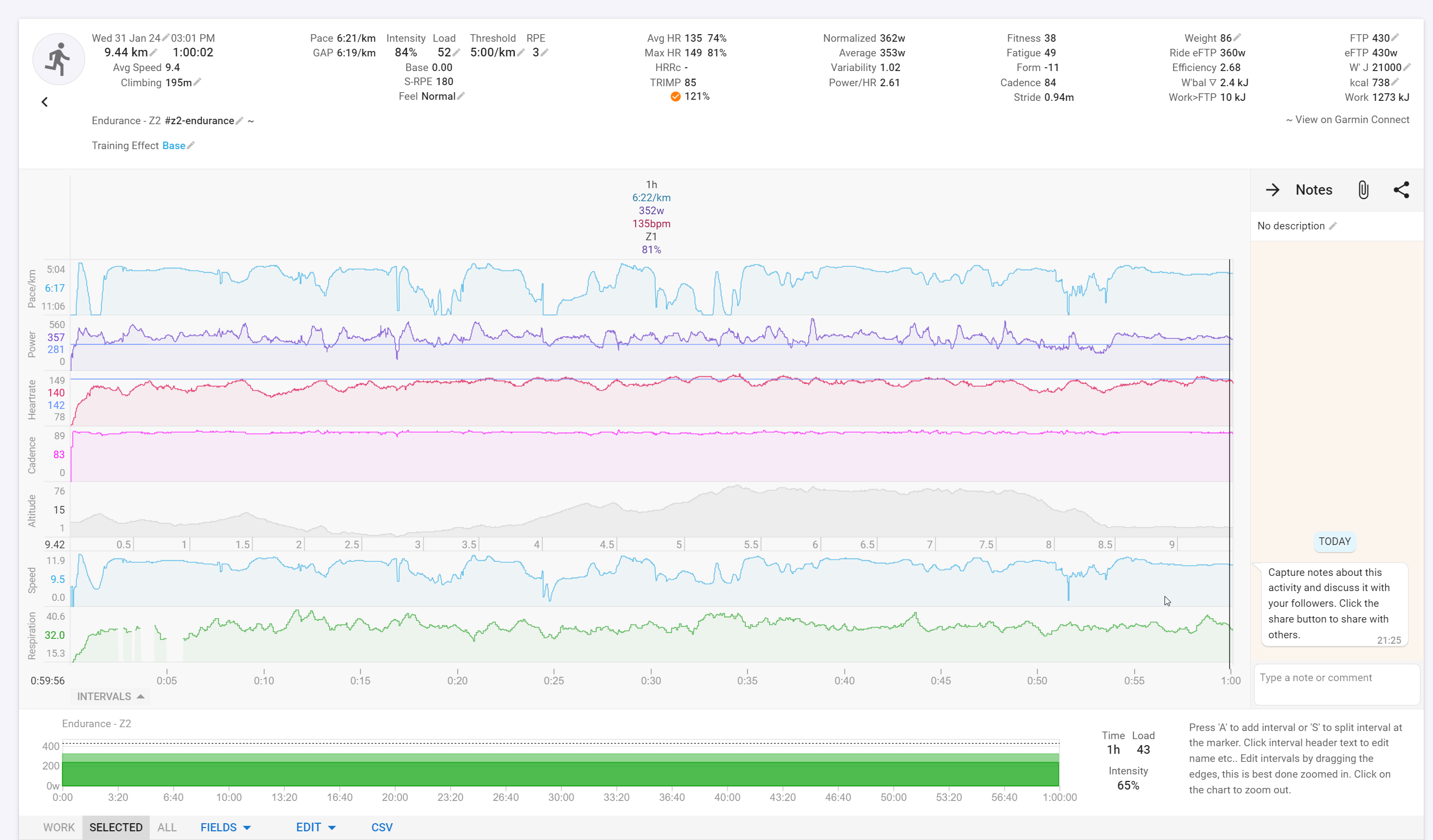
From your screenshot, the intensity shows 84%, which is clearly Z3 at least. Your session looks based on Power, so my initial guess is that you have the Intervals setting to something else. Probably HR, and your HR zones don’t match your Power zones.

1 Like

Thanks. I just realized that the setting might be off.
Even though I made a TT for setting all of the things at the same time, I think the Power Zones are not properly aligned. HR was fairly low for the entire run, so I think I have to tinker more with the Power Zones before using them for anything :confused:

Well color me tickled pink

2 Likes

very well done, appreciate you catched this low hanging fruit :cherries:

1 Like

That’s great. Thanks a lot! Super

This is amazing feature! It really helps me see at a glance what I’ve been doing on each week

1 Like

Thanks, looks great!

I have a question - why it does not show the intervals from my Rovy ride?

EDIT: I unchecked the “use laps for intervals” and now it shows. :+1:t3:

image

Thanks @david for this great new feature. As @David_R mentioned in another topic, it would be convenient to be able to hide the workout chart whenever the skyline plot is displayed (to avoid cluttering the calendar view with somewhat redundant charts). Is this something you could implement?
Thanks again!

1 Like

Mmm, so cool! Always liked how Strava displayed that in its Workout chart (and have been missing it on any other platform I’ve used).

Will add my 5¢ on reducing clutter… what about not displaying charts when there are no proper intervals - just a load of Z2?

I guess it would be fairly easy for activities with one or no intervals (like that in purple).

Bit harder for those with a bunch of random Z2 laps (marked with yellow)… maybe use the variability index? :thinking:

5 Likes

This is great - thanks. Is it/would it be possible to display this chart type on the Activity page?

1 Like

Nice feature!

beyond amazong feature!!! :smiling_face_with_three_hearts:

I think something happened to the chart showing planned workouts.

Previously I could write 70% MMP 5s - but it is not showing anymore on the chart?

Or is that because I changed this setting?

You can’t mix HR and Power. It must be all HR or all Power.