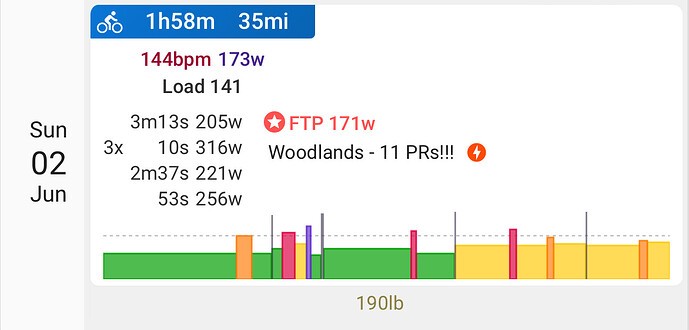
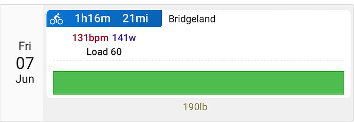
I’m getting some “negative feedback” regarding how completed workouts are loaded on the calendar. If I create a workout for one of my athletes and it’s completed, instead of matching to the planned workout it’s basically logging separately and creating a new workout… is that by design, a setting, a bug?
this should be the one i think.
And when the planned and completed don’t match due to x reasons, just drag and drop.
Can you please explain why some of my rides show a more detailed graph with power data figures and others show virtually nothing? Thank you.
YOur 2nd workout looks like a single interval, either that or the intervals are very close together in terms of HR/Power that it’s merged together.
More details in this thread above
I have noticed that the summery graph on the calendar not always accurately reflects the detailed data of the activity.
Example:
summary: all blue-green (Z1)
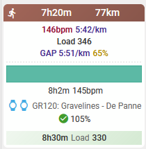
the HR detail of this activity shows mostly Z2, so I would have expected the summary graph to be the more green color (Z2)
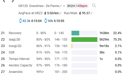
The intervals setting for runs is HR:

Or do I miss something in my interpretation of this data?
Chart is based on intervals either detected or LAPs as denoted within the FIT file.
If the laps are very close to each other in terms of intensity / power / pace then it will all be lumped together.
That was not my question/remark.
There are no laps or intervals in this workout, it’s just one interval.
My question is why the color of the skyline chart doesn’t match the color of the dominant HR zone.
eyeballing - it says hr 145bpm and the color for 145bpm is the Z1 color.
Laps are based on average data. Hence in that sense, it’s the correct color.
You may be spending more time in Z2, but looks like overall, the entire interval was spent at Z1 HR of 145bpm
OK, I see.
Thanks!
Hi,
I don’t know if I’m in the right topic to ask this question (sorry if not), but is there a way to customize the activity view?
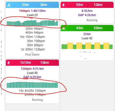
For bike workout you see power data in the overview. Is it possible to see pace data for swim workouts and running instead of heart rate?
I’ve moved your query here.
On the settings screen for the given activity type, ensure that the Intervals setting has Pace first.

