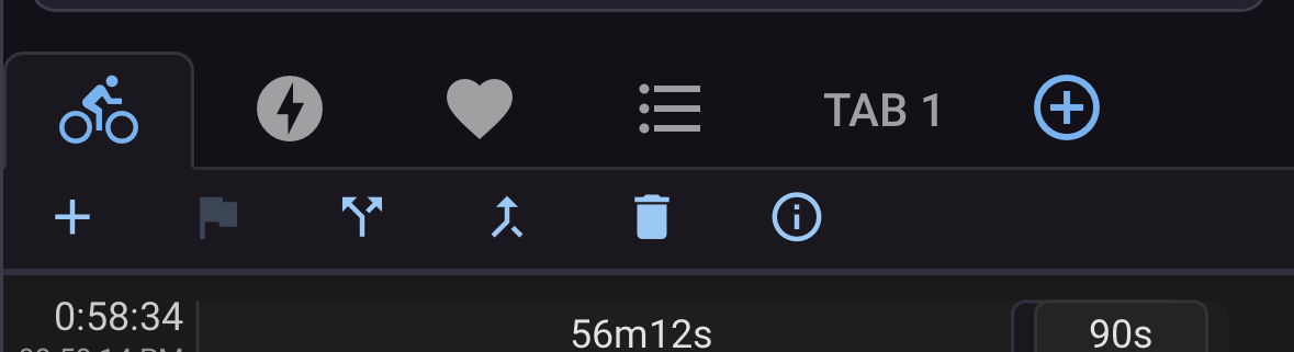
The activity page has been reworked
Hi all 
We have been busy with another big UI rework, this time on the activity page. We’ll gradually apply this new button layout (parts of it) across the other pages as well.
The problem and the solution
The activity page has grown a lot of buttons over the years. Every list of things you could change had a button of its own under the charts, on the bottom of the page. This is a rework of that: one place to change what the page shows, one place to act on it, and a page that reads as a stack of sections rather than a run of charts and tables.

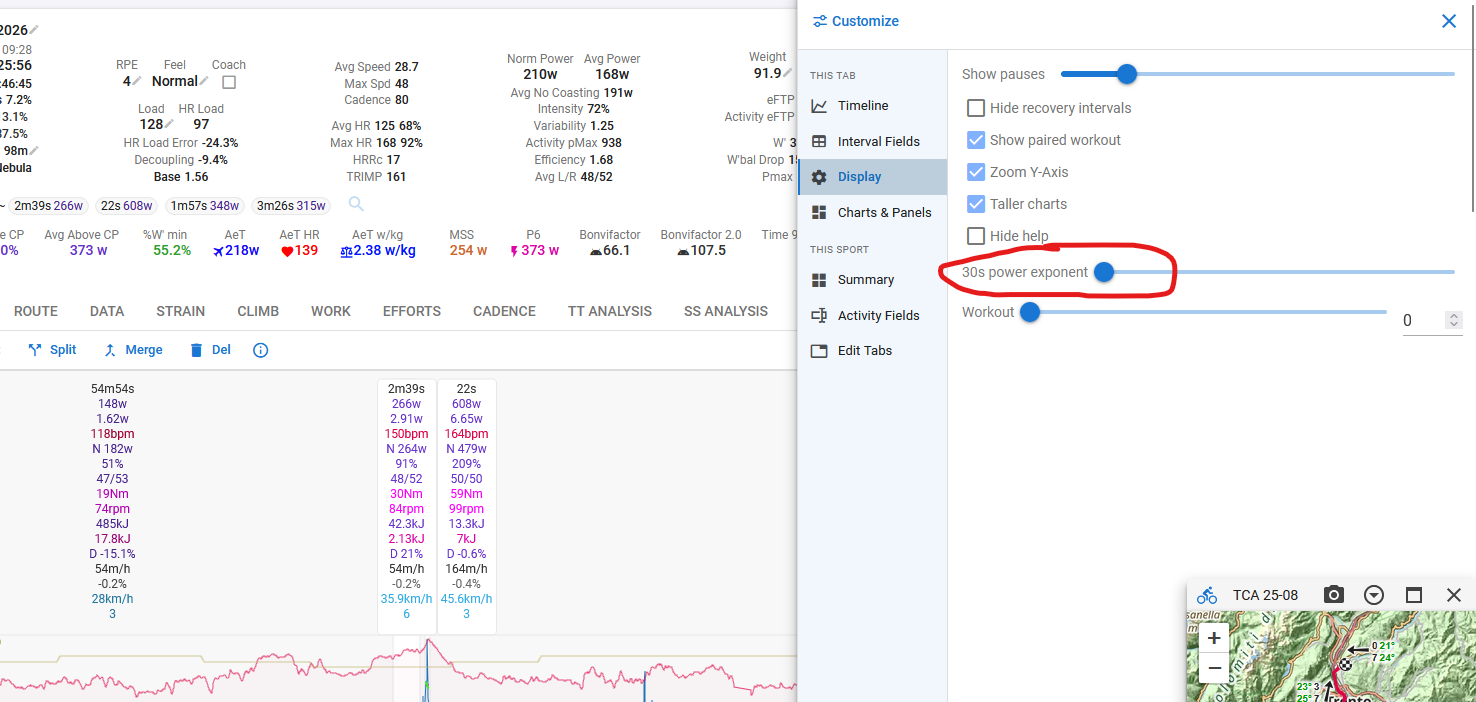
One Customize button
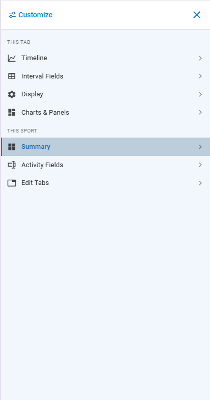
Timeline graphs, interval fields, display options, the summary panel, activity fields, charts & panels and your own tabs are all in one drawer now, and it customises the tab you are on.
The sections are grouped by what they change. This tab is what you see on the tab in front of you; This sport applies to every activity of that sport.
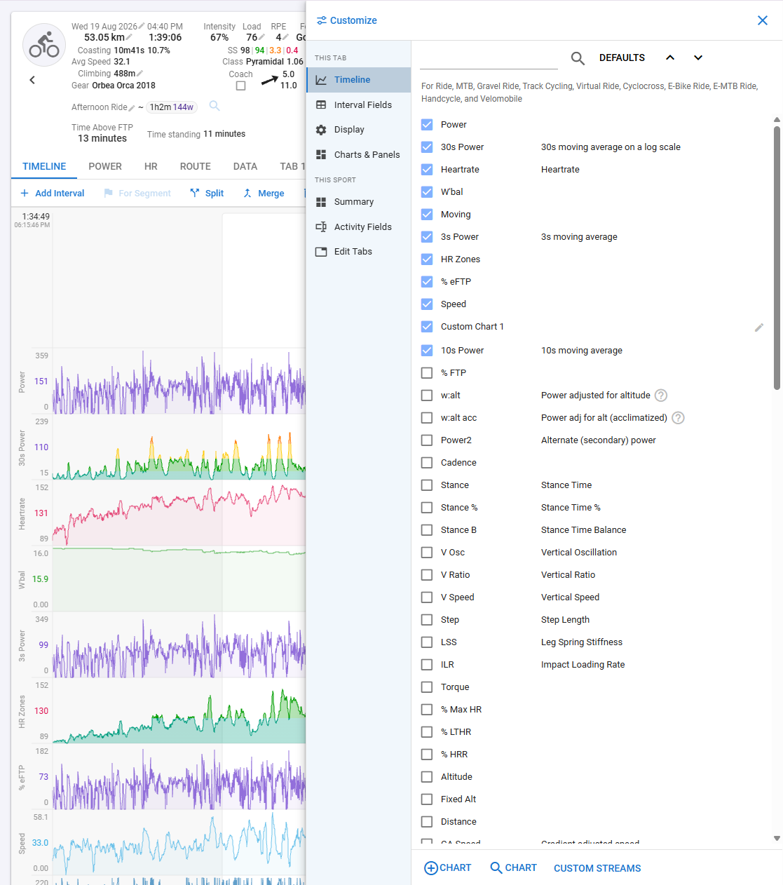
Each section says what it applies to, because that was never obvious: the timeline’s charts and interval fields are kept per sport category, while the summary, activity fields and charts & panels follow your sport settings.
Notes
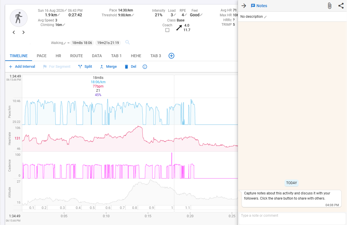
The activity chat is a drawer instead of a panel squeezing the chart, and it is reachable from every tab rather than only the timeline. It opens by itself when you arrive at an activity that has unread notes; a note arriving while you are reading no longer jumps over what you are looking at, the badge tells you instead.
On a phone
Map, Notes, Customize, Screenshot and Actions are on a floating button where your thumb is, and the seventeen Actions items are a drawer rather than a menu the length of the screen. The unread note badge rides on the button too.
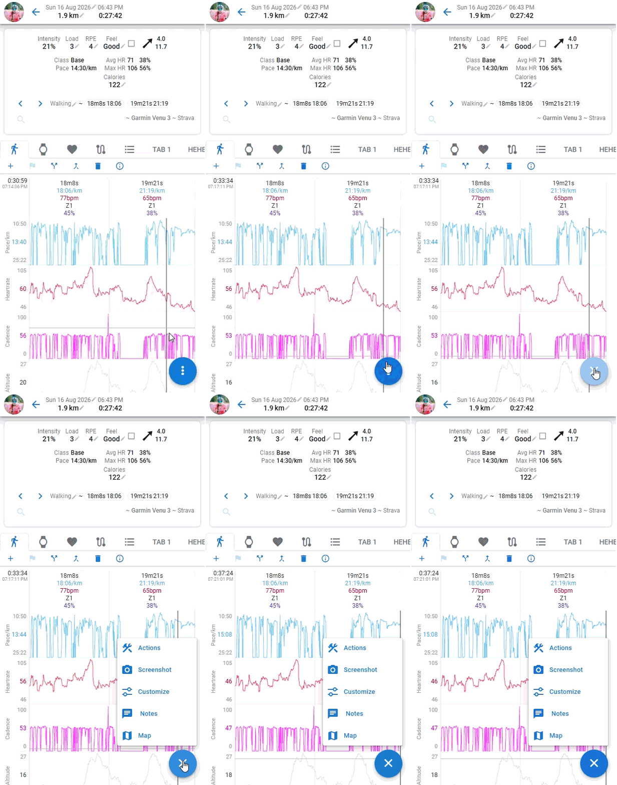
Android Back closes an open drawer instead of leaving the activity — including the notes drawer when it opened itself.
The interval buttons
Add Interval, For Segment, Split, Merge and Del have a row of their own now, directly under the tabs and above the chart they work on. They used to share that row with Map, Charts, Fields, Screenshot and the rest — a line where half the buttons edited the activity and half changed what the page showed, all looking alike. The ones that changed the page have gone to Customize and to the tab row. What is left is what you press while you are looking at the chart, with Actions at the end of the row where it has always been.
It speaks more quietly than it did: one height, small, and the keyboard shortcuts have moved off the
buttons into their tooltips — (A), (S), (M) and (D) still work, they just no longer take up room on
every button. The chart’s help text is behind the i button beside them.
Below the timeline charts
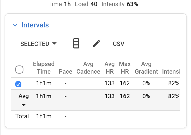
Intervals and Charts & panels each sit on a card with a heading, which is the card the summary already becomes on a phone.
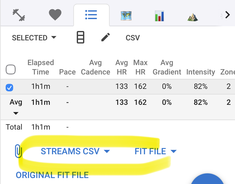
Work / Selected / All / Recovery is the same control it was just different colors, on a phone it becomes a menu, because four segments and the three buttons beside them do not fit a phone’s width.
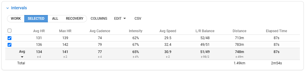
The button beside the filter renamed to Columns from Fields, and it is the interval table’s columns — a different list from the drawer’s Interval Fields section, which is what the timeline chart draws on its interval bars. Those two have always been separate lists; now they are separately named.
The interval table also scrolls inside its own card instead of making the whole page scroll sideways, which is what stopped you dragging it on a phone.
Fix that came with it
The interval table opens on Selected and picks your work intervals when an activity has none selected. It looked for them while it was still being set up, before the intervals had loaded, and nothing selected them when they arrived — so Selected showed an empty table on every activity whose intervals you had not picked yourself.
Bits and pieces
-
The tab row scrolls under the page’s buttons, so no number of your own tabs can push them off, and it has arrows for a mouse.
-
On a phone the selected tab is drawn as a folder tab, and the summary is a card on the page.
-
Screenshot moved into the Actions menu on the timeline tab; the other tabs keep the button they had.
As always, tell us what is broken and what you miss and please tell us if you like these changes