Same issue here as well. I have duplicate entries for one activity and cannot delete the ones I don’t want.
Edit: it was working fine before this update
Same issue here as well. I have duplicate entries for one activity and cannot delete the ones I don’t want.
Edit: it was working fine before this update
The trash bin symbol is for deleting intervals.
If you want to delete the activity, use the three dots symbol.
At the moment there is a bug that deleting is not working on mobile, but I am sure @eva will fix this soon. For the moment you can delete from the activity list view as a workaround.
Thanks for the bug reports! A fix has been deployed, hard reload your browser or if you are using the installed PWA app, check updates under settings and try again.
This update also fixes the issue with re-analyzing activity with mobile and the summary edit dialog issue (open it twice, the app goes back to calendar)
The interval shortcut keys are working like they used to be.
The single click resets the zoom (which fitness page doesn’t have). If we wanted to implement locking the marker, our options are:
What would you prefer? Or leave it as is?
Ah, right, I forgot about the zoom.
I think I prefer: Click/touch locks only if the timeline is not zoomed in.
100%. This is intuitive, consistent with many other platforms across different segments, and also solves the problem of accidentally zooming out.
What he means, is that the Key clue is no longer there. Add (A), etc.
Found that’s impossible to delete empty Tabs
Yes please.
Please don’t make user interactions ambiguous (Two functions with same interaction, depending on some kind of state).
Yep! That took care of the issue!! Thanks!!
Thank you, I discovered this on mobile a couple days ago. Much better on my iPhone.
Hi, I love the new mobile look, it’s a huge improvement!
However, I’ve run into a usability issue in landscape (horizontal) mode, as shown in the attached screenshots. The iPhone notch is covering critical parts of the UI:
This is quite annoying. It would be fantastic if you could add a little extra space, specifically, side padding or safe area insets in landscape mode to push the content inward and clear of the notch. This will ensure that all key navigation elements are always visible.
Thanks!
The new Activity Page looks cleaner, but as a coach I am concerned about the new Notes/chat workflow.
I understand that Notes opens automatically when there are unread messages, but coaches often need to review and comment on an activity even when the athlete has not written anything. Previously, the chat was always visible next to the timeline. I could see the athlete’s feedback and immediately type or dictate my analysis without hiding the charts.
Now I need to open Notes, click into the editor, write and send the comment, close the drawer, and then mark the activity as reviewed. The drawer also covers around 25-30% of the timeline, which makes analysis harder.
For an athlete reviewing one activity, this may be a minor issue. For a coach reviewing dozens of activities every day, the extra clicks add up quickly. Could we have an option to pin Notes beside the timeline without covering it, or keep a small, always-visible chat near Summary?
The new UI looks great. However, the camera / picture icon is gone. It still exists on the Map screen but seems to have gone missing from the Activity page. Low priority request, but would love to have it back. Overall I really like the updates - keep up the great work!
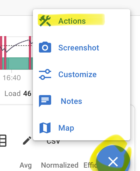
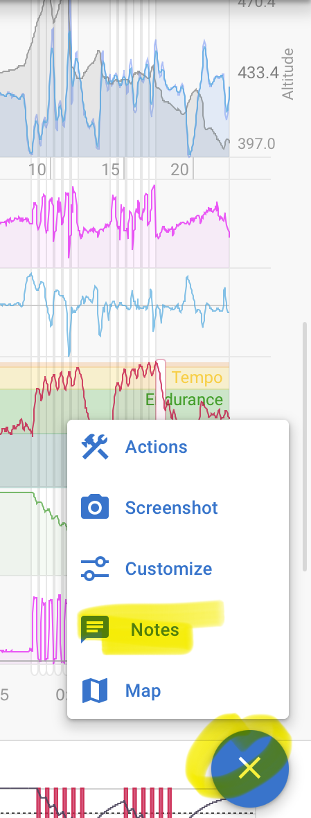
It’s in the three dots menu or action button
As an athlete I feel the same. I’ve had a coach and always wanted to view the coach notes at the same time as the activity timeline. Same when opening my own notes. That is not possible now, part of the timeline is covered making it impossible to zoom into late intervals without closing the notes.
Hey guys, wanted to just bring something up because with the new UI.
Video Dropbox
It’s impossible on a mobile device to get to the notes section to add anything after your workout.
It basically is crowded out with all of the new editing tools that are crowding out the space. The only way you can possibly get to it is to turn it landscape. Is there another way to reach this?
I’m using an iOS 15 Pro, and like to narrate my training notes using my iPhone right after a session. At this point, its a PITA. Only work around other than landscape, which is still a workaround 0 So is wait till I get home on the desktop, really not an ideal use case.
It would be nice if the rest of the page would shrink when Notes is displayed, and then expand again when you hide it. That way you could still see the entire activity when using Notes