(here is the link )
I envisage the data points to be intervals from an activity range which meet certain criteria.
Alternative question: can I export the interval data of all activities so I can do the post-processing elsewhere?
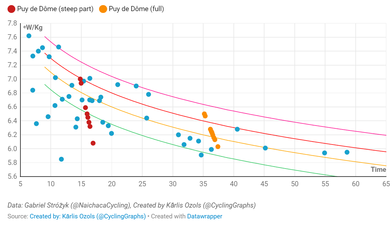
PS: How are 7W/kg for 15 minutes even remotely possible
If you isolate the climb by cropping the activity and set the Options on the Activity Power page to show W/Kg on the PDC curve, you should get something very similar.
But drawing this kind of charts from a set of select intervals is not possible at this time I’m affraid.
It is almost unhuman. But analysis discussion points out that diet has been the major factor for performance improvement over the last 5-10 years. All teams have a diet specialist on board now and what/how much/at what time they eat/drink, is followed up in great detail.
The story of marginal gains goes on…
I can assure you that the top Pros are climbing at about 6W/Kg on the 8-9% gradients, and not >6.8W/Kg as being reported in the media. This comes from a coach that is on one of the teams currently in the top 3, and has worked at another Tour winning team this decade.
Unfortunately it is not possible to build that chart directly in Intervals.icu yet. I need to do “custom Plotly fitness charts” for that. Definitely keen to make it possible.
You could do it using the API. Label the interval the same on all the activities so you can identify it in the activity.icu_intervals list and pull the time, average power and so on from there. Weight is on each activity.