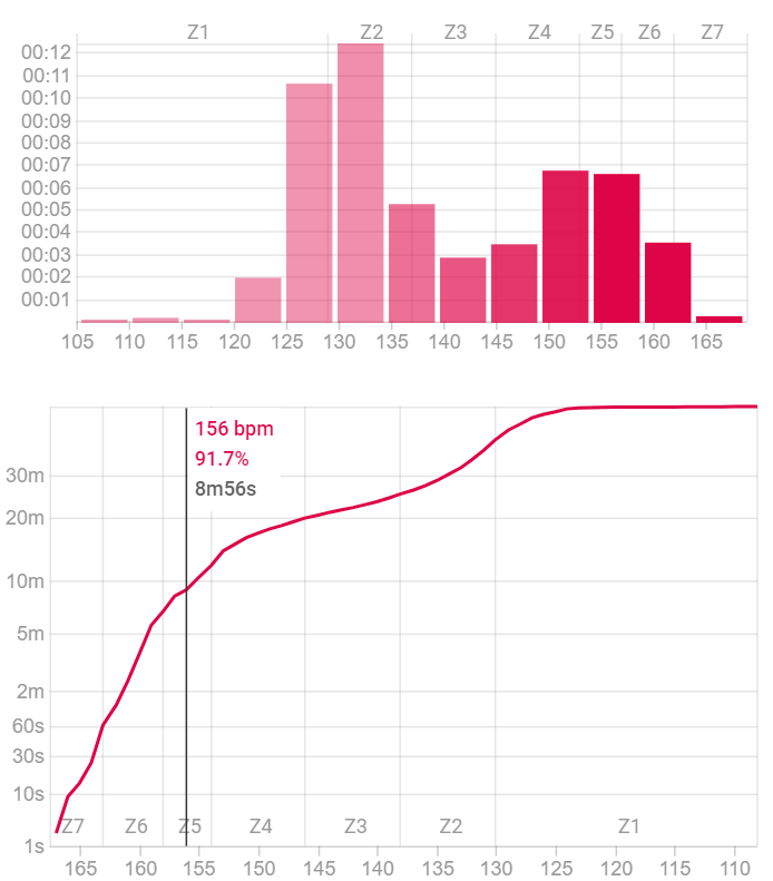
Useful to check that your VO2 max intervals are working!
This is part of the accompanying text below the Cumulative Time vs HR graph. Curious, if someone could give me an explanation.
Useful to check that your VO2 max intervals are working!
This is part of the accompanying text below the Cumulative Time vs HR graph. Curious, if someone could give me an explanation.
As that zone is defined as 5 and up (105% - 120% of threshold) you could see if your VO2Max interval’s HR falls within the right zone. Or, if your zone setting needs adapting I suppose…
@Cyclopaat has it right. VO2 max power zone work should give you a very high HR like 95%+ of HR max. The goal is to have high power but also a long time at high HR. So for me I have found the “hard start” method works well. I might do the first 60s of a 4m interval at a power a bit higher than I can sustain for 4m. The average power is only a couple of watts lower but I spend more time at 95%+ HR. The chart is useful to see that.
Thanks for the replies. I guess I was overthinking it  instead of taking it at face value.
@david I too prefer hard start to get the HR up and then settle in for the duration.
I am having the same question. This statement “Useful to check …” still puzzles me.
More exactly: what is the exact benefit that this very graph gives? I (think I) can judge what zones I have been exercising in way better with the bar chart right above the chart in question. That one shows very nicely the amount spent in each zone. What am I overlooking?
Have attached a screenshot of todays interval running session for clarity…
Cheers!
Well one way to measure how well your vo2max intervals went is how much time you ended up spending above say 90% of max HR. That is easy to read off the graph.