Hi,
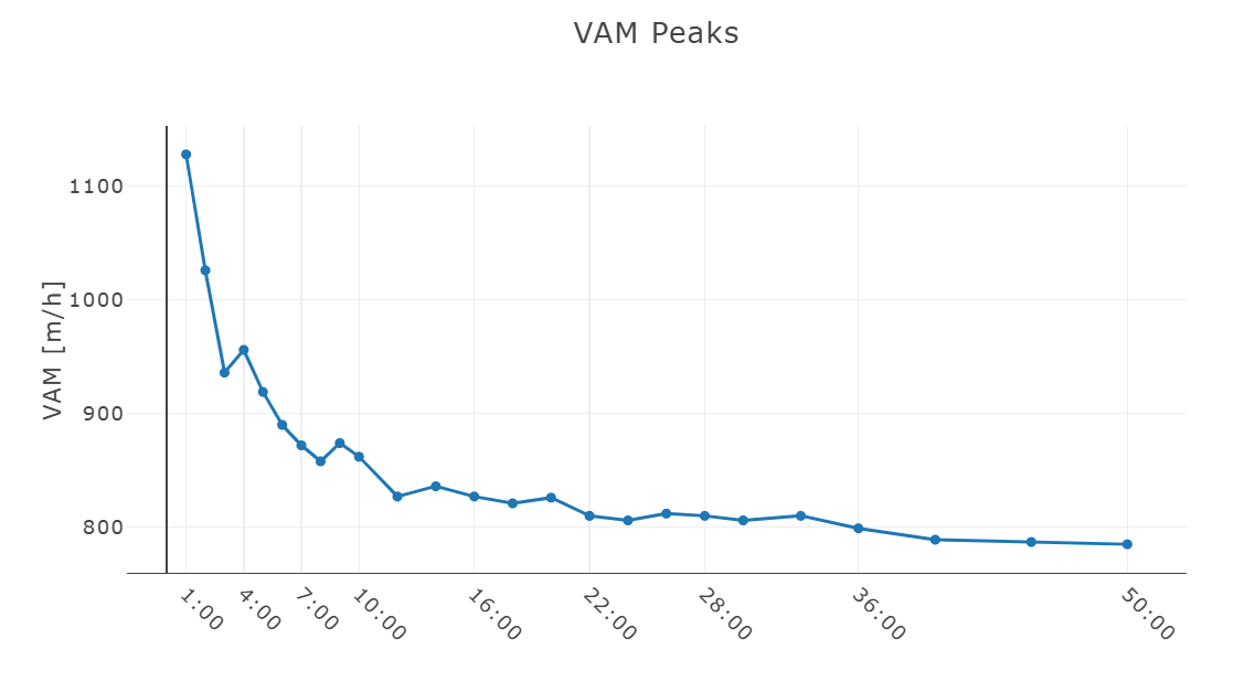
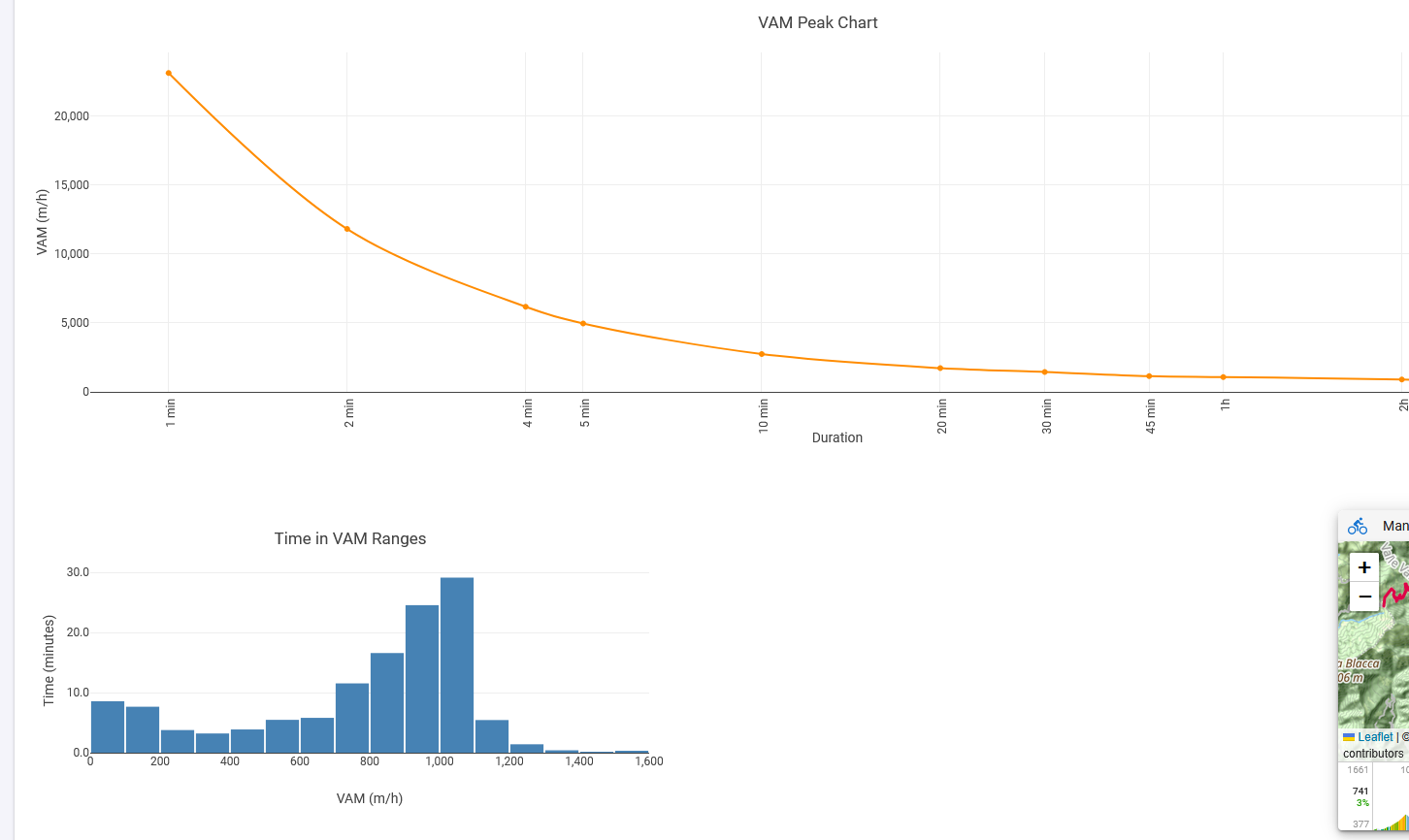
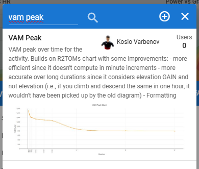
Is it possible to create a graph like the one attached (VAM Peaks, showing the best vertical ascent rates over different time intervals) for an activity in Intervals?
If yes, how can I generate such a chart?
Thanks!
Hi,
Is it possible to create a graph like the one attached (VAM Peaks, showing the best vertical ascent rates over different time intervals) for an activity in Intervals?
If yes, how can I generate such a chart?
Thanks!
perhaps @R2Tom knows that
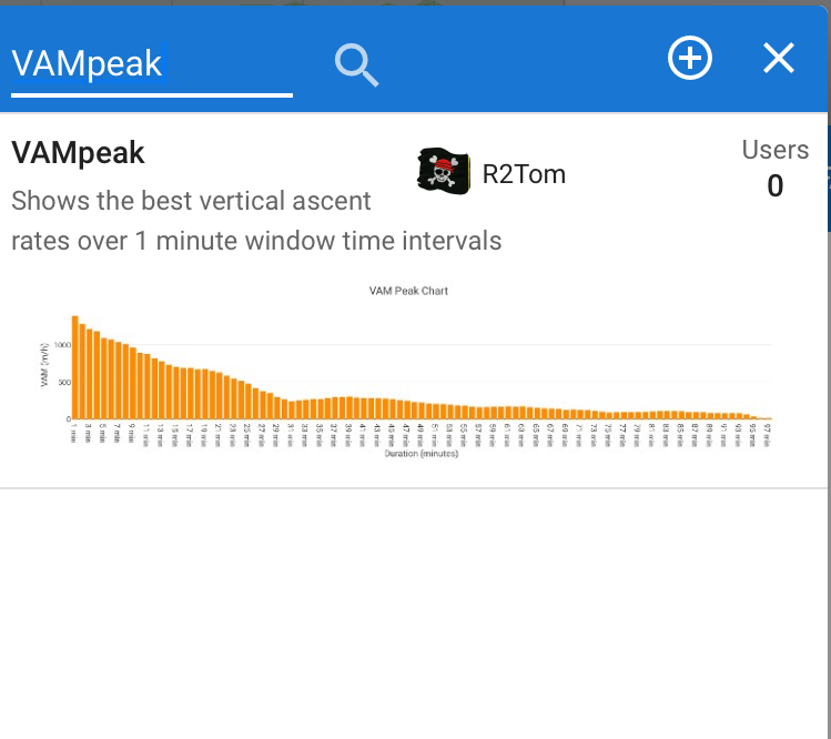
Could be possible. Did a quick hack ![]()
Search for ‚VAMpeak‘
Not perfect, but should be working for the moment ![]()
Hey @R2Tom,
very cool, thanks for your work! ![]()
But unfortunately, I think something isn’t working quite right. ![]()
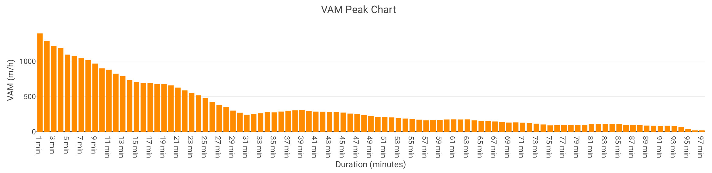
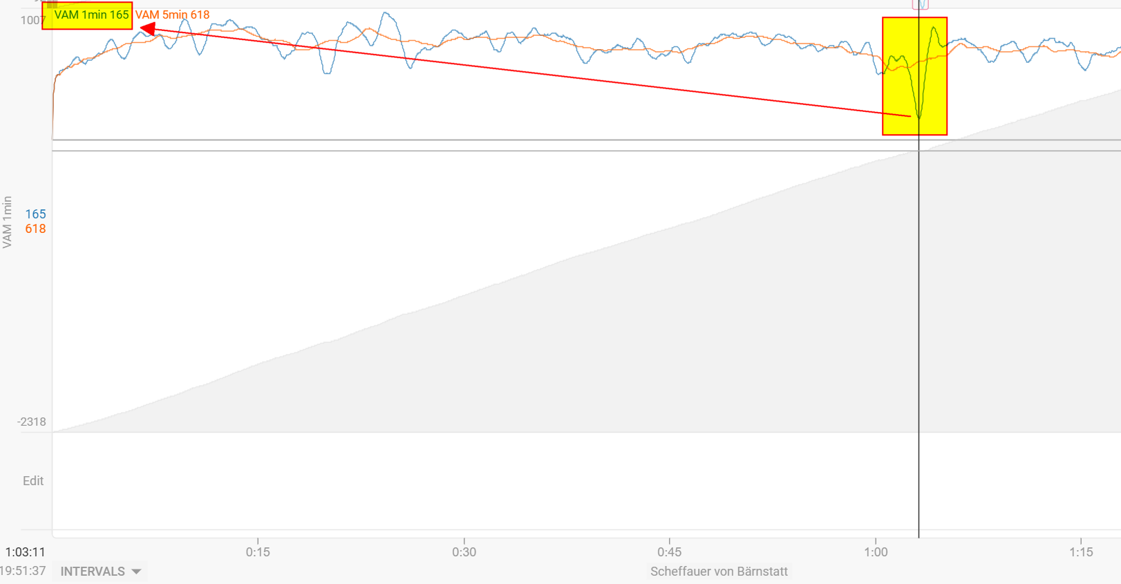
For example, I have an activity with 1h 36min uphill and 51min downhill, but it’s displayed like this:
And with even longer activities, it seems to break completely ![]()
![]()

Would be awesome if you could take a look – thanks a lot! ![]()
I remember that Golden Cheetah had such a graph (but over all activities, similar to the power curve). I would find such a feature really cool!
Hmm,
could you explain, what is not working correct? I don’t see it at first glance ![]()
You did 96min an uphill segment (2116-929=1187m).
This should be 1187/96*60 => 742 m/h
The VAMpeak chart shows this, for shorter sections you went sometimes a bit faster. Seems ok to me?
The chart creates “intervals” in 1 minute steps. So first for 1min, it calculates the difference of end altitude and beginning altitude and does this for each second. The highest value is taken and corresponding VAM calculated. After that for 2min, then 3min and so on.
Though there is one simplification in the calculation. If you go downhill in a time frame, it won’t calculate the net elevation gain for that time frame. Could look at that later.
Hey @R2Tom,
thanks again for your time and effort! ![]()
Just to clarify: The graph is supposed to show how long you spent at each vertical climbing speed (VAM) – e.g.,
5 minutes at 1,100 hm/h, 25 minutes at 900 hm/h, etc.
So in my case, for this activity, it would be something like 96 minutes at (at least) 165hm/h (least amount of hm/h over 1 Minute at ascend - since that’s the total uphill time).
Everything above 96 minutes should actually be zero or even negative values, since there is no more uphill (just descent) – so there is no climbing VAM anymore.
like 1 Minute at -2750hm/, 5 Minutes at -1900hm/h, …
Hope that makes sense! Thanks a lot for looking into it! ![]()
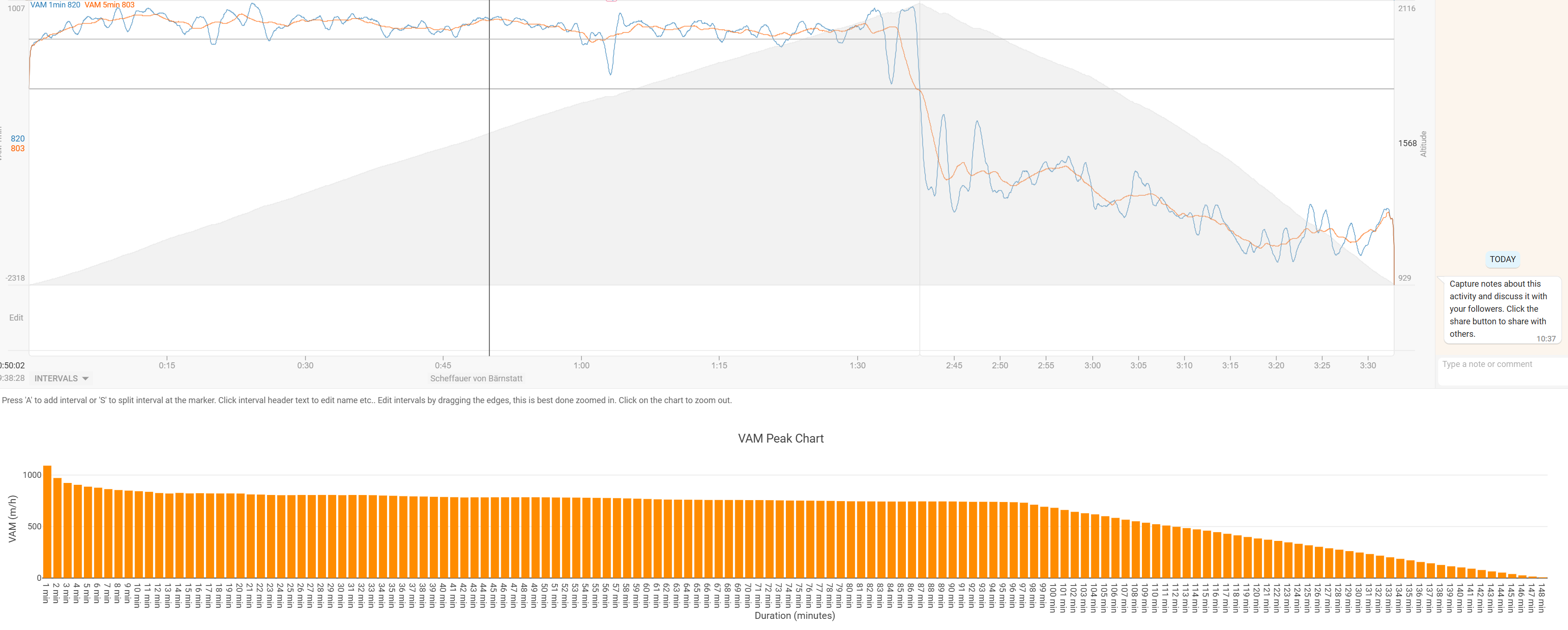
For example:
During my ascend, I had one slower minute because I grabbed some food/drinks from my bag.
This isn’t really reflected in your graph, since it averages the whole ascent speed over the segment.
Ideally, those slower moments should also show up as drops in the VAM curve.
Hmm. I fully agree on descents. Thought of it how to handle it, but this was the easiest way to do it for a first attempt.
But for the ascents, I would say that it’s still correct if it should be a VAMpeak curve, or I have misunderstood the initial question.
It should imo reflect the average VAM for each duration on the x axis. And you did 700m in 96min. According to your chart you were most time at or above 800m/h, so it still reflects this dip you have shown.
Looking at my power curve it is the same. It shows the average of that duration, even if there is 1min with less power.
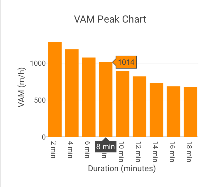
In my example I have a 8 min with 1000m/h
Could you give an example what the 1min, 2min and let’s say 90min peak should look like according to your chart?
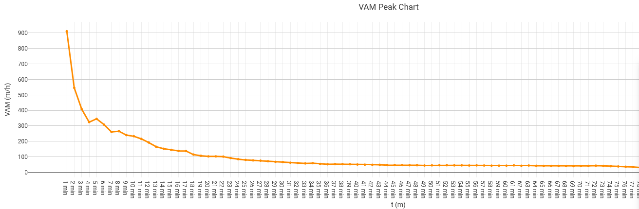
hat graphic actually is a cool idea. I managed to create a chart, with the help of the initial @R2Tom script and a bit of editing. I made a scatter plot of the 1-minute peak VAM up to 90 minutes.
I added some improvements of my own, especially helpful for longer activities where elevation is not the same as elevation gain. It is also faster and (I think) better formatted.
Find it here:
Nice and clean!
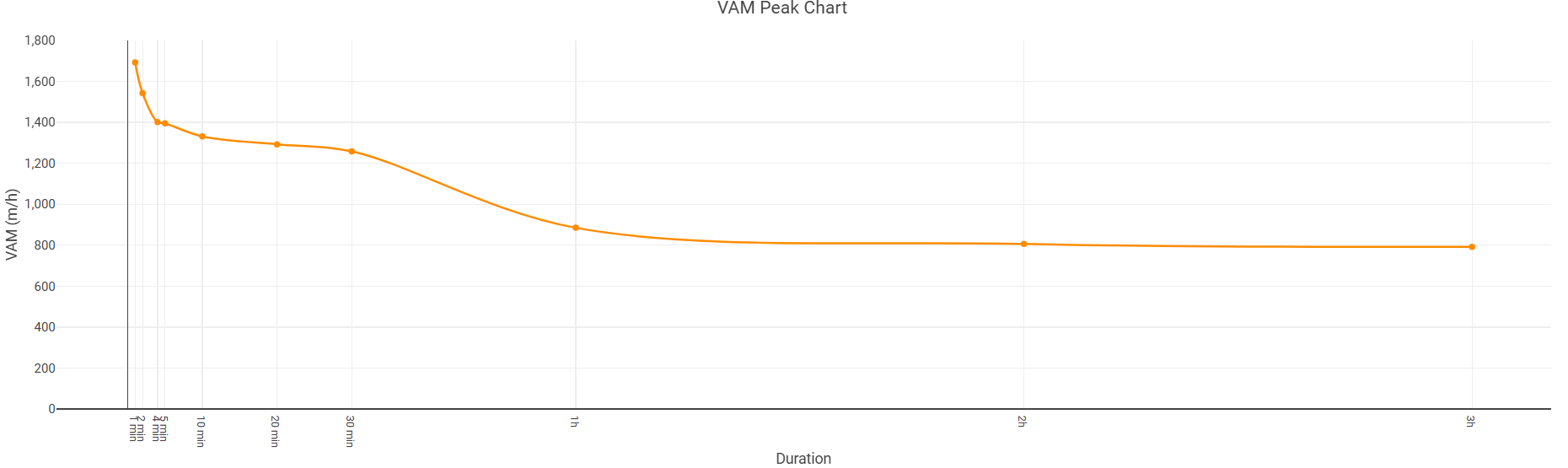
Log x-axis scale (like PDC) would be nice but I don’t know if it is possible.
yes it is absolutely possible!
xaxis: {
  type: 'log', // ← Add this
...
}
if you want a log scale.
Thanks a lot to everyone who contributed to the VAM peaks graphs – they are really cool and super helpful!
What I would be additionally interested in:
Would it be possible to have a graph similar to “Time in HR/Power Zone,” but for VAM, specifically for mountain climbing?
Technically, this would mean generating a histogram or bar chart showing the total time spent within different VAM zones (50hm/h increments?) during climbing. This way, you could clearly see how much time you spent going full gas on steep sections and how much time you had to slow down due to exhaustion or changes in the terrain profile.
Does anyone else find this useful, or am I thinking in a wrong direction? ![]()
Thanks again for your great work!
Something into this direction:
This is definitely feasible and can be helpful, I guess the only thing to be considered from a real-world data perspective is that you need to filter VAM (say 10/30s?) before creating the histogram. I might look into that if I have a bit more time ![]()
Edit: Look for VAM Histogram
not sure how well and robust it will be
Edit 2: Just saw that such a histogram exists natively
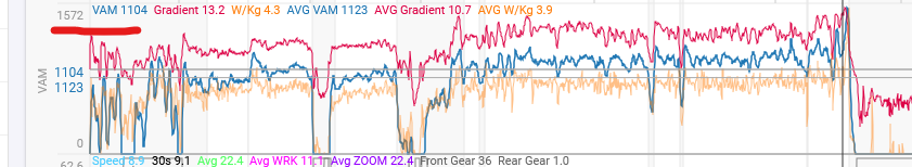
This chart works fine with everyone except one athlete, for whom it gives absurd numbers. As you can see, I don’t know why — the altimeter works fine, and there aren’t even any VAM spikes when I look at the VAM chart. The only athlete with the wahoo elemnt bolt…
it happens in every activity.
That looks strange indeed, but I am not sure how to debug from just one image ![]() Maybe some more data/context would help
Maybe some more data/context would help
I checked, and it happens to everyone who uses Wahoo. I attached a file if you want to check it.
https://drive.google.com/drive/folders/1_XwFinMokCESqQ8PSprxXgofxrzvguT5?usp=sharing
You could check if the first values are zero in the altitude stream. I have a Wahoo myself and see this in nearly every activity.
Therefore I correct this always at the start of the script (firstValidValue). As I saw, @Kosio_Varbenov removed this part from the script. Maybe that could lead to this absurd numbers (it’s the same for me btw). But that’s just a guess.
Coros has this too on almost every activity. Garmin only sporadically.
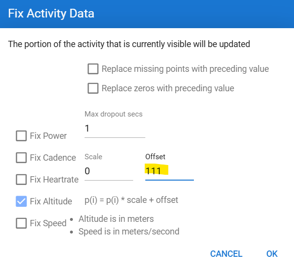
Zoom to the first 5-10 sec and then use Actions - Fix data. Replace 111 with the first valid altitude data, then refresh the page and it should be OK. Unless you have other parts where the 0 altitude occurs. Could for example be at longer stops.