Looks like this is going to show something useful. I had to do a lot of fiddling around but the trick to finally get it to work was to use a 60s moving average for power. Otherwise its just too messy. I think Dr Seiler used % of 6m power just because that makes the power line end up close to the HR line. I am going to do some more work to fiddle the axis a bit so the power and HR lines always start off overlapping like they do in this example (not live yet!) where there is quite a bit of de-coupling going on (this wasn’t a Z2 ride!):
8 Likes
I am also thinking about plotting the “gap” between the lines as a separate trace underneath. That might make it even easier to spot the point from where drift really sets in.
6 Likes
I have listened to Seiler’s talk and slides, and done some calculations myself, about my own rides in Z1/Z2.
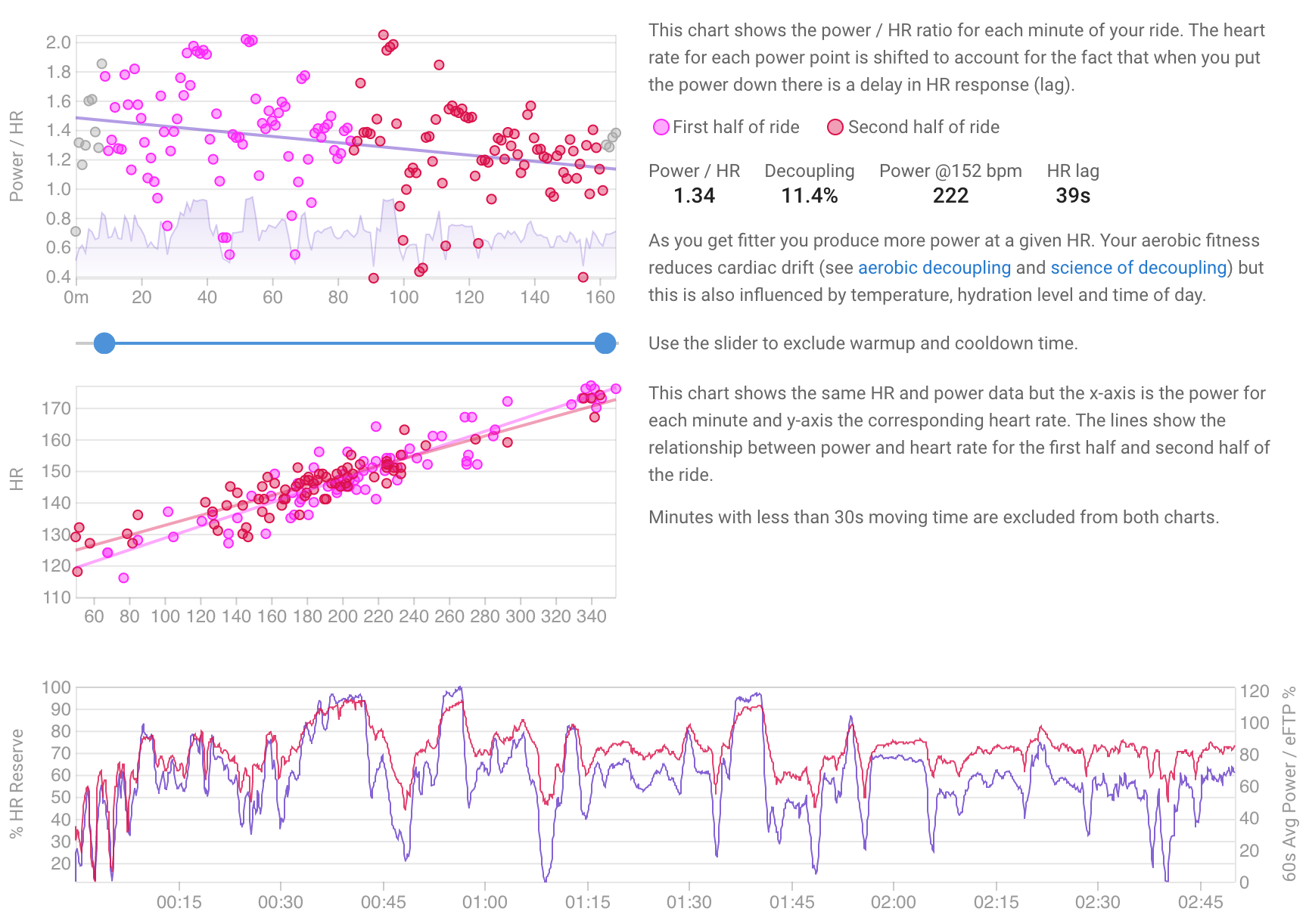
In its basic form, Seiler’s proposal is to compute the ratio HR/Pwr. In his case he normalises HR by relating it to HRmax and HR reserve; and he normalises power by normalising it to some measure of maximum power [in his case, max 6-minute power]. And he smooths the data by using 20-minute intervals.
In the short term and for one person, HRmax, HR reserve and the measure of maximum power are all constant. So Seiler’s index is simply the ratio HR/Pwr, appropriately smoothed. [One thing about long smoothing intervals is that HR lag becomes insignificant.] The major difference between Seiler’s index and David’s current implementation in the short term and for one person is therefore that Seiler traces the ratio over time looking for durations at which the index begins to rise [durations at which HR/Pwr begins to exhibit signs at which the body’s effort begins to rise relative to the work done], whereas David currently regresses HR/Pwr for the who ride to calculate decoupling.
Compared to David’s first go implementation, above, therefore, I’d look for [1] longer smoothing intervals and [2] presentation of the HR/Pwr ratio not their difference. My experience in doing this is that intervals should be at least 5 minutes long – remember that this is all assessing one’s about long endurance rides with a view to finding what training is needed to provide a stimulus [though assessing changes in performance can be identified too].
For the longer term or for comparison between individuals [HRmax, HR reserve and FTP not constant], then normalisation as per Seiler seems useful. But not otherwise necessary.
Apologies for the long post …
6 Likes
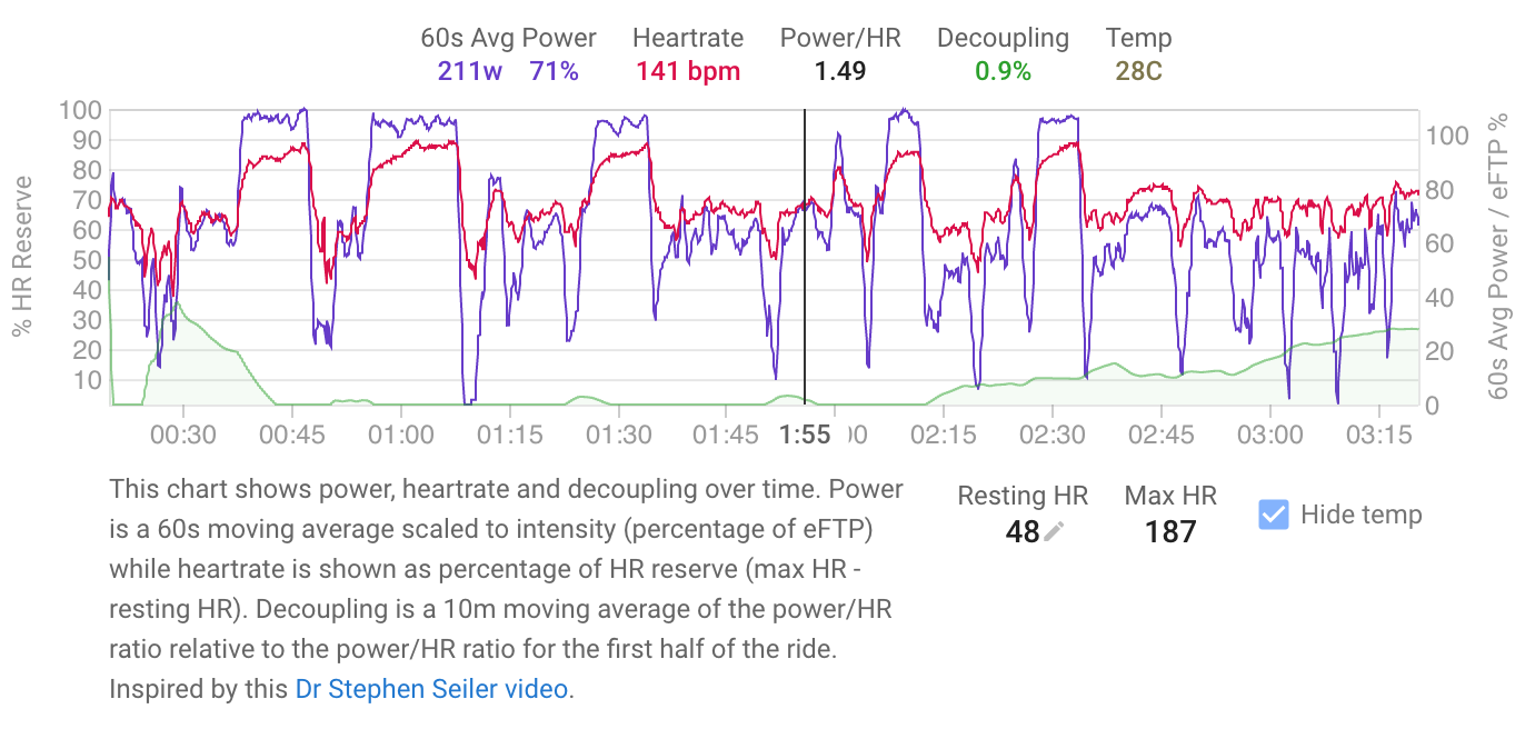
The first version of this is now live. I added decoupling along the bottom. When you have some decent drift going on as in this ride it works well and lines up with what the power and HR traces are doing . The decoupling numbers come out a little different to the current charts as there is no attempt to remove coasting and so on like the others do.
If anyone has any long endurance rides done on an indoor trainer please msg me link. I don’t have any of those myself and outdoor stuff is always quite messy.
8 Likes
Neat! Well done – especially so quickly.
Here is a 2.5 hour endurance ride indoors: https://intervals.icu/activities/3305690107/power. And this is a longer outdoor ride: https://intervals.icu/activities/3348983811/power.
I notice two things. [1] Your normalising interval = first half of the ride, which is quite long. And more importantly, [2] the ratio Pwr / %HRR seems to go to zero. Actually this is an artefact of the fact that the ratio has no scale on the graph that is shown. The zero line is presumably 1.0. And then, your flat lines [and mine in the activities I listed above] show periods where the ratio is less than 1.0 but your graphs do not permit this. You need some way of plotting the ratio [green line] that gives the scale.
1 Like
I could make it the 1st half or an hour whichever is less?
The green line is the decoupling and I thought neg decoupling wasn’t all that interesting so left that bit out. But maybe that needs to go on its own little stripe then it can have a scale and the zero line will be the 1st half/hour reference.
Or I could just plot the HR ratio itself and add a 1st half value reference line.
1 Like
Sorry I might be being stupid, but where do I see this chart? I can’t find it.
Longest recent one I have is 90 minutes which might show up something. https://intervals.icu/activities/3064495285
Ignore me, found it. Was looking in the heart rate section.
1 Like
Hi David, these all have a fair bit of intensity in them, but all are just over 4hrs with mostly Z2/3 and pretty steady. Saturday is my official long ride day and unfortunately most of them are indoors lately…
https://intervals.icu/activities/3162326259
https://intervals.icu/activities/3228048498
https://intervals.icu/activities/3316269281
https://intervals.icu/activities/3350965065
David, this is a excellent new feature. It certainly helps assess aerobic base. Any chance of tracking and plotting a metric that allows for identifying changes in performance over time?
1 Like
@Brian_Lande Check this out:
2 Likes
3h - https://intervals.icu/activities/3348893869
2h - https://intervals.icu/activities/3291399131
2h - https://intervals.icu/activities/3301204412
1 Like
david:
You have certainly sparked interest! Well done.
On the baseline: Seiler uses the second 20-minute interval because in the first power is high relative to HR, as the rider warms up. But I suppose that over an hour this would work itself out. And an hour is better than 20 minutes if this is to be used for outdoor rides too. So I think first half or an hour, whichever is less.
On the green line: I think that its own little stripe would be best. And it’s not a zero line! It’s a 1.0 line.
Brian_Lande: the key metric is the time at which the green line [Pwr/%HRR] begins to deviate from the horizontal, for a given average power output. This is what Seiler is trying to track, I think – at what point is the body beginning to be stimulated beyond what it can currently do. That seem to me to be difficult to identify in an automated manner.
1 Like
Wow, this is awesome! Never thought it was going to get this much attention. I love this subject and hoped you did as well, and indeed my hopes were met! Thank you!
1 Like
Just donated for the first time. The straw that broke this camel’s back is the incredibly quick response to this request. I was vacillating about whether to make a similar request but was reluctant to ask without ever having contributed.
This is a really interesting and useful topic for me, so thank you Daniel for initiating it and David for implementing it!
2 Likes
I have many! All from 2 to 5 hours long, some very steady, some with some slight power changes:
https://intervals.icu/activities/3343033306
https://intervals.icu/activities/3313395872
https://intervals.icu/activities/3308612196
https://intervals.icu/activities/3299343018
https://intervals.icu/activities/3290227049
https://intervals.icu/activities/3272676139
https://intervals.icu/activities/3259847638
https://intervals.icu/activities/3242959322
https://intervals.icu/activities/3232428920
https://intervals.icu/activities/3204143743
https://intervals.icu/activities/3179839674
https://intervals.icu/activities/3176977248
https://intervals.icu/activities/3145730551
https://intervals.icu/activities/3138839892
Tx. Some nice rides there. Its working well on those. The ones with de-coupling the power and HR traces diverge nicely and the 2nd half has green decoupling creeping up.
1 Like
Definitely. I already tried once but couldn’t figure out how to clean up the messy data. Going to get back on it shortly. Good ideas on the other thread.
Ok I will move the decoupling onto its own trace and change to 1st hour or half whichever is less. The configured warmup time for the activity is already excluded. Tx for all the feedback!
I really like it so far, here’s some things to improve if possible:
- Several times I have negative decoupling, but the graph is locked in 0%. Maybe good to see it too, like a line at 0 in the center.
- The ending of the graph sometimes doesn’t match with the “cool down” on the slider just above. When I move it anywhere it does refresh and match, it’s just the initial one the first time I get in an activity
- On long rides that I stop for 3-10 mins, the graph stops working after the break.
1 Like