Running interval data: recovery -> work

Hey guys,

new to the tool and really enjoying it so far. I am still figuring out how the analysis tools here work, so please don’t mind the following 2 (rather unrelated) problems. I have been fiddling around with the charts and interval data for some time now, but couldn’t figure out a solution.

Problem 1:
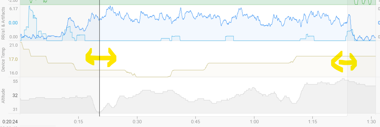
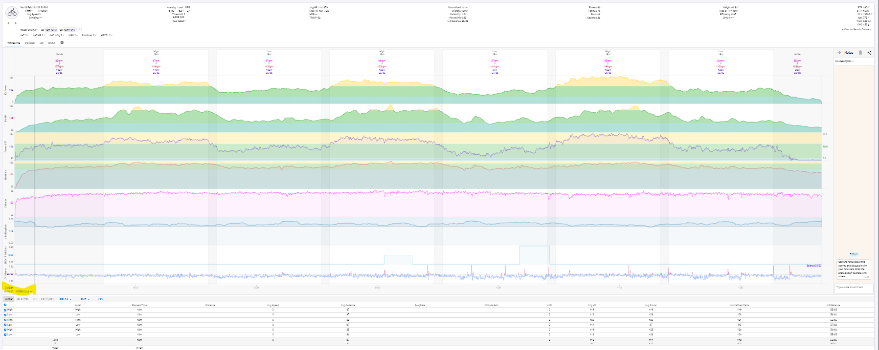
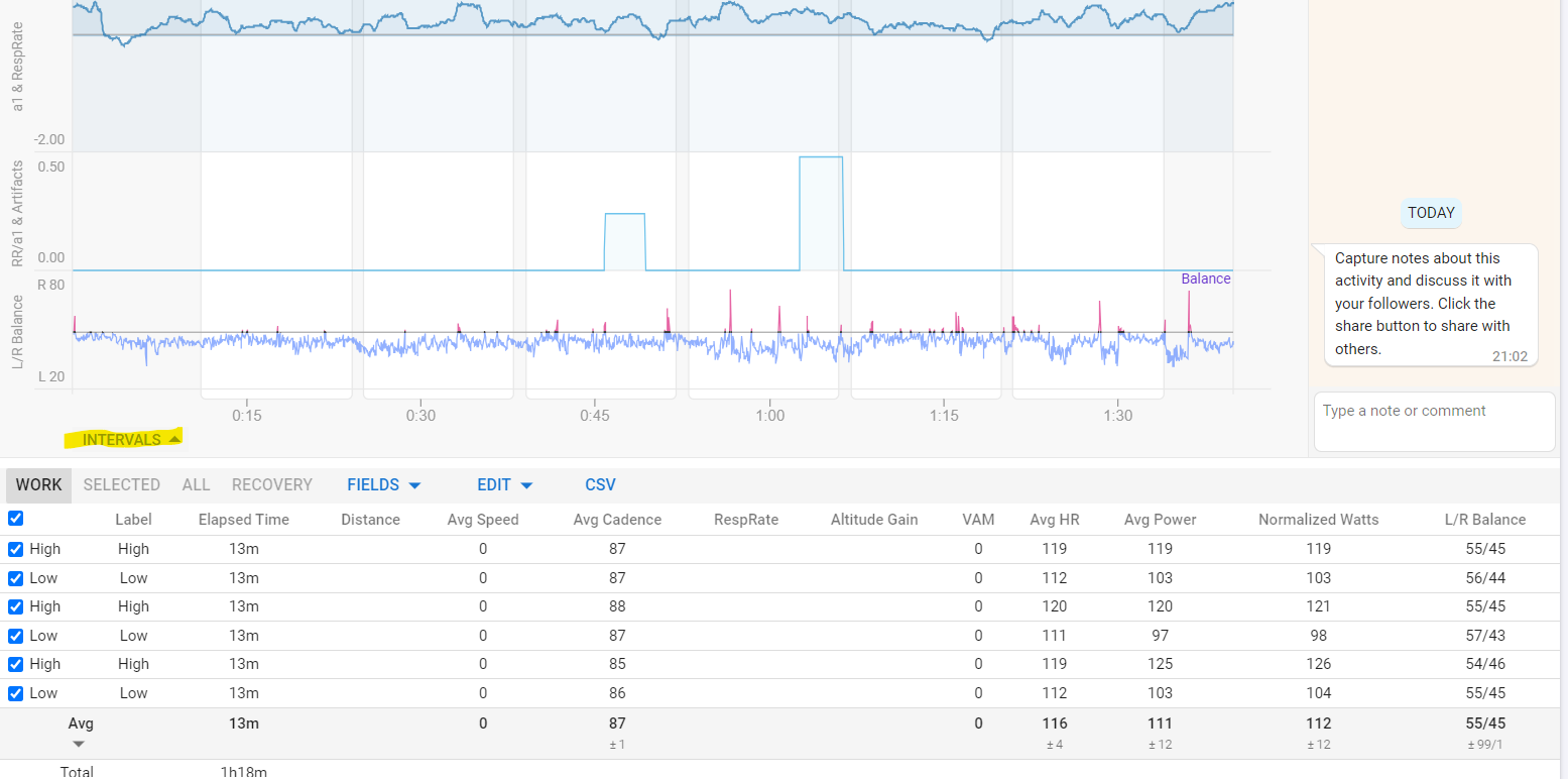
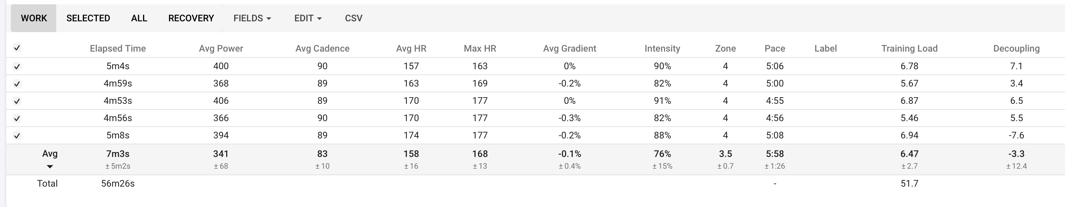
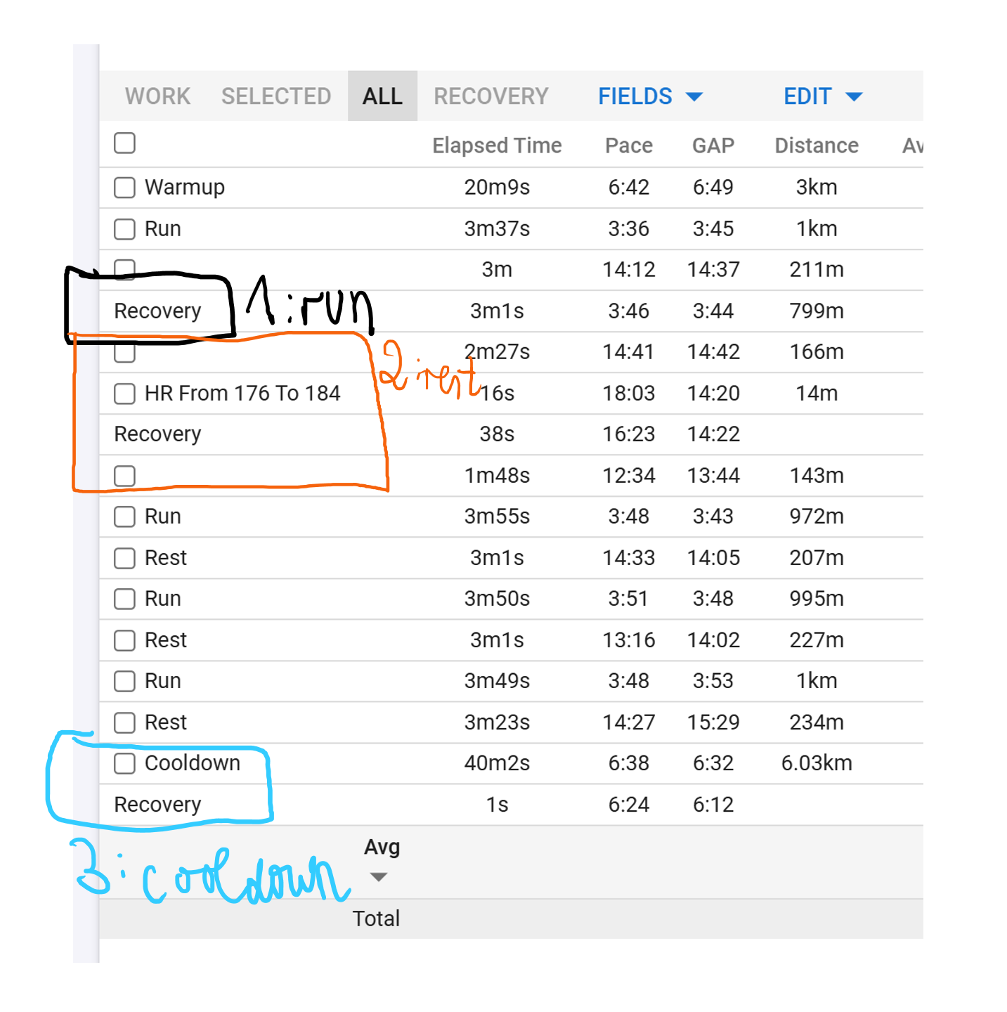
I have had a 5x1km interval running workout today, but somehow had severe problems with my heart rate monitor in the run up to the second interval when I restarted it and had to manually press the lap button on my Garmin watch a couple of times within a preconfigured workout (which I absolutely try to avoid usually for this exact reason you see here), which seems to have destroyed some entries in the fit file or whatever (Garmin HRM Pro+, fkin hate these things, it’s my third one (third one was on Garmin) and they always tend to break after a couple of months, that’s ridiculous for such an expensive product in its category).

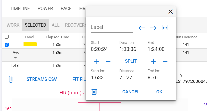
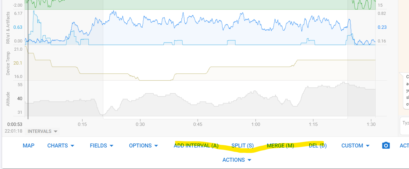
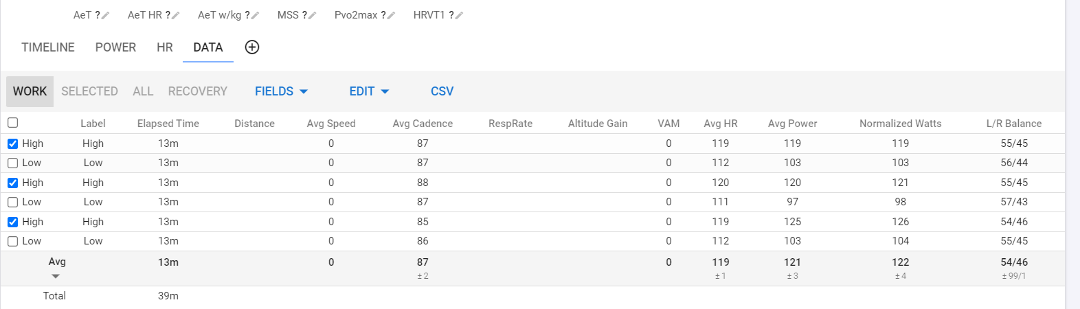
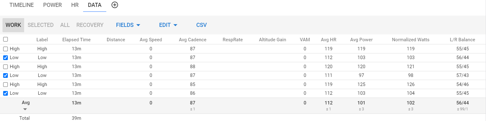
The problem I have: 1) why does it show my second interval as recovery? (marked in black). I wanna change this to Run. 2) How can I merge the red block into one interval? It’s maybe somehow possible with the graph, but how? Wouldn’t it be easier if you could also use the interval overview to merge intervals? 3) same as 2), how can I merge the blue block into one interval?

Problem/Q2:
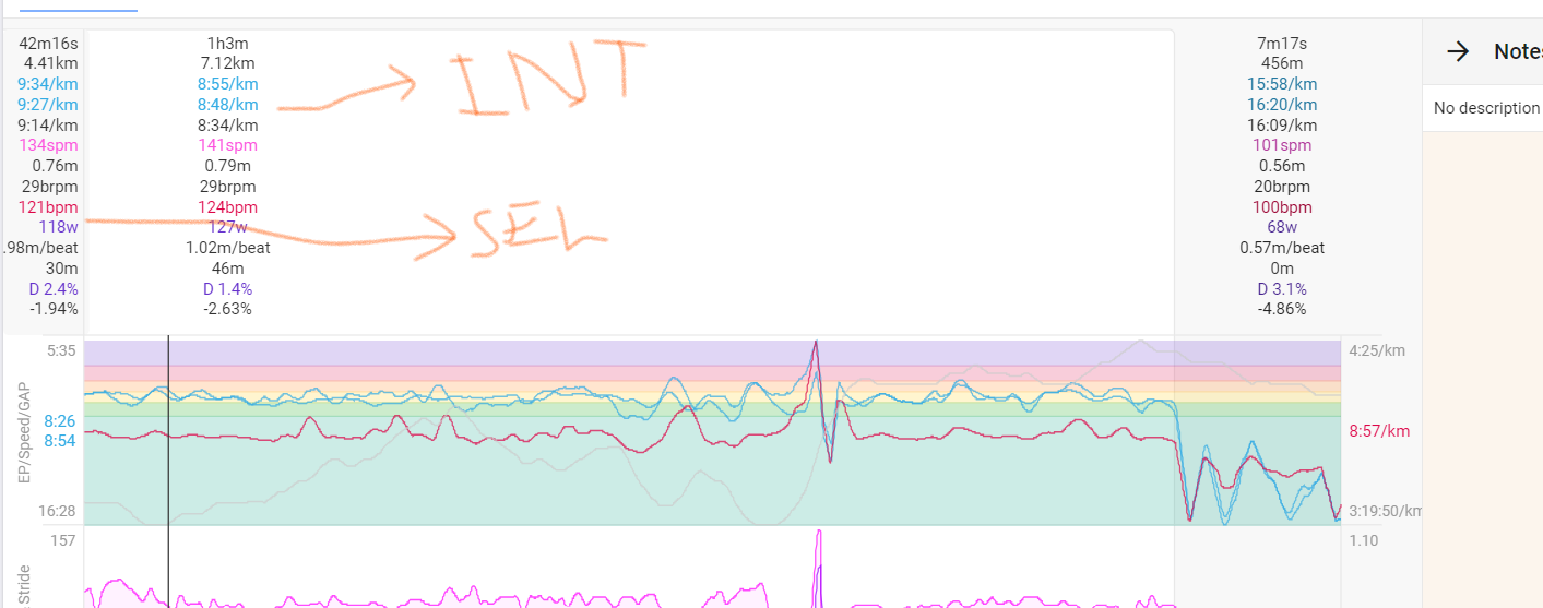
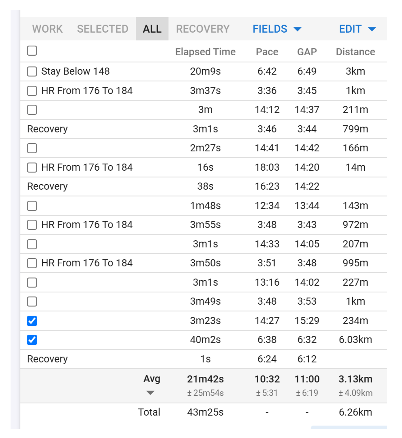
What’s the benefit of not weighting the paces by %of distance in the pace average calculation? I don’t see how this number is helping me and am asking myself wouldn’t it be much more meaningful for an analysis to weight everything by %of distance, i.e. scaling it correctly such that the real pace that I have run across the selected intervals is shown? In the following example the real pace (not GAP) was roughly 6:56 and not 10:32 as shown in the picture. Why is that and could that be changed? Or can I change it myself with a setting?

Thanks a lot for your help and cheers,
A

Intervals can be edited in 3 ways:

  • On the Interval Data page, click on the Label Name and adjust time/distance… as you want

  • On the graphs, drag the edges of an interval over the next to merge. Simply drag to move edges. That’s normally the quickest way to roughly edit. To fine-tune, see above.

  • Set mouse cursor in a non interval area of the chart area and use keyboard A to Add. Set it on an interval to Split (S), Merge (M) with next, Delete (D).

Q2: the goal of this table is to compare similar intervals and then give you an avg of all the selected work intervals. If you just want to see what those 2 completely unrelated intervals have as overall avg, make a selection of them on the graphs and see the result top-left. The results above the graphs are the interval data. Top-left you get the data for a selection.

1 Like

Hi @MedTechCD
How do I select two intervals, that are not adjacent?

On the graph you can’t.
In the table, you can. But then you get the averages as average of the absolute values.
What exactly do you want to accomplish?

Great @MedTechCD, thank you so much for the thorough reply.

re Q1: your first bullet point did the trick. However, I had to use a small workaround for the black box in my first screenshot. This was marked as recovery. I have just placed a new interval in the middle of the recovery interval (via third bullet of yours) and then changed the start and end time (first bullet).

Can you maybe explain why the tool recognised this interval as recovery and why it’s seemingly impossible to change it to a work interval without the workaround I have applied, or is it possible?

second bullet: how do you use that method to fully merge two adjacent intervals? Probably you don’t and just use the merge command? Say if you want to merge two intervals with start time 00:00 end time 01:00 and start 01:00 end 02:00, respectively, you just change the end time of the first to 02:00 and you have merged them, right?
I guess it would also be possible graphically by dragging, but as you said, it’s not as exact to hit it spot on.
Can you also do this by clicking into the first interval (00:00 to 01:00) and then press M? Is it that what M does?

re Q2: I still don’t see the benefit of this calculation. Let’s assume you are comparing “similar” intervals, what do you mean by similar? Do you mean the 5x1km run intervals in a interval workout? In such a case, all would have the same distance, i.e. it would be the real pace. But what if you have an interval workout with 12x400m followed by 4x800m, do all 16 count as similar intervals? Or should you only use the average number to analyse the 12x400m OR the 4x800m, but not all 16?

I mean, for me it would be sensible to mark all 16 and get the real number for pace, not some average that has no real world application, what do you think?

Maybe you can shed some light on how you would use that number in an analysis of a running workout. Maybe there are more applications for cycling? Not sure, I am only running.

Highly appreciate your effort and cheers,
A

@MedTechCD I have now tried many things to recreate what you did re my Q2, however I cannot replicate your results. How do I make a selection on the graphs? Not sure what I am missing here, but I cannot make a selection of several, possibly non-adjacent intervals on the graph.

Or does the selection have to be made in the table and the results pop up in the top left above all the graphs? If so, it doesn’t do for me. Is there a setting you have to active to see the results?

Thanks,
A

From your post I got the impression I could select a number of intervals in the graph and then the average of these would be displayed top left - I guess this is not the case.

Say I ran 4 intervals with pauses in-between. I want to select the 4 and see the average pace, HR, etc., Is there a way to do this.

As much as I love intervals.icu, I really wish there was a UI guide for beginners, to ease you into it.

You can´t do that in the graph. You can only make one adjacent selection there.
To make a selection, click in an active chart area, drag and release. You now zoomed in on a part of the activity, and you have a ´selection´ for which you can see the data top-left.
I´ll reply with more details in a couple of hours.

1 Like

I have now tried out some more of the functionality and have found the following way of doing it: I can mark certain workouts with the same intervals in it, then compare these activities and in the compare activities tab on the right hand side of the screen I can select only the intervals to show me the field values for (see right side of the screenshot). That’s almost what I want to, however I have 2 problems with that.

  1. Seems a bit tedious of a workflow if I just want to check my latest session, i.e. directly after the session, to see the data from only the 5 hard intervals. I can do that quickly in Garmin Connect, but I hate Garmin Connect and want to do it it Intervals

  2. The pace calculation is still off: the average doesn’t make sense. I get where the number comes from (plain average), but have a look at the first workout (top line). The elapsed time per interval is 3:38, the avg. distance (due to HRM fiddling) is 0.954km and not 1.0km. That makes an avg. pace of roughly 3:49 min/km and not 3:45, hence this average number is not really useful.

Is that on purpose? If so, how should I use this number?

Thanks for your effort and time and cheers,
A

I don’t understand that you don’t understand :wink:
You can do exactly the same on a single workout. Once you have your intervals correct, go to the Data Tab and check the checkbox for those 5 intervals. The same average will be shown for only those.
First screenshot shows that for the intervals labelled with ‘High’, second for those labelled ‘Low’

What it comes down to, is that you need to learn how to correctly get your intervals. A simple solution for this kind of workout would be to delete all warmup/cooldown/rest intervals. Then only the 5 work intervals would be on the data page and when you select ‘all’ with the checkbox left from ‘Label’, you immediately have the averages on the bottom line.

Moreover, once configured, you can see them at the bottom of the Timeline Tab by clicking on Intervals!

Zoomed to bottom part only:

And you could use my BoxPlot charts to give you quick data on every single interval + avg of all equally named intervals. If none are labelled, the most right boxplot will give a total of all work intervals:

I will make a guide post on the different ways of defining intervals as soon as i have the time. This is becoming important with all the different possibilities and the stream of new users :wink:

2 Likes

Thank you - much appreciated.

Thanks for your extensive reply! I have to admit that I had the exact same thoughts you laid out in your first paragraph yesterday evening in bed, but phone was already in the kitchen, so couldn’t write that I have figured out how to do it in the activity analysis!

"What it comes down to, is that you need to learn how to correctly get your intervals. " => Very neat advice, I’ll follow that!

However, again, let’s assume you have a session where the working intervals are not the same in distance, i.e. 8x800m followed by 4x400m (or whatever, just an example). I would have 12 intervals now and would have deleted all “non-work” stuff. If I would check all 12 intervals in the part below the graph I’d still have the exact problem I am trying to get my head around: the pace is no real world pace, it’s just the plain average across all 12 paces and that’s just not a number that is applicable to anything.
I get it, if you have similar intervals, i.e. only 800m, you get all the right numbers, but I don’t get why the tool is coded like that in the first place?

I see use cases where I’d need the averaging the way I have described it. But, let’s keep it the discussion here and I’ll see if I can figure out any meaningful ways of analysing the data in the coming weeks over which I’ll get to know the programme much better!

Today, when analysing an easy run, I have tried to split the run split after every kilometer, but the distance of the intervals was not 1km for every interval, why is that? Is it because the resolution is only 1 second in the data and sometimes the kilometer is only made full at a fraction of the next second?

And thanks for your guide post to come soon! Looking forward to that one.

Cheers,
A