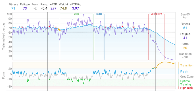
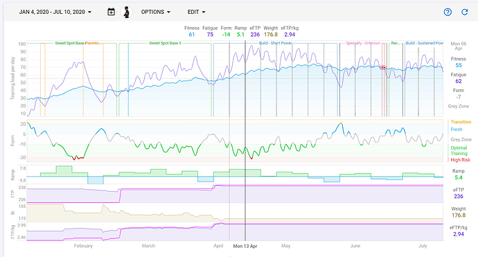
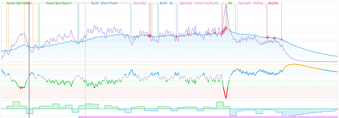
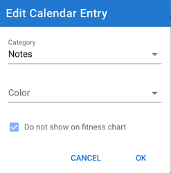
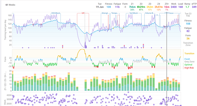
Calendar entries with category “Note” are now displayed on the /fitness page on the top of the fitness chart. You can turn this on/off in “Options” (look for “Show notes”). So now you can annotate your chart with the different stages of your plan and so on.
Awesome. Was thinking about this. One question, how do you get the text between the upper lines? I only get the line,and the name down on the page among activities.
Like always…
You are doing an awesome work with this page and giving some real nice support  Hope you feel how much we all appreciate this.
New pateron incoming from another email adress, can you find it anyway?
Tx for the support, I got the notification!
The text is included between the lines if it fits. I will do some more tweaking tonight to perhaps shorten long labels with “…” so more fit + make the label clickable and hover for the full details.
The note label between the lines is now truncated if it doesn’t fit. Of course if it is too small it is still left out completely.
Hi @david
Another awesome feature for this tool! I love being able to annotate my training and fitness chart. In fact, yesterday I spent all day going back 3 years and annotating the training.
One thing I noticed, is that when I sync my TrainingRoad calendar, it also brings the Notes (specifically the week notes/descriptions) from TR. This causes small (one day) grey line which I don’t necessarily need or want in my fitness page. I was able to turn them off for weeks in the past by edit them and changing them to “Holidays” but I can’t for the future (mainly because on the next refresh it will go back to Notes).
Is there any way to turn off the weeks Notes so that those don’t show up on Fitness?
Thanks again. This is AWESOME!
Thanks! Its probably easiest if I just leave out 1 day notes. You will still be able to see them at the bottom of the page.
I have just made the drop down lines stop at the fitness line. I think that looks neater. What do you think? You might have to reload the app to see the change.
Ok the 1 day notes are gone. I noticed that some of your note labels are overlapping, that isn’t supposed to happen. I will fix that tm.
This looks great! much much cleaner with the lines stopping at the fitness line! Wow.
Some of the overlapping notes is due to me putting “a note within a note”, such as I took a week off inside my Sweet Spot Base 1.
I am loving it!
Thank you for this feature, David: making an awesome site awesomer!
But now, my one-day events don’t show! [This is not a big deal, but it is a consequence of the change.]
Can you point me at one of those? Tx.
If that is a question to me, then: https://intervals.icu/activities/3164298190.
If you edit that ride on Strava and change it to a race it will get a red dot on the fitness line. Thats probably the best thing to do for “significant” rides. Injury/Sick is still shown with dots on the fitness line. Lots to competition on top of the chart.
Thank you for that, David!
is it possible to show illness and injuries on the fitness chart in the same way? these are useful to see when they occurred in relation to fitness/fatigue ect.
thanks
You could add a note, give it the swamp colour uses for illness and call it “flu” or whatever. The little dots on the curve for illness/injury work nicely if you also have notes.
This is great. I don’t know how I’d missed this before. This really feeds my inner data organization tendencies.
And labels within labels? Yes, please.
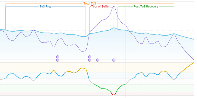
cheers that’s working well for me, and can differentiate between training notes and illness through colour coding.
it does make me wonder what the point of the illness/injury classification option (as opposed to notes) is though…
I like the little dots on the fitness line …
thanks! Planning and analysis on intervals.icu definitely helping my progress so you can take some credit for every one 
