According to latest articles from Marco Altini (HRV4Training) where he normalized the hrv value to resting HR, it should be nice to plot the same graph intervals.
Should We Normalize HRV by Heart Rate?
Anyone had tried to do it?
According to latest articles from Marco Altini (HRV4Training) where he normalized the hrv value to resting HR, it should be nice to plot the same graph intervals.
Should We Normalize HRV by Heart Rate?
Anyone had tried to do it?
Keep in mind that the normalization might obscure meaningful day-to-day variations at times. Hence, always look at the individual signals as well (HRV, heart rate) as well as at the normalized HRV, to analyze responses to various stressors.
~Marco
For me, those day-to-day variations are important to see. But, it would be interesting to have the normalised graph below the standard HRV graph. This might allow me to better account for below normal heart rate and higher parasympathetic activity.
I’m interested about graphing HRV4TRAINING data into Intervals.icu in general, as I export data through Dropbox but right now except viewing the values in Calendar I don’t do much with it. If anyone can share best practice, example of day to day charts to keep an eye on this would be great ![]()
@ohmax I keep plots of HRV and resting HR on my fitness page. However, I find it hard to understand what the values actually tell me over and above what’s in the HRV4T app long and short term correlations.
@Michael_Webber, if you would like to share screenshots of your graphs I’m sure there are a few of us who could point out a few things for you. ![]()
HRV and HR graphs would be the minimum information. Training load, form, and training zones (HR), as well as sleep and any wellness data you track would be beneficial.
Thanks yes if you can share some sample graphs and setup please ![]()
@Howie , thank you for the offer of help. Any advice would be most gratefully received.
The data come from HRV4Training. I take measurements almost every morning, complete the questionnaire and every few days save the data to intervals.icu. I plot the rMSSD and RHR values on the Fitness page. And I read the advice. If it’s dire [the red warning!], I’ll normally just do a recovery ride, at most. Otherwise, I do what I had planned.
I have examined the short term correlations. These are pretty obvious: high TSS days, poor sleep, alcohol all reduce next day’s HRV. And there are some similar long term correlations. These have led me to change some behaviour – eg, be more careful about sleep, no alcohol before important events.
The issue that has perplexed me is whether there is any added value in the intervals.icu plots, over and above the HRV4Training correlations. In other words, is the intervals.icu plot just a long term historical record or is there some information in it that I’m missing?
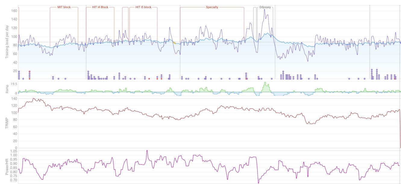
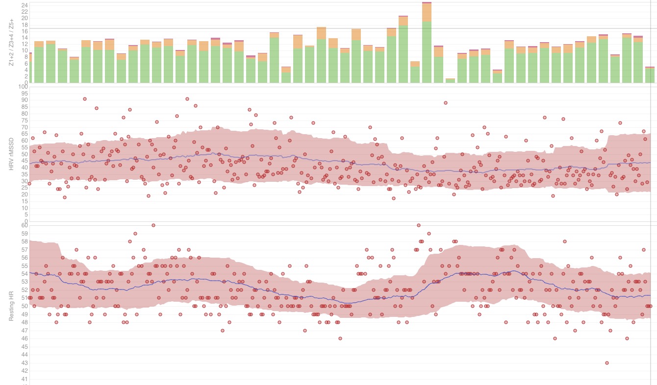
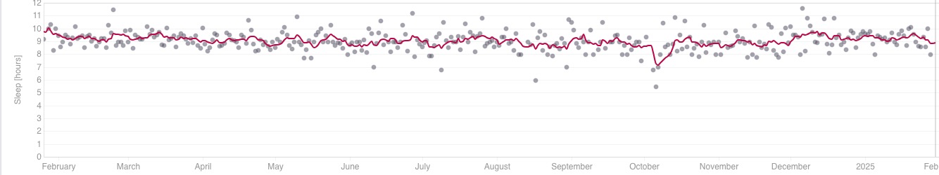
The last year of data looks like this [I’ve excluded some graphs that I use but that aren’t of significance here]. Apologies for the fact that the graphs are divided into three, but the x-axis is the same for all three: it runs from 24 January 2024 to 28 February 2025 – the past year.
Graph1 has four data sets: Fitness + Form; Ramp; Trimp [42 day moving av]; Power/HR [7 day moving average].
Graph2 has three data sets: Weekly hours + three zone distribution; rMSSD; RHR [On these last two, the dots are the raw data, the blue line is the 60 day moving average, and the red shading includes 1 standard deviation of data.
Graph3 is sleep in hours: actual data [dots] and 7 day moving average [line].
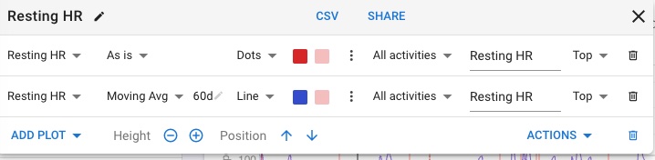
@ohmax, you can see the sample graphs in my response to Howie. As for set up, rMSSD and RHR are standard charts. Go to Custom Charts on the Fitness Page [at the bottom of the page] and choose the graphs you want. You can edit the height of the graph and the axes’ scales.
This is an example of a box that you get when you open Custom Charts. From left to right: first, choose what variable you want to plot; then choose what form you want this variable to take [eg, the raw data = as is, or a moving average, or a monthly total or whatever]; then choose other data, such as the length of the interval over which the averaging is taken [60 days in this case]; then how to represent the data [dots, line or bars]; what activities you want to include; and then the label you want to give to the y-axis.
See how you go. You might need to play around in order to get graphs that look meaningful to you. One important question is how much smoothing you want – it looses detail, but makes trends clear. Or do you want both?
I hope that this helps.
Better use the HRV graphs that are shared. I made those in the exact same way HRV4T does. Daily Raw data as bars, 7-day average as Baseline and 60-day average with Std deviation as Normal range.
You can find them in the Custom charts.
The charts on Intervals do not give you any more information then what is on HRV4T, on the contrary, HRV4T has more and better analysis with the correlations and other more advanced things.
The charts over here just allow to do the basic HRV4T analysis if you are measuring with another app.
For anyone wanting to use the CV (coefficient of variation), you would need to use a natural log of the RAW RMSSD. The values for guidelines on CV interpretation are totally different when using RAW or natural log. Anything in literature is using the natural log!
As others have posted, there are better graphs than the ones you have. Are they better than HRV4T? I personally find them better easier to use. What I like about the graphs on Intervals is that I see HRV, rHR, sleep and workout data on one page.
In regard to your data, it sounds like you’ve picked out key points. The largest effect was after Odyssey. Your HRV and rHR took a it, and the effects lingered for over a month.