Hi,
Recently re-joined Intervals.icu after a few months in the training wilderness and notice that you can set up multiple TABS in the Fitness section. Is this a new feature only rolled out recently as I haven’t seen it before? Also, pardon my ignorance but what purpose would you need multiple Tabs for when you can build graphs directly under the Load & Form charts now that the workout descriptions remain at the bottom of the screen when scrolling through the built graphs? Just curious to know what others use multiple Tabs for.
Cheers Adam.
Fair enough…I would have definitely voted for multiple tabs if the workout description update remained as it was but now it stays on the page and the graphs roll behind it, I love having them all in one view but can see the benefit on both counts.
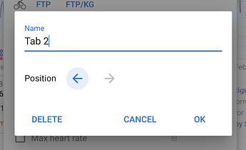
You can click “Edit Tab” in options and delete the extra tab if you prefer everyone on one tab.
@david Although tabs are nice (to organize charts/data) they seem to not sync across devices, right? I adjusted them on desktop but don’t see changes on the mobile web (either tablet or smartphone)…
I haven’t noticed those tabs until now, but I love them. However, can we have different date ranges per tab? That would be perfect. To quickly switch between past, close and wide
Different time ranges would of course be a hit!!
I now separate the activities and the physical data via the tabs. Then you can make the individual diagrams a little larger for a better overview.
You could also look at different activities separately, e.g. a tab for bike, a tab for run etc.
I like it very much. 
Yes the tabs are different on mobile, desktop and tablet. What you setup on desktop won’t fit on your phone etc…
I kept the time separate on purpose … figured people would want to look at different charts for the same time range.
Both have their charm
As a WKO user, this has a big impact on displaying data/charts, in a similar way.
Do you mean each tab should have its own time range or one for all tabs?
What are you all putting in each tab?
No, I would keep the time range on top where it is. (See example below).
Perhaps some buttons (1 - 6 in my example) with predefined ranges, eg. Last 42 days, last 84, last 365 days, this season, last season, etc., and clicking on the button will display the range. This would save time using the date selector. WKO has the option to change date ranges using the RHE (right hand edge).
In the tabs I would add charts with related data, grouped together for easier analysis, instead of having two separate pages for Power and HR. Also, no need to scroll up/down, or drag charts up/down. It results in all data being viewable on the full screen view.
Let me configure mine as an example. Seeing something might be easier to understand.
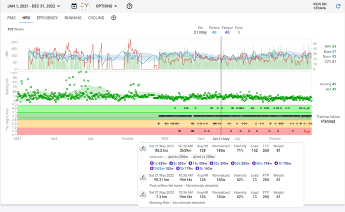
Here’s a quick overview without paying too much attention to the detail in the charts, but rather just organising data into categories.
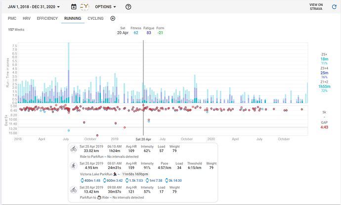
I have noticed that ride data shows in a running only chart (see the screen shot), even though the filter shoes virtual run and run. The summary at the bottom shows all the activities for the day. Again, for me, it’s not a major issue, but it can hide some of the charts (but scrolling will solve that).
The problem is that each chart can have different filters. So it’s not so easy to decide which activities should be included in the popup. I might be able to figure something out if all the charts are showing the same activities.
I like the suggestion with the 6 buttons. I don’t think it’s a bad thing that you might have to scroll - but I pretty much always ride my bike.
It gets even better
Wow, what a nice surprise this update. Thanx David, this was something what I missed on the fitness page for years lol.


