I really appreciate the power that this site provides for reviewing my historical training data, and how it informs my future training. In particular I like the “Compare” feature to see how my current performance tracks against prior years.
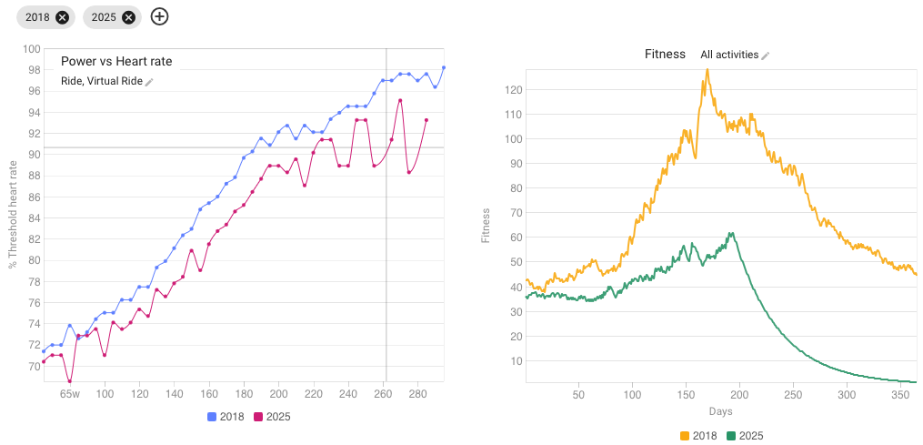
If I am reading this correctly, chart on left of Power vs Heart rate for this year (2025 partial) shows a significant improvement over the year 2018. To me, this means that for a given effort (RPE) I am putting more power to the pedals today than when I was 7 years younger (I am currently 64).
And to add another element to this, the right chart shows that my training volume was dramatically higher in 2018. This suggests to me that all things being equal, we should not equate performance with miles/hours logged in training. Or should I go further to conclude that too much volume actually hurts performance?
To add context to the 2018 data, I was logging many miles from Mar-May to prep for a weeklong trip to the French Alps.
Looking to the experts among this group: am I making reasonable conclusions? Anyone surprised that this effect is so pronounced?
Don’t jump to conclusions too fast. Your conclusion on the first chart is probably correct. Unless your LTHR drastically changed (for maybe a medical reason/medication…) you’re putting out more Power for the same HR. If that also corresponds to RPE, perfect.
The second chart, on the other hand, is much less clear to make that sort of conclusion. It plots Fitness. And Fitness is a result of not only volume, but also intensity. And on top of that, Fitness, since it is the result of TSS load, is highly dependable on correct setting of FTP. If your FTP is set too low and you ride by feel, Fitness will go sky-high.
It is by now a known fact that too much volume at high intensity, is usually destructive for performance. But high volume at low intensity with the correct amount of high intensity sprinkled in remains the best working principle in general. There will always be outliers, but the correlation volume/performance is the biggest of all.
So looking at Volume alone, Cumulative moving time in a chart on the same page, will make the picture more clear. It will show if your fitness during 2018 was more influenced by volume or by intensity. And only you can know if your FTP was more or less correctly set at that point in time.
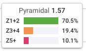
Thanks @MedTechCD for your thoughtful response. I just checked the charts for overall time-in-zone numbers for same periods, and it does suggest that today I am spending greater time in Z1/Z2 than in 2018. I recognize that these numbers are also dependent upon properly-set training zones to be accurate.
@FoHo The most appropriate measure of load here is kJ. On the Fitness page, you can plot graphs with kJ calculated with 42-day moving averages and 7-day moving averages, just like the so-called Fitness graphs.
kJ i simply the total amount of work you day, measured in energy.