In short, you’re looking at information from different systems that will often not align nicely in graphs. Many factors will affect each system: muscular leg strength, cadence, hydration, metabolic efficiency, heat, etc… Also, HR is a lagging metric as opposed to power. This means that while changes in power will be recorded nearly instantaneously (depending on various settings), HR can take several minutes to reflect changes in output demands, both up and down. This could be why you’re seeing the Z3-Z7 buckets filled in your power chart but not in your HR chart.
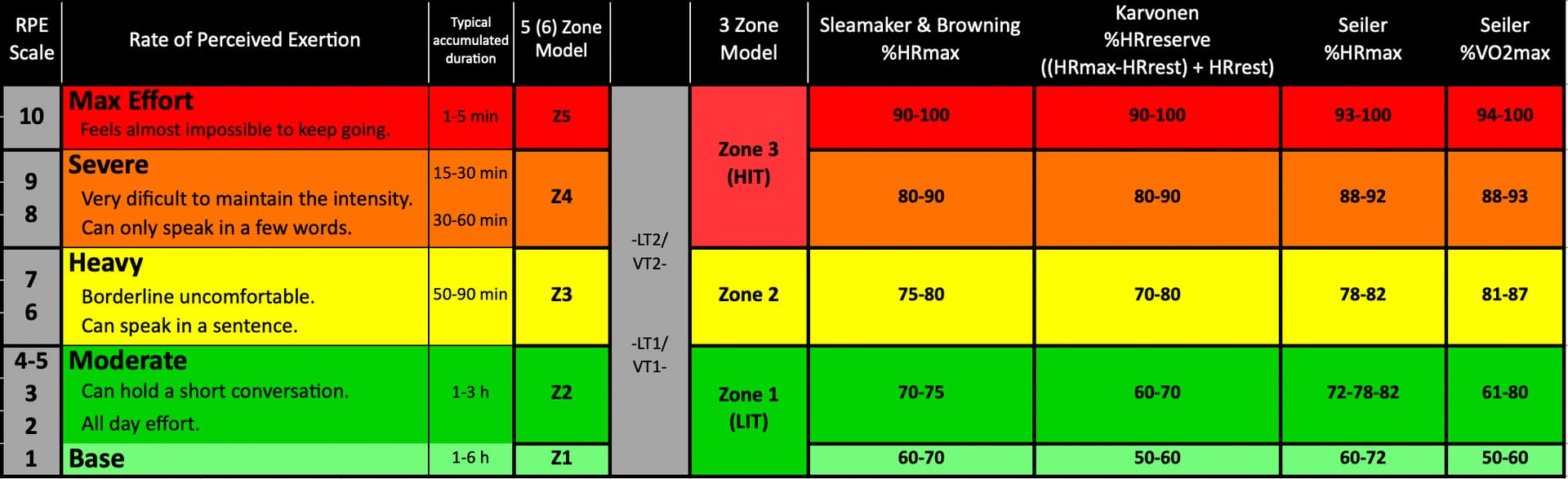
One thing of note from your images, your HR zones may be set rather high. Regardless of what percentage base you are using, 80% as a cut-off for HR Z1 is very high. People often overestimate the top value of their zones. Most of the published zone values are for elites, not the rest of us. In the chart below, the highest value in each square is an estimate that equates to the fittest athletes in their particular sport. If you’re not an elite in the sport for which you are calculating values then your top-end value will probably not be the higher range value. (Note: HR values are calculated per sport. Your HR zones for one sport, i.e. cycling, are not the same as for another sport, i.e. running.
In the summary chart below, you have to find which values align with your cardio, pulmonary and metabolic systems. Once you do, then you have to keep an eye on daily, weekly and monthly fluctuations between power and HR.
I’ve posted a link to this chart in spreadsheet form in this thread.