Interested to visualise how much time (minutes and seconds) is/was spent above .75, inbetween .75 and .50 and below .50 for an activity.
Ideally id like to see the info in real time on my garmin but post activity in intervals.icu would be a start (data is being recorded in AlphaHRV on garmin)
Why isn’t so important but if anyone really wants to know i just want to be able carry out a comparison of dfa vs time in heart rate zones for some self experimentation.
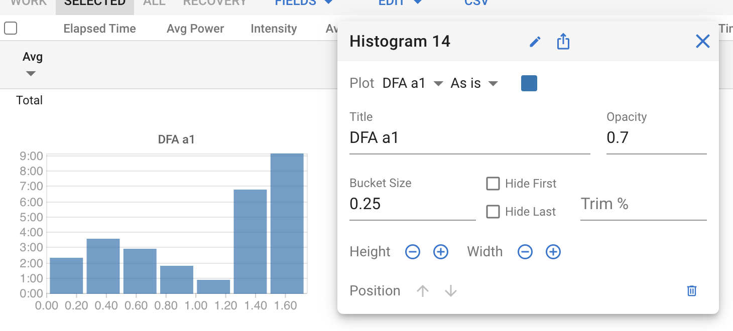
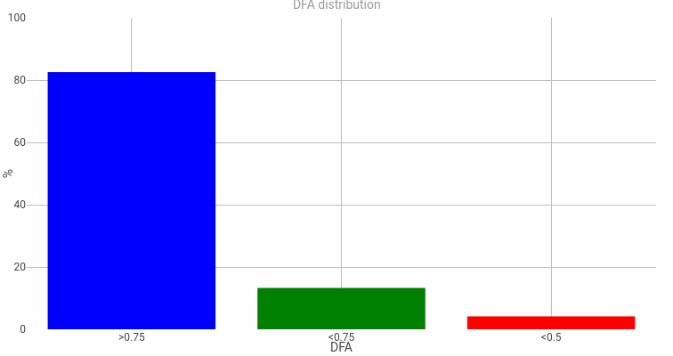
I felt nerd-sniped by the Plotly mention and gave this a shot. I’m a daytime SRE and only really know Python so this was a fun experiment. Forgive the ugly colours and overall layout, but here it is:
I’m curious to find out how your experiment went? In particular if you can share some screenshots of your charts and how useful it might have been compared to the default training distribution charts from Intervals.