Would be nice to be able to mark several of the bars in a histogram and see the sum of time spent in those. Let’s say i’m looking at a gradient histogram, set to have “1” bucket size, I’d like to see total time spent over 10%, would therefore like to choose all the bars above 10 and see the total. Strava has done something similar in their “25W distribution” chart.
There’s not a single group ride that I don’t recommend Intervals.icu as hands down the best tool out there. And it amazes me that people don’t know it.
Reading this thread, I think it’s almost unbelievable! You get to see a great new feature being announced, then technical support, bug fixes and new features requests coming right after. I don’t experience this kind of treatment elsewhere!
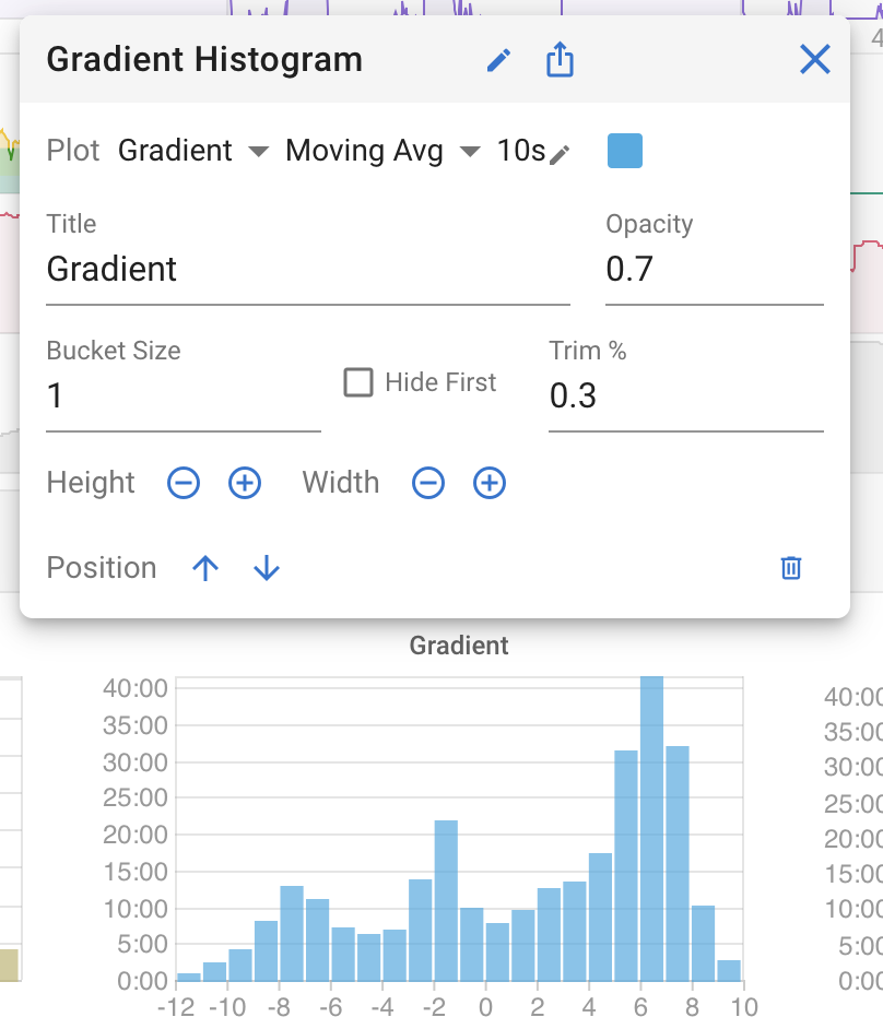
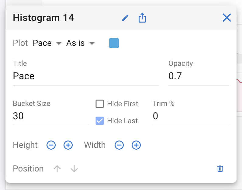
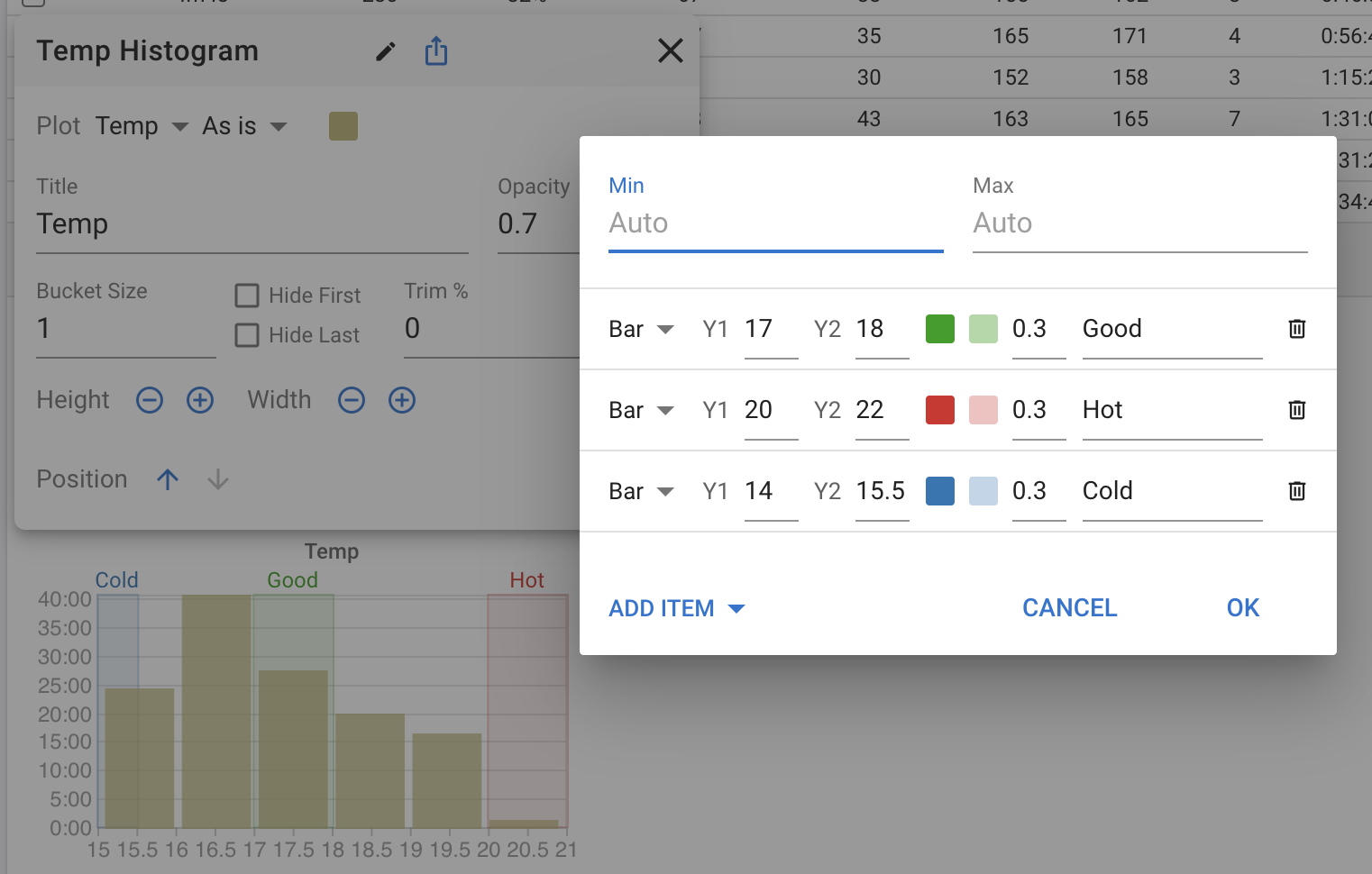
Question, you’ve got “hide first” and “trim” to remove unwanted parts, but I miss “hide last”.
With a pace histogram I would like to remove the slowest pace-part (this is mostly the part where I’m walking or standing still in the last section of the workout) and this is the last part of the histogram
These are great, I guess with any new feature comes lots of ideas for how to extend it.
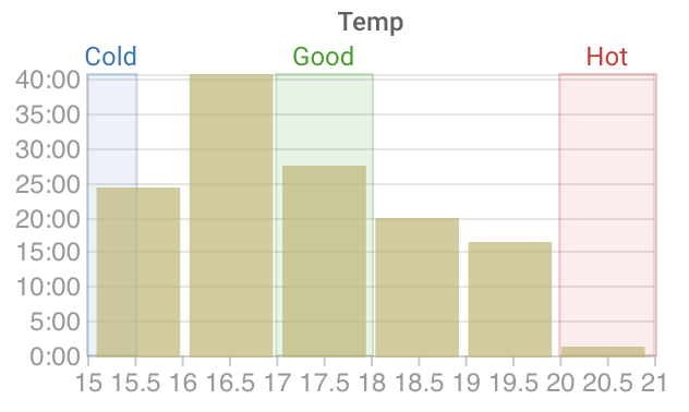
It goes against the generic nature of the histogram but it would be good to have zones marked on the X axis for applicable heart rate and power plots?
Rather than trying to automatically decide when to make it availble, probably impossible once formulas are implemented, it could be as simple as two checkboxes on the definition window - one to include heart rate zones and one for power zones.
Something like a simple cross mark or maybe the axis line changing colour to match the zone colours.
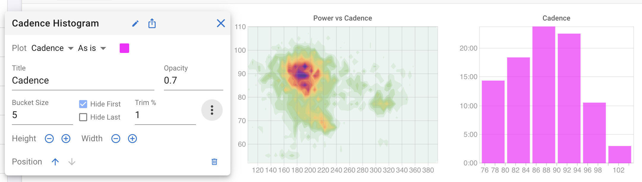
Similar to the heatmap charts, I would love to be able to clamp the values to certain ranges with histogram charts as well. This would work like the regular activity charts “min” and “max” settings for axis.
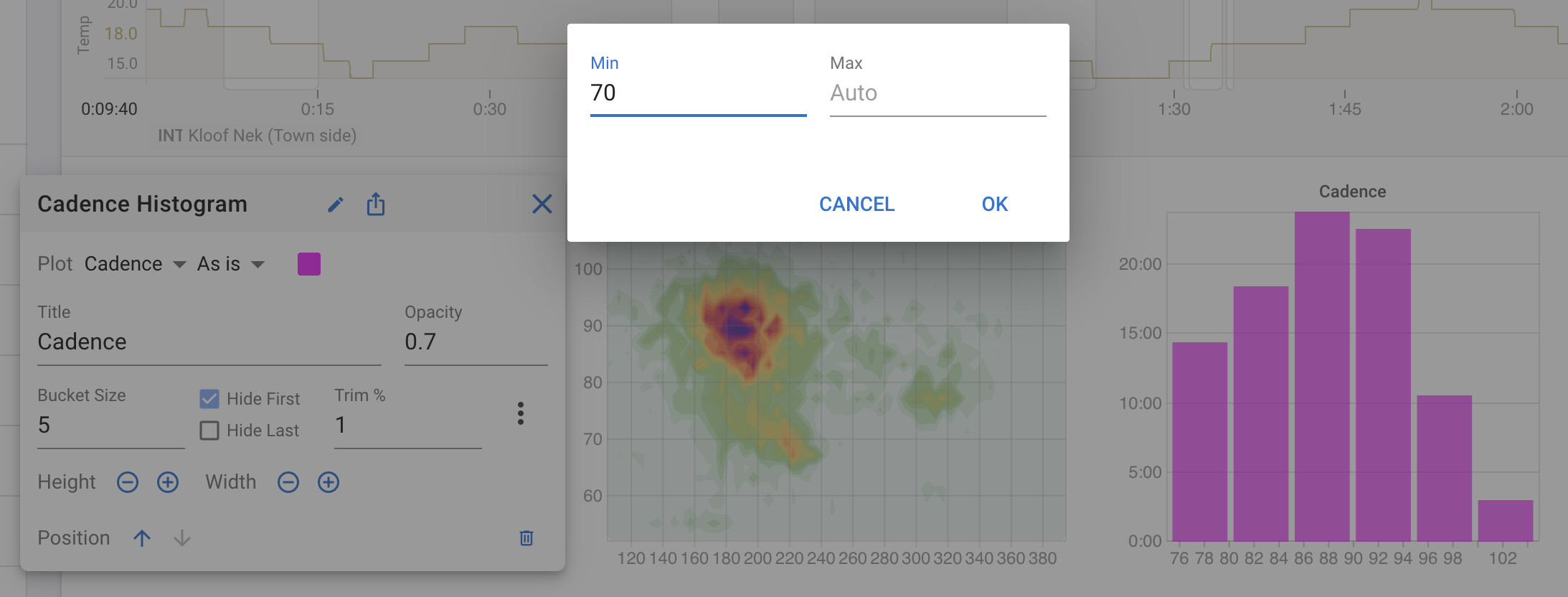
You can now specify the min and/or max value to be plotted for histograms and heat maps. This is applied before “Trim %” and the hide first and hide last options. Click the dot dot dot button:
The continual improvements you roll into intervals is really impressive, particularly for a one person shop. Compare it to the glacial changes in Strava which probably has 100s of devs!
This seems to only trim ranges.
For easier visual inspection I would like to have fixed ranges, e.g., always show pedaling smoothness with a 10–50 range. However, if the data does not span that range the displayed range is also smaller, thus moving data around (visually)…
Any way to get a stable display across activities?
I have changed the min and max to give stable axis range. You can set just a min and then buckets on the max side will still be removed if empty … same in reverse if you only set a max.
Amazing, thank you! This is exactly what I was after. And the new zones functionality is superb!
A couple more bugs that I’ve encountered:
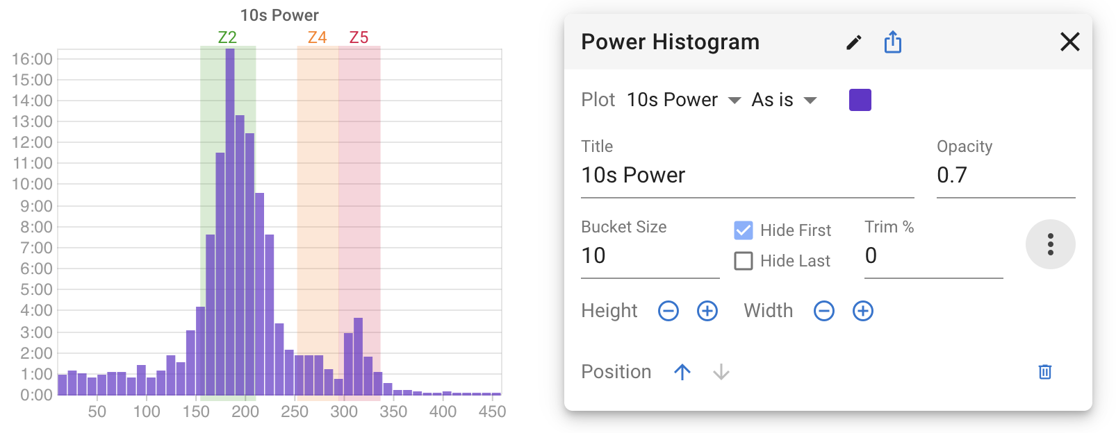
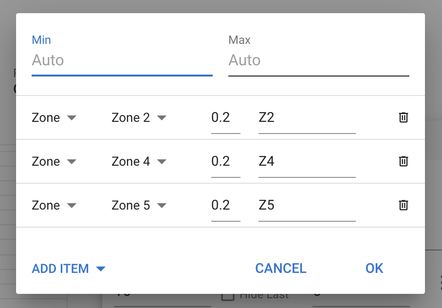
HR zones on histogram charts go up to Zone 7, though I’ve only Z1-Z5 set up. Z5 doesn’t seem to match with the range I’d expect.
Hovering with the mouse on histogram bars doesn’t work anymore when bars/zones are overlaid. Previously it used to highlight the bar and the value on the bottom axis.
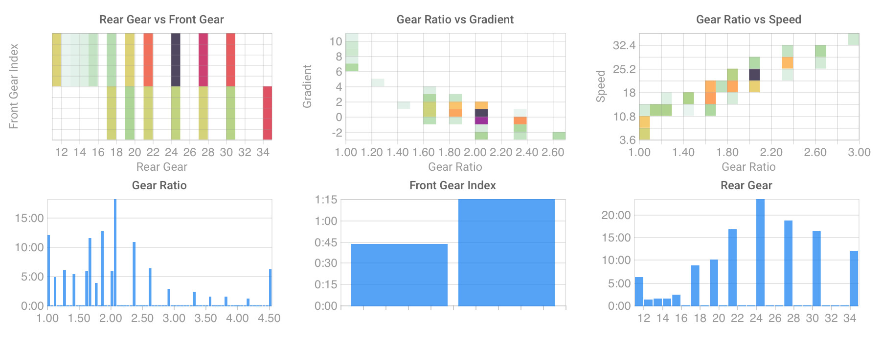
A feature request I have would also be having the ability to remove “empty” parts of the charts, at least from values from histograms. For example, this would allow for a much neater display of gearing data without scripted charts.
Below is an example for some of these charts. At least “rear gear vs. front gear”, “gear ratio” and “rear gear” would benefit from being denser.