Hi,
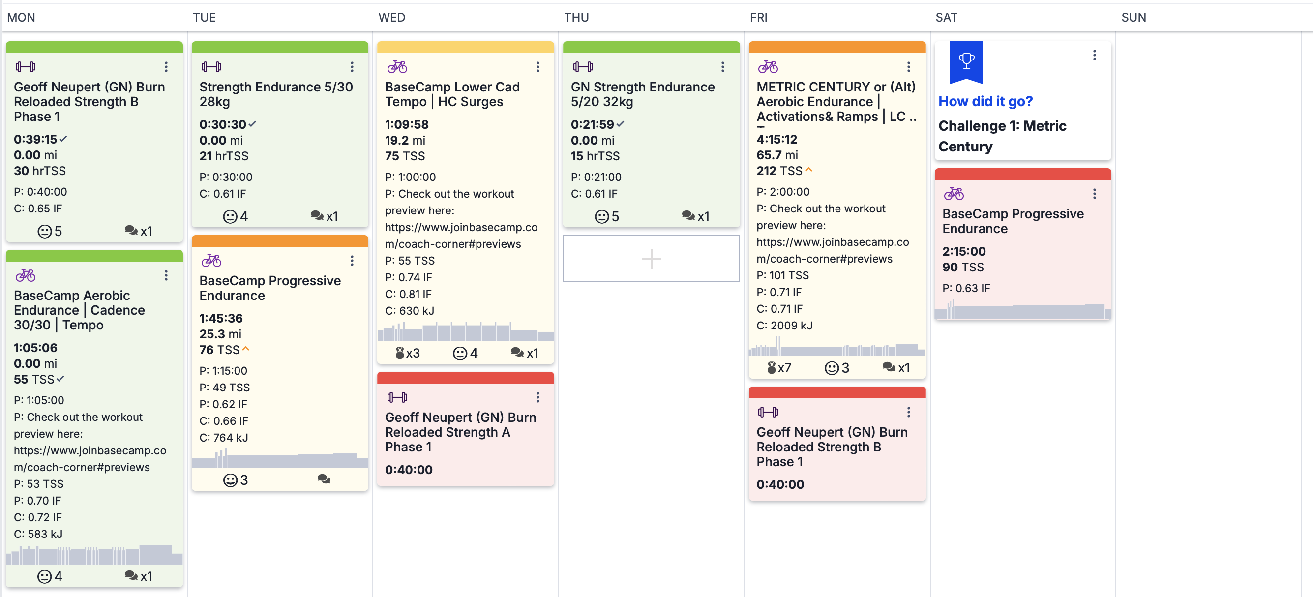
I’m trying to reduce clutterness on my calendar. I have a plan but due to weather/life/whatever I find myself on doing not what I “have” to do but something else, this results on having a lot of things on my calendar.
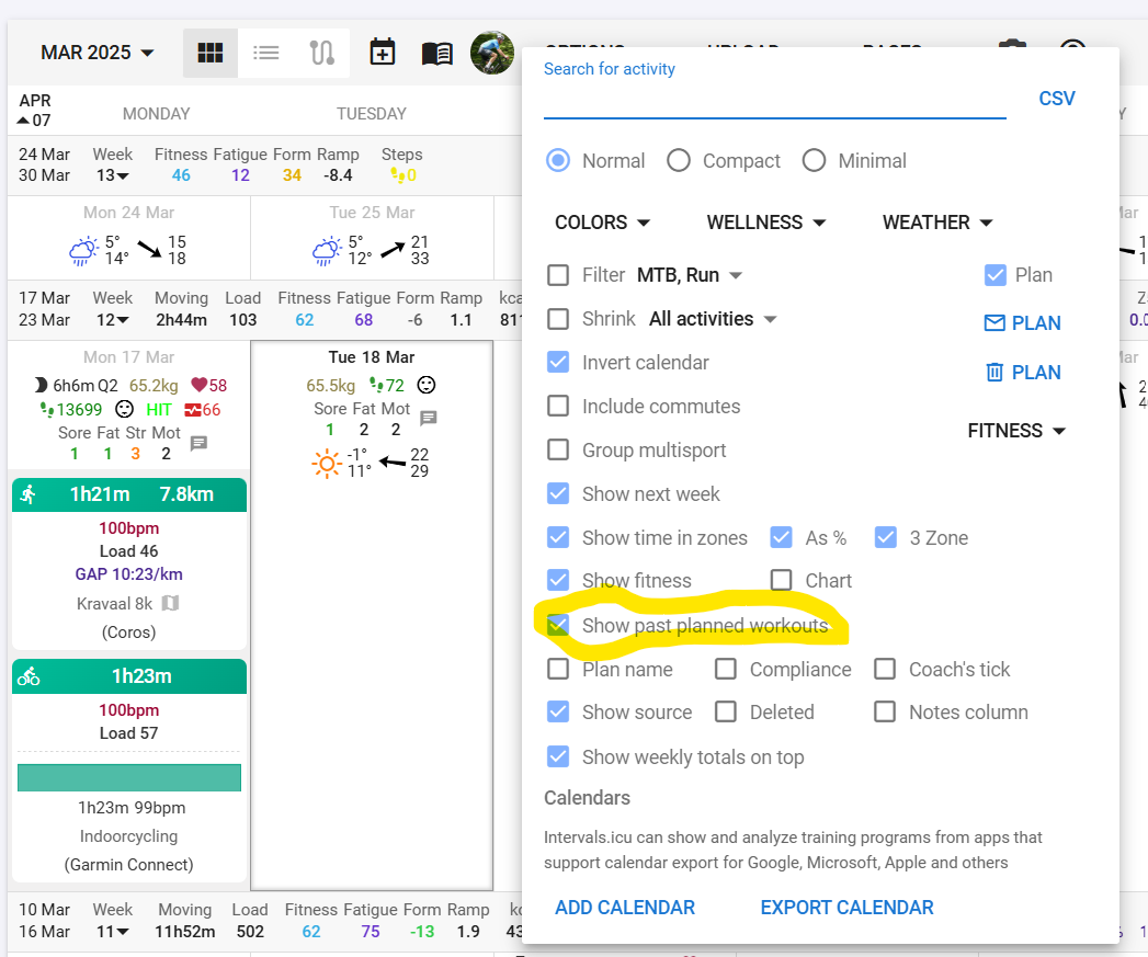
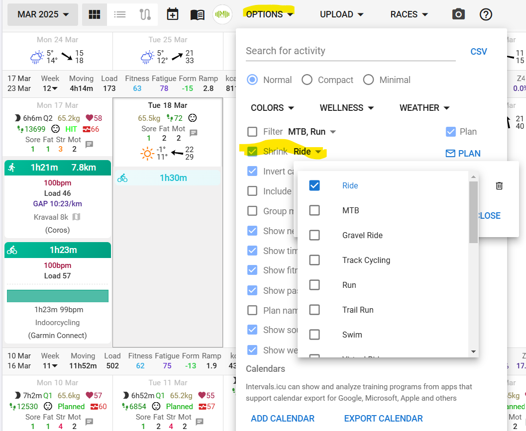
to be more clean I would like to hide the chart on past planned workout so:
I can still see I had to do something else instead of what I did, having it unlinked from the actual work and with the
the planned but discarded workout takes a lot less space on my calendar
I still want to see the chart for future workouts.
thanks but I would like to still see on my calendar that I had a workout, I just want to hide the chart to reduce clutter
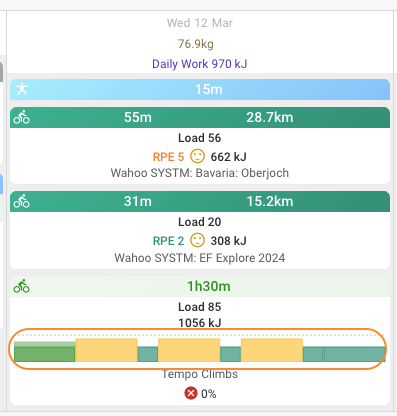
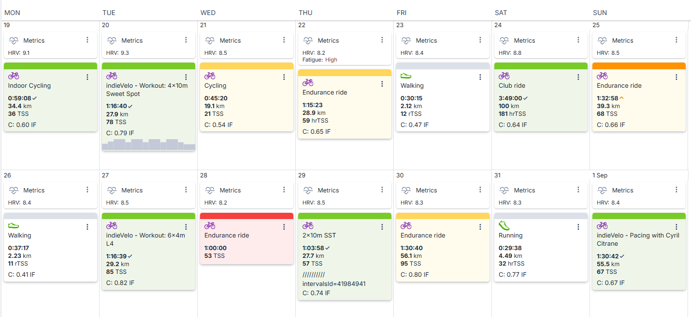
instead of this
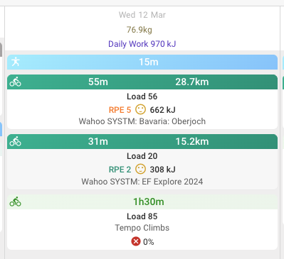
something like this, so I still see I’ve “missed” a workout" but doesn’t take much space and it’s less prominent on my calendar (even better if past planned workouts could be “grayied out” or similar)
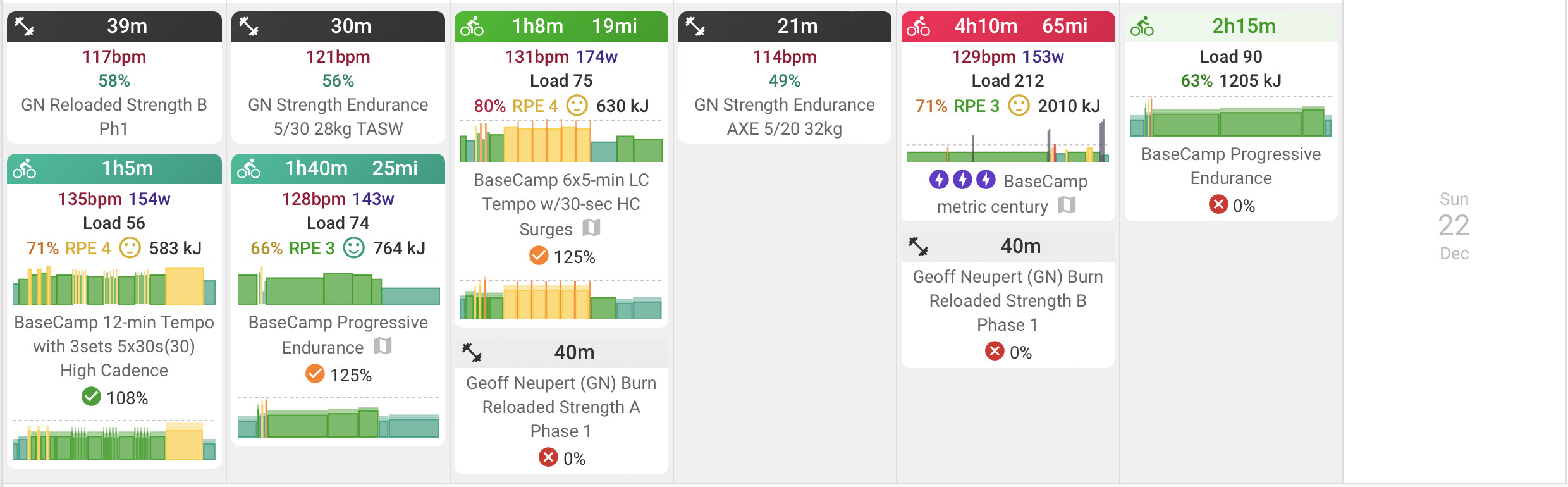
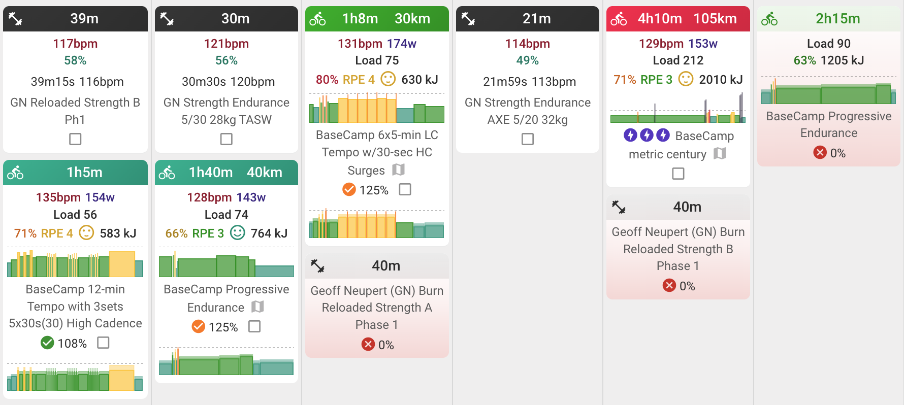
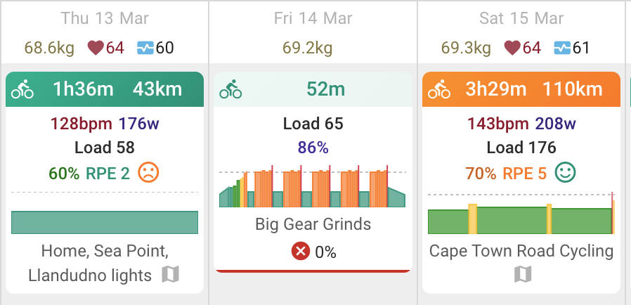
@David maybe its just me, but TP makes it EASIER to visually scan my calendar for missed workouts. The small red x 0% is gets harder to seee the more I have on my calendar. Versus red tiles in TP.
This is the only ongoing UX issue I’ve had with Intervals, no matter how I train my brain its difficult to visually audit my calendar after completing a (3-4 week) block of training.
I think that leaving the option for the user to choose whether or not this update, like the others that have been done, is already satisfactory for me. For example, I prefer it as before, it is cleaner and easier for me, at least.
I’m okay with the change; thanks David.
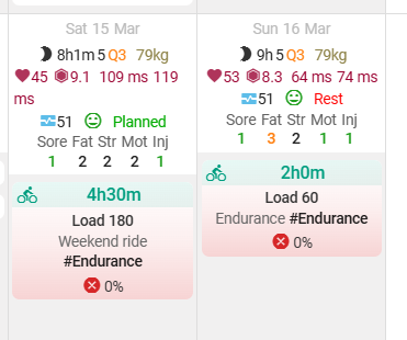
The red gradient made an impact when logging in now, which is what it should do.
Perhaps an option (tick box) would be good for those that don’t like it.
I’m not a designer or UX person, my only other thought would be to put a big red X across the entire tile. Because of the existing color scheme, it doesn’t seem like you have many options. The fade to red is better to my eyes!
Hopefully that stands out enough without annoying people. Maybe a triangle on the left or right side would look better? Anyone who can use the DOM inspector and do a bit of CSS: if you have other ideas please post screenshots and CSS fragments.
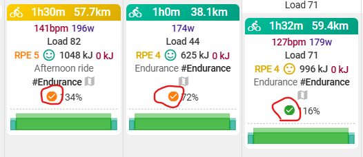
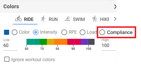
Hi @david , is there any way we could have an option in the “Colors” menu (next to Color, RPE, Intensity, and Load) for compliance? The base color for the prescribed activity could be grey (or another), and then it could change color based on compliance.
I like the shading more than the line, as it stands out more.
TrainingPeaks doesn’t have the colour of intensity/load, and only compliance, so the clash of colours is less than here. The skyline chart is the planned workout, and is grey only.
Personally, I would prefer to have compliance to plan show, rather than colours based on intensity, or load. Not sure if this could be added to the colour options. I’ve modified my Intervals calendar in the below screenshot to show how I would see the compliance colours on the header.
Red, Orange and Green are the only three colours. The grey is a walk, so would change if selecting the relevant header.
This is what I meant in my previous reply! I can think of two good options:
Color based on compliance for the whole activity
The shading (red, orange, and green) based on compliance and I could set all my activity colors to grey so it wouldn’t clash with the compliance colors