It took me a while to modify the colours on my calendar example ![]() , so you had posted before I was finished my post.
, so you had posted before I was finished my post.
1 Like
worse IMHO.
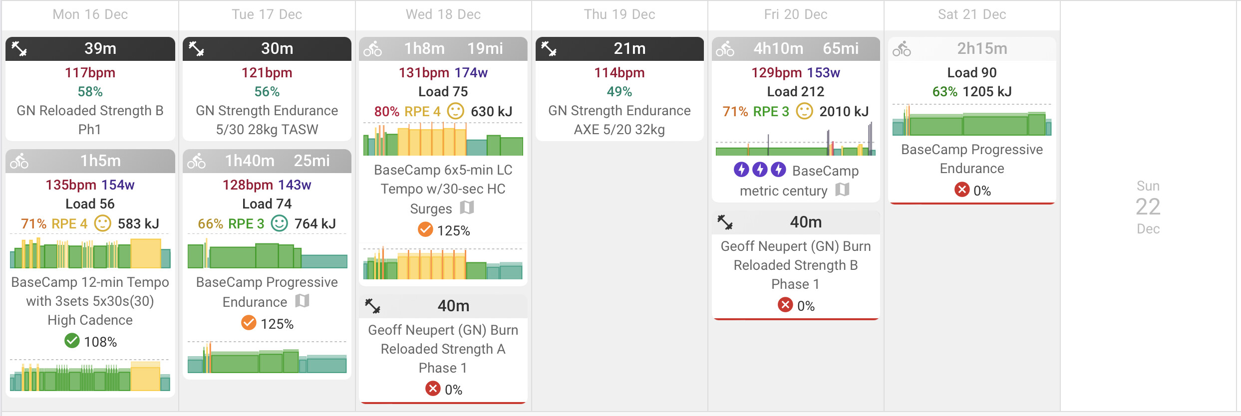
From a UX point of view, my basic observation is that TrainingPeaks nails it when auditing calendar for compliance (daily, weekly, block, etc).
Intervals on the other hand makes that exceedingly difficult, and provides a large number of options to use colors. That can be easily seen from looking at the skyline, or title, or tile metric (IF, RPE, Load).
@David continuing down that line of logic, if I accept your current solution, the problem IMHO is that skipped workouts still display color for IF and Load. But not RPE. So that led me to select color for RPE:
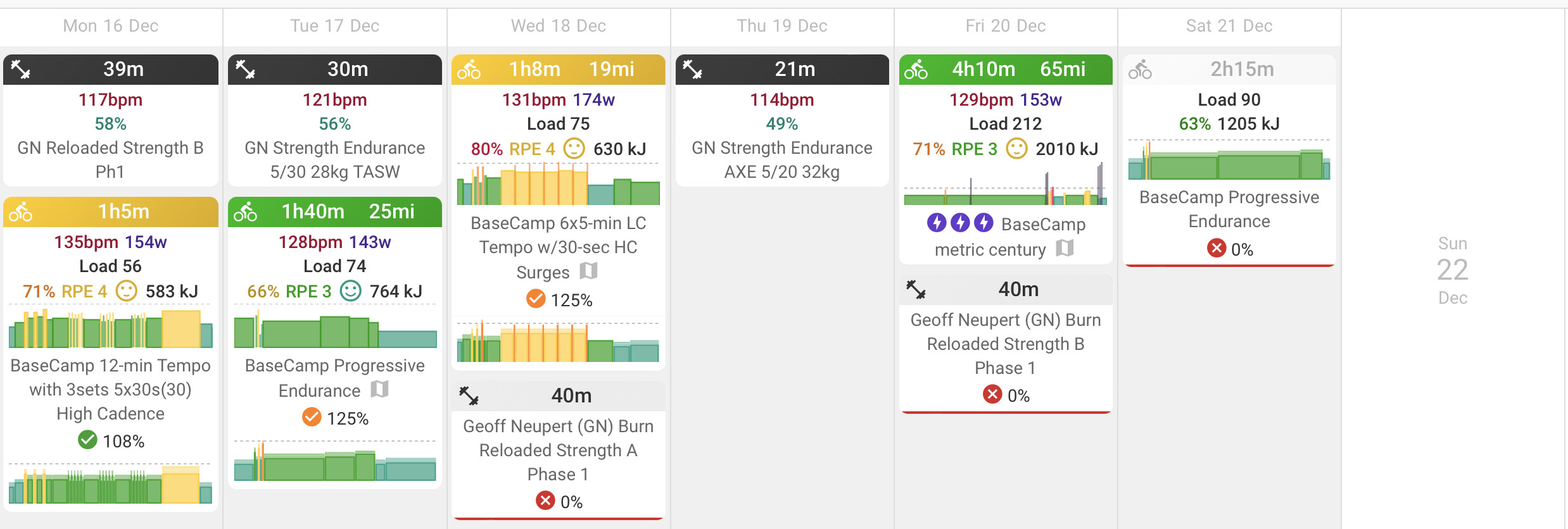
I guess thats better, but still not as obvious as TrainingPeaks.
I prefer having color coded skylines on the tiles, versus TrainingPeaks. But TP makes it drop-dead easy to see missed workouts.
And my beloved skylines, IMHO, leads to a color hot mess when the Tile’s title bar can also change color.
Which then makes it nigh impossible for me to visually scan and see if my base training - which uses CTL load progression as a primary programming parameter - is either on target or way above or below. Cycling coaches use CTL along with individual workout intensity/TiZ/etc to define a bloc of training. That I believe is the logic of TP, and the power of making it easy for the athlete to review if they are basically on target or not.
With this latest change, my workaround is to either make the Title permanently grey, or use RPE for color.
A compromise would be for you to implement removal of color for missed workouts, for all 3 options (IF, RPE, Load).
And further, its silly IMHO that Load coloring for completed workouts doesn’t match the completed load. For example:
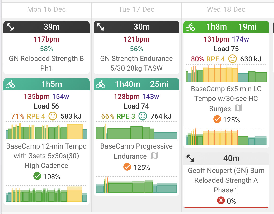
Tuesday and Wednesday workout are orange 125% in the little circle, but the tile is still green. Sorry, that makes no sense to me from a UX.
@David hope that helps.
in summary, I believe that for previous days, the Tiles should:
- use title color of completed work (IF, RPE, load) and NEVER the color of planned
- more clearly show missed workouts
My gut reaction for skipped workouts:
- Tile title should have no color
- skyline of planned workout should be ghosted and not full color
- fonts should also be ghosted
Again I’m not a UX designer, and in fact often ask my wife for help picking shirts to match my pants.
1 Like
![]()
![]()
1 Like
“chart should be hidden” works for me, assuming a well named workout so I can read the workout title and remember what I missed.
1 Like
@Gerald Should we maybe make a post about the compliance in the colours menu specifically in feature requests?
1 Like
I’m not sure; David has already responded on this topic, and made two changes after some feedback. The number of requests for unique colouring seems to be quite wide across how the calendar is viewed, so might be a bit overwhelming, and possibly a little complex to please everyone.
—————
As a coach, and my own critic of my own data, I like to see the 30,000-ft view first, which would be “was the week compliant? Yes or no?”.
This is available on the compliance tab, but is for all athletes.
- Yes = less detail needs to be spent looking at the next level(s).
- No = drill down and look at the next level… the 5000-ft view (activity level).
Was there compliance at activity level? Yes or no?.
This is the calendar view, and per athlete, but it’s hard to see among all the various colours used.
- Yes = look at a few charts, then tick and comment
- No = drill down, to ground level, and look at why, including adding comments/questions on the coach’s tick option.
2 Likes