You are just starting out and the Fitness chart needs 6 weeks of data before it becomes meaningful.
Check the first few posts of this thread to learn more about it
Fitness = CTL (Chronique Training Load - 42 day avg of your load)
Fatigue = ATL (Acute Training Load - 7 day avg of your load)
Form = TSB (Training Stress Balance - difference between CTL and ATL)
Anything you want to know is described in detail on TrainingPeaks under the PMC (Performance Management chart)
Intervals is using other naming because the original naming is trademarked. But it is essentially the same.
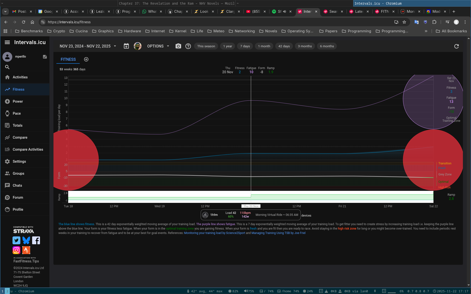
Ah, got it now! I thought those big coloured circles were ‘highlights’ that you added.
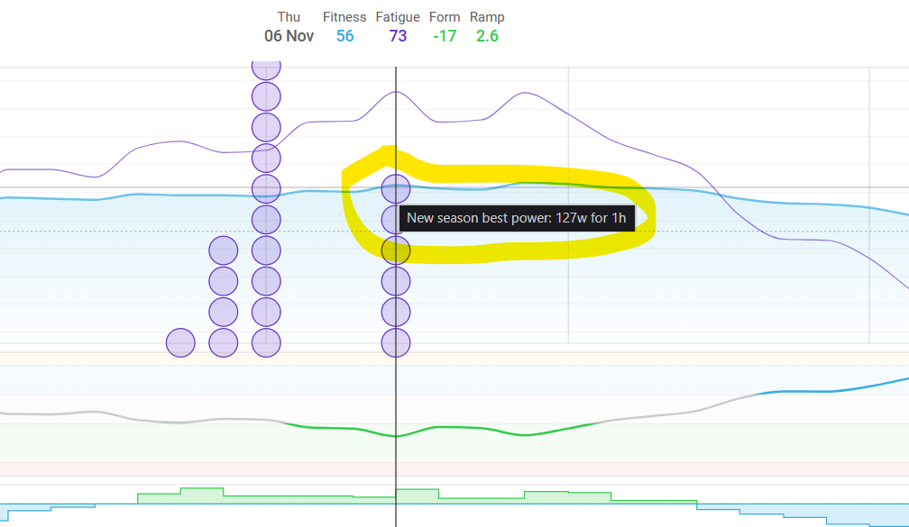
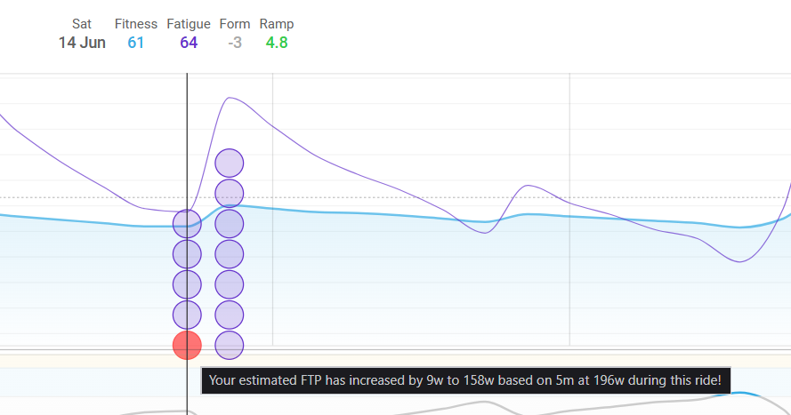
No, that big purple circle is the result of a ‘Season Best’/‘Achievement’, but it is too big just because you are on such a small date window.
Set the date-range to last month or something like that and you will see the purple dot on the fitness chart in a more friendly way.
The Fitness chart doesn’t make sense when displayed for only a couple of days.
It’s an overview of your activity and the impact on your body that should be looked at for a period of 6 weeks or more.