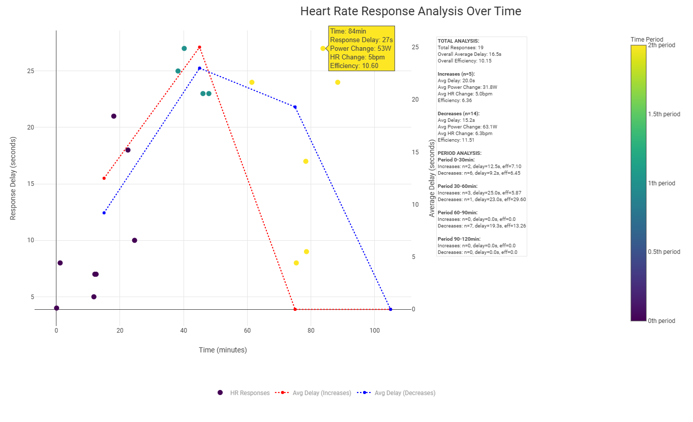
I have developed a chart to analyse heart rate response patterns during workouts. This visualisation helps you understand how your cardiovascular system responds to changes in power and how this response evolves throughout the session.
What does this graph show?
-
Analysis of HR response:
- Each point represents a significant power change (>20W) and the time it took for your heart rate to respond.
- The colour gradient indicates the progression throughout the training.
- Dotted lines show average response times for increases (red) and decreases (blue) in power.
-
Key metrics analysed:
- Response delay: Time between power change and HR response.
- Changes in power: Magnitude of power changes
- HR changes: Magnitude of heart rate changes
- Efficiency: Ratio between power and HR changes
-
Period analysis:
- Data is divided into 30-minute periods.
- Records how response patterns change over time
- Helps identify possible markers of fatigue
Why is it useful?
- Understand your cardiovascular response patterns
- Track the evolution of fatigue during workouts
- Identify possible cardiac deviations
- Compare responses between different types of training
- Monitor training adaptations over time
The graph includes a comprehensive statistical analysis showing
- General response patterns
- Separate analyses for power increases and decreases
- Period breakdowns
- Efficiency metrics
I hope this tool can help others analyse their training data in more detail. I would love to hear your feedback and suggestions for improvement.
Do you think it could be useful?
6 Likes
Where can I find the chart?
I checked in Activity charts but nothing shows up when searching for ‘response’
1 Like
I’m correcting some things in the layout (I’ve only used javascript for web DOM), if you want I’ll send you the code by private.
I don’t have direct need for it. But always curious to see if it can be interesting  .
.
I probably misunderstood your message because I thought that the chart was available already in Intervals Activity Charts.
1 Like
I can see plenty of value in this chart so long as a user makes sure that they are comparing like with like. For example I find that I can cope with power riding/running uphill far better than flat (i.e. where I would need to increase speed & so stride length beyond comfortable & likely leading to injuries). So a workout for me would need to have near identical elevation profiles or generally fairly flat I suspect to offer a fair comparison. But in fairness that is important for most analyses & not just this type/graph.
I am currently using DDFa1via AI Endurance app to try to assess real time fatigue alongside subjective feelings. Whilst it does offer some insight on more personalised thresholds I am finding that DFA is quite sensitive & also variable depending on my “readiness/freshness”. So I find that there needs to be quite a bit of fuzziness around the thresholds to allow for days when I am more fatigued. AI Endurance tends to take the ideal condition workouts to set their thresholds which do not happen that often thereafter for me. Also the thresholds e.g. 0.75 & 0.5 seem quite disputed e.g. should it actually be closer to 1.0 than 0.75 for the majority of users? So it needs time & experimentation/benchmarking with a variety of “benchmark workout types” to calculate what they are for me. Which is fine as it is not a settled science but merely a part of a larger toolset. So a chart that looks at fatigue in a different way should in theory add more nuance, quality & subjectiveness to that DFA guidance so as to enhance the overall picture.
Dividing the periods into 30mins seems quite long for me as an keen amateur as I suspect that depending on the workout intensity I would fatigue significantly in far shorter periods than 30mins. And my workouts are often 60mins for a particular discipline or a brick session if longer so as to reduce e.g. run impact stress. Perhaps the science shows that it needs to be that period length for validity? I quite like the ability to analyse decoupling percentage for individual (shorter) work intervals that Intervals allows though as this seems useful for workouts with intervals of e.g. 10-15mins where there is still likely to be sufficient fatiguing as to show in power HR metrics. I can then do a e.g. 60-90min workout with quite a few indicative intervals rather than perhaps only 2-3 if the period of analysis was 30mins. But this is depending on the sport science & the data validity of my preferred shorter intervals perhaps?
Here I don’t look at dfa at all, what the graph does is to detect changes in power and heart rate with a threshold that I have put that can be changed in the code divided into periods of 30 minutes but in those periods you will see all the changes that occur, if in those 30 minutes you have 5 very intense changes they will be reflected in the corresponding 30 minute interval.
It does sound like it can accommodate shorter intervals then which is good. And presumably it should be less volatile than DFAa1 seems to be which would be good. it would also be good for those without access to in activity HRV/DFA.
So yes it does sound very useful as a non-DFAa1 personalised fatigue measure independent of other currently existing ways of estimating it. Even if the different ways do not necessarily correlate to one another then with suitably optimised benchmarking protocols there should be useful information to learn from the graph/data.
DFAa1 (e.g. via AlphaHRV) is potentially useful especially as a real time fatigue measure, but only if it proves sufficiently reliable & perhaps a bit more stable ideally than I can currently seem to get it, even with minimal artifacts. However, taken over 2min as covered by the AlphaHRV graph then it is probably stable enough to indicate a fatigue/effort level. DFA & RR/a1 may perhaps prove a more reliable metric to aid stability & reliability. But otherwise trying to target a particular zone can mean having to drop too far away from a threshold boundary than is perhaps ideal. But then is there a fixed boundary or is it a continuum with slightly fuzzy “zone edges” anyway? And then fatigue level pre-exercise also complicates judging zones further.
That question always comes back to “how would I use that to adjust my training?” Out of your “Why is it useful?” list, it doesn’t answer that question. At first glance, I feel your answers point to more of a season review, or season over season review of cumulative benefits of training. Thats my first reaction.
After spending 3 years with a top coach, I’d say that level of analysis THROUGHOUT a season isn’t going to help much. My coach used it as one of several metrics to judge when I was ready for certain workouts during a build phase.
1 Like
I don’t know if you didn’t understand the question or if I didn’t understand your answer. This is a chart that analyses in one session the behaviour of heart rate versus watts, to evaluate a season or a complete mesocycle I have other things, where of course heart rate is very important. Each coach has his own analysis system, I am a physiology technician and a qualified physical trainer. The only thing I wanted to say is that if someone could use it, I would share it.
Share it and I’ll try. Currently detrained and starting my season next week.
I would like to try it also please.